STARK COMMUNITY FOUNDATION MURAL PROPOSAL
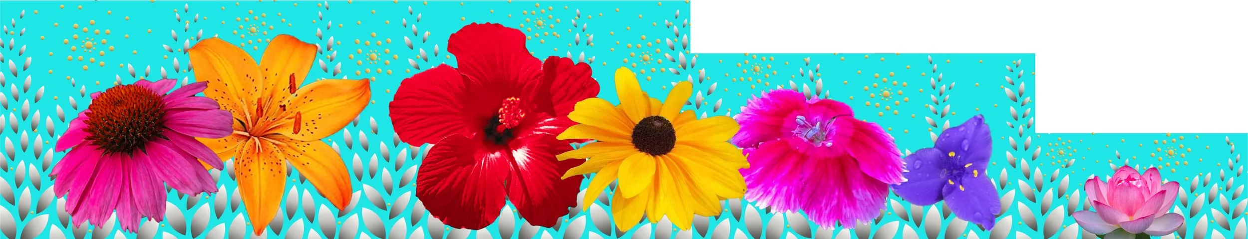
Canton’s Blossoming Community mural is designed to become a symbol of Canton’s growth and vibrance. I chose flowers because they’re not only beautiful and vibrant, but because they symbolize community, generosity, and welcoming. Canton has been blossoming like a flower because of organizations like yours.
For the background color, I chose Tiffany blue because it’s lively and always classic. The metallic petals and seeds for the background patterning embolden the flowers without distraction while adding elegance and interest. The silver petals are lifting up and growing while the gold seeds bursting with energy.
To draw visitors to the new Cultural Center greenspace, it is also significant for this mural to be a popular photography spot. This design would be popular for kids, families, photo shoots, prom and wedding photos, friends, and selfies.
Welcome to Canton’s Blossoming Community.
PETAL DESIGN
CIRCLE DESIGN
SYMBOLISM
FLOWERS = community, generosity, welcoming
PETALS = growth
SEEDS = rebirth, energy
CIRCLES = infinity, community
ECHINACEA = healing, strength
LILY = devotion, rebirth
HIBISCUS = friendship, welcoming
BLACK-EYED SUSAN = encouragement, motivation
DIANTHUS = gratitude, affection
TRILLIUM = Ohio state wildflower, recovery
LOTUS = strength, resilience
Q & A
What would be her plan for incorporating the public into the design and execution of the work?
Anyone of any age or skill can be included to paint the metallic petals in the bottom section that can be reached without a lift or ladder. Though you stated it’s not the responsibility of the artists to recruit the community, I would be happy to reach out to teachers and principals I know to have them encourage their students and parents to participate.
I would like to hear Dyanne address these points. How will she "study" the location and bring that study to bear on the final proposal?
Usually, my priority about the logistics of a site is that it affects which materials can be used. Since this is painting, I just know that I need to use high-quality paints since on the west side of the building it will receive quite a bit of weather and sun exposure. I would use a combination of brands, but there is an excellent mural paint brand called Nova Color that I would use for the metallic elements and flowers.
I also study the site for shape to figure out what kind of design would fit organically and flow within the space.
I also consider the goal of the space. For me, this is usually my client’s taste and style. For this project, it seems the goal is to transform this area into a vibrant community space, to draw in visitors, and make them feel welcome.
What strategies has she developed for facilitating conversations? How would she best like to receive our feedback regarding aesthetics, etc. and how does she like to deliver feedback?
As far as strategies to facilitate conversations around aesthetics, I usually show the client one or two designs first. I try to explain the design as clearly as possible since computer renderings don’t always give the feel for how a completed artwork will look and make sure they understand why I made the choices. I first ask clients open-ended questions such as what they like or don’t like. Sometimes people don’t have the words to express specifics, so then I’ll break down the elements of the design to get a feel for what I should try next. From here, the next stage would be to get more feedback in a conversation and refine or even redesign.
If you were asking how, as in what method I would like to receive feedback since this is a committee, discussing the design in a Zoom or in-person meeting or two would probably be best. Otherwise, I could be getting disparate feedback which wouldn’t be productive. Then, if there are slight refinements that everyone needs to comment on, I can set up a Google doc so everyone can comment and discuss.
For instance, with this, I showed you the original design with the proposal and I tried to implement the feedback as I understood it to make the design more dynamic. But at this stage, it’s just guessing since we haven’t had a conversation. For all I know you all hate Tiffany blue, metallic elements, or flowers and I’d need to redesign from scratch. But I had to make initial choices to develop, and then hopefully you will see that once we discuss ideas more, I can create a beautiful mural for you.
MY PAINTINGS
OTHER DESIGNS
First I tried making circles with movement:
Then I tried moving the flowers down and using silver leaves:
I didn’t like the flowers partially “off-screen” so I moved them back:
Then I tried making a silver vine running through with leaves:
And added gold berries:
Then tried making the leaves single:
Then there’s this monstrosity. The only thing I have to say about this is when my designs get really ugly I’m usually about to get close to something good! ;)
And just to go way back, this was the original design I made several months ago before I started painting the flowers with metallic backgrounds.