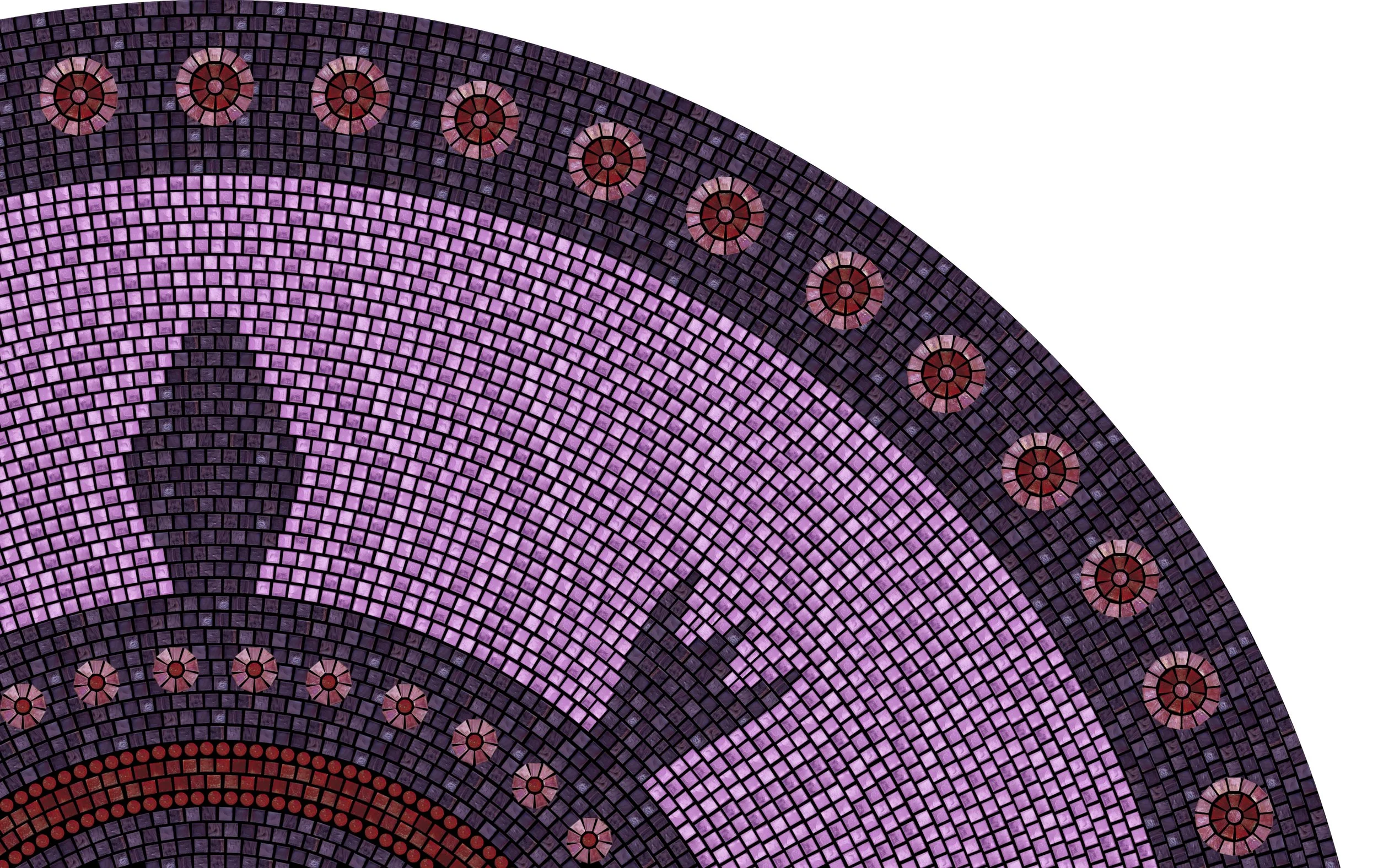
The first decision should be the two colors to be used for the border/turtle main color and the background color so that the rest of the colors can be chosen to correspond. These are quick mockups using photos of the glass samples I have available to help make this choice. The color codes are all listed so you can refer to the sample sheet.
S1 Dark Purple Border & S34 (or S35) Translucent Light Purple Background
This is the 1/8” glass, but I am including it because I believe it is overwhelmingly the best choice for this mosaic because my understanding is that the purple color is the priority and the 1/4” glass doesn’t come in the right purple. In case the decision for 1/4” was made based upon the design with the shaped glass, I’m going to start adding potential ideas for making the highlight color designs more interesting than the diamonds I used before. I’ll update with images below as I have time to mockup these ideas.

I only had time to make these two mockups below this morning, but I’ll add more if I have time before I leave town. I really love the first one and think it would look amazing. For the second one I wanted to try repeating the center of turtle motif on the border, but I think it may be too busy. For something in between, maybe adding in one of the bright colors into the center of the border circles?

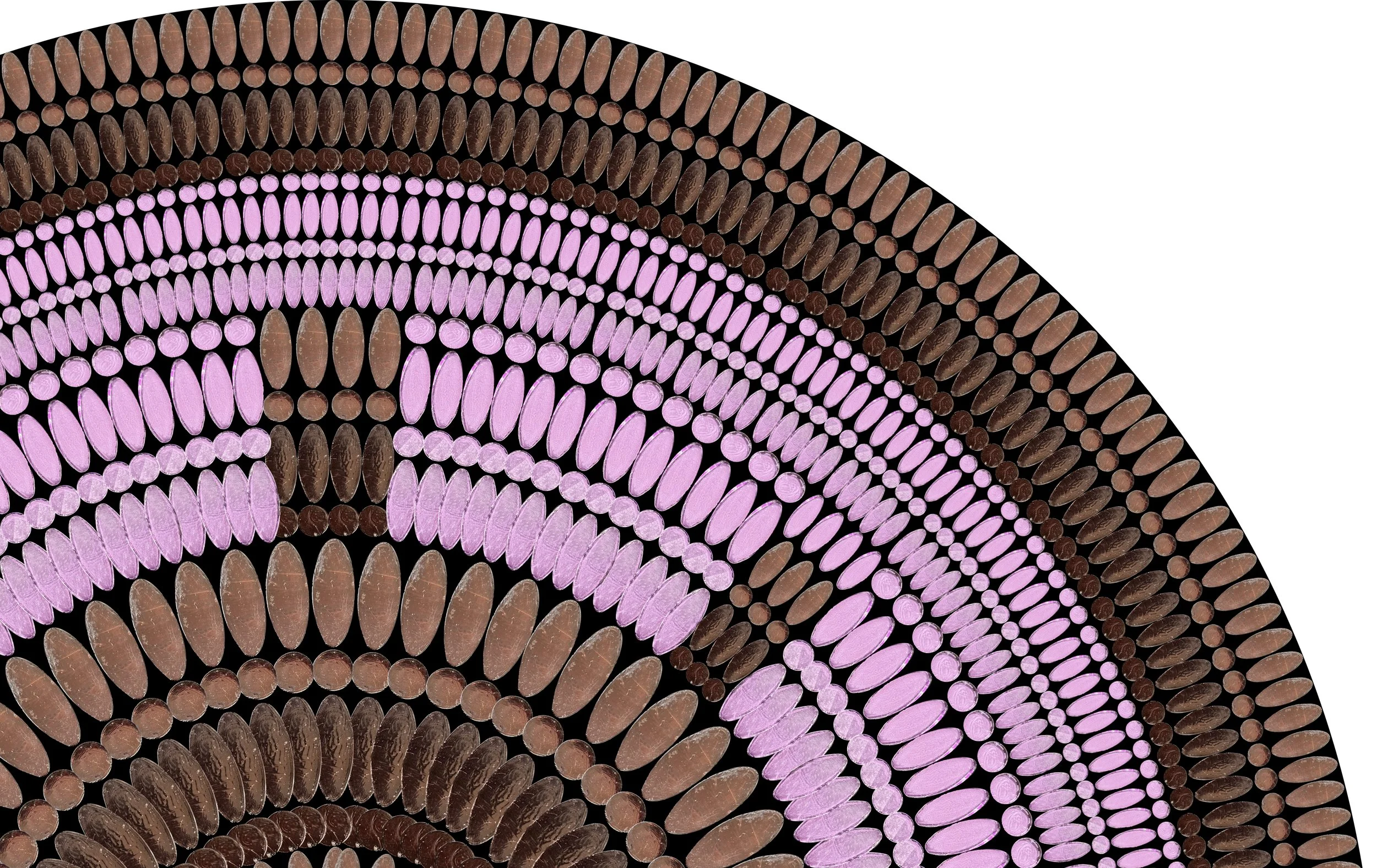
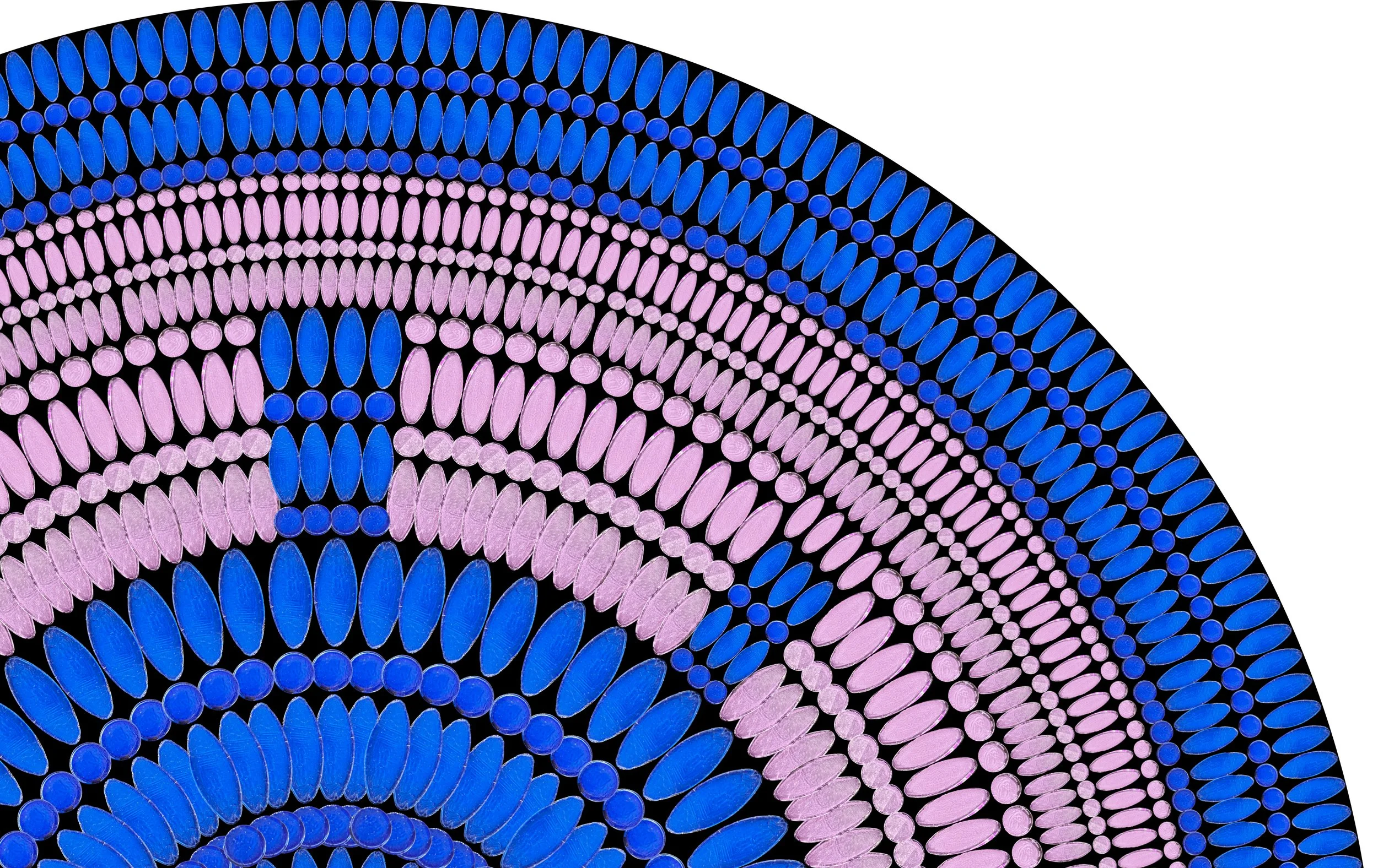
Since the only real purple glass color in the 1/4” glass is C5, all options below use C5 with another color for contrast.
1: C36 Dark Purplish-Brown Border
This is my top choice for 1/4” glass because it will provide enough contrast and let the purple and other colors of glass pop.
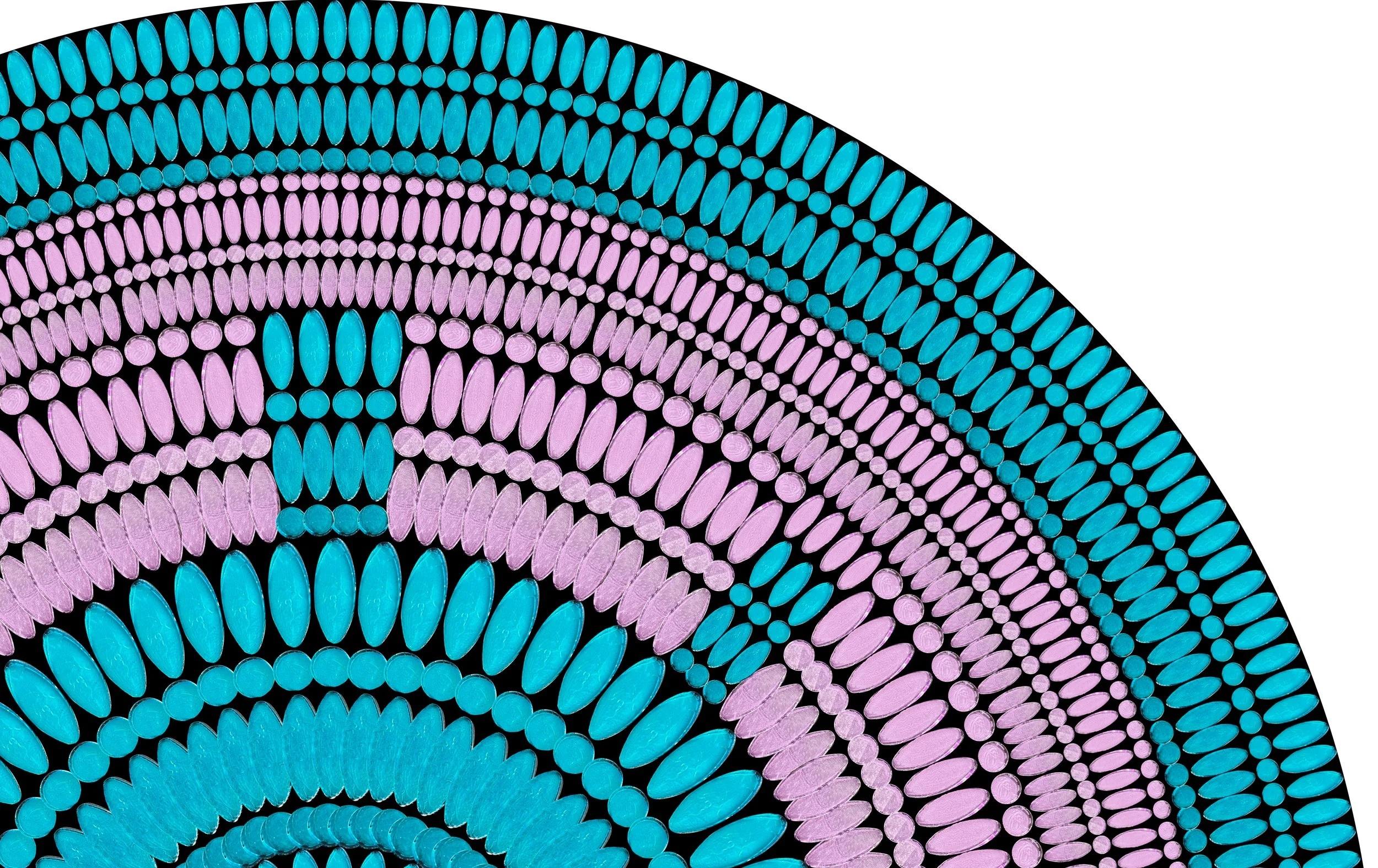
2: C20 Deep Bright Blue Border
This is my second choice because it will provide enough contrast and is a great option if you want the entire mosaic brightly colored.
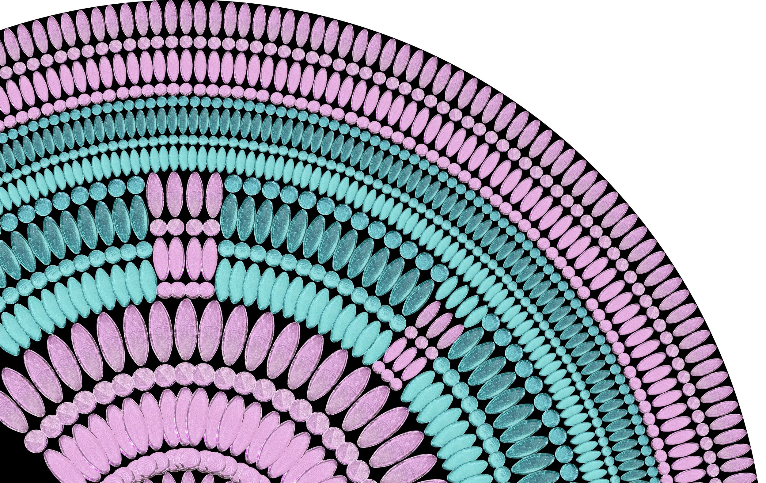
3: C24 Deep Aquamarine Border
This provides less contrast, but the design would still stand out. Note that the glass color does look deeper in person.
4: C24 Deep Aquamarine Background
This is the same as above except with the colors reversed.

5: C27 Aqua Background
This is bright and gives the impression of the turtle swimming in the sea.
6: C18 Cream Background
There are a few colors of glass that range from off-white to pale pink to choose from that would fit into this coloration (C43, C41, C18, & C47). They all photograph in a similar way so I’m just putting one picture here, but if you choose this one we can define which would work best.

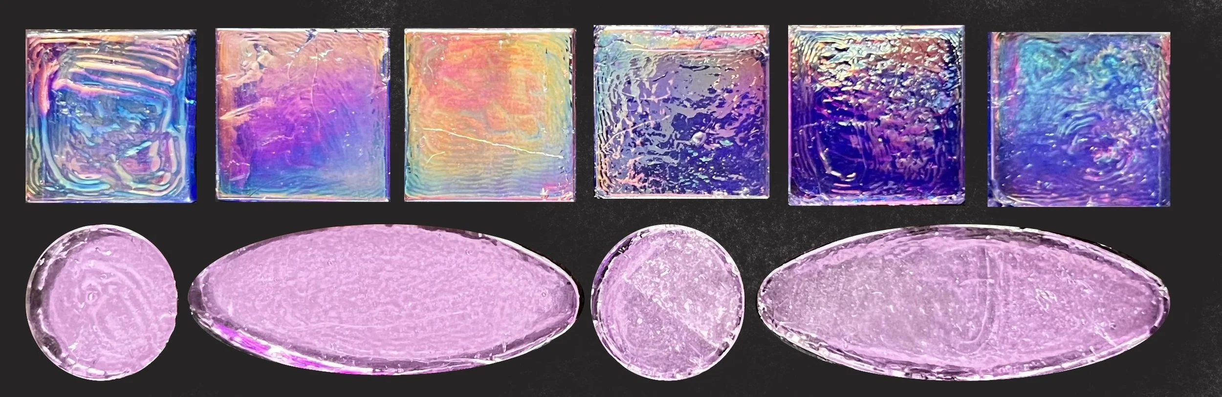
The following two mockups don’t look as they appear in person because of their harsh iridescence. They are the two darker colors against the C5 purple, but it concerns me that the way the lighting hits the iridescence of this glass that the contrast of the design would be lost.
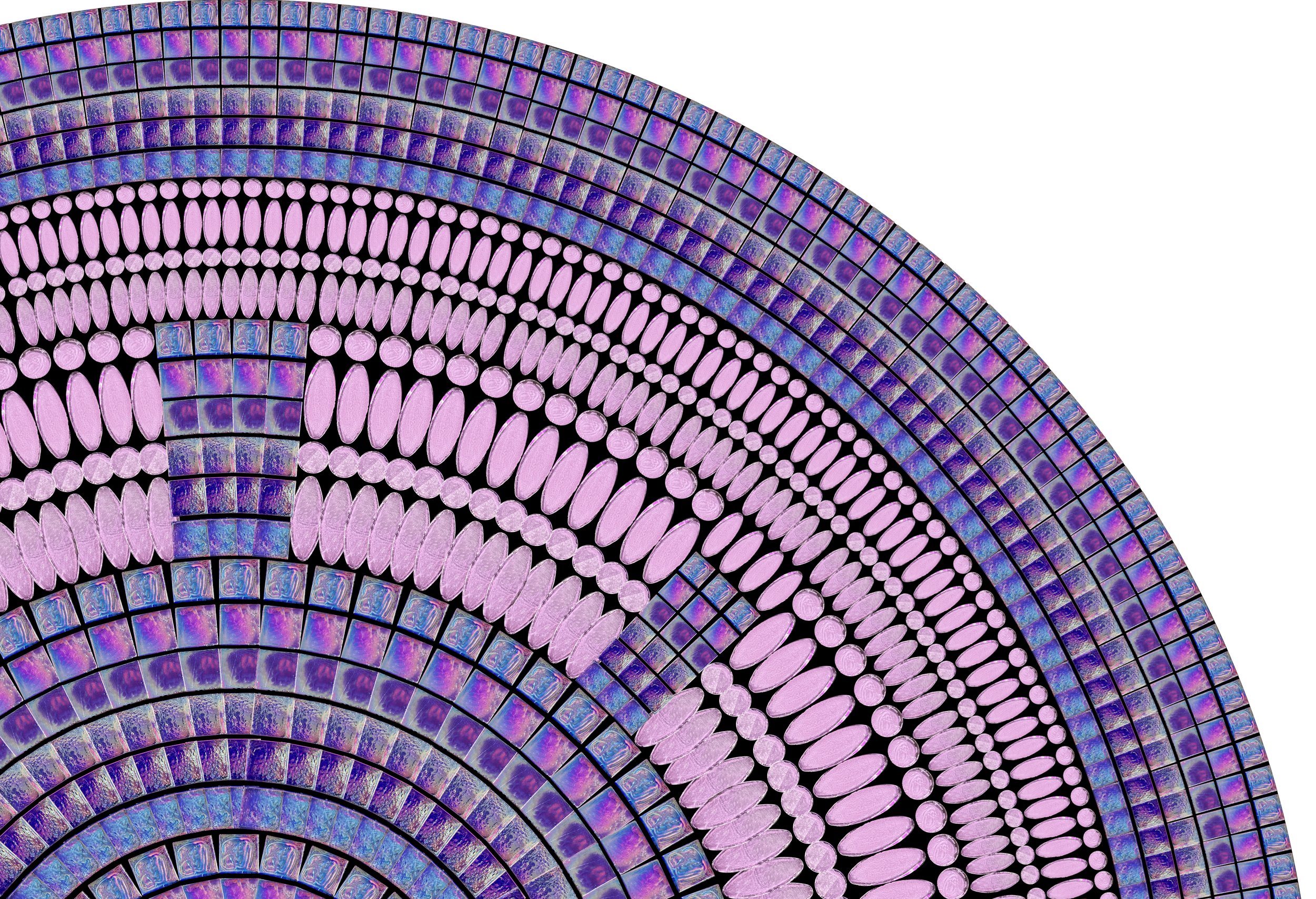
7: C1 Iridescent Black Border

The iridescent glass looks rainbow striped because iridescent glass is dynamic and changes as you move. Here’s an image of just the glass to show what it looks like alone.
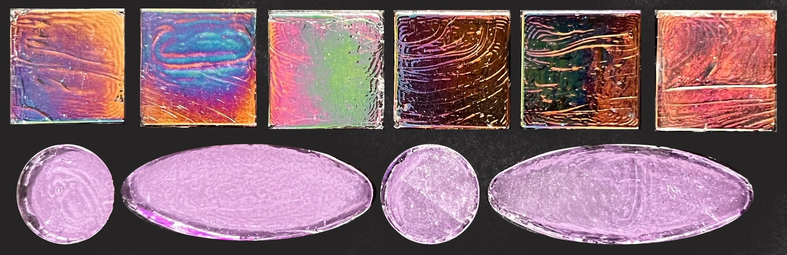
8: C19 Iridescent Blue Border
The iridescent glass looks rainbow striped because iridescent glass is dynamic and changes as you move. Here’s an image of just the glass to show what it looks like alone.