
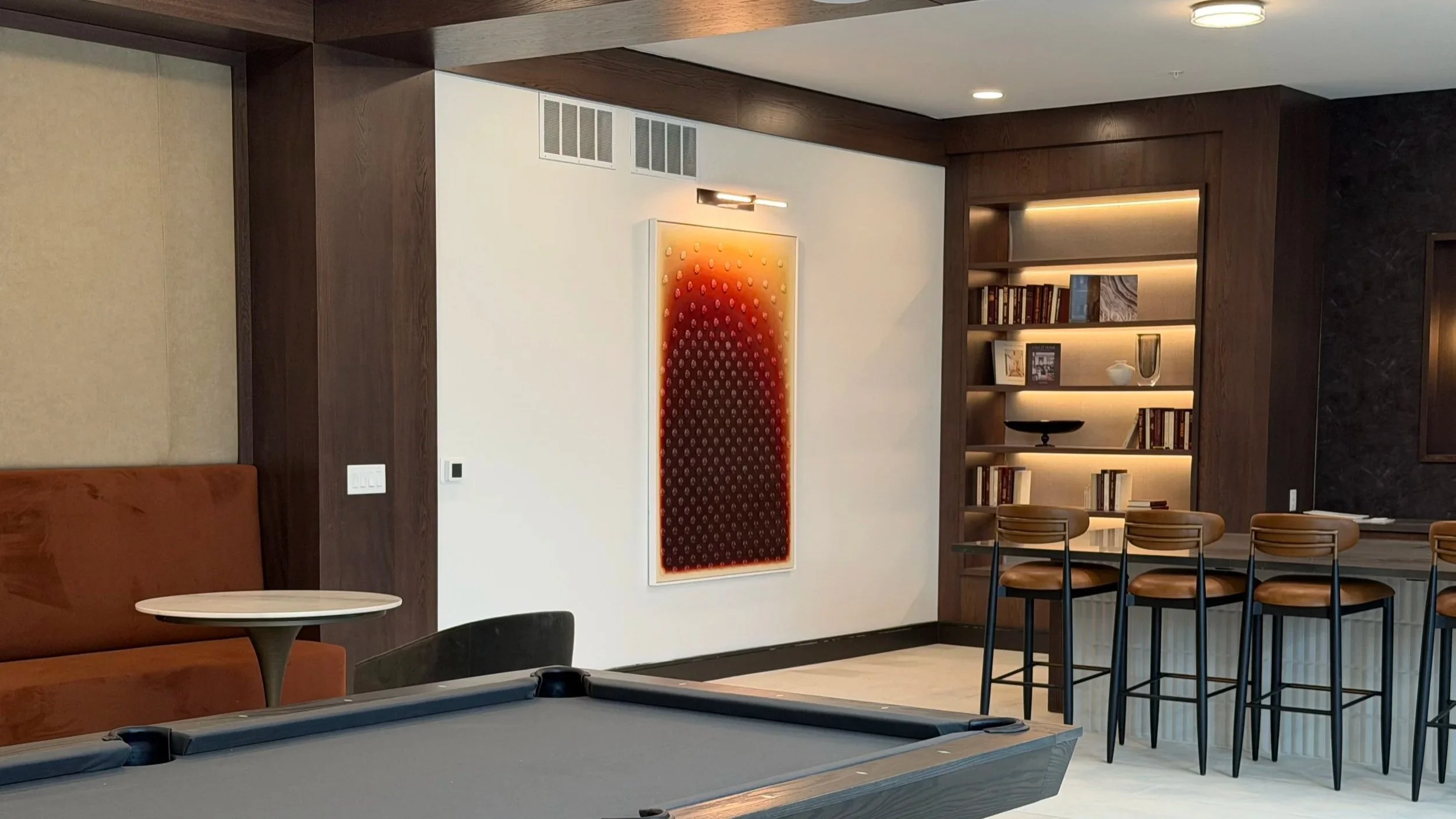
Aura I installed at Tempo at Truepointe. Photography by Brenda Kroos.
The piece, Aura I, is an acrylic painting with applied glass cabochons, 48" x 72", created for a public lounge area where residents and guests encounter it as part of their daily environment. I love the idea of art living in a shared space, quietly present in someone's everyday life rather than tucked away in a private room.
I have been working with curator Brenda Kroos of Brenda Kroos Gallery for several years, crossing paths on various projects that never quite made it to completion. When she was curating artwork for SJL Design Group's Tempo at Truepointe residential community in Columbus, Ohio, she recommended me for the commission. I was thrilled that we were finally going to see a project through together.
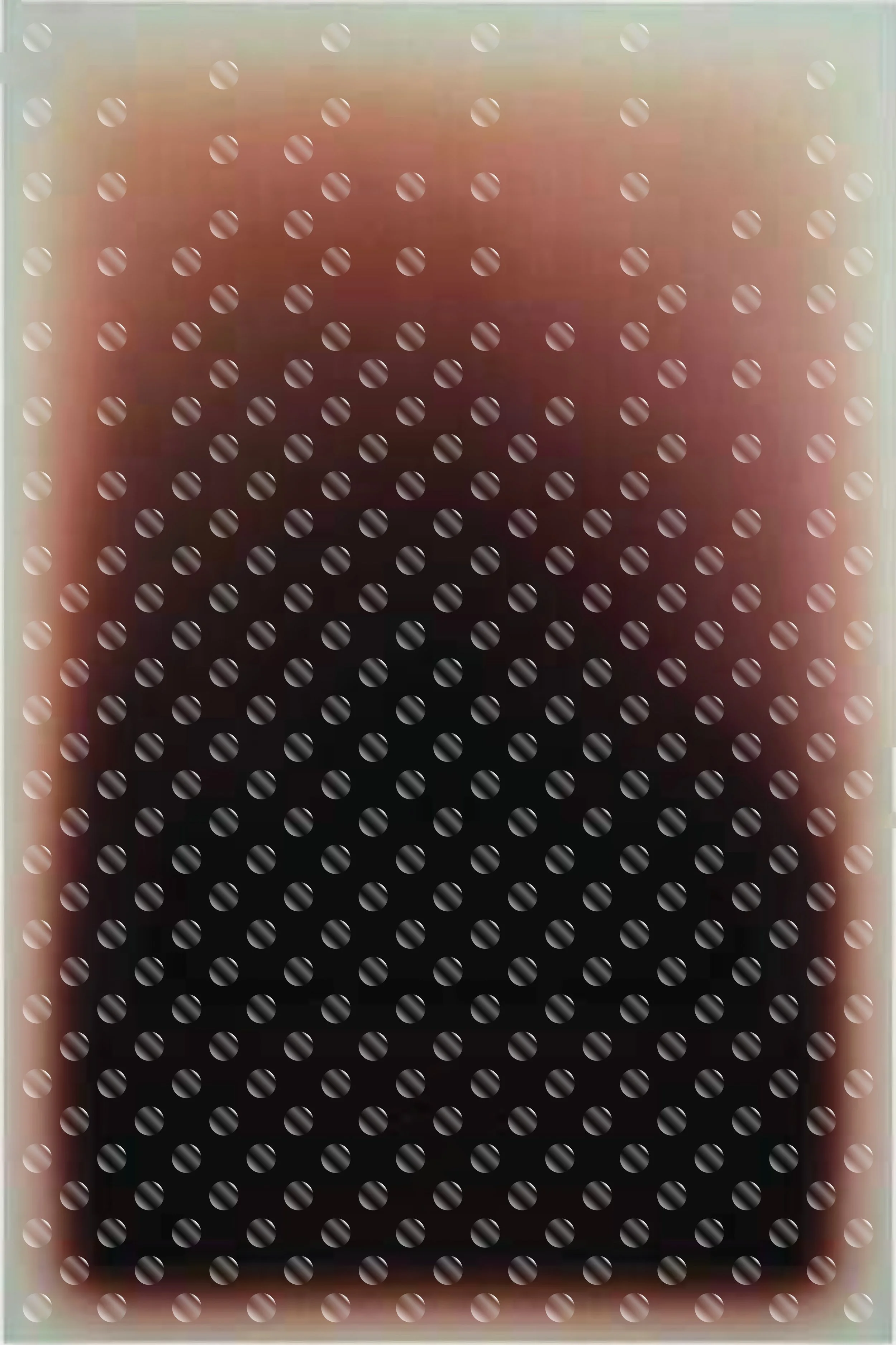
Digital mockup exploring cabochon placement: a grid fading toward the top.
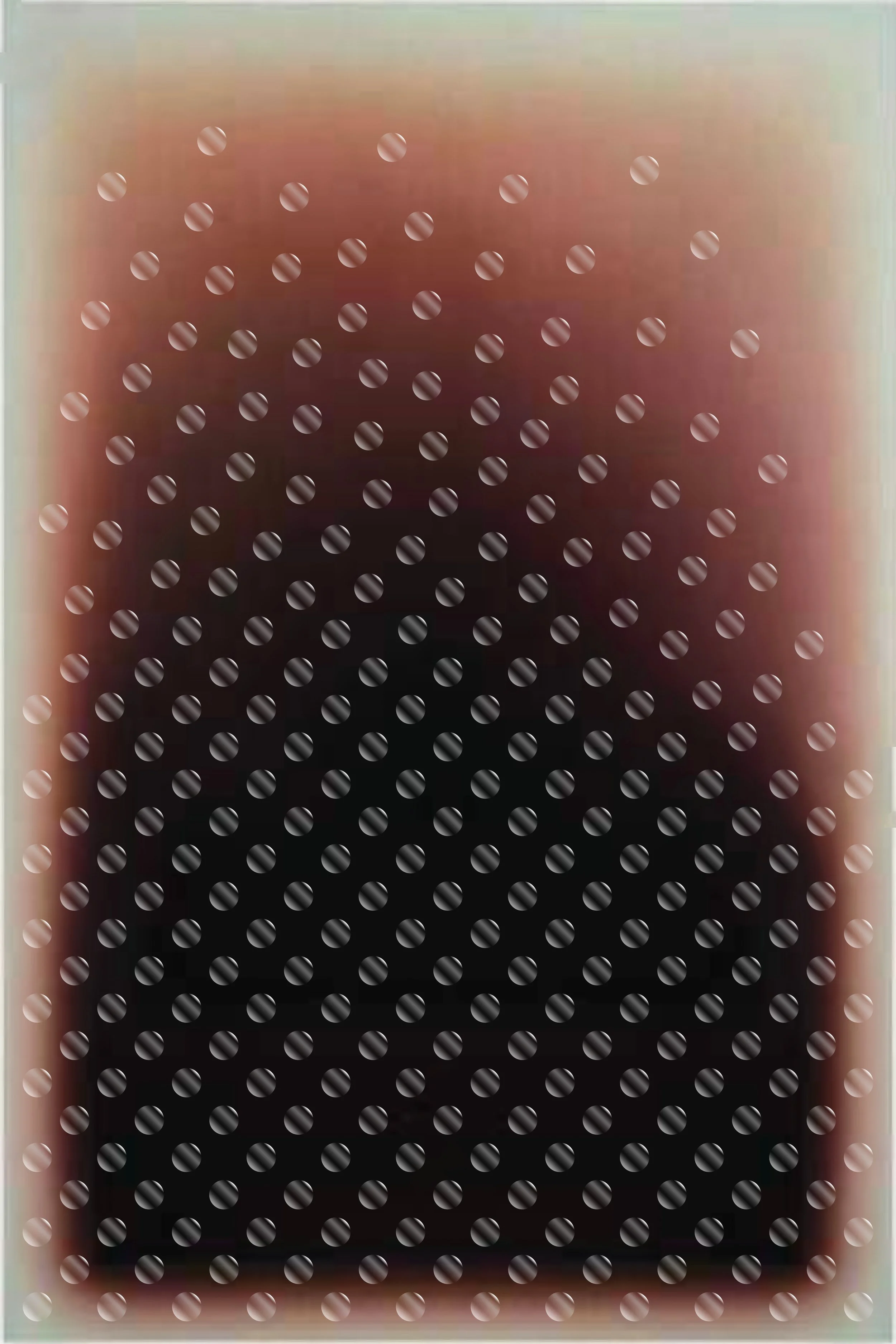
Digital mockup exploring SJL's idea of cabochons scattering and floating upward.
The Concept
SJL Design Group came to the project with a clear concept: a gradient painting with glass elements applied to the surface. My original mockups showed cabochons arranged in a grid that faded toward the top of the composition. They proposed having the cabochons scatter and float upward rather than simply fade, which made the piece feel more alive and less mechanical.
The original concept called for glass gems, but I recommended cabochons instead. Cabochons have a more consistent shape, size, and thickness than gems, which vary considerably and would take away from the effect of beginning with a grid structure and falling more into chaos as the colors shift.
Finding the Color
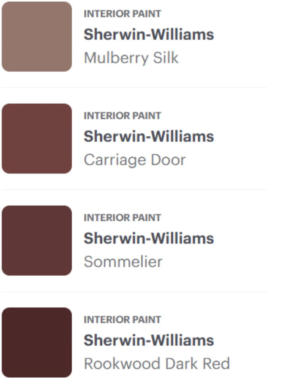
The color direction was where the process became genuinely challenging. SJL provided Sherwin-Williams paint swatches as a reference, ranging from Mulberry Silk through Carriage Door and Sommelier to Rookwood Dark Red. They also provided a digital color smear as a visual guide. The problem was that the two references didn't fully align with each other, and neither translated cleanly into the warm, rust-toned gradient they described wanting. The swatches described a chocolate brown to taupe progression with little warmth, while the color smear and their verbal description pointed toward something richer. Translating a digital color concept into physical paint is inherently difficult: colors shift dramatically between a screen, a printed swatch, and actual acrylic on canvas, and no amount of sampling fully resolves that until you commit to the actual work.
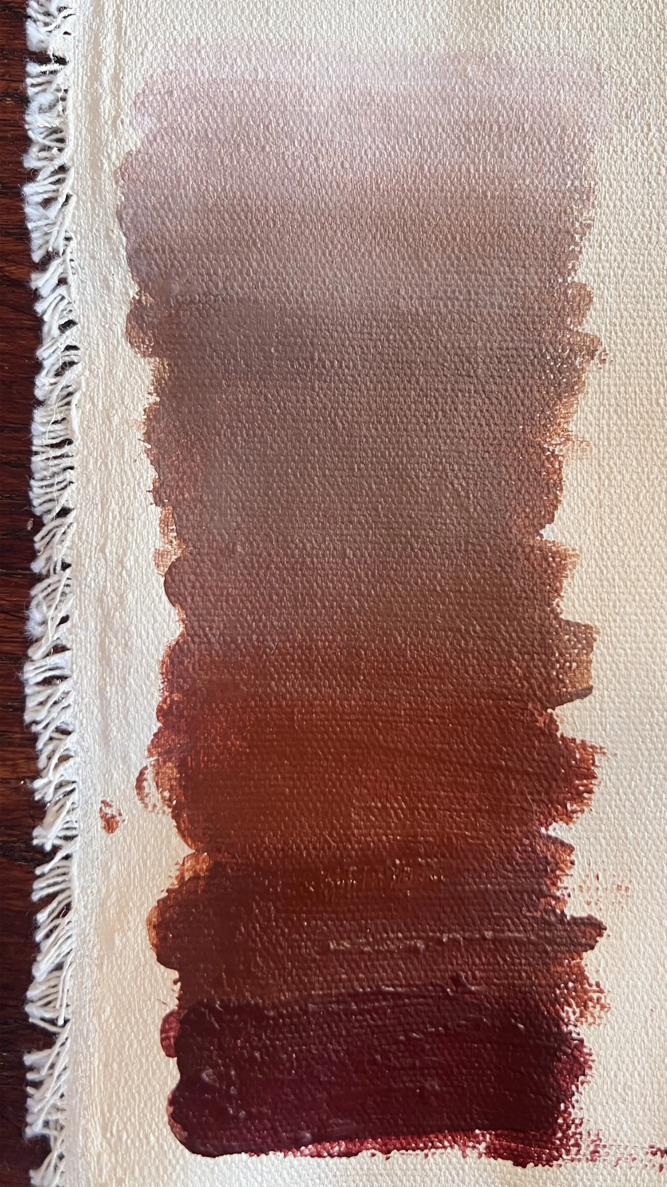
Paint palette study: wine brown to taupe to white.
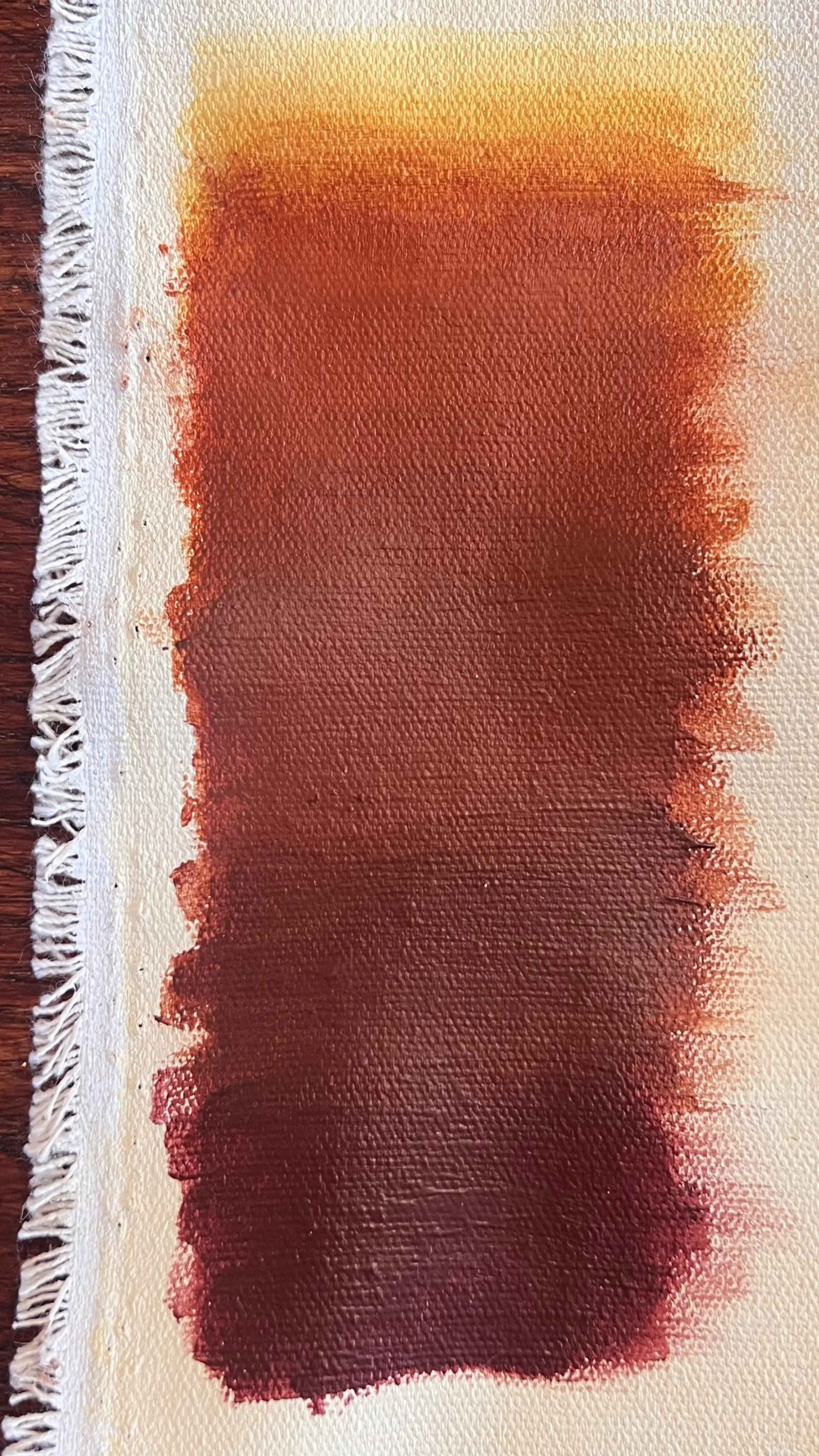
Paint palette study: wine brown to rust to yellow.
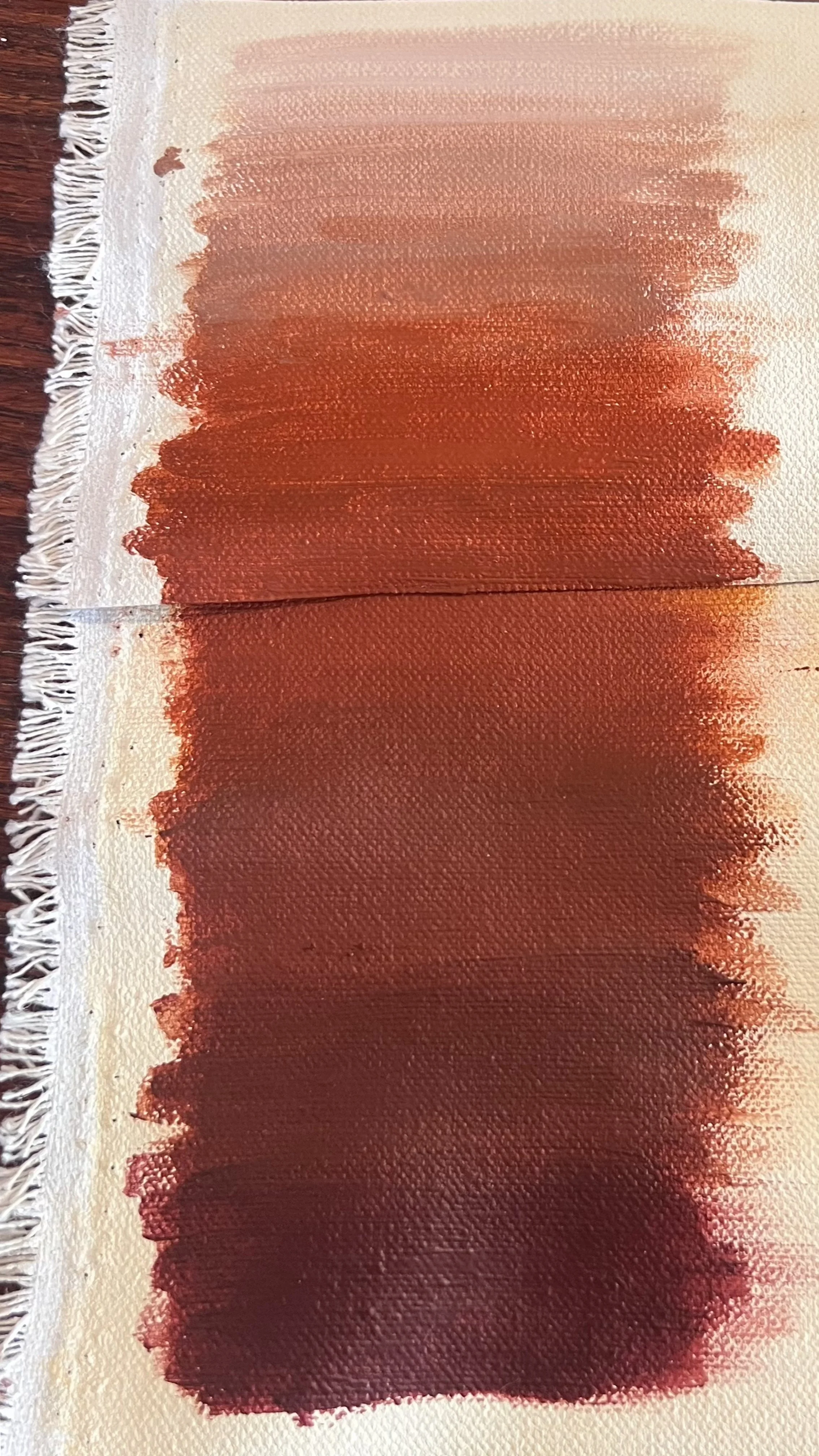
Paint palette study: wine brown to rust to pink beige.
I worked through multiple palette studies, mixing various combinations to try to reconcile what I was being told with what I was being shown. First I tried starting and ending with the sample colors, except adding more red to the deepest brown because they asked for a wine brown, but I couldn’t get the orangish rust tones in and still naturally transition to the mauvish taupe of the Mulberry Silk. Next I skipped the Mulberry Silk and tried a natural transition from reddish brown to rust to an iron oxide yellow because the initial digital color smear ended fading out to yellow. They didn’t want the yellow, so so my next attempt was transitioning to cream by removing the yellow. They didn’t want the pinkish tones, so I knew the next step was to try to fade out from the rust to cream trying to keep a balance of the two colors, yellow and red, that make up the rust color.
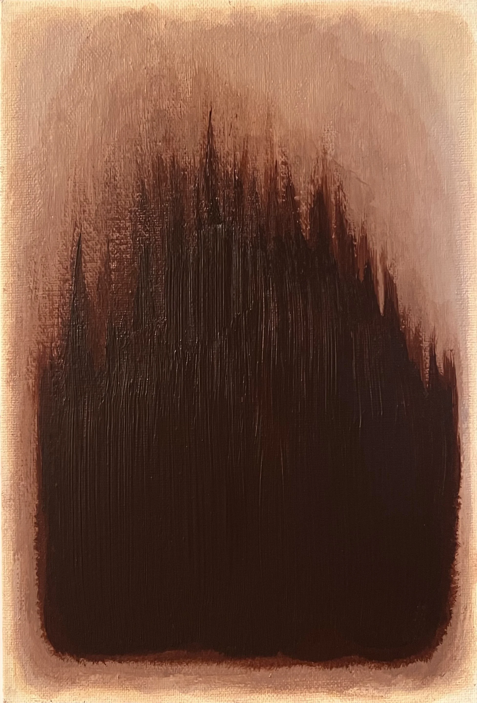
Sample on canvas board showing the colors from the Sherwin-Williams swatches
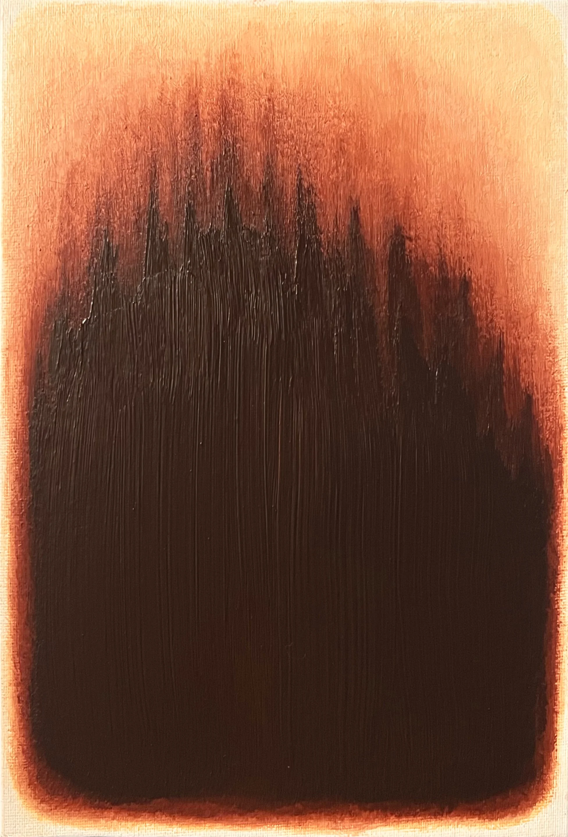
Sample on canvas board showing the colors from the original color color smear
From there I made two samples: one with the Sherwin-Williams colors and the other with the colors from the digital smear I was given in the beginning. This would allow me to reference everything I was given while I continued to refine the palette.
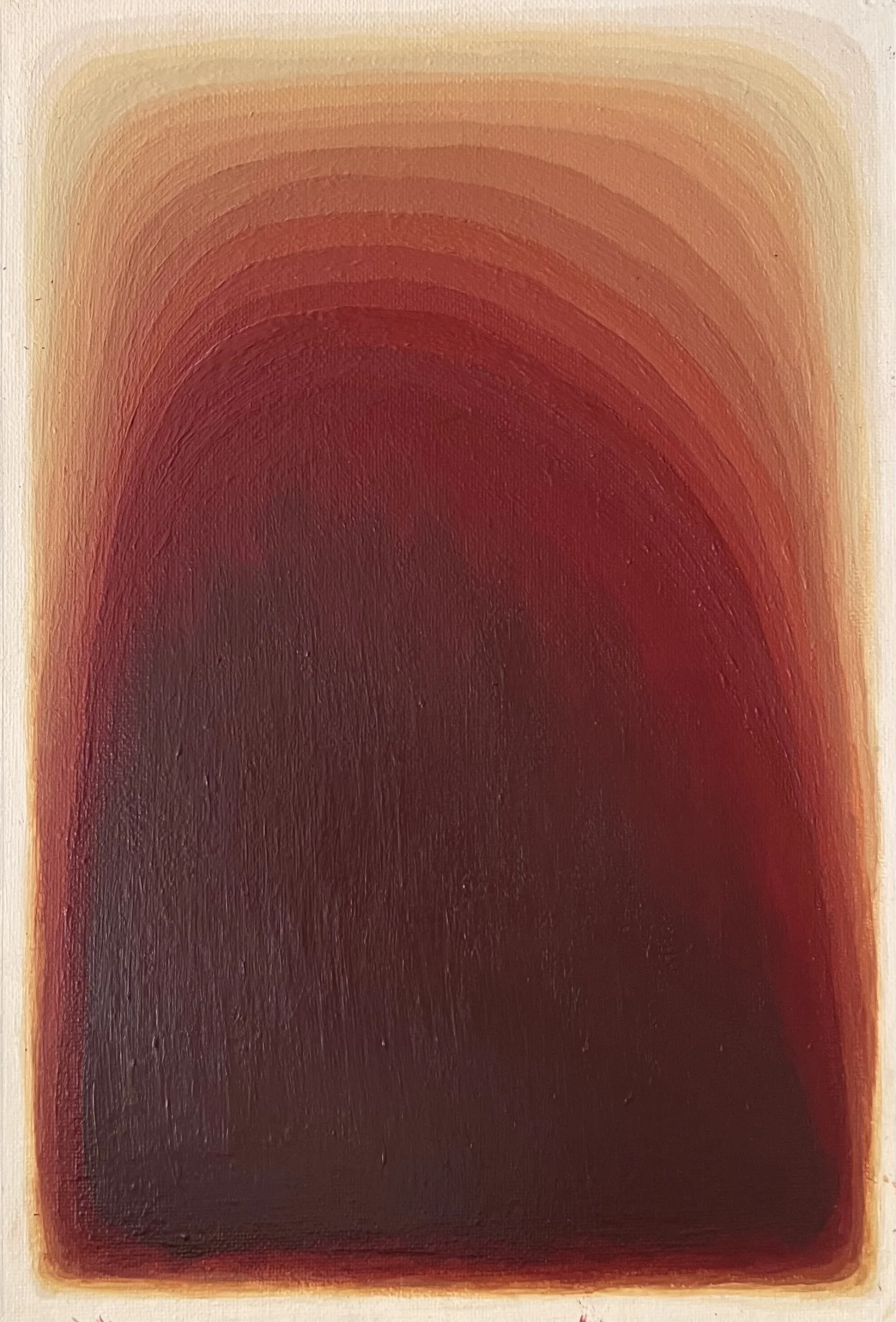
Later refined sample: too yellow.
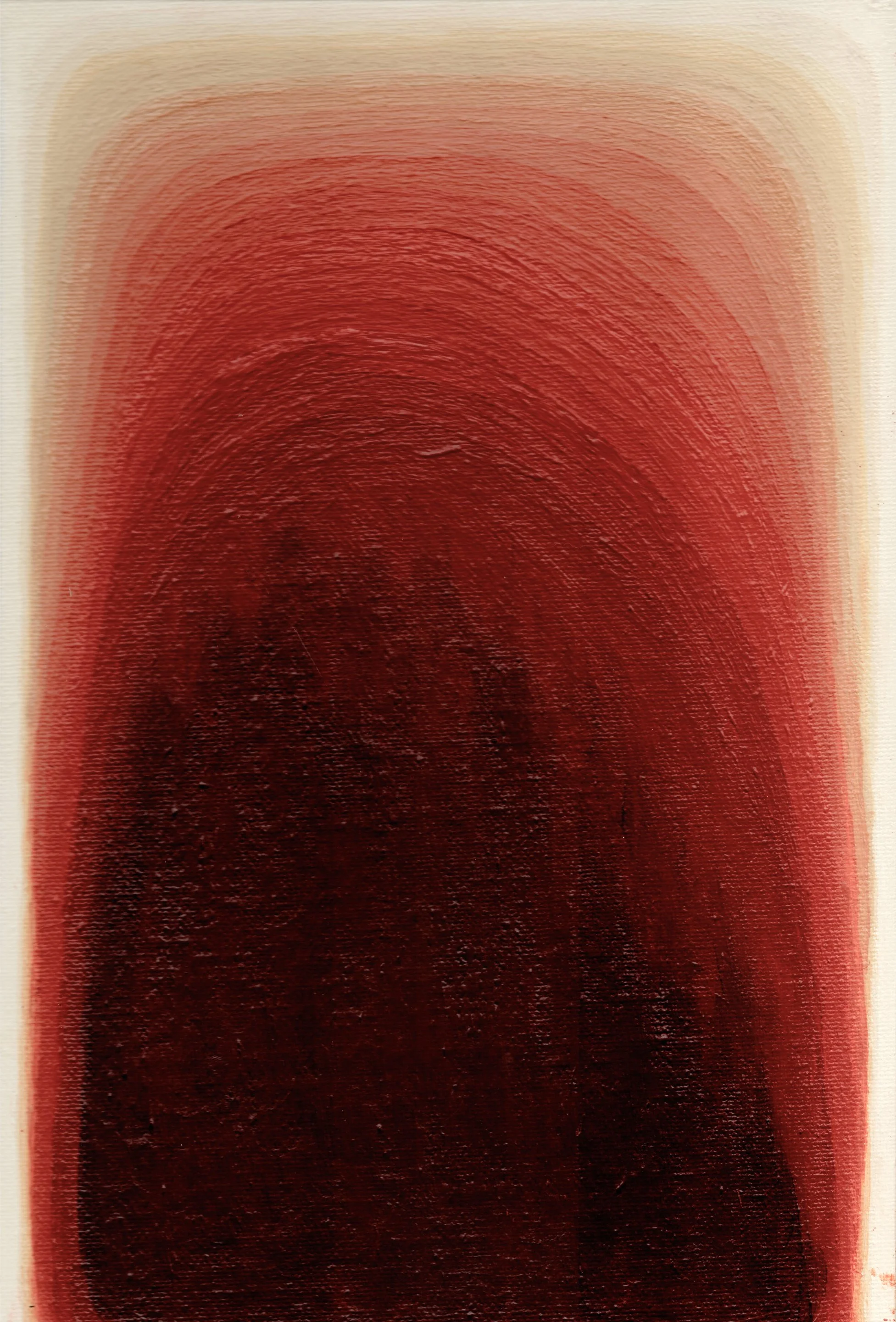
Very close, just need to ease transitions.
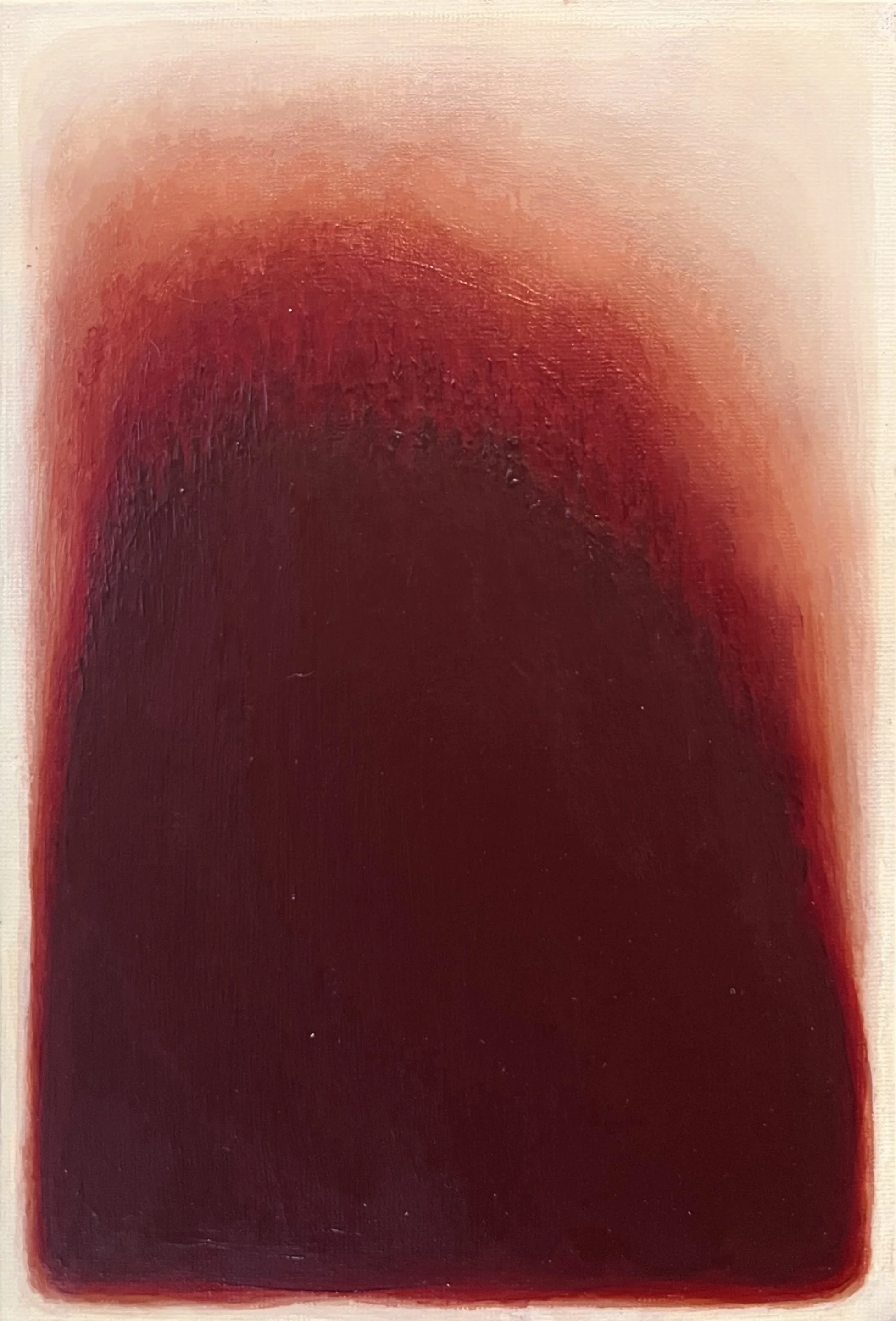
Sample with blending, also very close.
I painted more samples, working closer to the final format to test how the colors would actually read as a composition, but initially keeping the paint in bands so I could identify which colors weren’t working. The samples revealed how differently the colors behaved once feathered and blended together, as opposed to sitting in isolated swatches. Acrylic paint looks completely different wet versus dry, and photographs of samples never fully captured what they looked like in person, which made it difficult to communicate what I was painting and seeing to the client.
After many rounds of samples, I had a clarifying conversation with Brenda in which she confirmed that my last sample was on the right track and encouraged me to move forward. That was the turning point. The sample I worked from moved from a deep brown-red at the base through warm rust tones into cream at the top. The rust became the bridge between the dark and light ends of the palette, and finding a way to make that transition feel organic rather than forced was one of the most satisfying parts of the process.
Painting Aura I
To create the substrate, I stretched canvas over the entire sheet of plywood, secured it onto the front with Mod Podge and used a staple gun to attach the ends on the back. The artwork needed to be created on a solid surface so that the adhesive holding the cabochons would hold. If it was on a traditional canvas stretched over a frame, the weight and any movement could have caused cabochons to fall off. The painting is on a 4’ x 6’ x 3/4” sheet of plywood, so I worked on it downstairs in my foyer so I didn’t have to carry the plywood upstairs. I put it on stools so it would be about waist height to make it easier to work on. This meant I had to pull out a ladder and attempt to take pictures from above to get an assessment of the progress. There was a chandelier directly overhead and natural light wasn’t sufficient in this location because it was winter, so it was hard to take decent images.
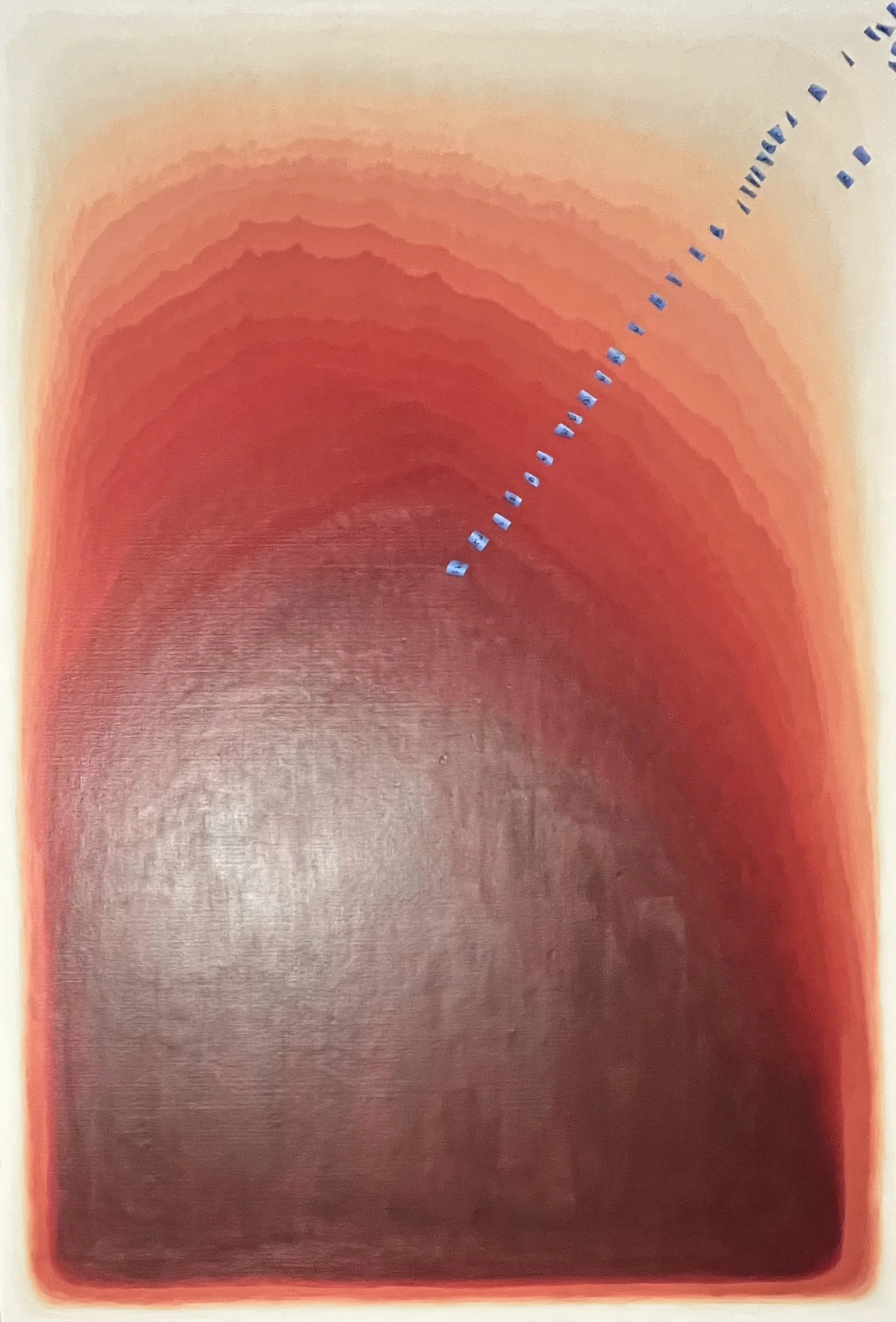
Early stage of the painting with colors applied in labeled bands before blending.
I mixed 28 distinct tones to work with across the full gradient. Rather than jumping straight into blending, I first painted the colors in clearly defined bands across the canvas, labeling each one so I could track the subtle shifts and keep the transitions moving in the right direction. This gave me a map to work from before the real work of feathering began.
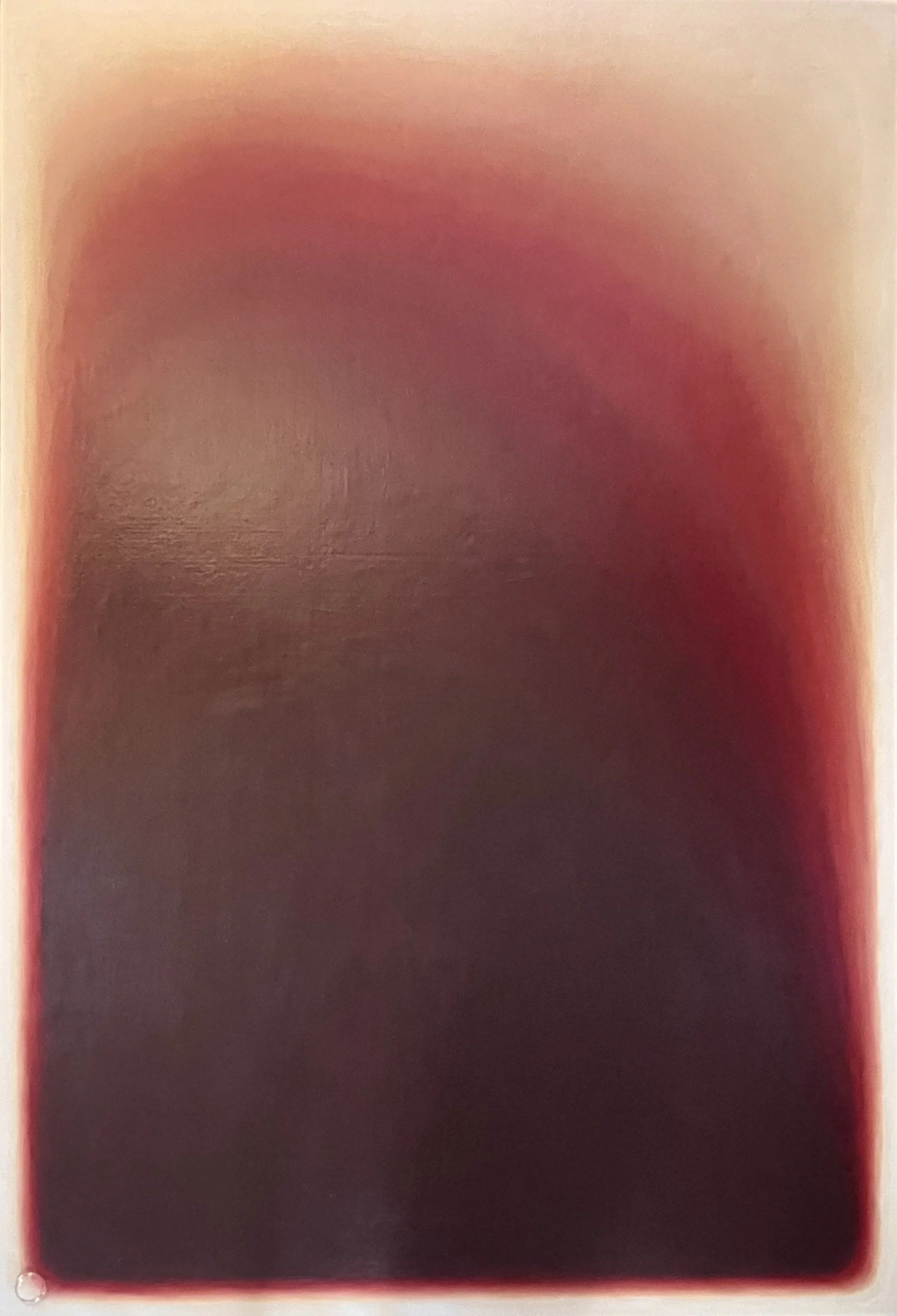
The painting fully blended and nearly complete, before cabochon application.
Once the bands were established I smoothed and feathered the transitions until the surface looked continuous and glowing. The goal was for the gradient to feel inevitable rather than deliberate, as though the color had always been that way rather than being carefully constructed from 28 separate tones.
Applying the Cabochons
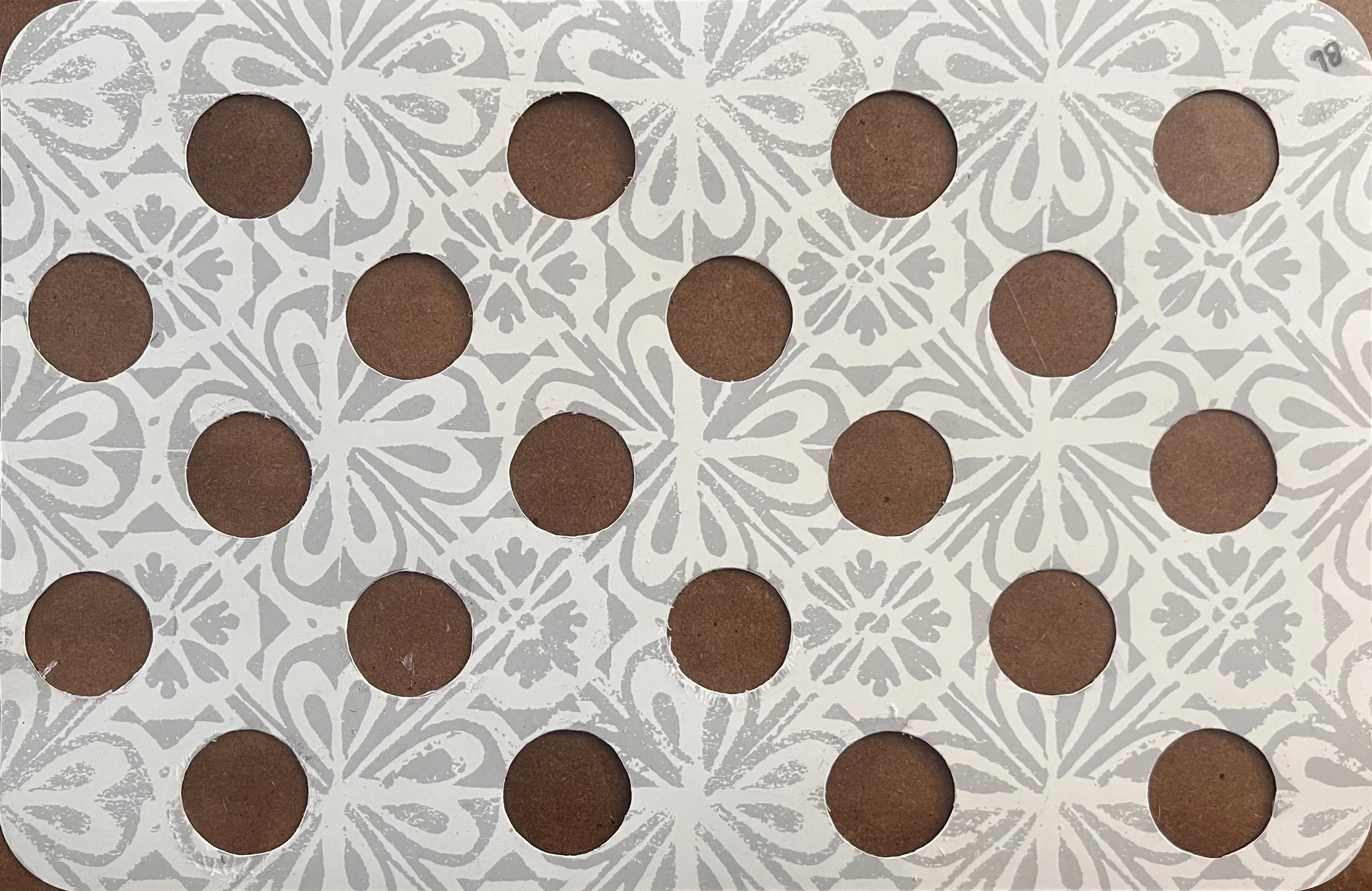
Template made out of a plastic placemat with cut circles used to position cabochons consistently across the painting.
Applying the cabochons required as much planning as the painting itself. I used clear silicone rather than a solvent-based adhesive like E6000 or Household Goop, to avoid any chemical reaction with the acrylic paint beneath. To position each cabochon consistently across the full 4 by 6 foot surface, I made a plastic placement template by cutting circles at the correct spacing. I would lay the template over a section of the completed painting, place the cabochons through the holes, and then move on to the next section.
The cabochons do something unexpected and beautiful to the paint underneath: they magnify the surface texture slightly and make the color appear a little lighter beneath each one, as though each cabochon is lit from within. It adds a dimension to the piece that no photograph fully captures. The painting looks more ethereal in person, and I think that quality is entirely due to the cabochons interacting with the paint beneath them.
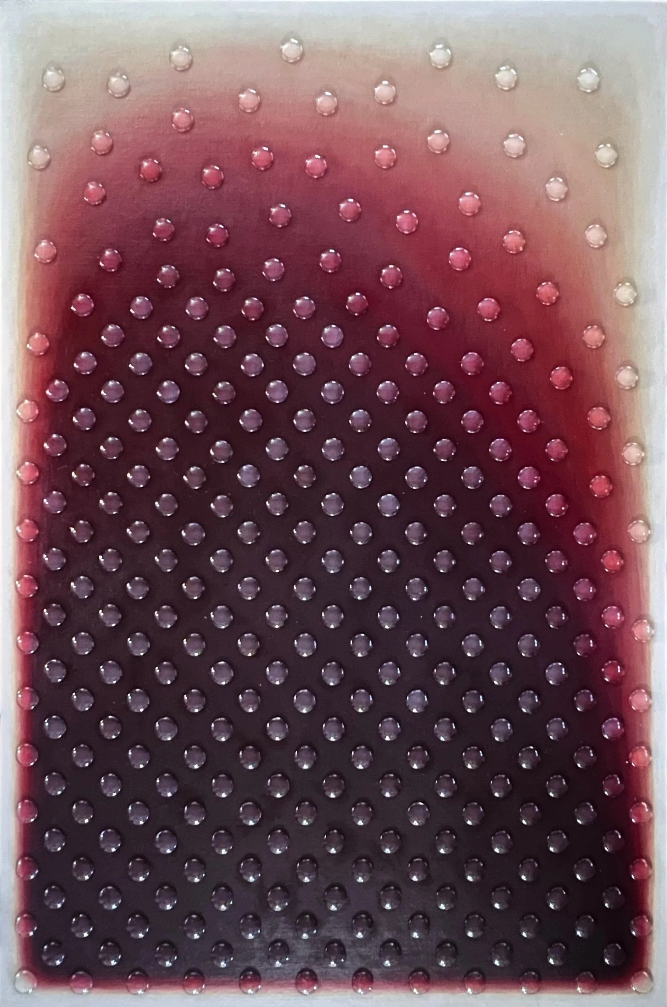
My not so good attempt to take a picture of the completed artwork Aura I. Notice the transition to white & cream with minimal yellow.
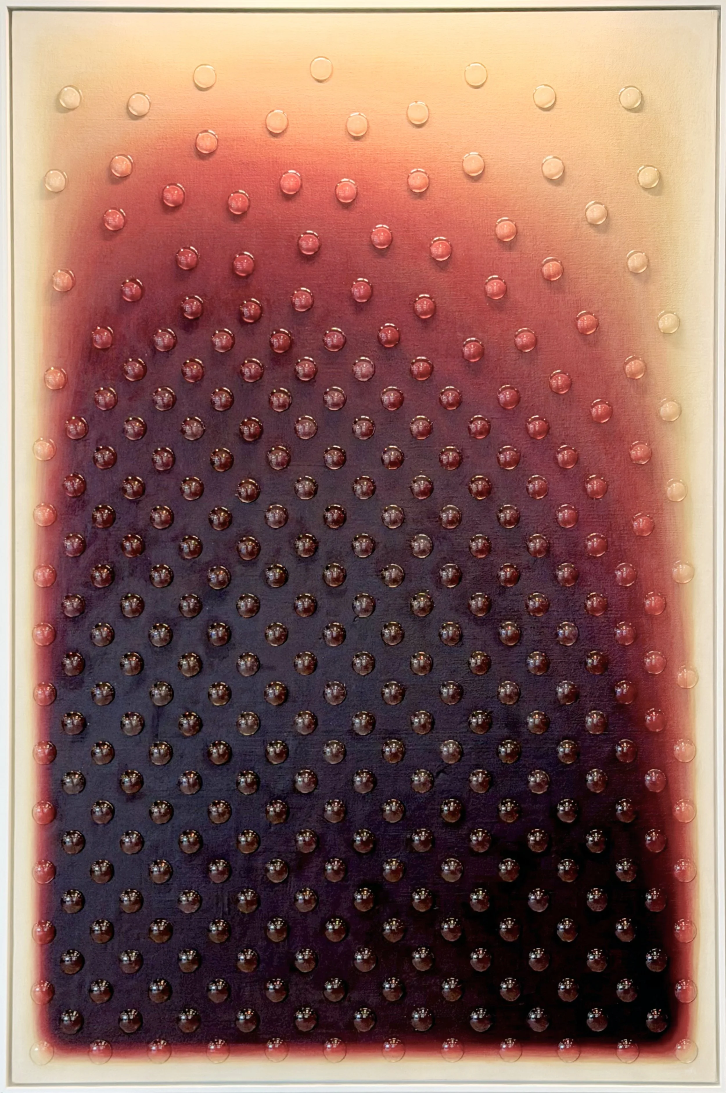
Brenda’s photograph of the Aura I artwork installed. The lighting creates the yellow effect I was trying to avoid.
I’m so grateful Brenda took excellent pictures during the installation because none of the ones I took were good. I want to show a photo I took for a side-by-side comparison though. I worked really hard to avoid yellow in the transition to cream and white, and you can see in the photo I took that I was successful. The warm overhead lighting in the installed photo creates a yellow cast that doesn't reflect the actual painting.
See the full gallery page for this project.
