Aura I: Creating an Artwork for Tempo at Truepointe

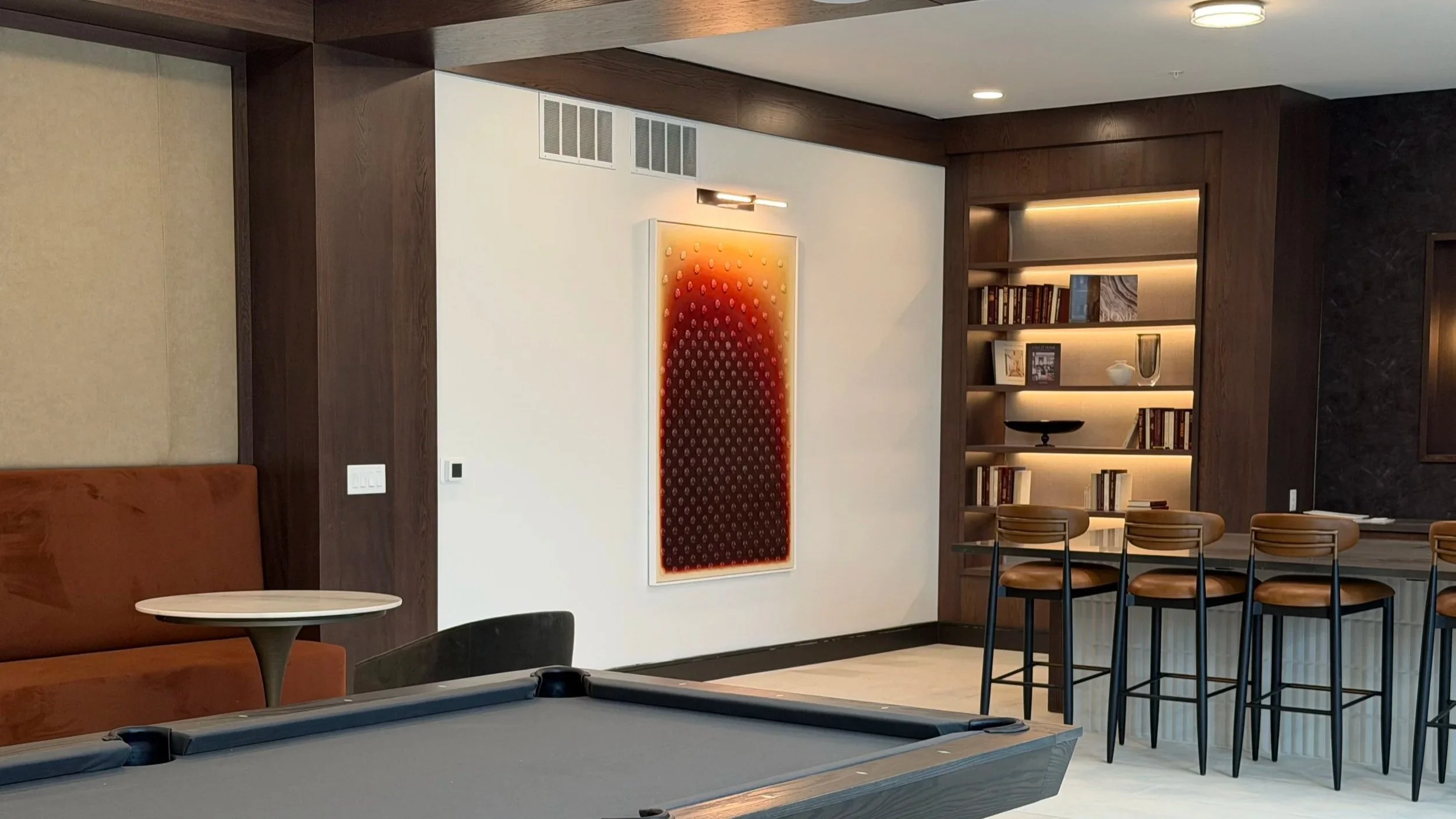
Aura I installed at Tempo at Truepointe. Photography by Brenda Kroos.

Aura I installed at Tempo at Truepointe. Photography by Brenda Kroos.

The piece, Aura I, is an acrylic painting with applied glass cabochons, 48" x 72", created for a public lounge area where residents and guests encounter it as part of their daily environment. I love the idea of art living in a shared space, quietly present in someone's everyday life rather than tucked away in a private room.

I have been working with curator Brenda Kroos of Brenda Kroos Gallery for several years, crossing paths on various projects that never quite made it to completion. When she was curating artwork for SJL Design Group's Tempo at Truepointe residential community in Columbus, Ohio, she recommended me for the commission. I was thrilled that we were finally going to see a project through together.
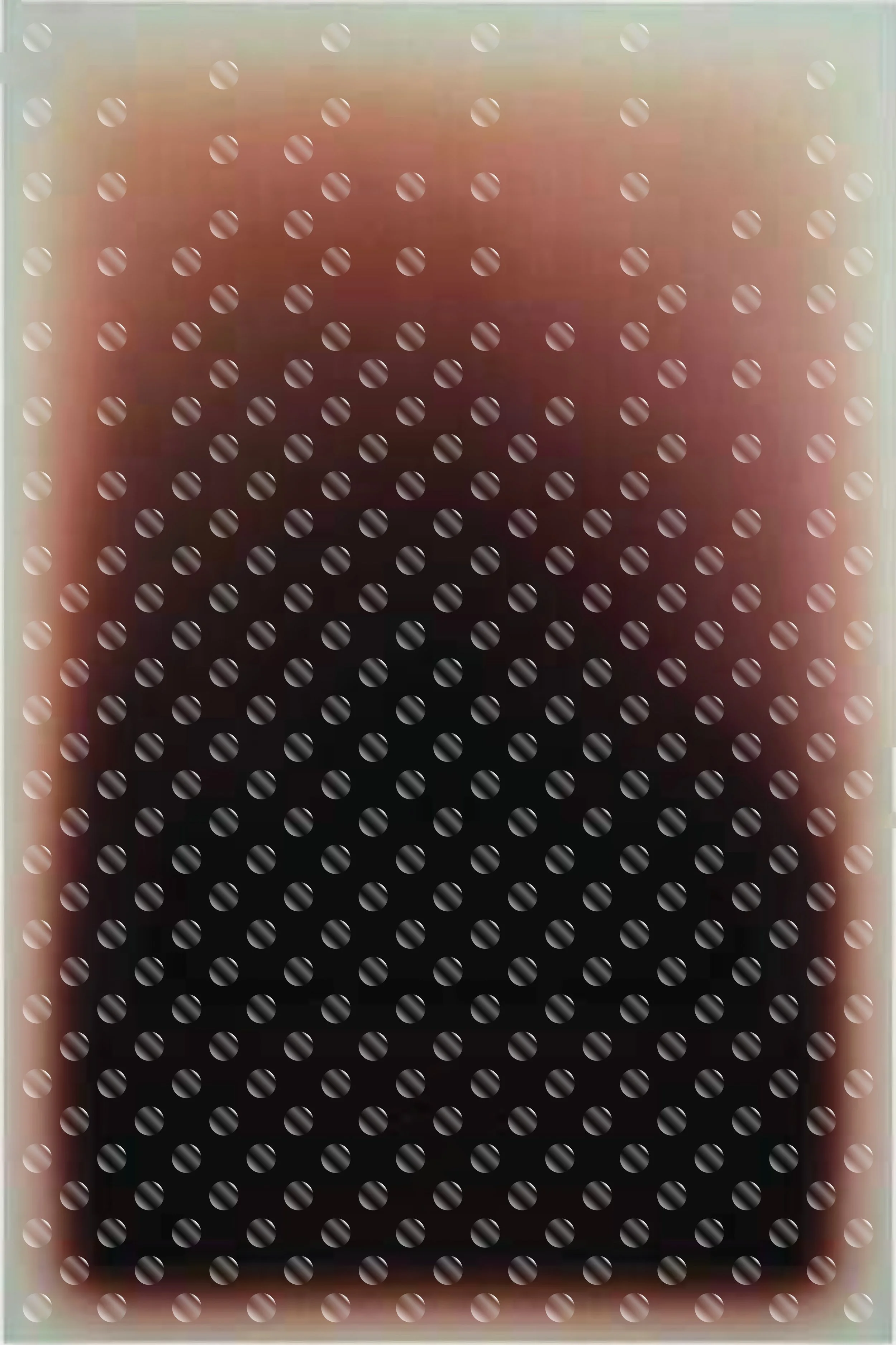
Digital mockup exploring cabochon placement: a grid fading toward the top

Digital mockup exploring cabochon placement: a grid fading toward the top.
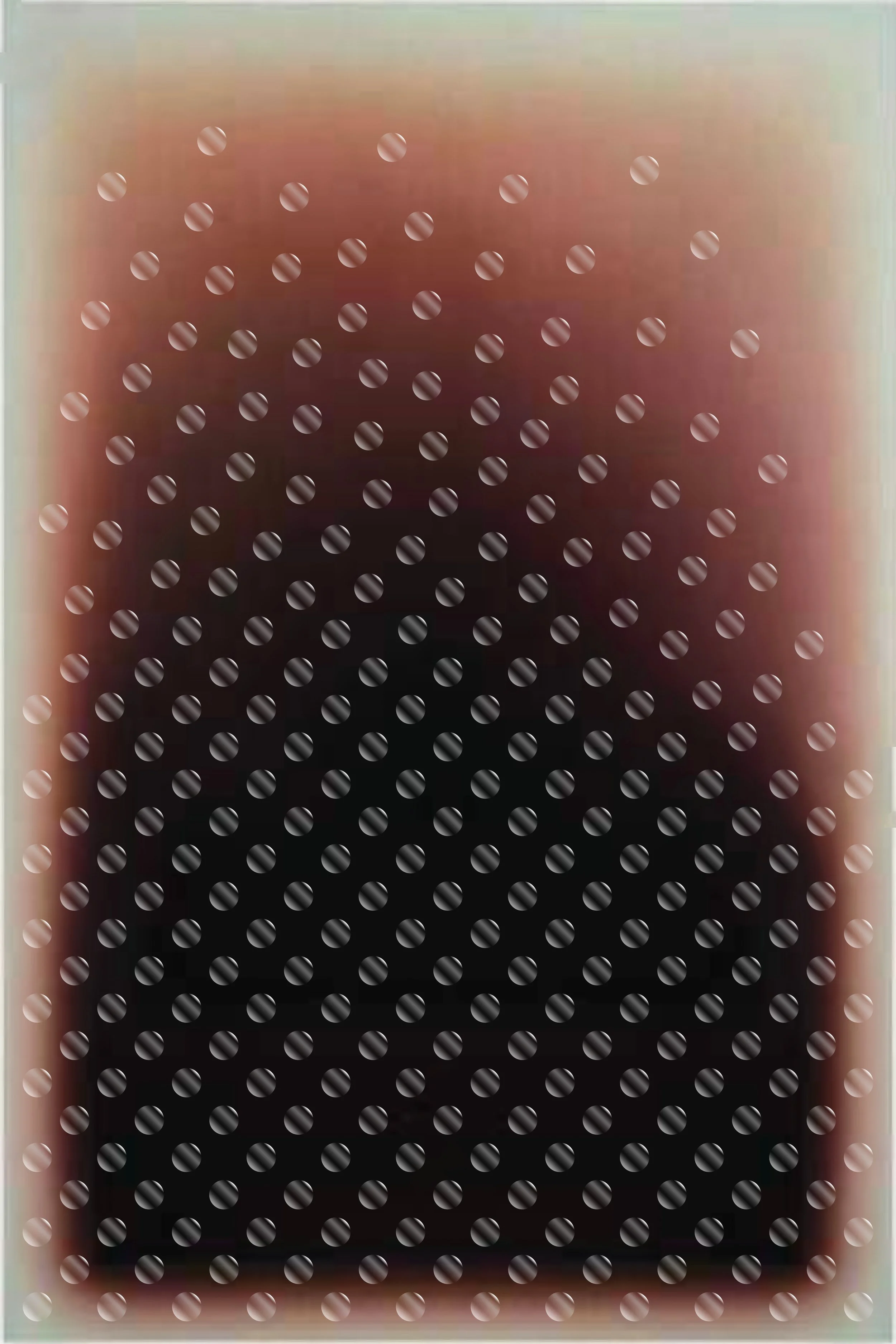
Digital mockup exploring SJL's idea of cabochons scattering and floating upward

Digital mockup exploring SJL's idea of cabochons scattering and floating upward.

The Concept

SJL Design Group came to the project with a clear concept: a gradient painting with glass elements applied to the surface. My original mockups showed cabochons arranged in a grid that faded toward the top of the composition. They proposed having the cabochons scatter and float upward rather than simply fade, which made the piece feel more alive and less mechanical.

The original concept called for glass gems, but I recommended cabochons instead. Cabochons have a more consistent shape, size, and thickness than gems, which vary considerably and would take away from the effect of beginning with a grid structure and falling more into chaos as the colors shift.
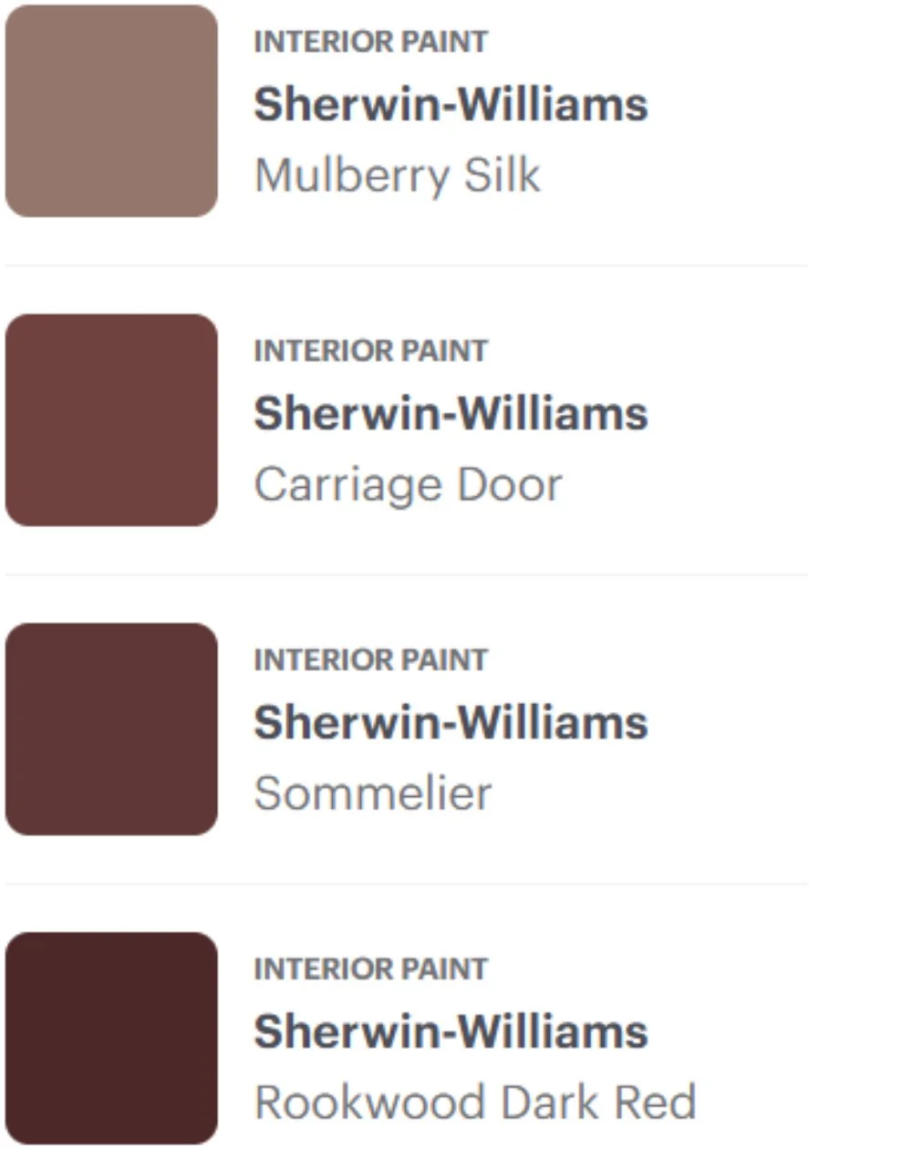
Sherwin-Williams color swatches provided by SJL Design Group: Mulberry Silk, Carriage Door, Sommelier, and Rookwood Dark Red

Finding the Color

The color direction was where the process became genuinely challenging. SJL provided Sherwin-Williams paint swatches as a reference, ranging from Mulberry Silk through Carriage Door and Sommelier to Rookwood Dark Red. They also provided a digital color smear as a visual guide. The problem was that the two references didn't fully align with each other, and neither translated cleanly into the warm, rust-toned gradient they described wanting. The swatches described a chocolate brown to taupe progression with little warmth, while the color smear and their verbal description pointed toward something richer. Translating a digital color concept into physical paint is inherently difficult: colors shift dramatically between a screen, a printed swatch, and actual acrylic on canvas, and no amount of sampling fully resolves that until you commit to the actual work.
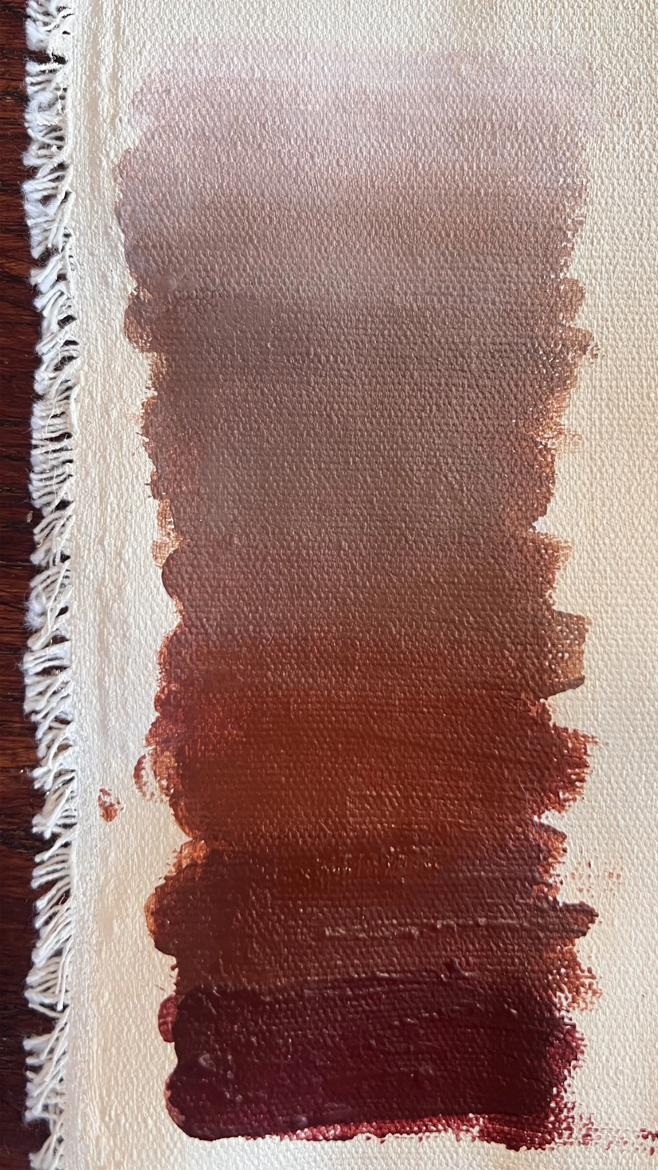
Paint palette study exploring reddish brown to taupe to white

Paint palette study: wine brown to taupe to white.
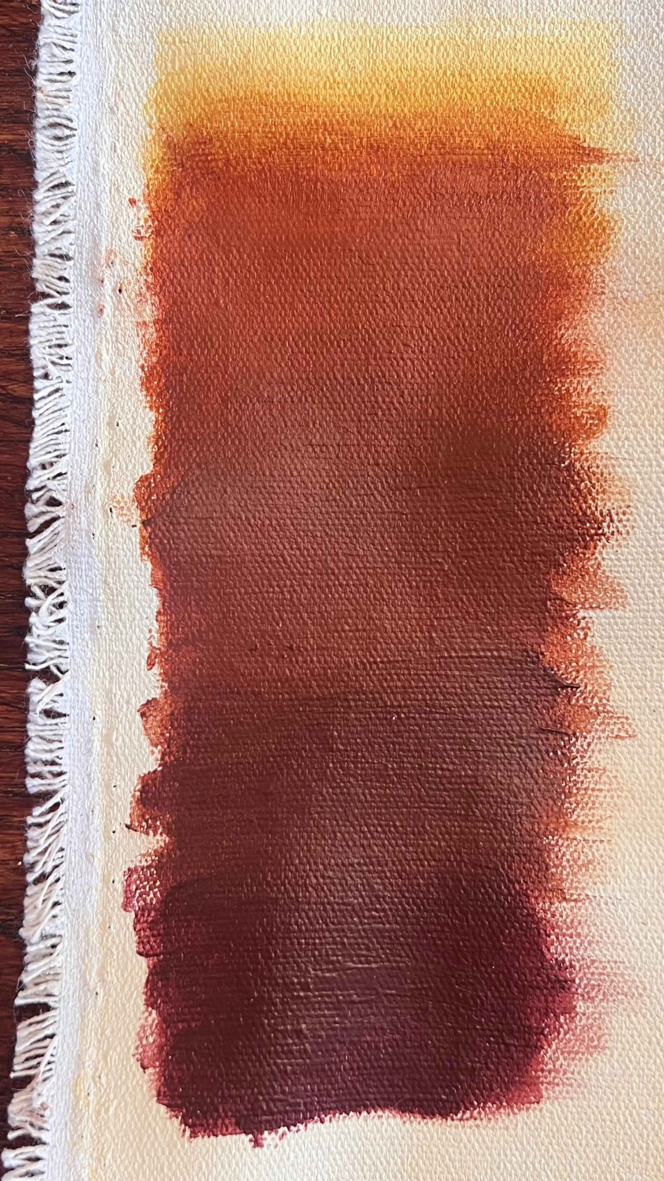
Paint palette study exploring reddish brown to rust to yellow

Paint palette study: wine brown to rust to yellow.
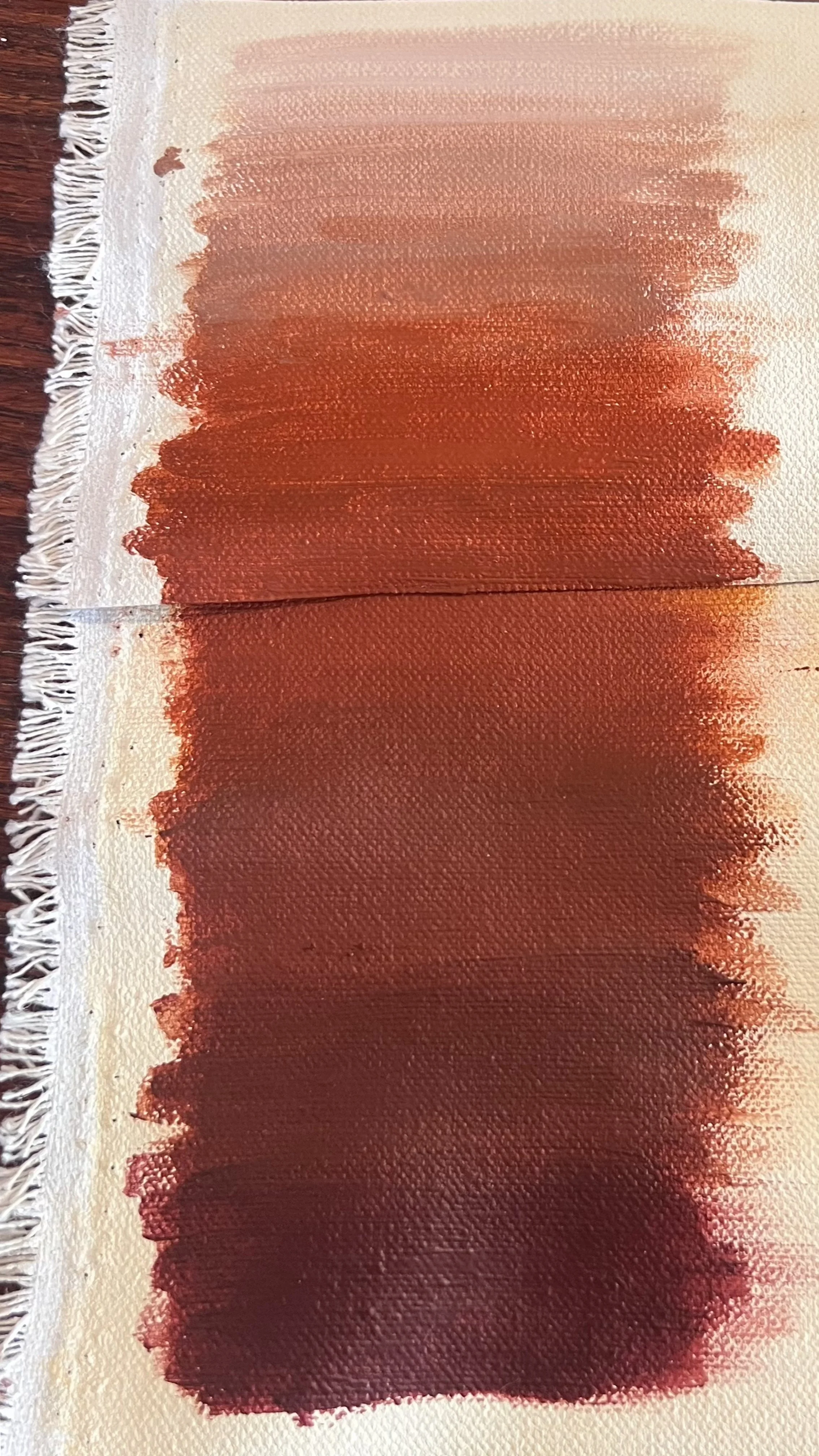
Paint palette study exploring reddish brown to rust to pink beige

Paint palette study: wine brown to rust to pink beige.

I worked through multiple palette studies, mixing various combinations to try to reconcile what I was being told with what I was being shown. First I tried starting and ending with the sample colors, except adding more red to the deepest brown because they asked for a wine brown, but I couldn’t get the orangish rust tones in and still naturally transition to the mauvish taupe of the Mulberry Silk. Next I skipped the Mulberry Silk and tried a natural transition from reddish brown to rust to an iron oxide yellow because the initial digital color smear ended fading out to yellow. They didn’t want the yellow, so so my next attempt was transitioning to cream by removing the yellow. They didn’t want the pinkish tones, so I knew the next step was to try to fade out from the rust to cream trying to keep a balance of the two colors, yellow and red, that make up the rust color.
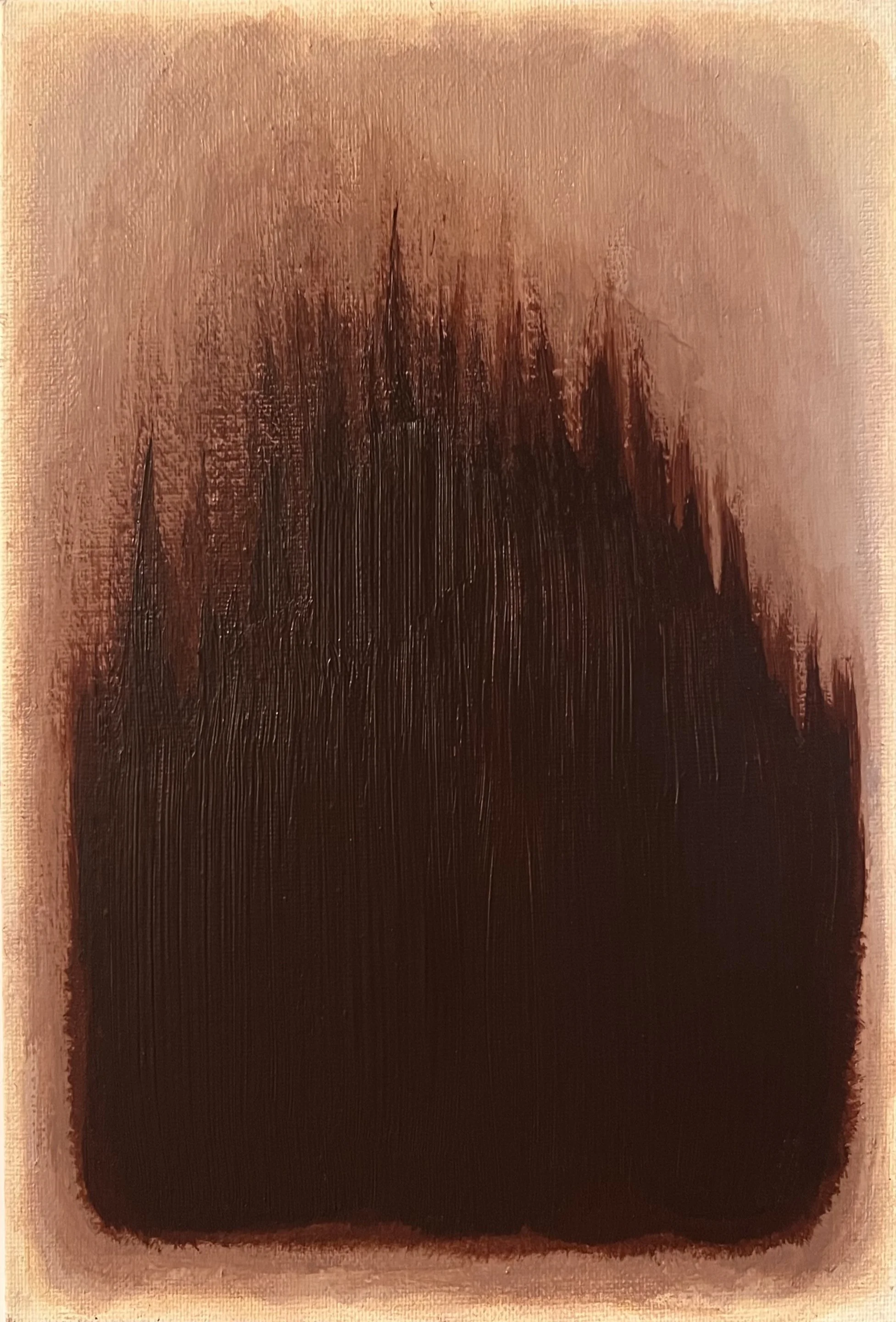
Color sample exploring the gradient in a small painted composition, from chocolate brown through taupe

Sample on canvas board showing the colors from the Sherwin-Williams swatches
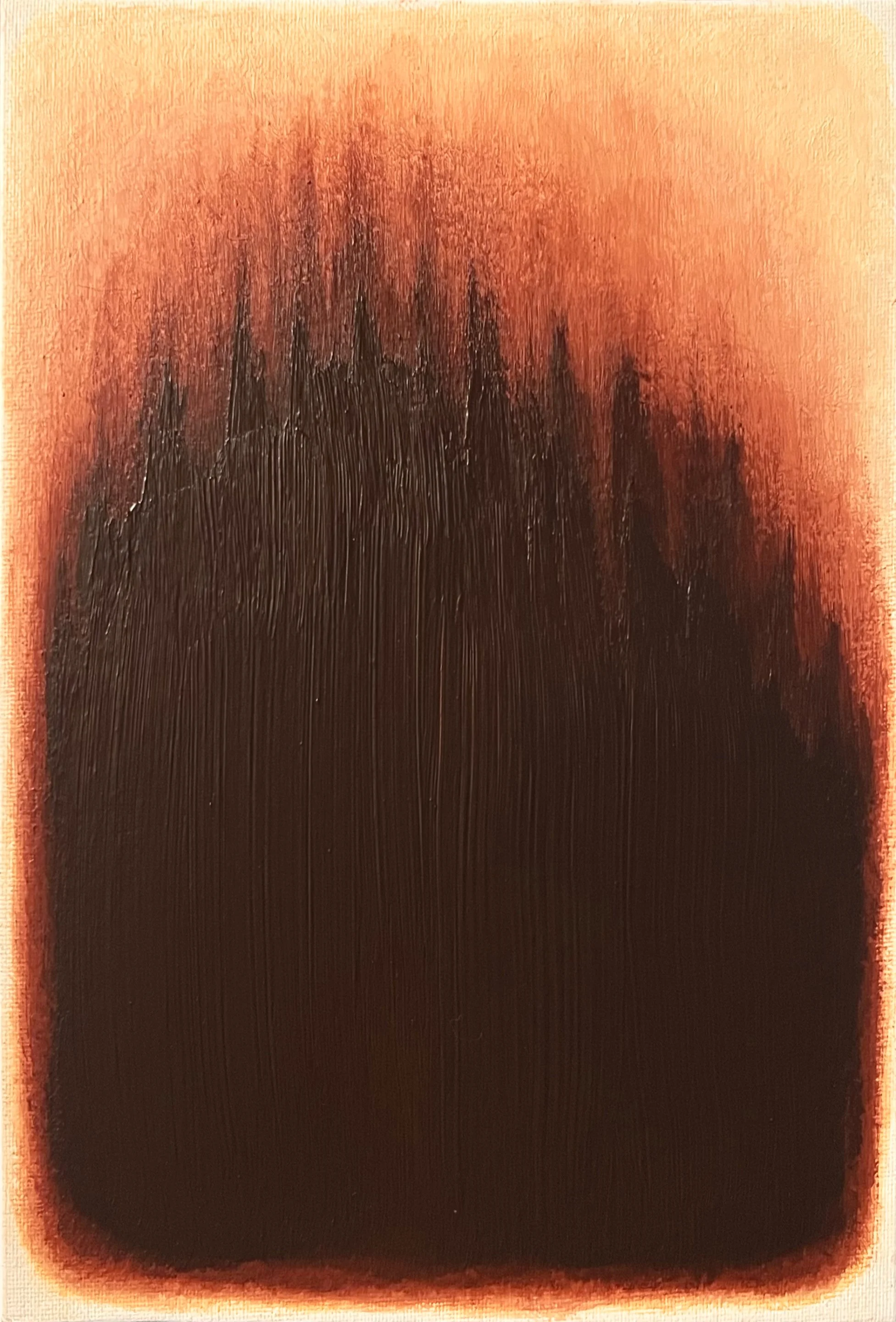
Sample on canvas board showing the colors from the original color color smear

From there I made two samples: one with the Sherwin-Williams colors and the other with the colors from the digital smear I was given in the beginning. This would allow me to reference everything I was given while I continued to refine the palette.
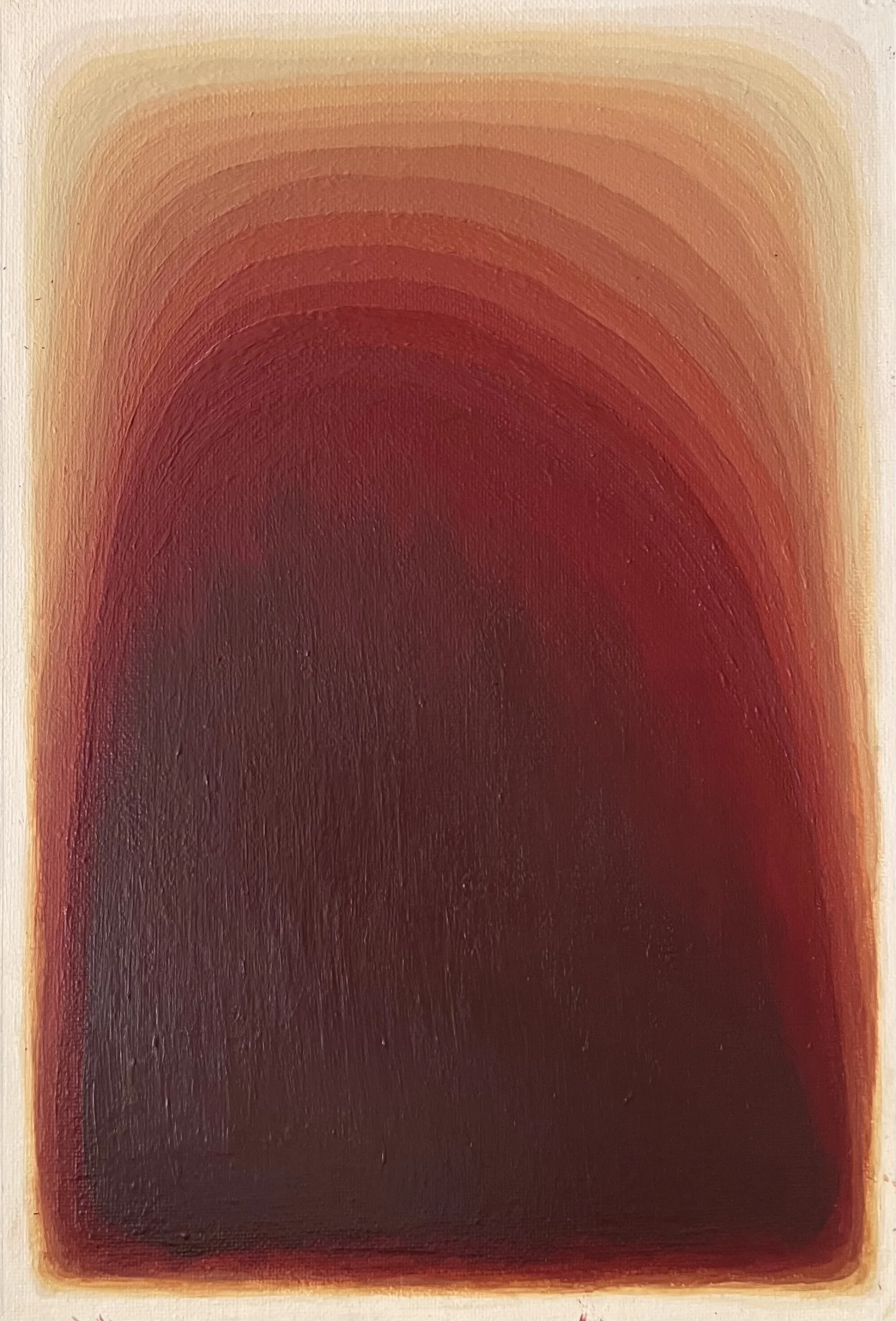
Later sample refining the gradient, finding the balance between red & yellow; too yellow

Later refined sample: too yellow.

Later sample refining the gradient, found a good balance between red & yellow

Very close, just need to ease transitions.
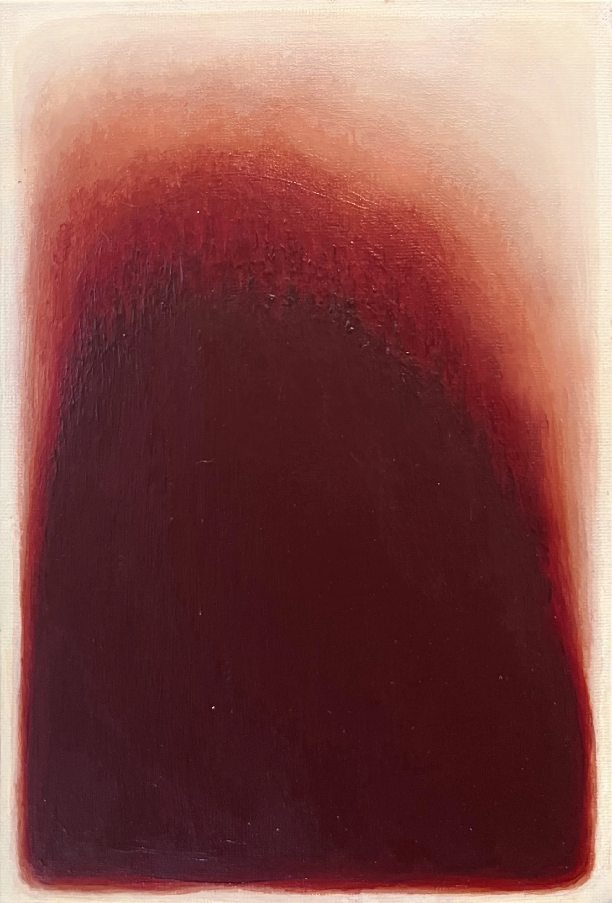
Sample with blending, balance between red and yellow

Sample with blending, also very close.

I painted more samples, working closer to the final format to test how the colors would actually read as a composition, but initially keeping the paint in bands so I could identify which colors weren’t working. The samples revealed how differently the colors behaved once feathered and blended together, as opposed to sitting in isolated swatches. Acrylic paint looks completely different wet versus dry, and photographs of samples never fully captured what they looked like in person, which made it difficult to communicate what I was painting and seeing to the client.

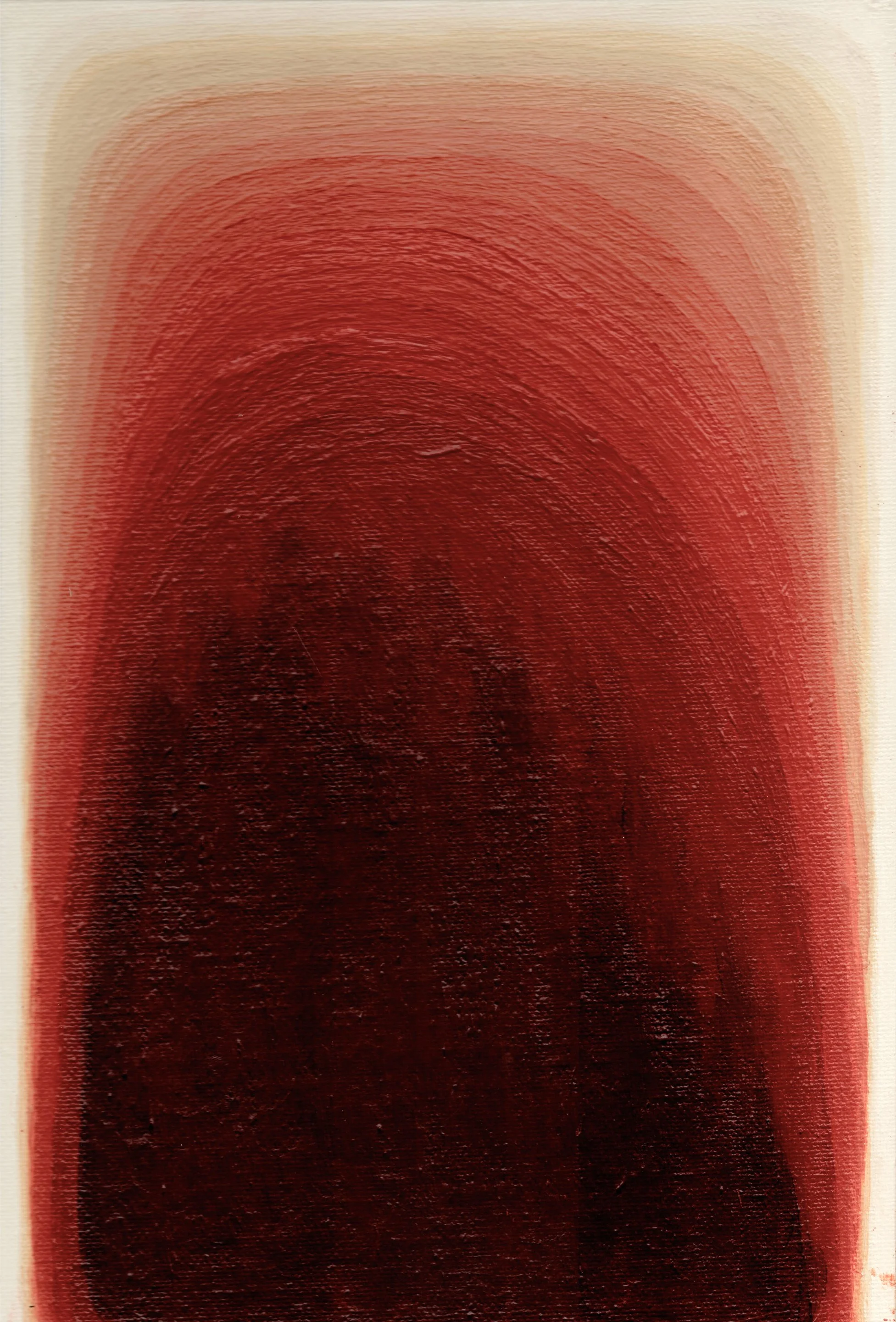
After many rounds of samples, I had a clarifying conversation with Brenda in which she confirmed that my last sample was on the right track and encouraged me to move forward. That was the turning point. The sample I worked from moved from a deep brown-red at the base through warm rust tones into cream at the top. The rust became the bridge between the dark and light ends of the palette, and finding a way to make that transition feel organic rather than forced was one of the most satisfying parts of the process.

Painting Aura I

To create the substrate, I stretched canvas over the entire sheet of plywood, secured it onto the front with Mod Podge and used a staple gun to attach the ends on the back. The artwork needed to be created on a solid surface so that the adhesive holding the cabochons would hold. If it was on a traditional canvas stretched over a frame, the weight and any movement could have caused cabochons to fall off. The painting is on a 4’ x 6’ x 3/4” sheet of plywood, so I worked on it downstairs in my foyer so I didn’t have to carry the plywood upstairs. I put it on stools so it would be about waist height to make it easier to work on. This meant I had to pull out a ladder and attempt to take pictures from above to get an assessment of the progress. There was a chandelier directly overhead and natural light wasn’t sufficient in this location because it was winter, so it was hard to take decent images.
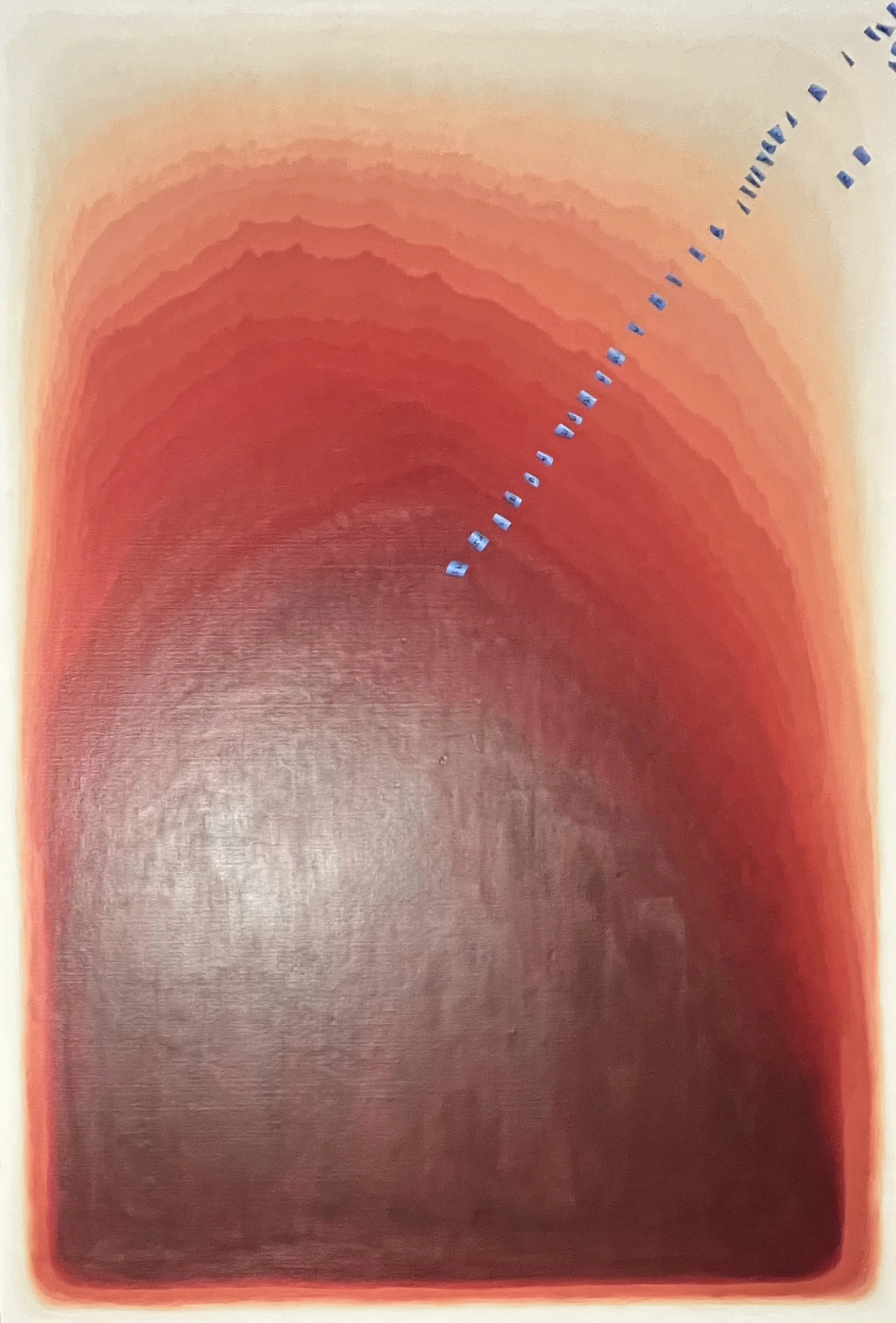
 
Early stage of the painting with colors applied in labeled bands before blending

Early stage of the painting with colors applied in labeled bands before blending.


I mixed 28 distinct tones to work with across the full gradient. Rather than jumping straight into blending, I first painted the colors in clearly defined bands across the canvas, labeling each one so I could track the subtle shifts and keep the transitions moving in the right direction. This gave me a map to work from before the real work of feathering began.
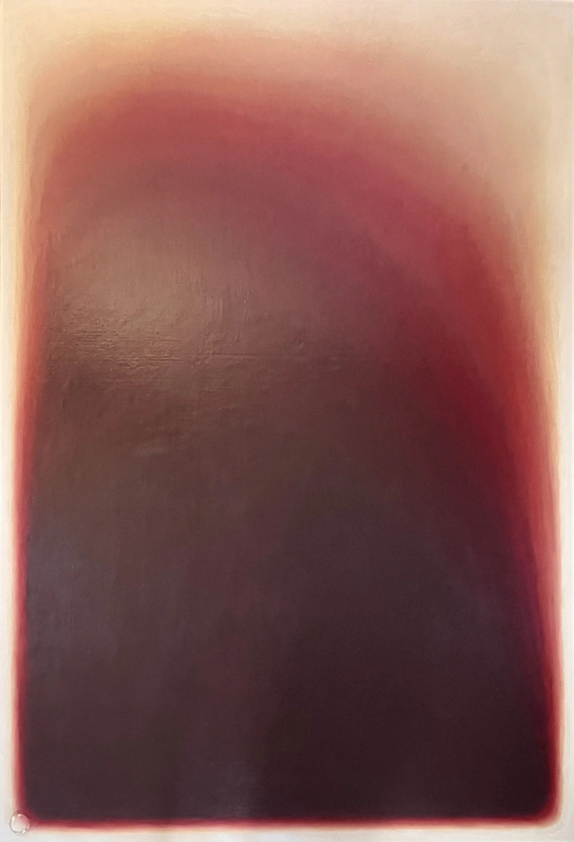
 
The painting fully blended and nearly complete, before cabochon application

The painting fully blended and nearly complete, before cabochon application.


Once the bands were established I smoothed and feathered the transitions until the surface looked continuous and glowing. The goal was for the gradient to feel inevitable rather than deliberate, as though the color had always been that way rather than being carefully constructed from 28 separate tones.

Applying the Cabochons
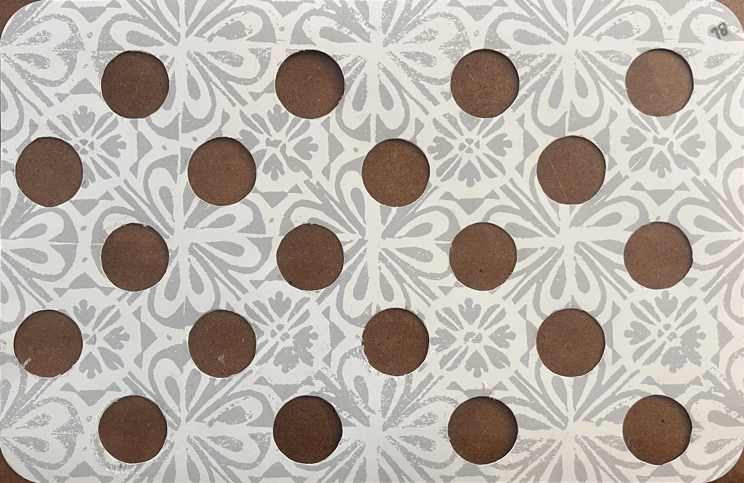
Template made out of a plastic placemat with cut circles used to position cabochons consistently across the painting.

Applying the cabochons required as much planning as the painting itself. I used clear silicone rather than a solvent-based adhesive like E6000 or Household Goop, to avoid any chemical reaction with the acrylic paint beneath. To position each cabochon consistently across the full 4 by 6 foot surface, I made a plastic placement template by cutting circles at the correct spacing. I would lay the template over a section of the completed painting, place the cabochons through the holes, and then move on to the next section.

The cabochons do something unexpected and beautiful to the paint underneath: they magnify the surface texture slightly and make the color appear a little lighter beneath each one, as though each cabochon is lit from within. It adds a dimension to the piece that no photograph fully captures. The painting looks more ethereal in person, and I think that quality is entirely due to the cabochons interacting with the paint beneath them.
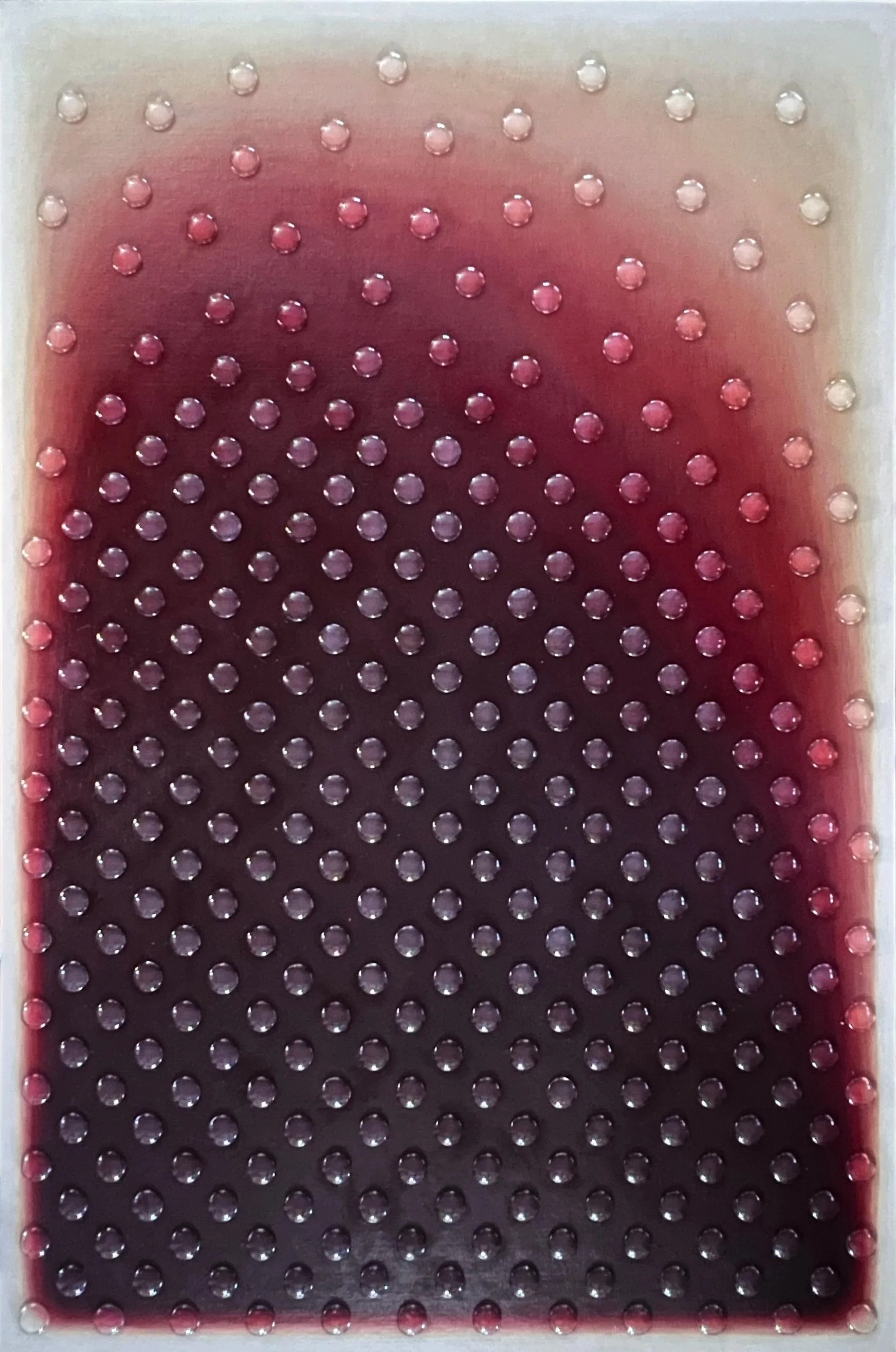
My not so good attempt to take a picture of the completed artwork Aura I. Notice the transition to white & cream with minimal yellow.
My not so good attempt to take a picture of the completed artwork Aura I. Notice the transition to white & cream with minimal yellow.

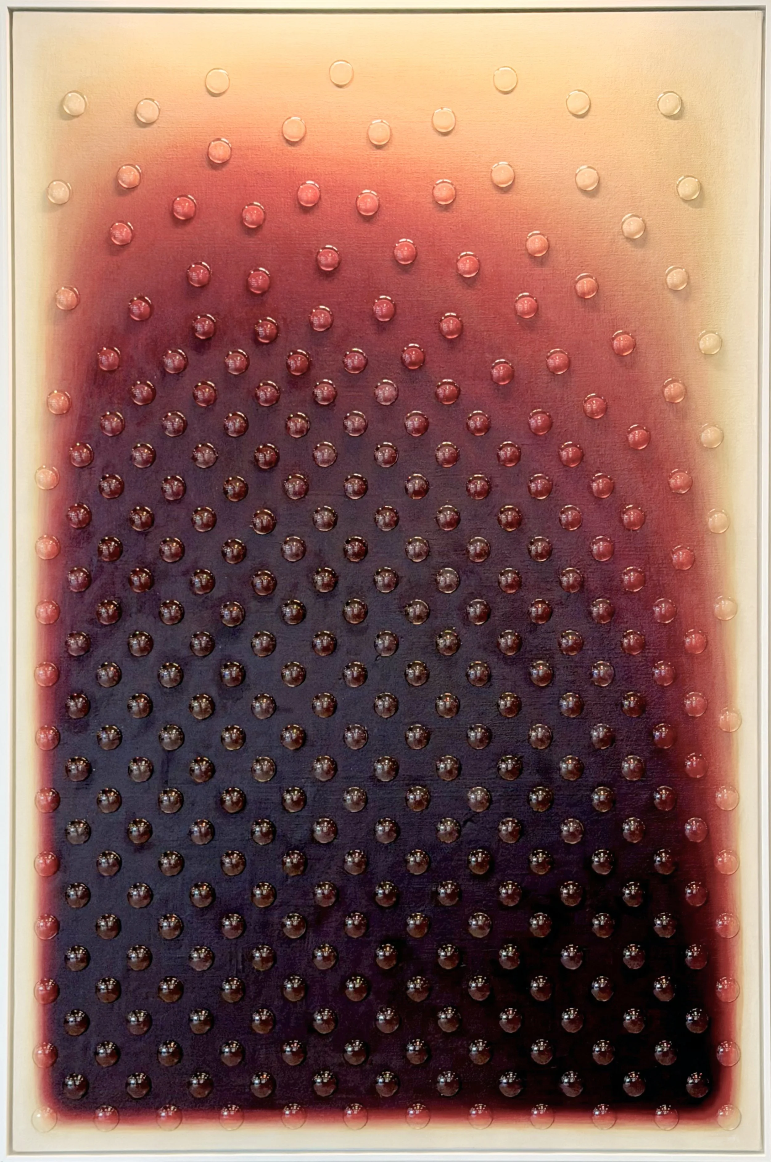
Brenda’s photograph of the Aura I artwork installed. The lighting creates the yellow effect I was trying to avoid.

Brenda’s photograph of the Aura I artwork installed. The lighting creates the yellow effect I was trying to avoid.

I’m so grateful Brenda took excellent pictures during the installation because none of the ones I took were good. I want to show a photo I took for a side-by-side comparison though. I worked really hard to avoid yellow in the transition to cream and white, and you can see in the photo I took that I was successful. The warm overhead lighting in the installed photo creates a yellow cast that doesn't reflect the actual painting.

See the full gallery page for this project.
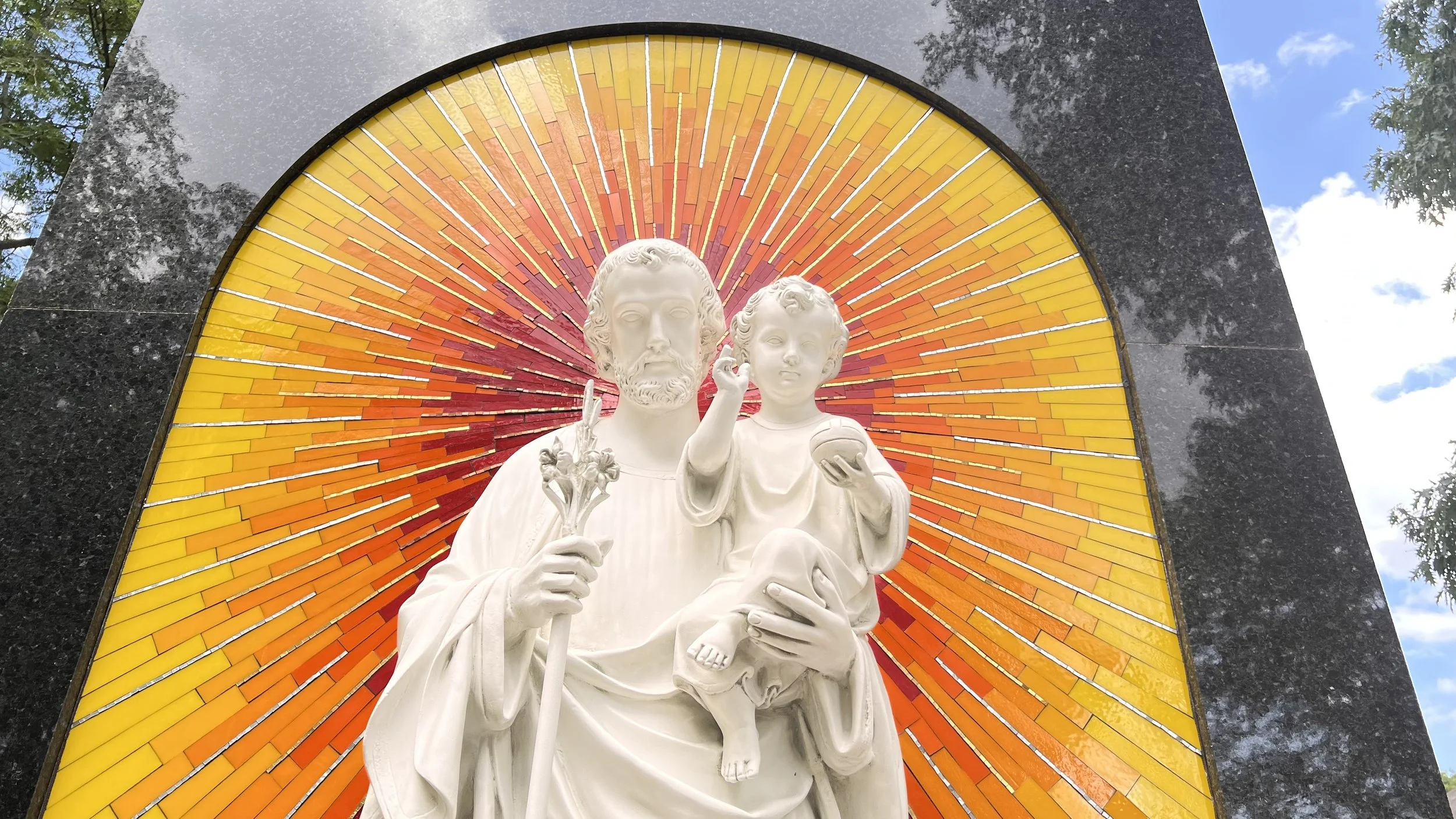
Creating the Sancta Clara Sunrise Memorial Mosaic

Detail of Sancta Clara Sunrise Mosaic with stained glass and smalti behind a statue of St. Joseph

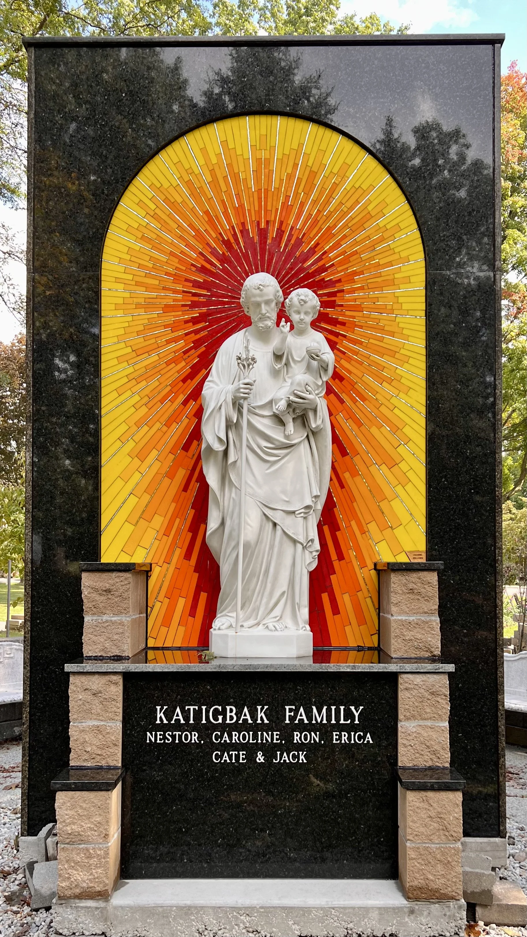
In 2022 I was commissioned to create a glass mosaic background for a St. Joseph statue at Sancta Clara Monastery here in Canton, Ohio. A family had donated the artwork to the monastery as a memorial to a loved one. The wall and arch had already been built by the monastery's groundskeeper, and the statue had been completed by another artisan. My role was to create something that would make the statue truly stand out, something more special and alive than leaving the plain wall behind it.

 
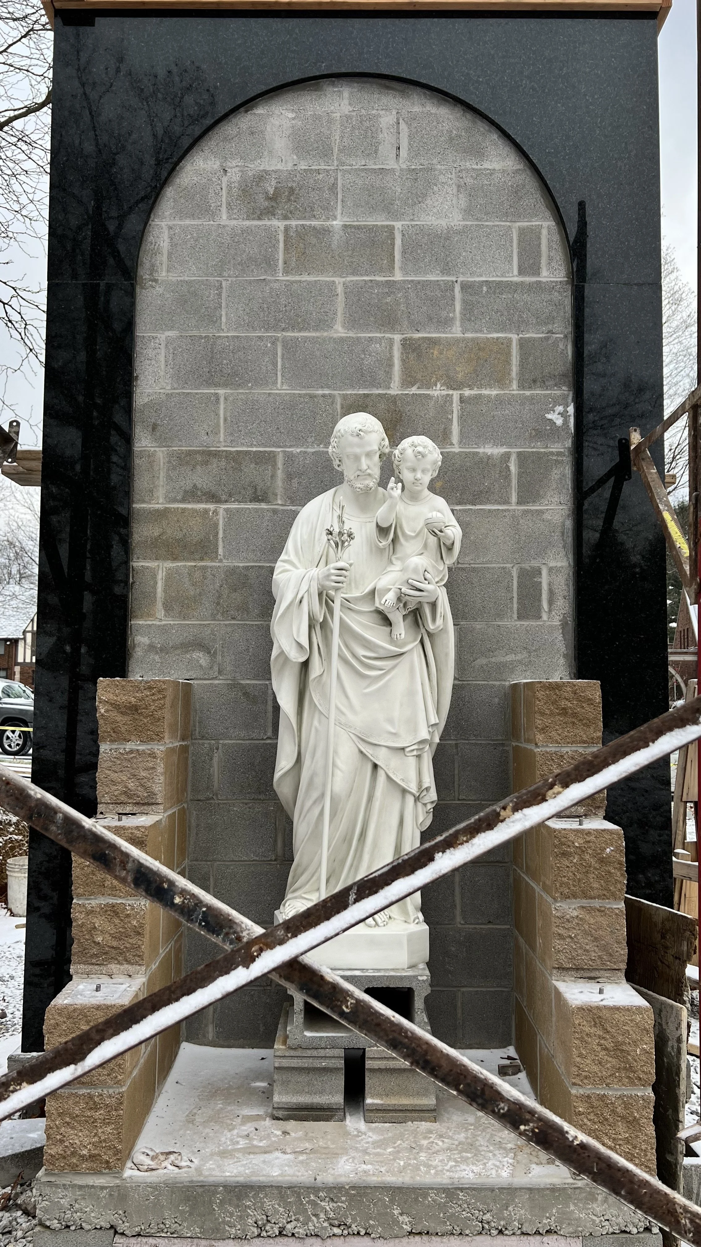
The wall and statue before the mosaic was installed.

The wall and statue before the mosaic was installed.


The groundskeeper brought the statue out and propped it up on bricks to the exact height it would sit on the finished pedestal so I could photograph it straight on. That photo became the foundation of my entire design process.

 
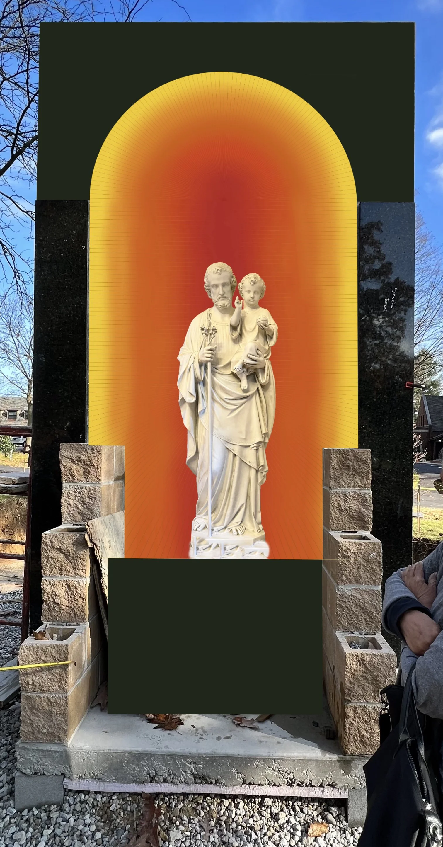
Digital mockup of the sunrise design placed into the site photo.

Digital mockup of the sunrise design placed into the site photo.


I told the client that the family had always loved bright colors, and asked if a sunrise palette of reds, oranges, and yellows would be too bold for the setting. She loved the idea immediately. On the other side of the same wall is a traditional Italian smalti mosaic, so I knew from the start that I wanted to incorporate smalti to create a visual connection between the two works. What I didn't know yet was exactly how.

Designing Sancta Clara Sunrise Mosaic

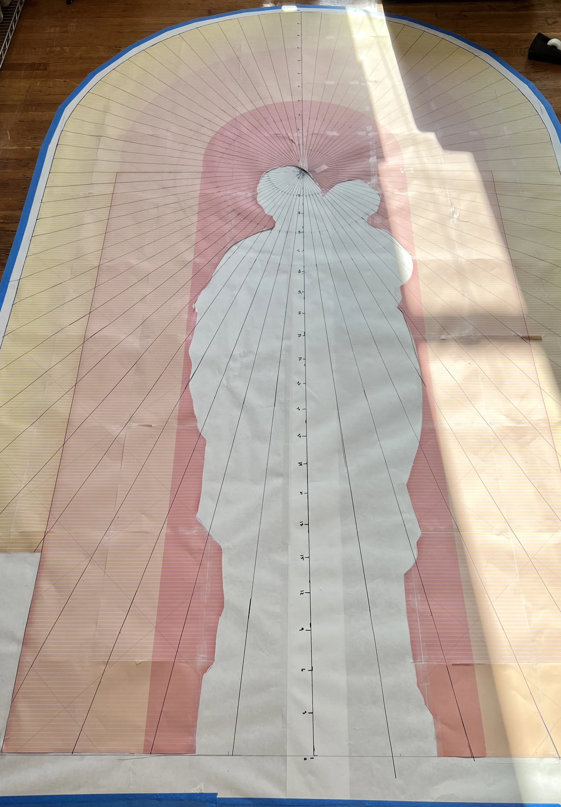
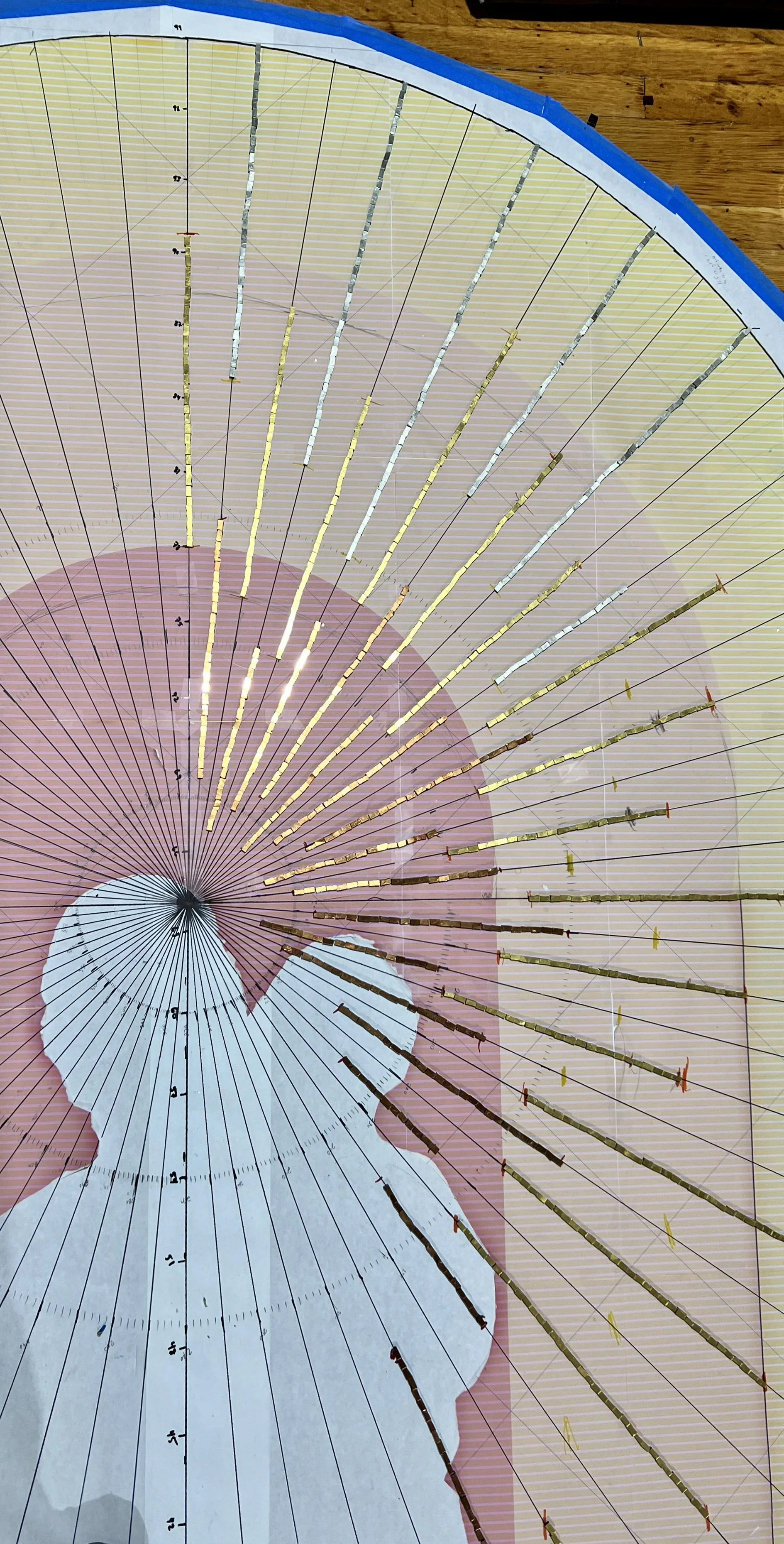
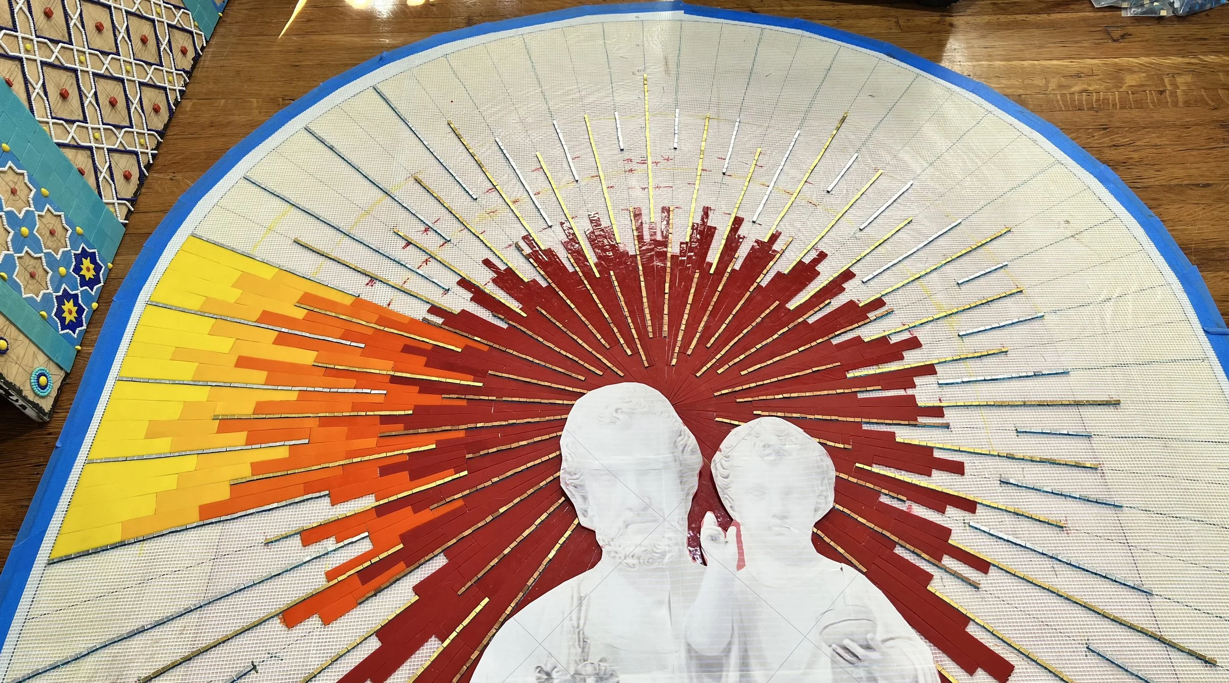
Because the mosaic needed to complement a statue that was already finished, the design had to work around an asymmetrical figure. I couldn't simply center the colors and call it done. I printed my design at full scale, cut out the silhouette of the statue, and placed it over the design as I worked so I could see exactly how the colors would read on either side of the figure and make sure nothing felt lopsided.

 
Full scale design with statue cutout used to check color placement.

Full scale design with statue cutout used to check color placement.


Once the sunrise design and stained glass colors were approved, I had the idea of adding gold smalti in three tones, bronze, gold, and silver, radiating as rays from the center of the composition. I put together a layout to show the client before committing.

Layout showing the planned gold smalti ray placement.

Layout showing the planned gold smalti ray placement.

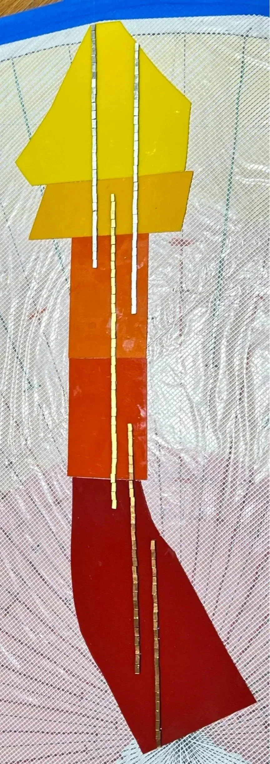
Gold, silver, and bronze smalti shown against the stained glass colors.

Gold, silver, and bronze smalti shown against the stained glass colors.

She approved it, and I'm so glad she did. The three tones of smalti catch the light differently throughout the day and add a shimmer and depth that stained glass alone simply couldn't achieve. They also tie the piece visually to the Italian smalti mosaic on the other side of the wall.

Creating Sancta Clara Sunrise Mosaic

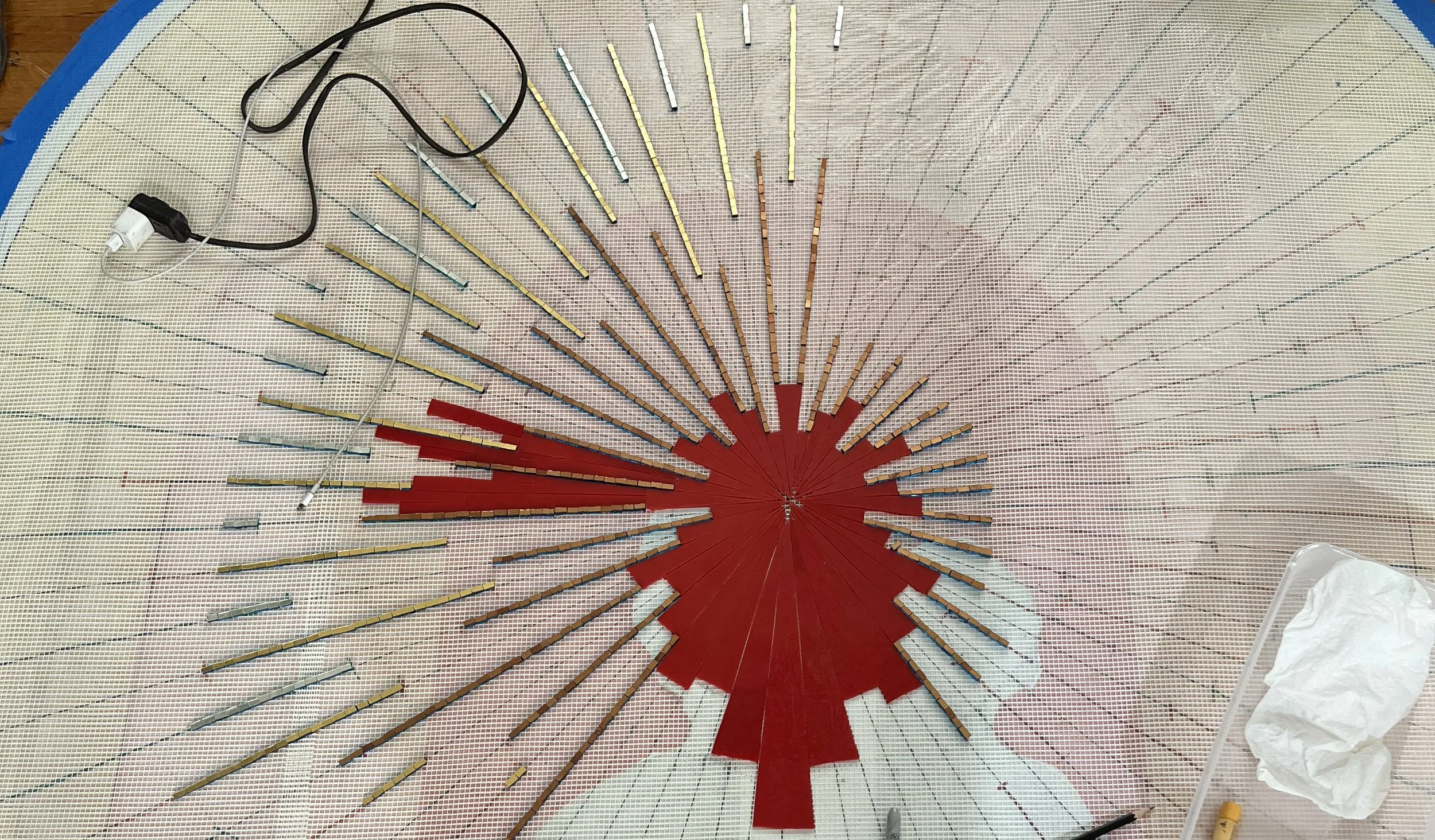
The mosaic was built on fiberglass mesh in my studio. I started by laying in all the smalti rays radiating from the center point, working as far out as I could reach before filling in the stained glass between them. This approach established the structure and rhythm of the composition first, with the color filling in around it.

Smalti rays laid in first to establish the structure of the composition.

Smalti rays laid in first to establish the structure of the composition.

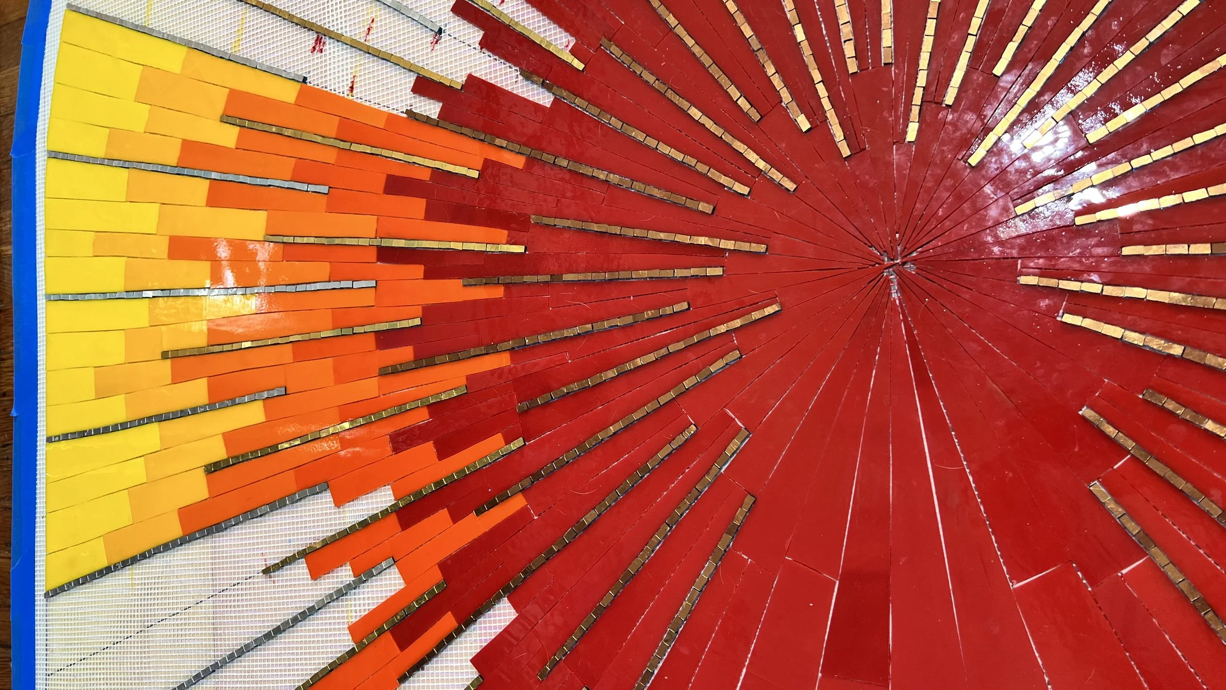
Stained glass filling in between the smalti rays.

Stained glass filling in between the smalti rays.

Throughout the process I periodically placed the printed statue cutout over the design to check the color placement as the piece developed.

The statue cutout placed over the mosaic to check color placement as work progressed.

The statue cutout placed over the mosaic to check color placement as work progressed.

Installation was a true collaboration with the monastery's groundskeeper. The mosaic was applied with white mortar rather than grey, since even opaque stained glass has some translucency and grey mortar would have dulled the brightness of the colors. We started at the top of the arch and worked downward, marking each section's placement carefully before applying mortar, working quickly but precisely to make sure the sections aligned on the curve. At the bottom I left pieces slightly longer than needed and trimmed them to fit exactly on site. Black grout was used throughout to give the finished piece depth and definition.

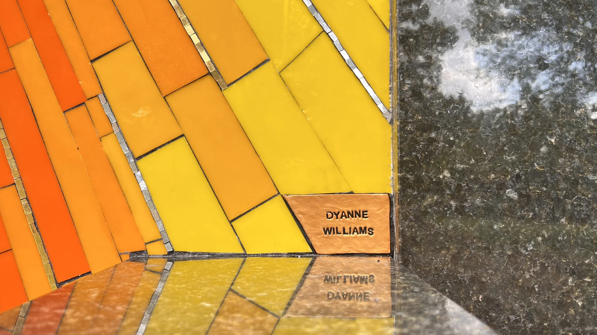
One unexpected and lovely touch came at the client's request. I don't sign my work as often as I should, but she asked me to include a signature. I made a small tile from bronze Sculpey clay, stamped my name into it, and darkened the letters with black enamel. It sits quietly in the corner of the mosaic.

Artist signature tile made from bronze Sculpey clay with name stamped and darkened with black enamel.

Artist signature tile made from bronze Sculpey clay with name stamped and darkened with black enamel.

The monastery community was warm and welcoming throughout the entire process. They prepared food for the groundskeeper and me during installation, and held a dedication ceremony afterward to which they kindly invited me and my family. It was a meaningful project in every sense.

See the full gallery page for this commission.

 
Completed Sancta Clara Sunrise Mosaic with stained glass and smalti behind a statue of St. Joseph
 

Creating Cycles, an ArtsWA Public Art Commission

Creating this mosaic for Ida Nason Aronica Elementary School in Ellensburg, WA was a milestone. It was my first public art commission, made possible through the Washington State Arts Commission in partnership with Ellensburg School District. ArtsWA has a remarkable process that guides artists through every step of a public art project, and working within that framework taught me things I could never have learned any other way. I'm now excited and prepared to take on more public art commissions! I get a lot of questions about this project, so I wanted to share the full story from design and mosaic techniques to my personal experience along the way.

Video of Cycles, a 20-panel glass mosaic public art installation by Dyanne Williams at Ida Nason Aronica Elementary School in Ellensburg, Washington. A public art commission for the Washington State Arts Commission in partnership with Ellensburg School District.

The Beginning

Several years ago, around 2019, I applied to become an pre-approved artist for ArtsWA, the Washington State Arts Commission, and was accepted. One spring day in 2023 I got a phone call asking me if I’m available to create an art commission for Ida Nason Aronica Elementary School. I was so excited! There were contracts to sign and handbooks to read, but the big first step was to go to Ellensburg, WA for a site visit. The site is a school, so I needed to go before the end of their school year, so I found time to squeeze in the visit a couple of weeks later. Because I was in the middle of projects as a teaching artist, I was only able to be in Ellensburg for 25 hours, but I found time between meetings to go for a hike in the gorgeous mountains surrounding the valley.

Panoramic mountain view from Rattlesnake Dance Ridge Trail in Ellensburg, Washington, near the site of the Cycles public art mosaic installation.

My first meeting was with the director of the K'tɨ́taas County Historical Museum in downtown Ellensburg. She was also the curator for the Aronica family, whose relative, Yakama Nation artist and elder Ida Nason Aronica, the school and this artwork were created to honor, and whose family would need to approve the final design. The director was wonderful, educating me on local history, showing me items the museum has curated, and explaining the cultural significance of Ida's work. As soon as I saw her absolutely stunning beadwork, I knew I wanted to find a way to incorporate it into the mosaic.

Historic downtown Ellensburg, WA, near the K'tɨ́taas County Historical Museum.

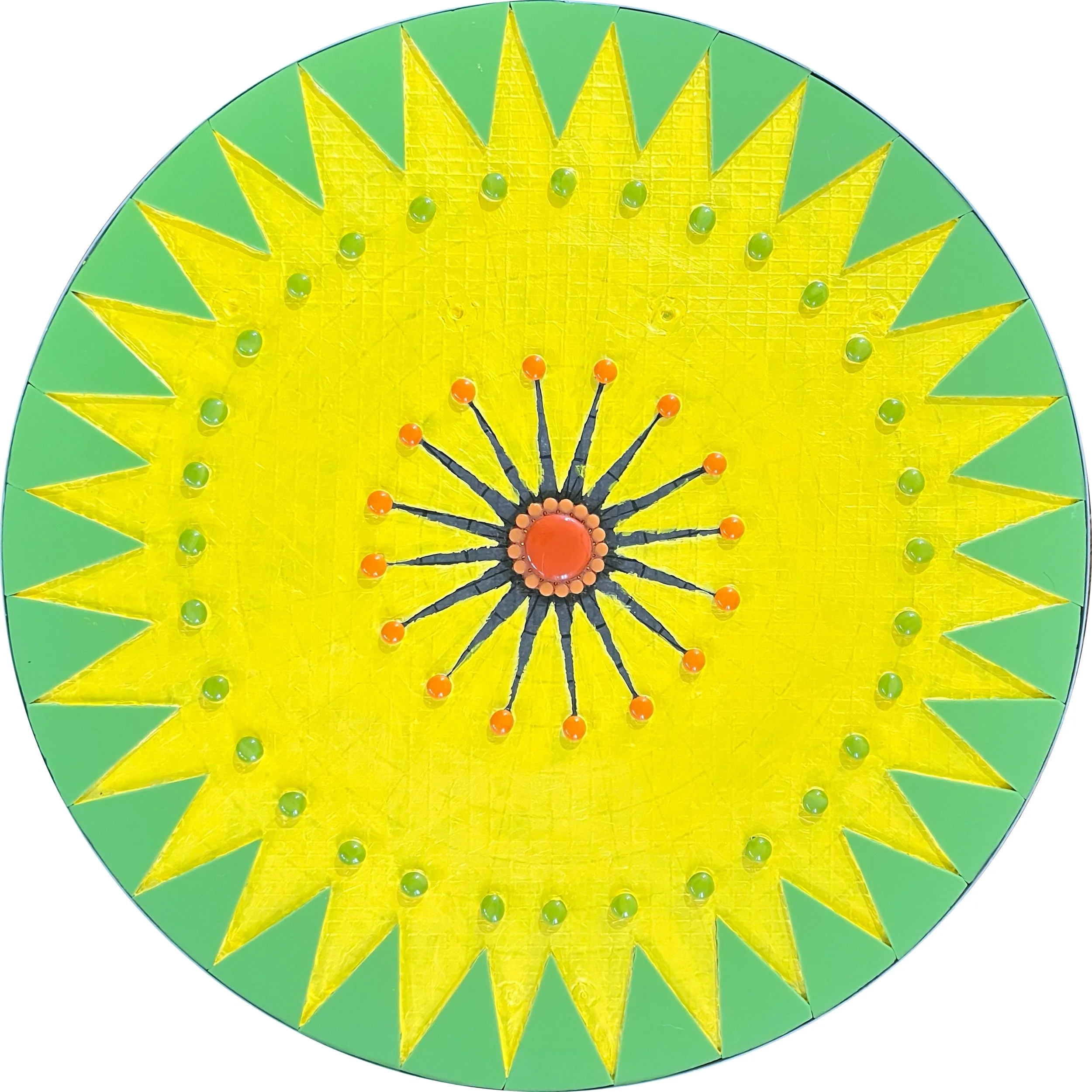
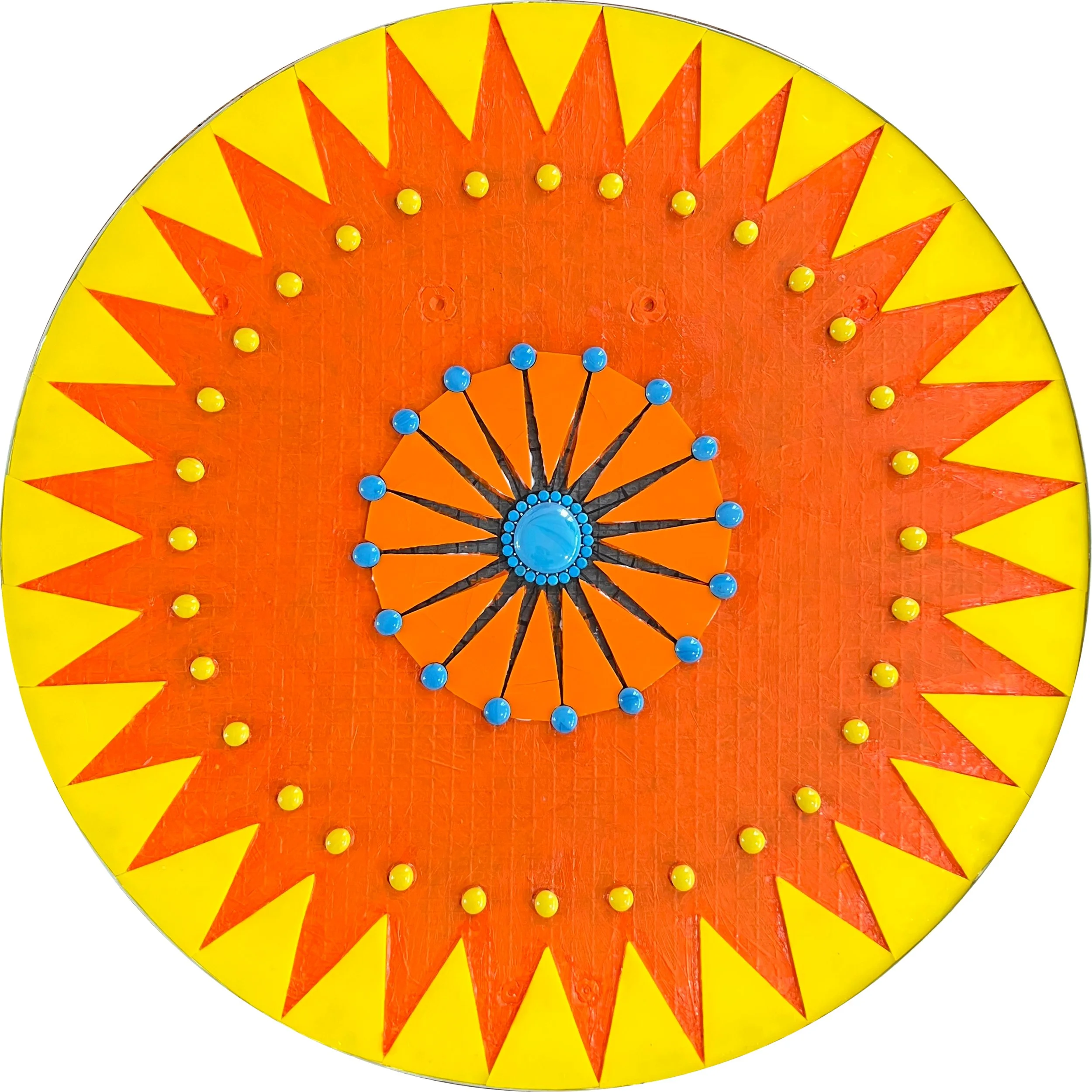
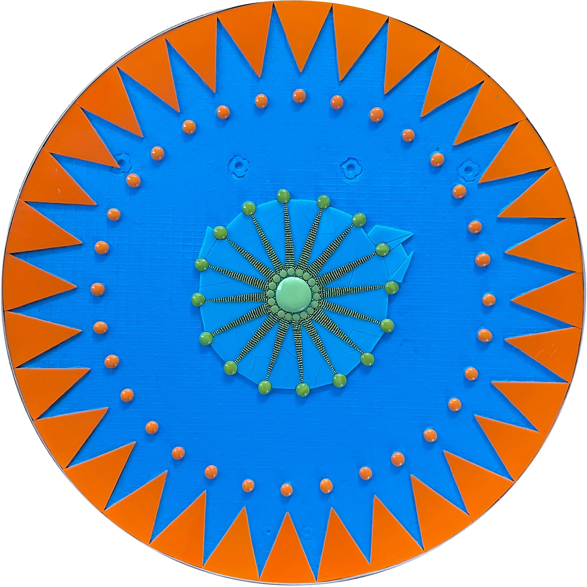
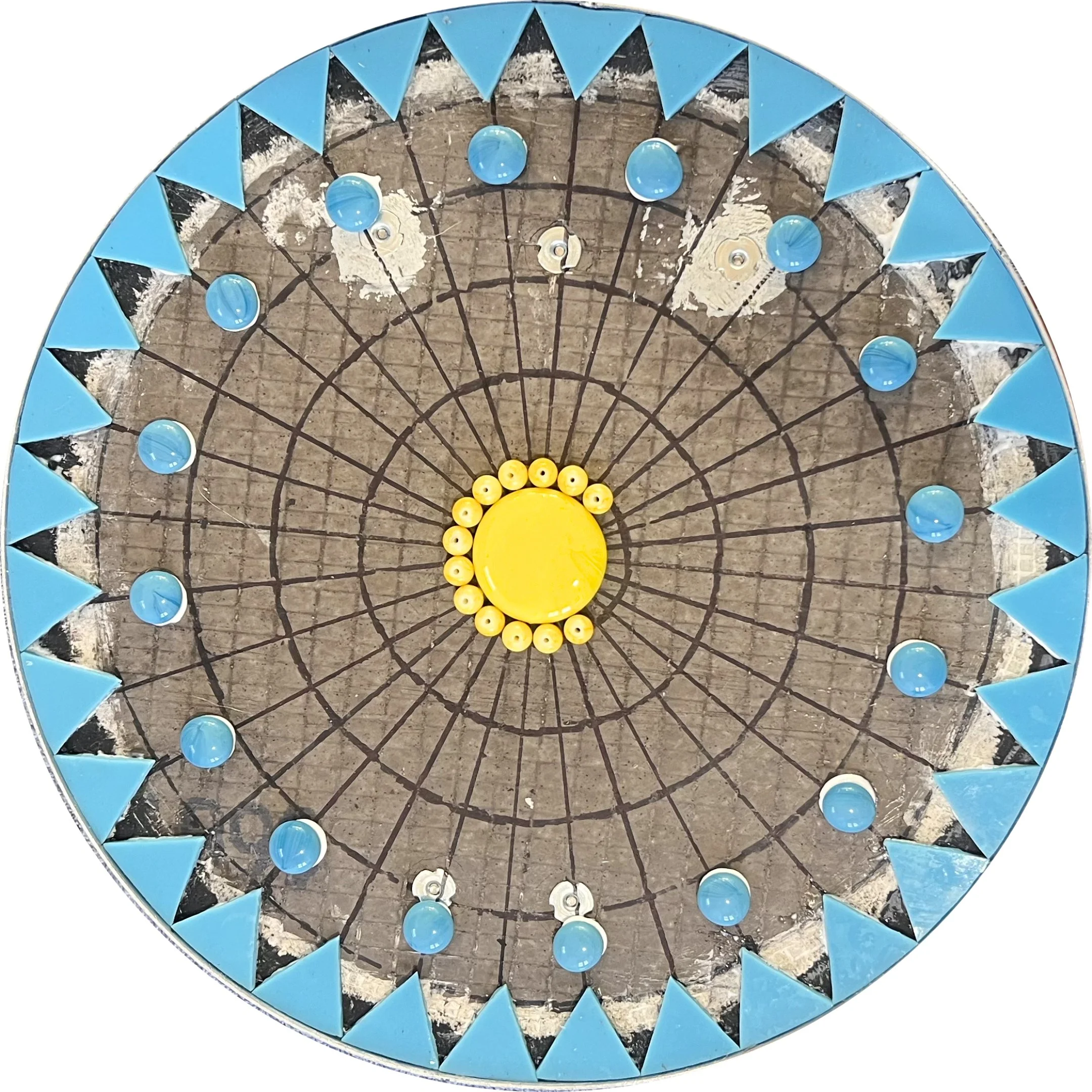
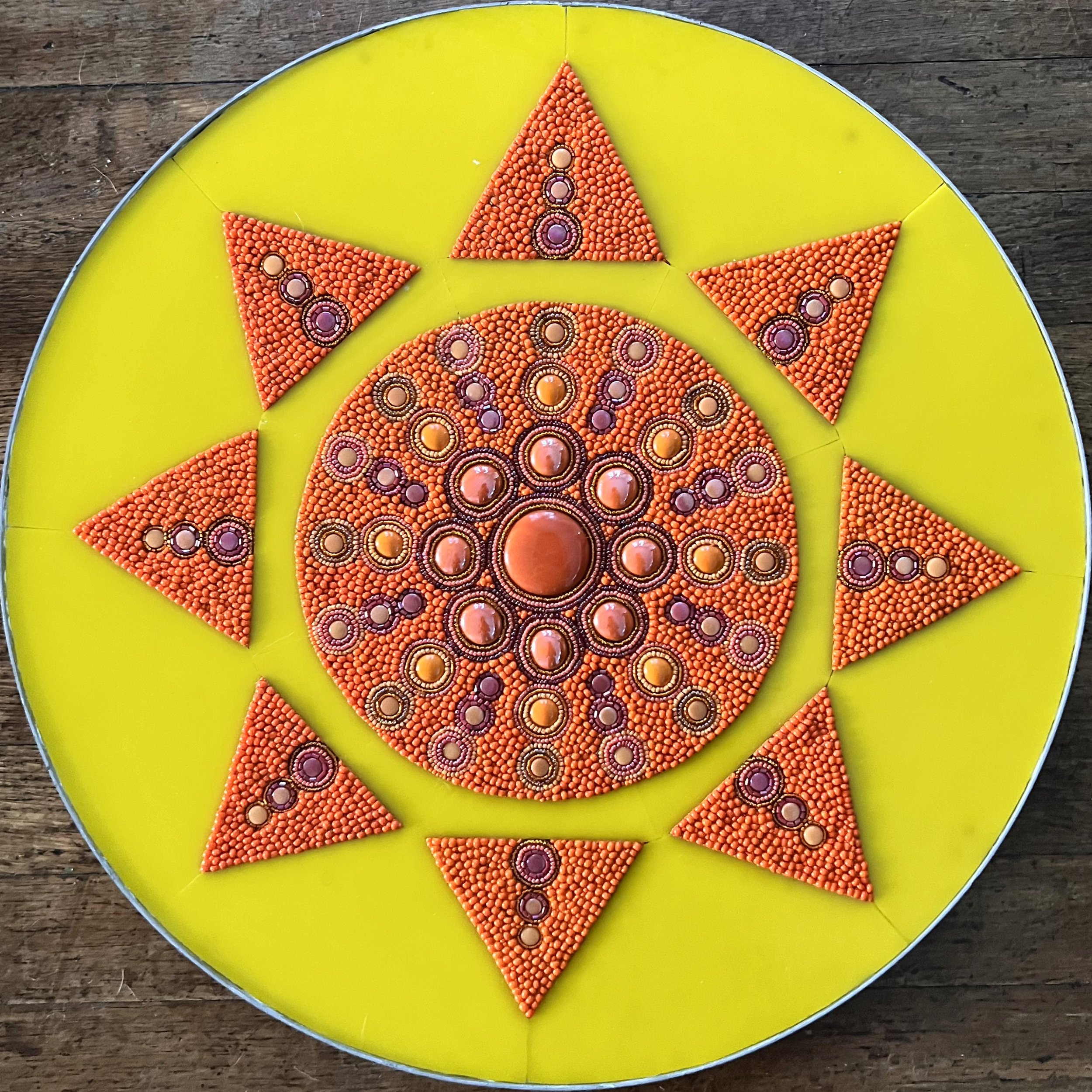
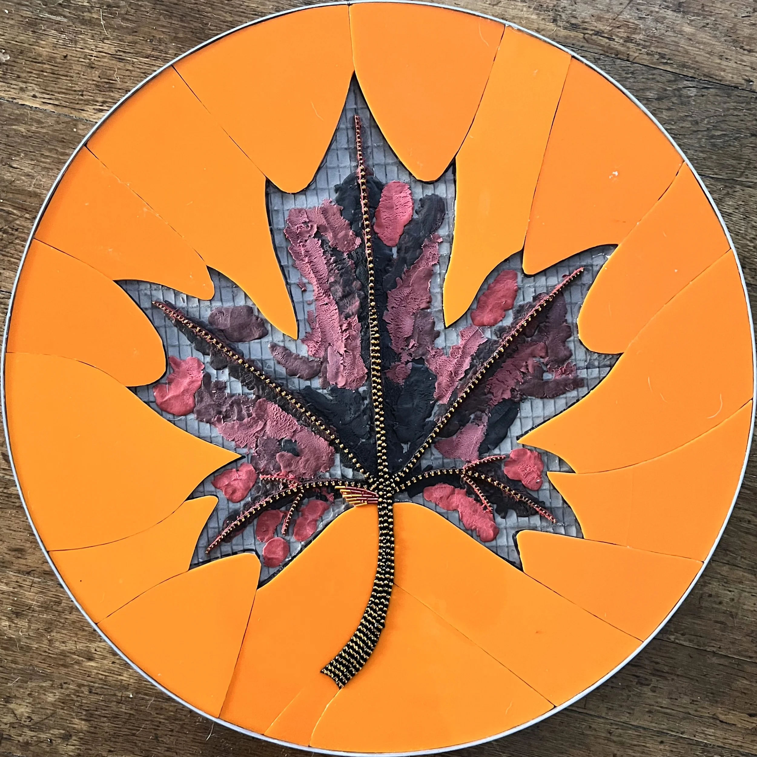
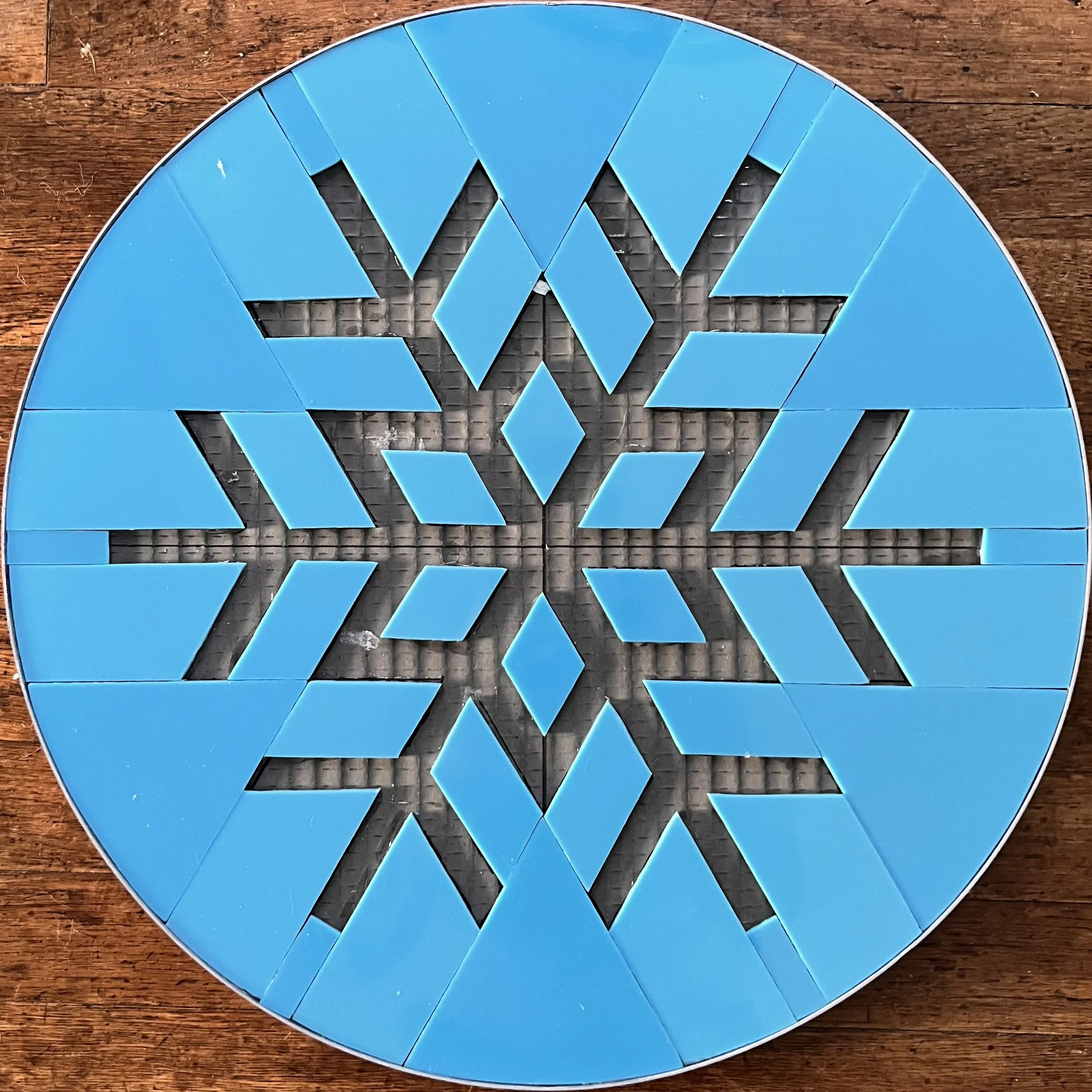
My second meeting was at Ida Nason Aronica Elementary with the arts committee. For every public art commission, ArtsWA forms a committee to approve and oversee the artwork's progress and having the building's architect on the committee was particularly valuable since the school was newly built. The school is designed as a square with a courtyard in the center where students grow local plants. Each of the four corridors surrounding the courtyard represents a season, color-coded with very specific tones: Spring Green, Summer Yellow, Fall Orange, and Winter Blue. As soon as I saw them I was thrilled to realize I already knew of a glass company that makes all four colors. It felt like a sign the project and I were a good fit.

Ida Nason Aronica Elementary Color Banner

Design

Back in my studio, the site visit had left me buzzing with ideas. One key requirement for ArtsWA public art projects in schools is that the work must be relocatable, designed with a lifespan of at least 30 years, and able to be moved if the school changes grades or purposes. Since I usually create architectural installations applied directly to a building, I needed to channel my ideas into something that could be hung rather than permanently fixed. Circles felt like the natural solution as I've always loved working with them and from there the concept began to take shape. Looking at the measurements of the various potential locations, I chose the long hallway leading to the gym, cafeteria, and assembly hall, where the artwork would be seen by every student every day.

Chosen Location for the Mosaic Installation

After choosing the location and shape, I divided the panels into seasonal groupings, which felt like the natural next step to reflect the school's existing motif. The architect sent exact measurements, and I settled on 5 panels per season, 20 panels total, ranging from 12" to 24" in diameter. I created my mockups in Pixelmator Pro, working through many different ideas before landing on designs that felt right.

For each season, the first and last panels follow a radially symmetrical design that captures the feeling of transition. The current season's color anchors the piece, while the previous season ebbs out toward the edges and the upcoming season flows in toward the center with more ebb in the opening panel, more flow in the closing one.

Mockups of Seasonal Ebb & Flow

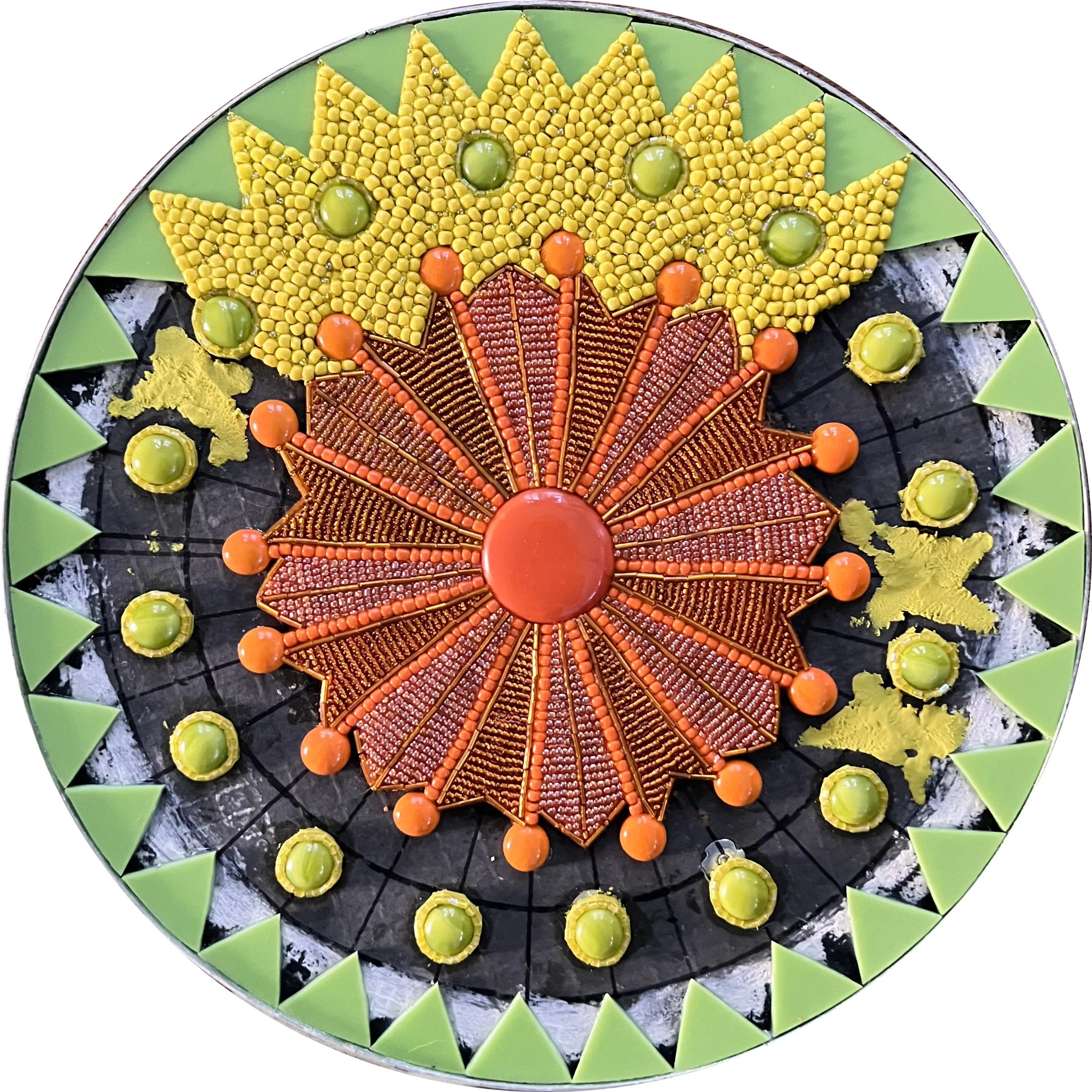
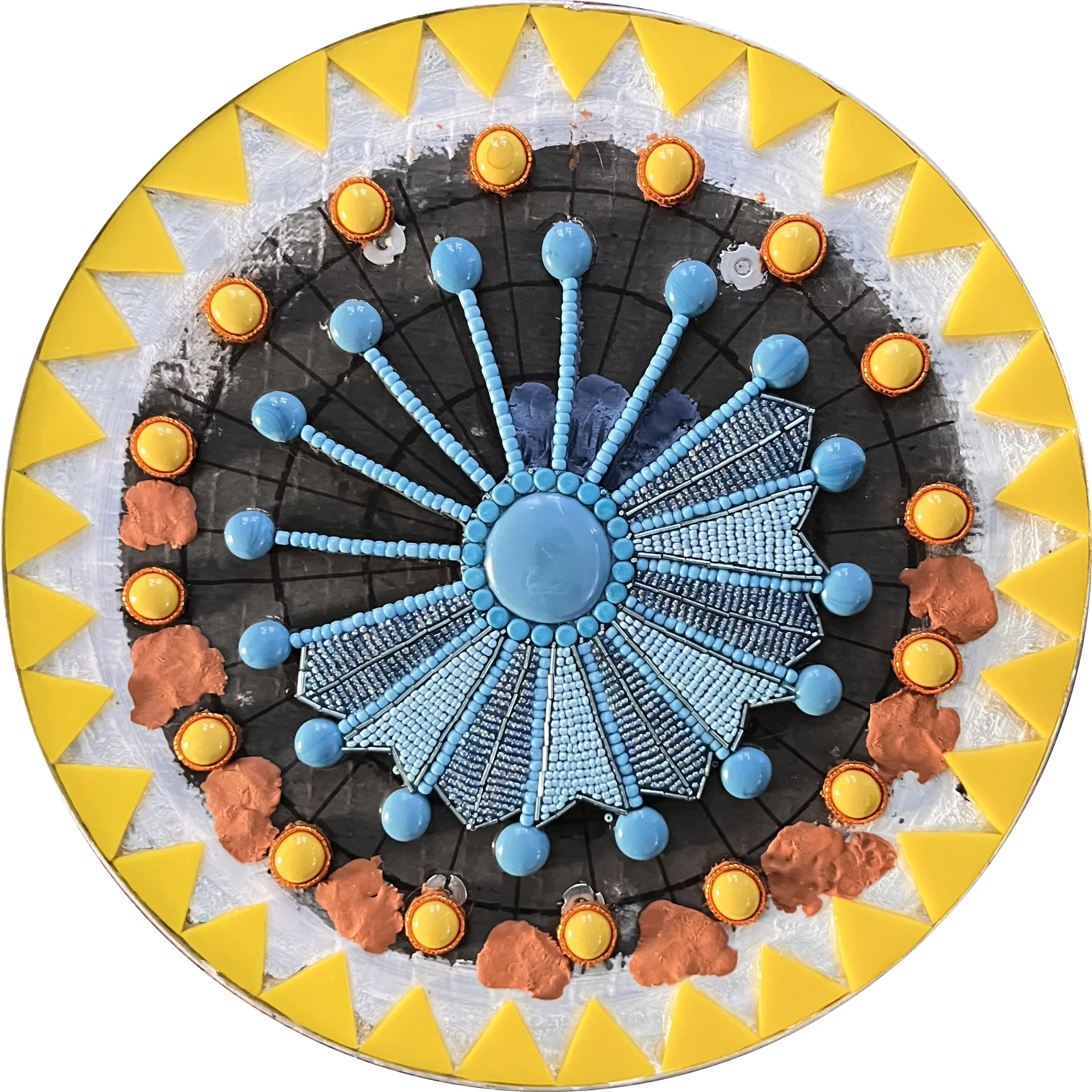
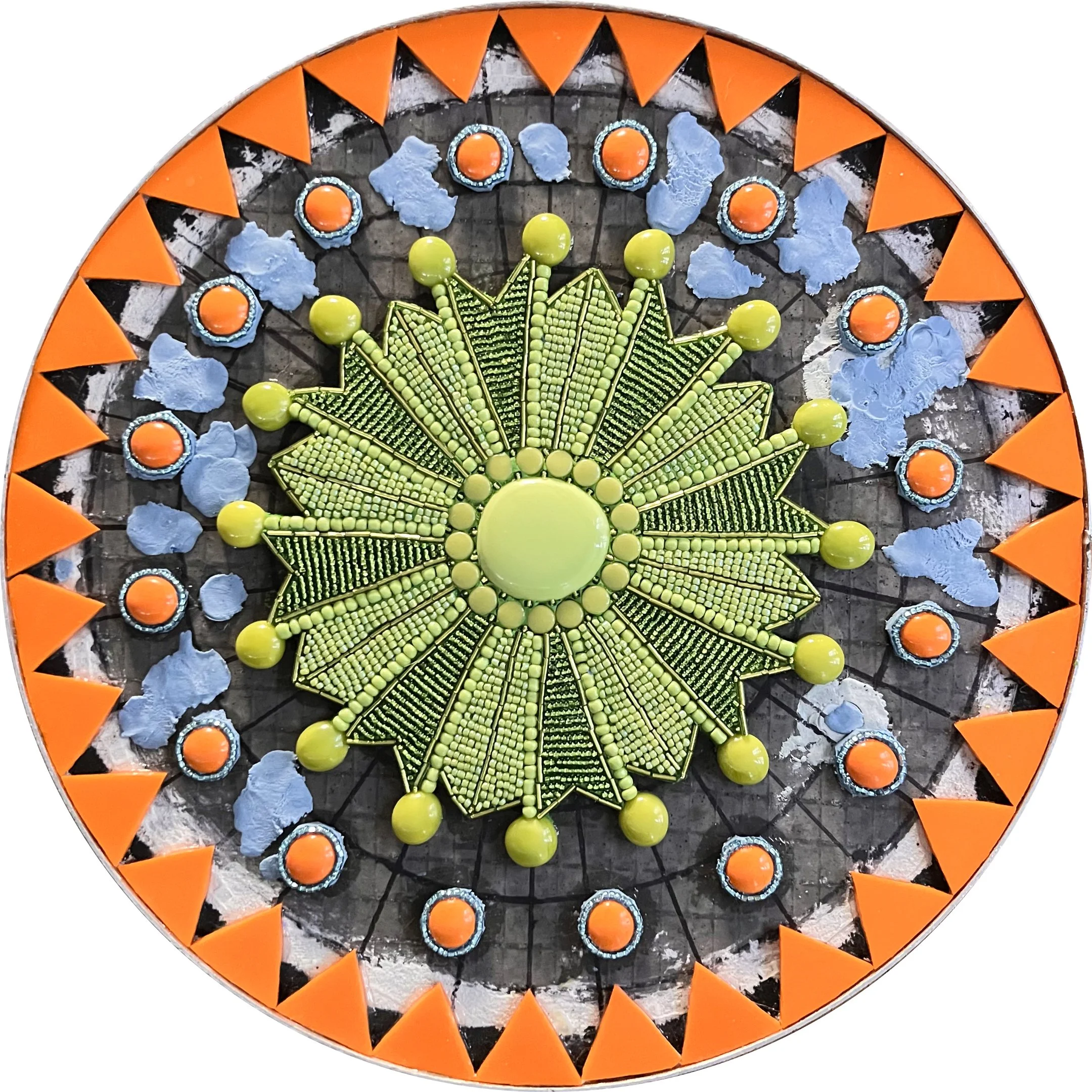
During my site visit I was also drawn to the beautiful woven baskets at the museum and wanted to incorporate some of those designs into the center panels. However, some patterns were of unknown origin and could be personal to specific tribes or hold cultural meanings that I wasn't in a position to fully understand or represent respectfully. It wasn't a risk worth taking. Instead, I decided the center panel of each season would feature a simple graphic representing that season, executed in intricate beaded mosaic as a heartfelt homage to Ida Nason Aronica's meticulous and stunning beadwork. It felt like the right way to honor her through the medium she mastered, interpreted through mine.

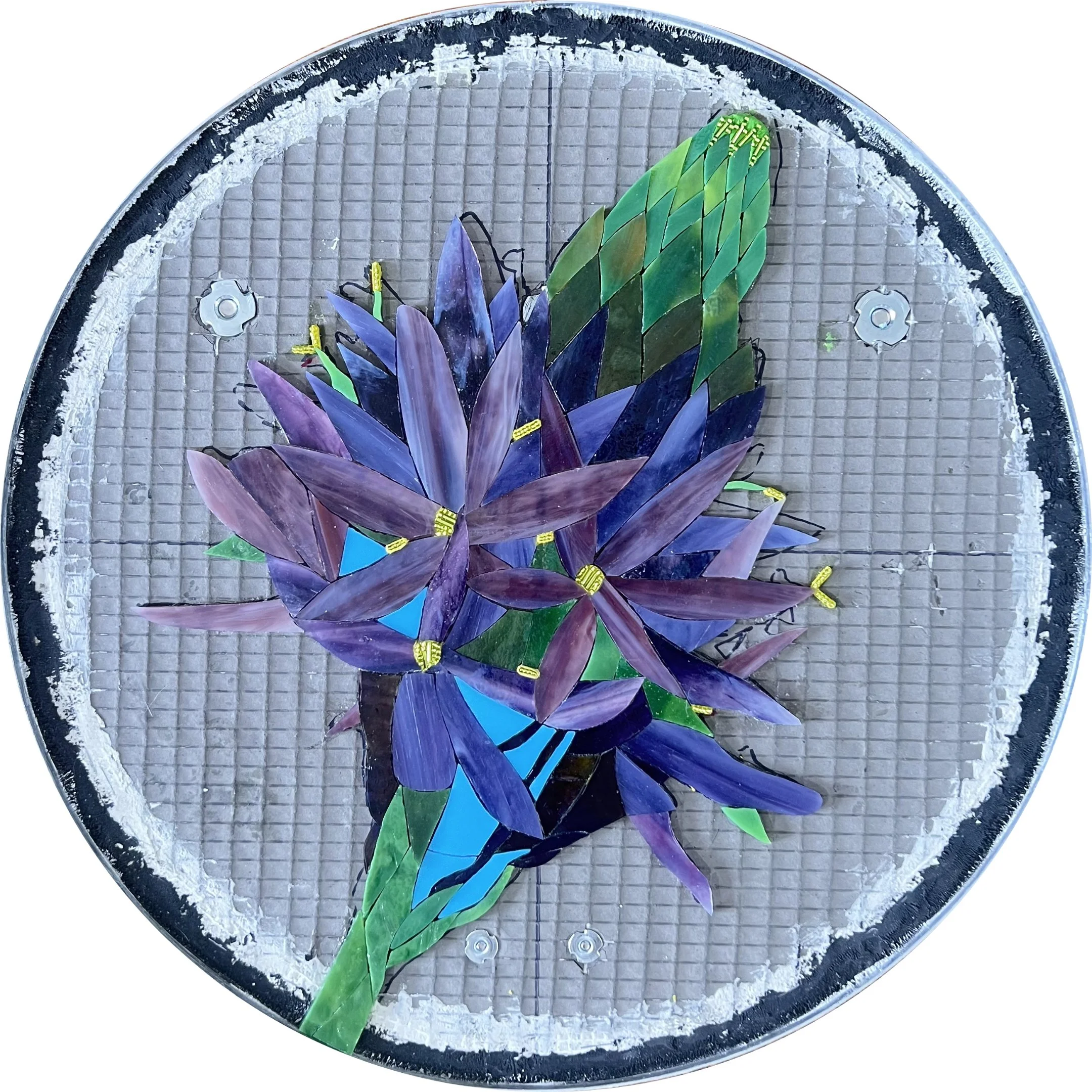
Mockup of Seasonal Graphics

The remaining two panels for each season required considerable thought and consultation to find concepts that would authentically represent both Ida Nason Aronica and local Native American cultures. Fortunately, I was permitted to photograph Ida's beadwork at the museum and given permission to use four of her designs as inspiration for the mosaics.

Attribution was handled with great care. While all four pieces were believed to be Ida's work, she was an elder who was frequently gifted beadwork, so the Aronica family wisely chose the phrasing "inspired by Ida Nason Aronica's collection" to ensure credit was never misattributed.

The one significant alteration I made was to the background colors, adjusting them to align with the school's seasonal color scheme. This required careful discussion, as colors in Native American beadwork can carry deep cultural and symbolic meaning. Since only the background colors were being changed and the designs couldn't otherwise fit the panels, everyone ultimately agreed the alteration was acceptable; a decision I didn't take lightly.

Mockup of Beadwork Panels

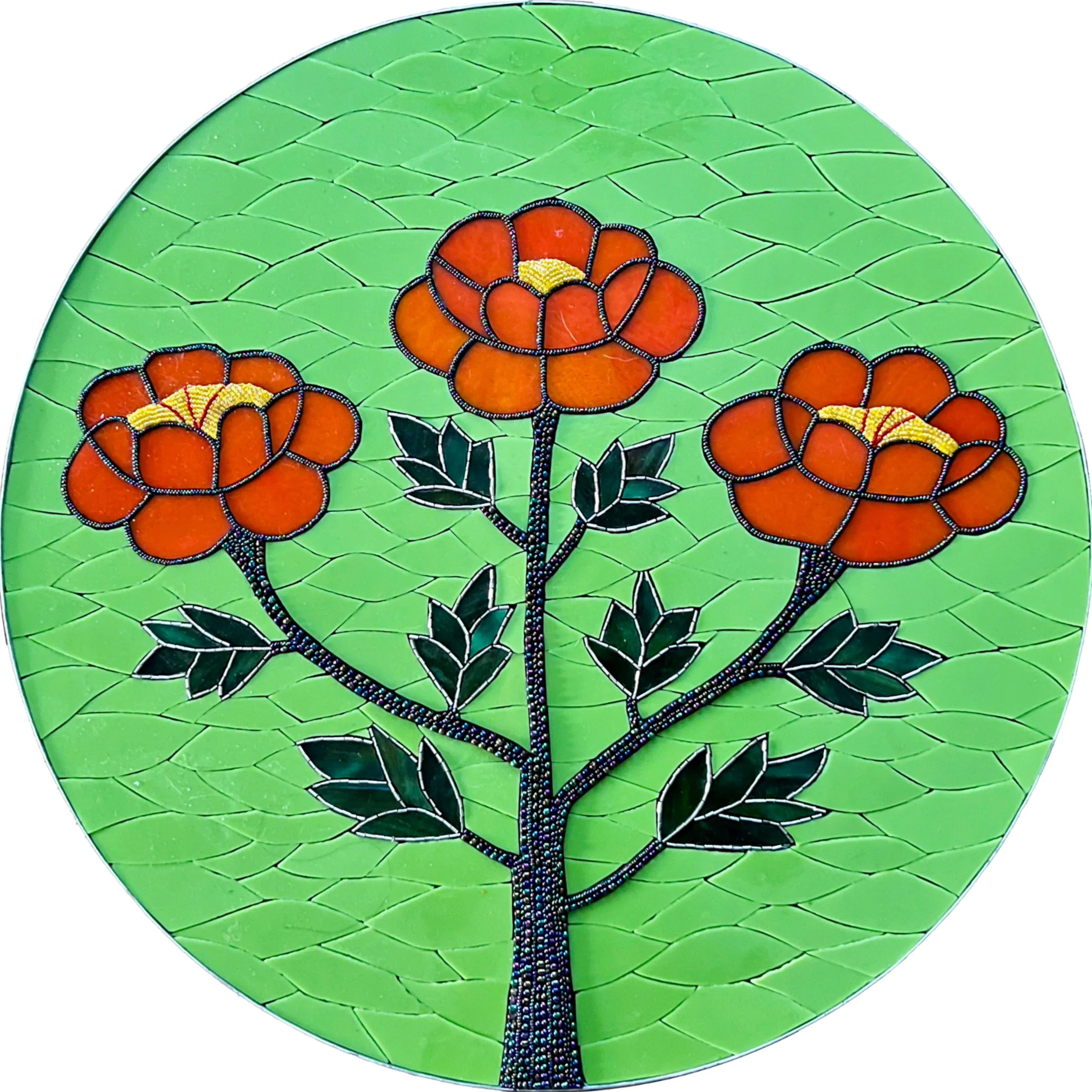
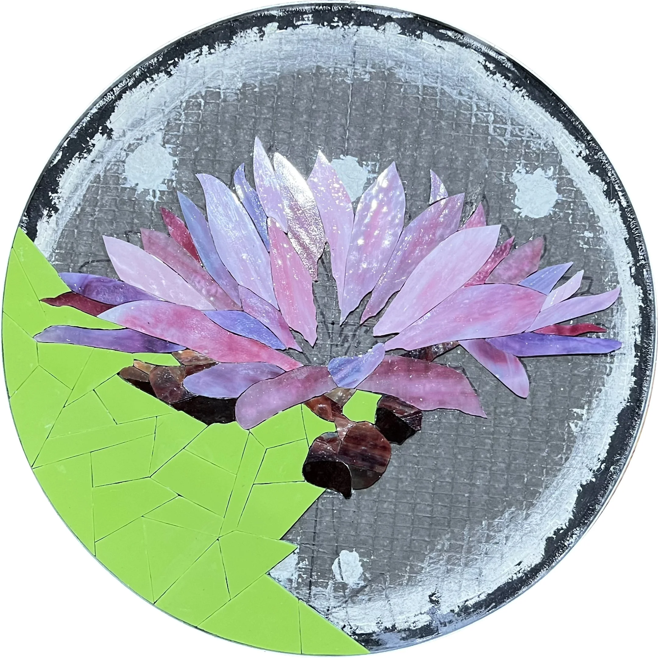
For the fourth panel of each season I returned to the director of the K'tɨ́taas County Historical Museum, who once again gave generously of her time and expertise. Together we identified food sources important to local Native American communities for each season: bitter root harvested in spring, huckleberry gathered in summer, salmon fished in fall, and camas root stored and ground into flour to sustain communities through winter.

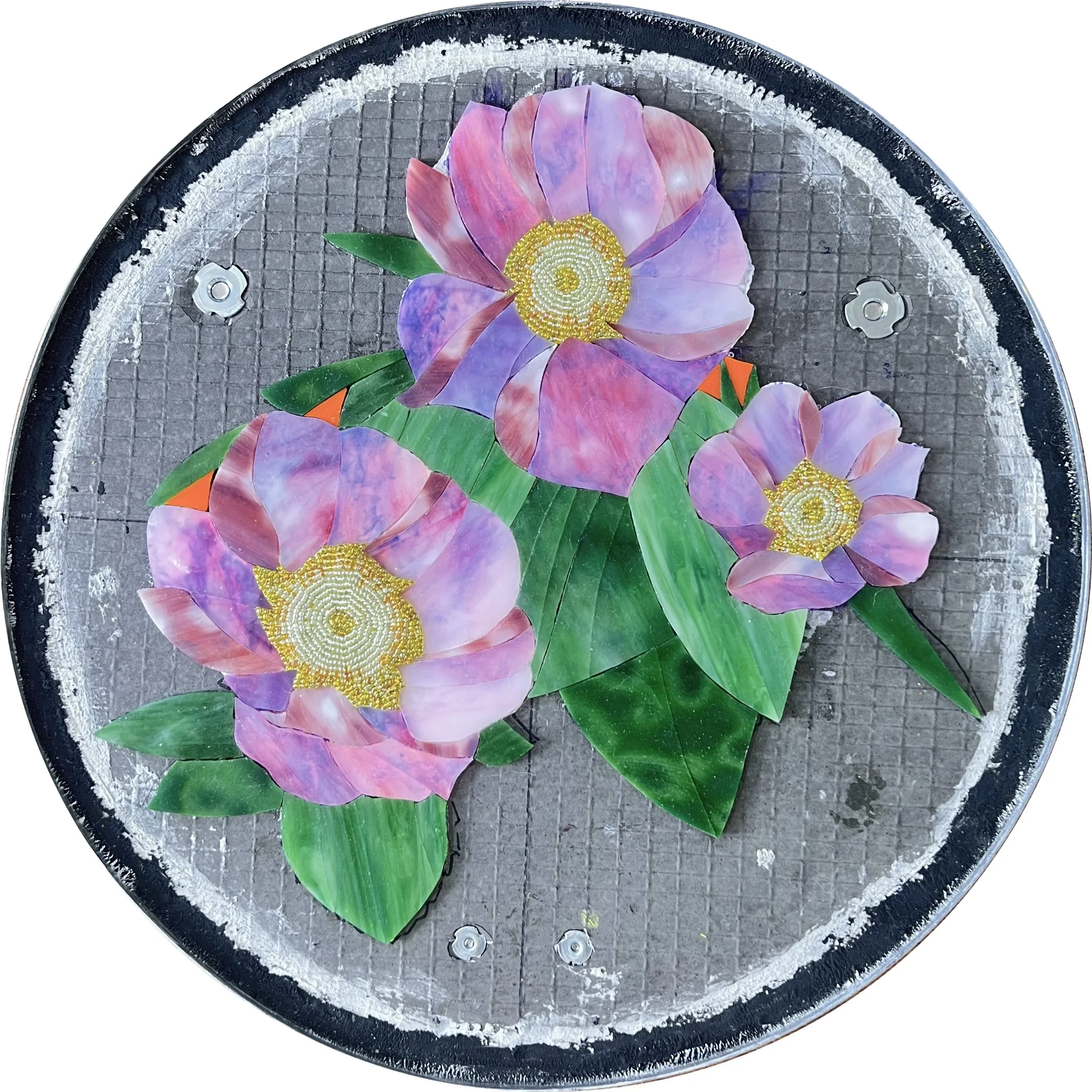
Since I was using flowers as the visual symbol for the three plants, the poor salmon looked a bit out of place among them. I ultimately replaced it with the nootka rose for fall. Its edible hips were dried and provided a sustained source of vitamin C through the cold months, and as a flower it fit beautifully into the panel's design.

Mockup of Important Food Sources

Creating the Panels

Once I submitted the designs, the committee approved them with what the director told me was the quickest positive consensus they had ever reached. I was so proud! Before fabrication could begin, I still had several important steps to complete: creating detailed technical documentation for review, consulting with an art conservation expert, and having an engineer analyze and sign off on the structural requirements of the hanging panels.

Then, finally, it was time to start making mosaics. ArtsWA requires extensive visual documentation of the entire fabrication process in case the artwork ever needs repair or restoration in the future, which means I have plenty of photos to share!

For the substrate I used 1/2" Wedi board: a foam core backer board coated on both sides with fiberglass mesh and cementitious resin. It's my go-to for installations because it's waterproof, easy to cut into any shape, and most importantly for a project requiring shipping across the country, remarkably lightweight. Once I had all the measurements and designs mapped out, I drew them directly onto the board and cut out the twenty circles.

Next I cut fiberglass mesh to fit around the edges of each circle, holding it temporarily in place with staples before applying a skim coat of mortar to bond it permanently. This is an important step that's easy to overlook. The cut edges of Wedi board expose the foam core, which isn't strong enough on its own to hold up over decades of public display. The fiberglass and mortar create a durable, finished edge that will last.

To finish the edges I added aluminum edging, securing it with Apoxie Sculpt which is a two-part epoxy clay that dries rock hard and bonds to almost any surface. Where the two ends of the edging met, I positioned the seam at the top of each circle where it would be least visible, reinforcing it with additional Apoxie Sculpt and finishing it with Testor's silver enamel paint. The result is a seam that is nearly invisible at a glance, but upon close inspection has the appearance of solder, a small detail I loved.

Because Wedi board won't hold a screw on its own, all hanging hardware has to be installed before the mosaic is created. The wide washers that anchor the screws need to sit on the front surface, which means they have to go in while that surface is still accessible. I used French cleats sized between 6" and 18" depending on the panel size, with special wide washers that screw in flush with the surface so the glass lays flat on top without any bumps or gaps. Getting them perfectly flush is a finicky process and I'll admit I don't always nail it, but if a washer ends up slightly recessed I simply smooth over the depression with a little leftover mortar or Apoxie Sculpt. Problem solved.

The security hangers also need to be attached before the mosaic is created, using the same wide washer method as the French cleats. Once the artwork is hung, a second piece attached to the wall is locked into place using a wrench-like key, preventing the panel from being accidentally (or intentionally!) lifted off the hanger. In a school setting this was particularly important. Without them, a curious kid reaching up to touch the artwork could inadvertently flip an entire panel off the wall. With twenty mosaic circles hanging in a busy school hallway, that wasn't a risk worth taking.

With the substrate prepared, edged, and fitted with hardware, the first panel was finally ready for mosaic! I can't overstate what a relief this was. I had conceived the whole framing and mounting system about six months before receiving the go-ahead to begin fabrication, and the entire time I quietly worried that one of the steps wouldn't come together as planned. Having it turn out exactly as I'd envisioned was deeply satisfying.

Of course, now I had 19 more frames to build...

Precision was critical at this stage as the hangers can't be adjusted once the mosaic is in place, so I measured everything multiple times before committing. It was painstaking work, but I pushed through and completed all 20 frames in about two weeks.

The timing of the project couldn't have been more chaotic. ArtsWA gave me the green light at the exact same moment I was buying my first home. I knew the next couple months would vanish in a whirlwind of carpet removal, painting, cleaning, and moving my entire life, including tens of thousands of pounds of glass.

Fabrication

Once the dust settled, literally and figuratively, from the move it was time to begin creating the mosaics in my new studio. The new space was a revelation. For the first time I have a separate glass room across the hall from my mosaic studio, where I can browse and select glass that wasn’t covered in grout dust, without tripping over works in progress, or balancing precarious stacks of stained glass sheets on boxes. Having a dedicated table in the center of the room to lay everything out and make considered color decisions was a joy and I'm happy to report I got significantly fewer cuts from the stained glass as a result!

The glass room in my new home. My family & friends are kind enough to act like it’s normal to have a room just to store my glass.

Selecting the materials was one of my favorite parts of the process. I carefully chose stained glass, glass gems, and glass beads not only to make each individual panel shine, but to ensure the entire collection of twenty pieces would flow together as a cohesive artwork. For adhesives I used Weldbond for the stained glass and gems since it's reliable, flexible, and dries clear, and Apoxie Sculpt for the beads, which need a stronger mechanical bond given their rounded surface. Below are images of all 20 panels in various stages of completion. Click any image to view it in detail.

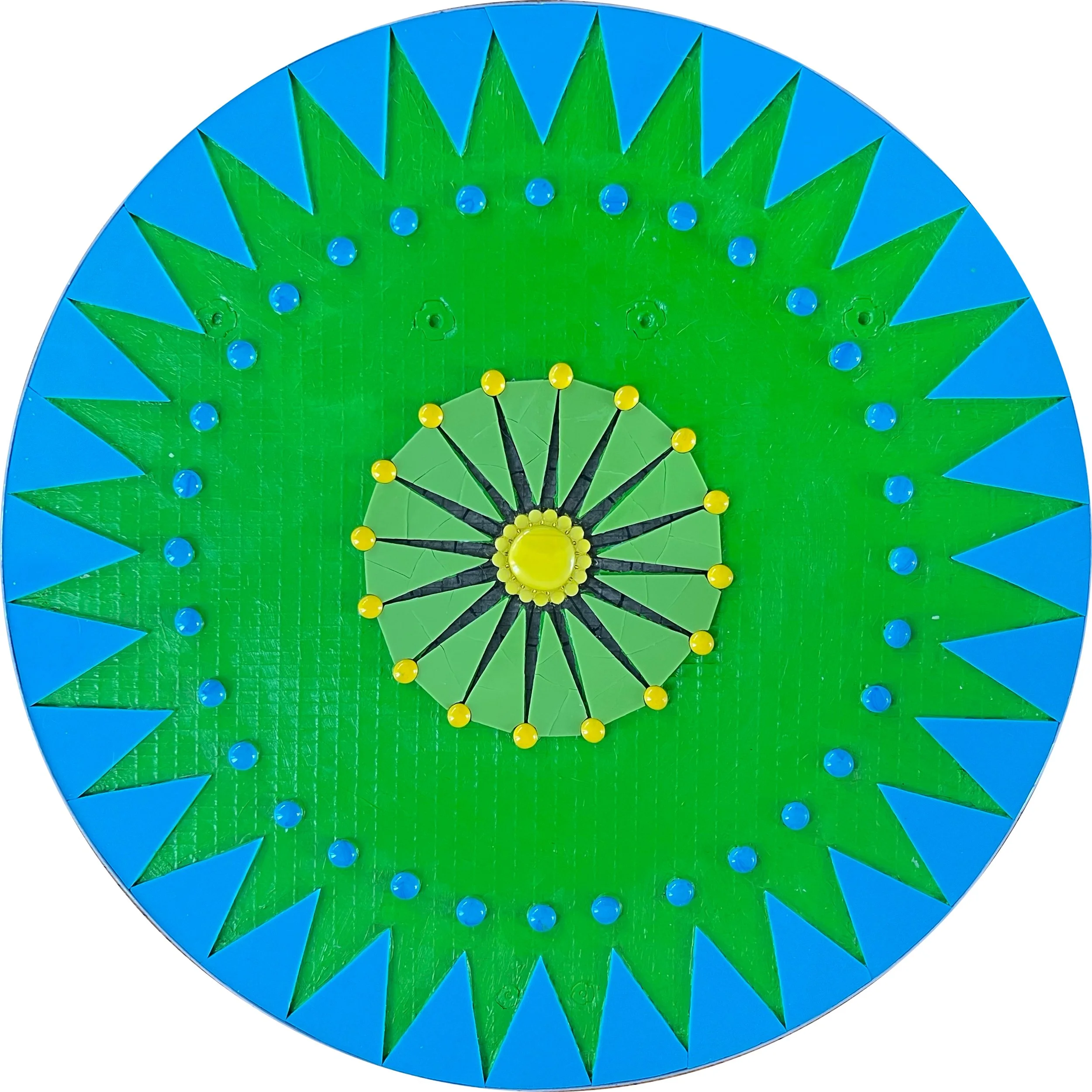
For the first panel of each season I began by drawing diameter lines at every angle needed, followed by concentric circles. These guidelines keep the geometric design accurate while I'm focused in on the small details. You can see them more clearly in the photos of the later geometric panels below.

I painted the substrate background before laying any glass, which might seem like an unnecessary step but makes a significant difference in the final result. Even opaque stained glass has some level of translucency, and without a painted background the dark grey of the Wedi board and my pencil guidelines would show through and shift the color of the glass. On the yellow panels especially, the lines were completely visible through the glass before painting.

The grout choice added another consideration. I used Starlike Evo Epoxy Grout, which has a beautiful glassy, reflective finish, but that reflectivity also picks up the color of whatever is beneath it. Left unpainted, the grey substrate would have made the grout appear darker and murkier than the clean, luminous effect I was going for.

The final panels of each season are similar in structure to the first, but smaller at 12" in diameter and considerably more intricate, featuring detailed beadwork throughout. Since I was using Apoxie Sculpt as the adhesive for the beads rather than mortar, I didn't need to paint the full background, though I did paint under the edges of the yellow stained glass where translucency would have been an issue.

As with the opening panels, I laid out the geometric elements in stained glass and gems first, then added the beads. To prevent the smaller central elements from shifting before they could set, I started by placing the thin pinwheels of glass radiating out from the center, then filled in the smaller bead designs once the pinwheels had dried and stabilized.

The beaded sections would not be grouted. Grout would obscure the delicate detail and fill the spaces between beads in a way that would diminish rather than enhance the design. Instead I used Apoxie Sculpt in various colors, sometimes mixing colors together or adding powder pigments to achieve exactly the effect I was looking for.

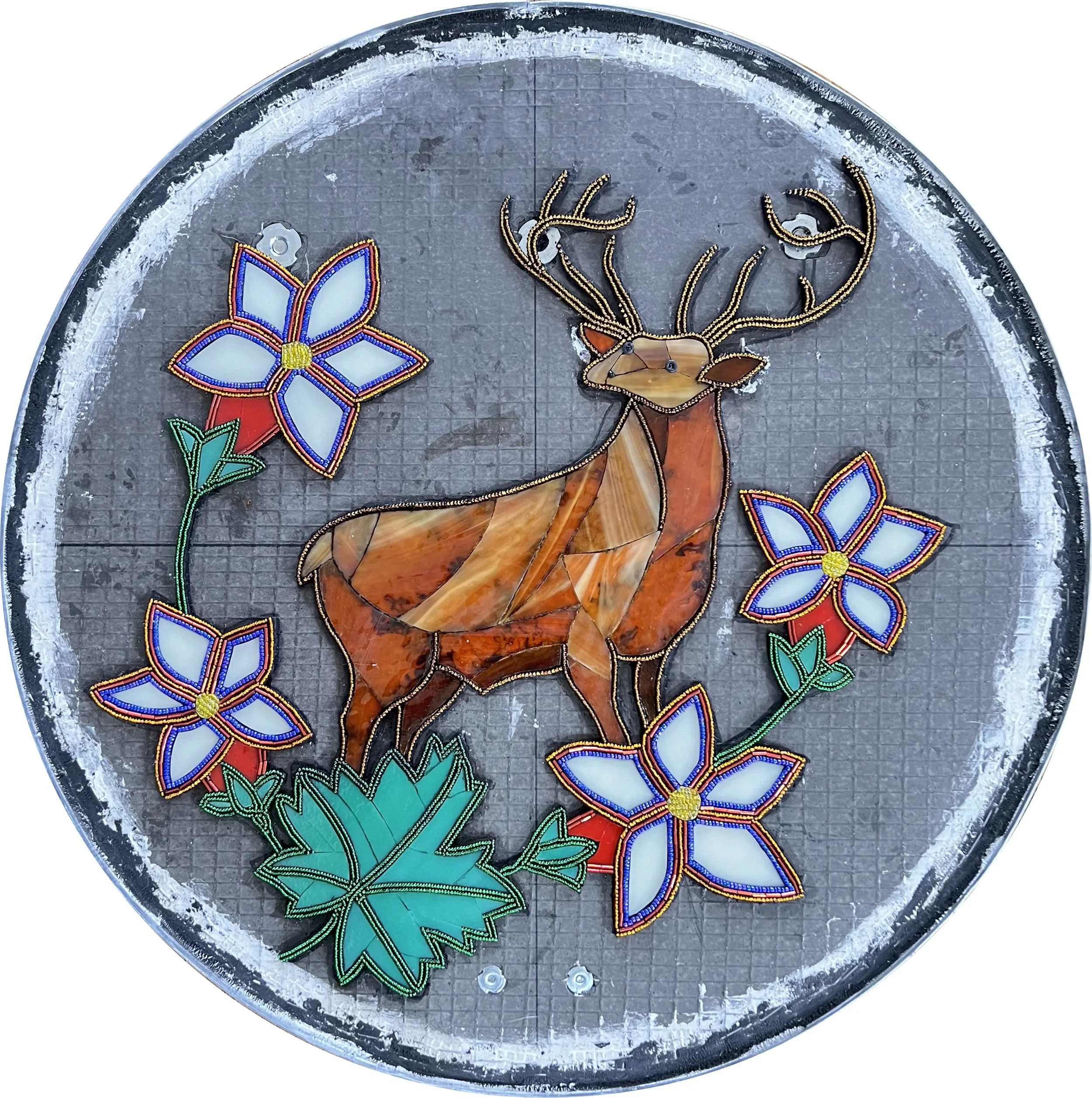
The second 20" panel of each season was inspired by Ida Nason Aronica's beadwork collection. Rather than simply replicating her beautiful designs, I wanted to interpret them using a combination of beads and stained glass to bring something of my own medium to the tribute.

These were by far the most difficult panels to create. The process required building tiny walls of Apoxie Sculpt and beads, most of which used 15/0 seed beads, the smallest size available. The challenge was relentless: there was a very small window between the clay being firm enough to hold the bead walls upright and becoming too firm to accept the beads securely. Too soon and everything collapsed. Too late and nothing would set. I repeated this process hundreds of times across the four panels.

It was painstaking work, but I never regretted taking the time to do it this way. The results exceeded my expectations, and I hope they honor Ida Nason Aronica's extraordinary beadwork in a way that would make her family proud.

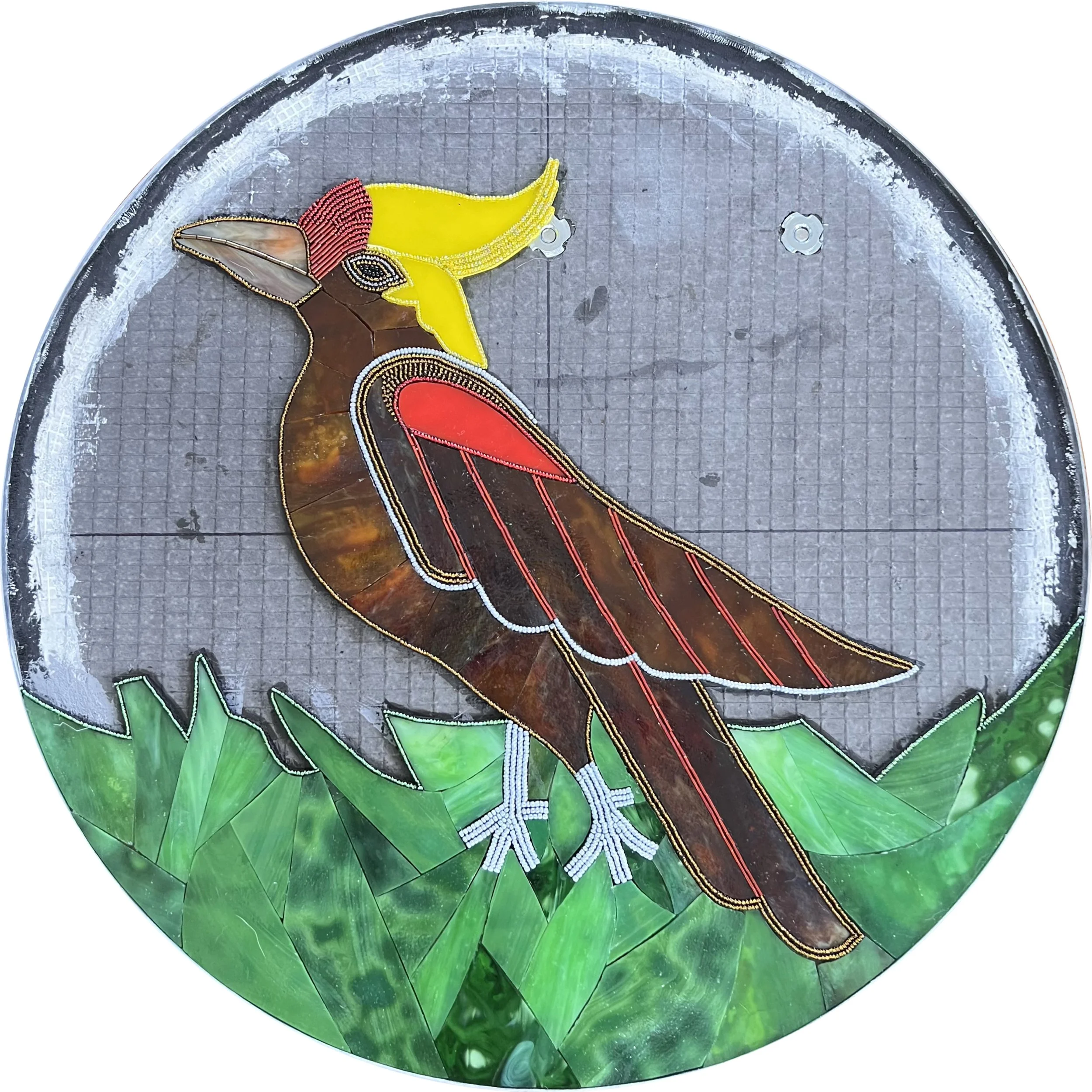
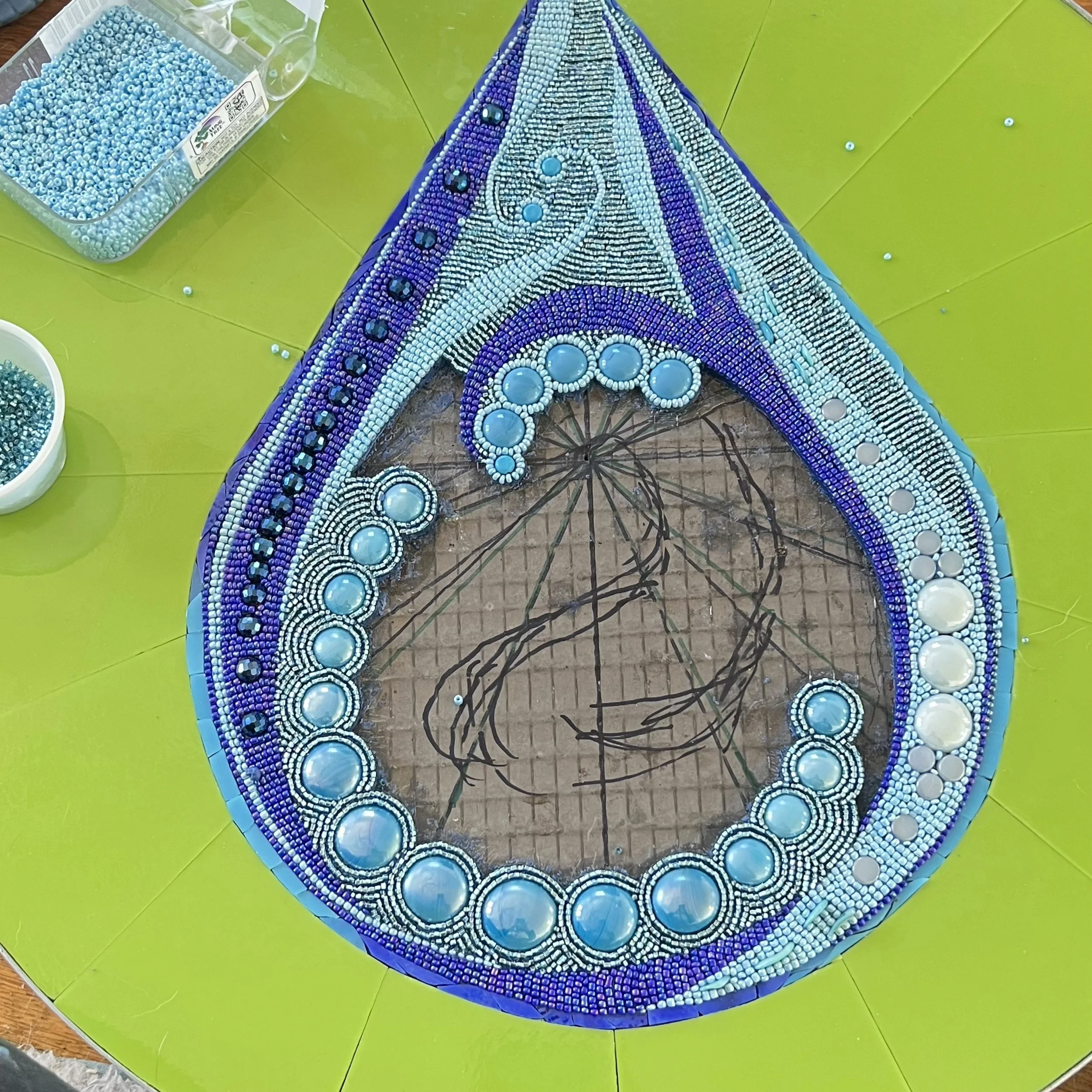
The center panels of each season are 18" in diameter, each featuring a simple symbol of its season made elegant and dynamic through intricate beadwork. As with the beadwork panels, I applied the stained glass shapes first to establish the composition, then built up the beadwork around and within them.

These panels demanded the same painstaking patience as the others, but the results made every tedious hour worthwhile. The fall leaf panel in particular turned out beyond what I had imagined, and remains one of my personal favorites in the entire collection.

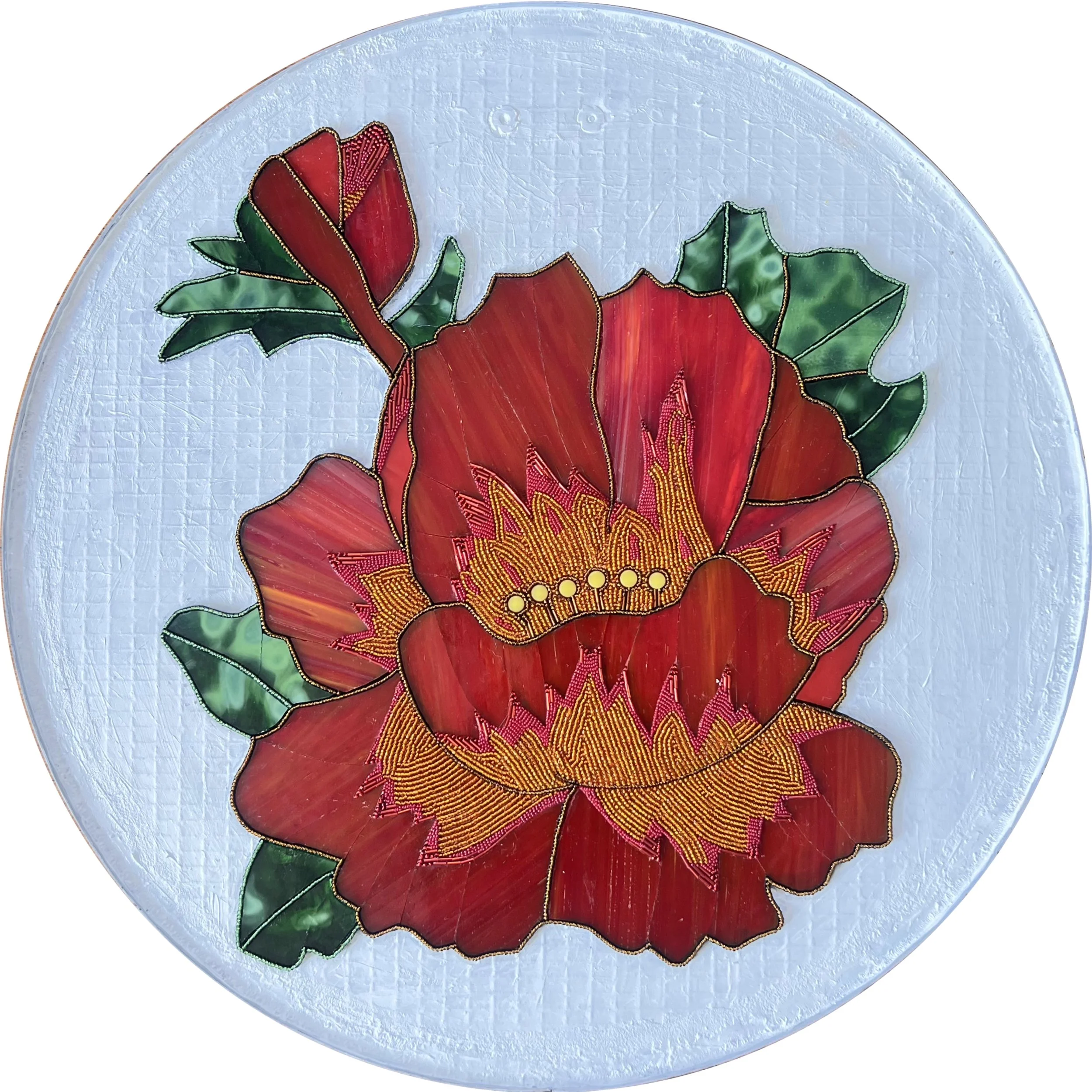
The fourth panel of each season depicts a flower representing an important food source for local Native American tribes, at 15" in diameter. I found ways to incorporate beaded details into each one, both because the beads add a liveliness and sparkle that I love, and because maintaining that beadwork thread throughout all 20 panels ties the entire collection together visually.

This project genuinely changed the way I think about my work. I loved the way the beads added energy and dimension to the floral designs so much that I expect beads will find their way into every floral mosaic I make from now on.

To complete the mosaics, I grouted all the stained glass sections with Starlike Evo Epoxy Grout. Its smooth, glassy, reflective finish was a deliberate choice: I wanted the grout lines to recede quietly into the background rather than compete with the beadwork and glass for attention. As you can see in the photos, the grouted panels have a much softer, more unified appearance that draws the eye directly to the subject of each piece.

Of course, the background glass itself received just as much care. I took considerable time cutting the background of each piece into patterns that flow well and remain consistent across each panel type, because even the supporting elements contribute to the overall cohesion of the collection.

You can view all the completed panels in detail here.

Shipping

With all 20 panels completed, grouted, and polished, it was time to pack them up and ship them to Washington. I gave myself a few days before packing so family and friends could come see them first. After more than a year of work, this was the only chance anyone I knew would ever have to see all 20 pieces together in person.

Arranging the shipping took some coordination. The school was closed for spring break, but the principal was wonderfully kind and communicative, arranging to receive the delivery at her home on a specific date. The packed panels filled several large boxes, and I was genuinely grateful she was willing to accommodate such a cumbersome delivery.

Then came the moment that nearly stopped my heart. I was already booked on a flight to Washington. The installation, student projects, and dedication ceremony were all scheduled. I dropped the boxes at FedEx, drove home, sat down, and breathed a long sigh of relief. Then an email arrived informing me the packages were en route to a random address in Georgia.

I checked the labels I had printed. They were correct. I called FedEx, shaking, and kept being told it was a computer glitch and everything was fine. Something about their responses did not reassure me at all. So I drove back to the FedEx location where I had dropped them off.

The woman who had helped me originally was still there, and she was a lifesaver. She knew something was wrong, made a series of calls, and discovered the boxes had not yet left the building. She arranged for me to load them back into my car and drive them directly to the main FedEx hub at the airport, where a staff member would personally take them from my car and ensure they were on the correct vehicle that afternoon. He even texted me later to confirm they were on their way to the right destination.

I still checked the tracking every couple of hours for the next few days. But they arrived exactly on time, exactly where they were supposed to be. I have never been so relieved in my life.

Installation

Nearly two years after the initial site visit, it was finally time to return to Ellensburg for the installation. I was nervous, excited, and ready.

ArtsWA asked me to arrive Saturday evening rather than Sunday, even though I wouldn't have access to the school until Monday. The reasoning was practical: if anything went wrong with the flight or the notoriously tricky mountain pass from Seattle, there would still be time to sort it out. As it turned out, the early arrival was a gift. I spent Sunday exploring the trails winding through the gorgeous landscape surrounding Ellensburg.

I had my heart set on visiting Mount Rainier, mostly because I envision it as a volcano that continuously spurts out Rainier cherries. Unfortunately the only route that wouldn't require a seven-hour round trip was temporarily closed. I was more than consoled by discovering the Umtanum Creek Falls Trail instead. No volcanoes, but an absolutely stunning waterfall.

Video of Umtanum Creek Falls on the Umtanum Creek Falls Trail near Ellensburg, Washington, visited during the Cycles public art mosaic installation trip

Finding the waterfall turned out to be an adventure in itself. The snow had just melted and the trail was barely visible. I had no cell reception, but thankfully had taken a screenshot of the trail map before leaving. At some point I wandered so far off the path that I had to climb a large hill just to get a vantage point and figure out where I was. I stood there for nearly 20 minutes studying the map and the landscape, trying to reconcile the two. The breakthrough came when I finally accepted how far off course I actually was. Once I let go of my mental image of where I thought I should be, the landscape suddenly matched the map perfectly. I could have turned back and found my way to the car. But I really wanted to find that waterfall.

This was like 5 minutes in. I looked like a mud monster when I left!

I can’t believe I actually made it across this “bridge”.

I fit in a couple more easy hikes that afternoon, but the waterfall was the highlight of the day. I realize I'm including a lot of nature photos in what is meant to be a mosaic installation post, but hiking in the Ellensburg area is simply extraordinary. Beyond the beauty, there was something deeply meaningful about walking this landscape while thinking about the project. This is the ancestral land of the Yakama people, and while I was out on those trails I kept thinking about how remarkable it would have been to live on this land hundreds of years ago, and how that history runs through every panel I had just spent almost two years creating. Back to the installation!
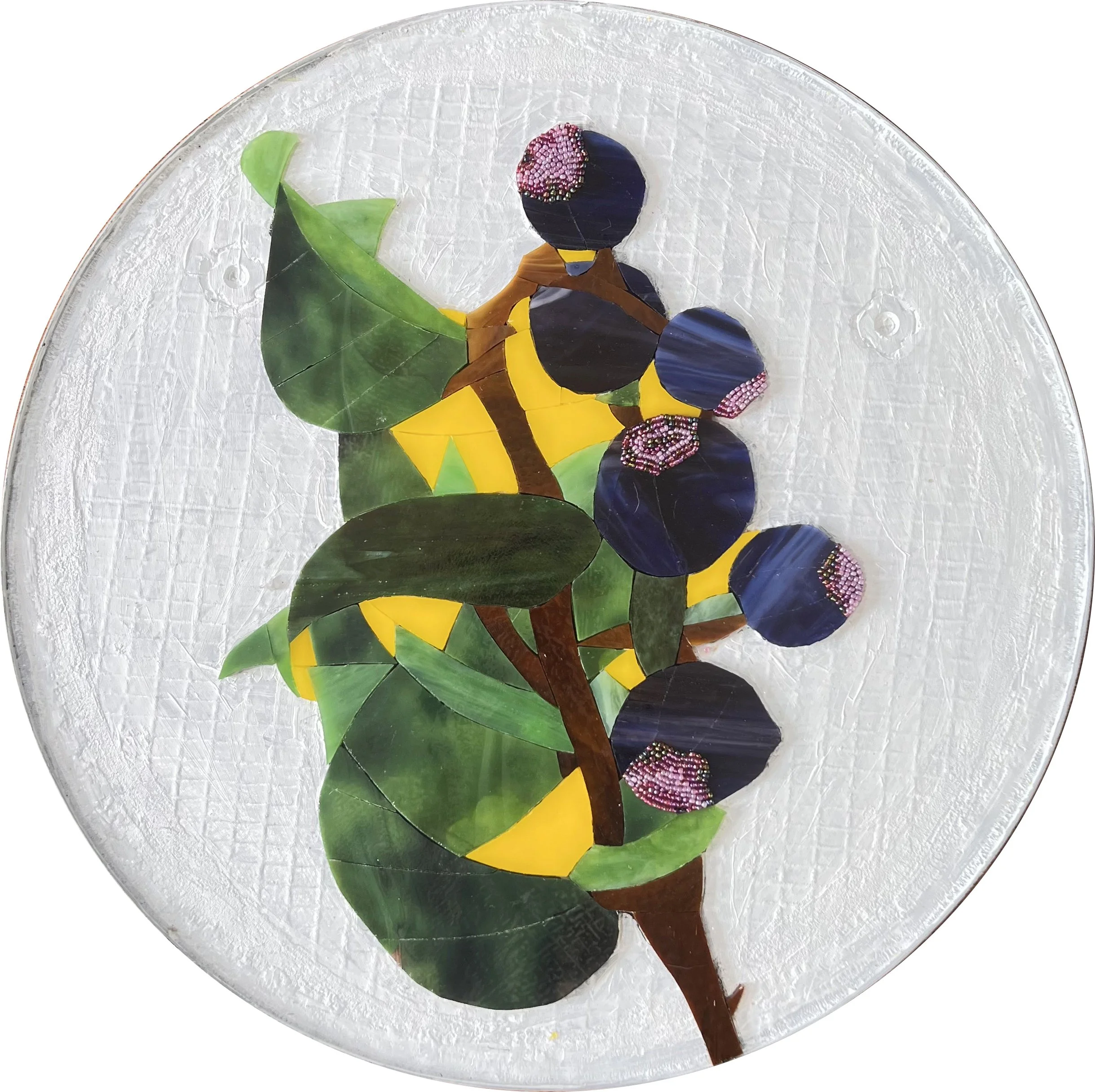
The next morning I met the principal well before dawn and we carried the packages of mosaics into the school together. I knew time would be short, so I had prepared obsessively. I created this detailed layout of all 20 panels and studied it so many times I could picture it with my eyes closed. The custodian generously provided a ladder, tape measure, and level, and I got straight to work marking every screw position for every French cleat with painter's tape.

Hanging the first mosaic panel.

Inspecting to make sure the security hanger is correctly in place.

Installing the fall leaf mosaic panel.

Making sure the French cleat is level.

As an artist working on state property, I wasn't legally permitted to drill into the walls myself. The principal had anticipated this and arranged for the head custodian of the district to come and handle the drilling and hanging of the French cleats. He was incredibly generous with his time, making sure every cleat was secure and positioned correctly. He was even gracious about it when I decided midway through that I wanted one of the panels shifted slightly from its planned position. When you've spent over a year creating something, getting the placement exactly right matters.

The head custodian for the district using the wrench-like key to lock the security hanger onto the wall.

We finished the installation by early afternoon, which gave me just enough time to change clothes and prepare for the end-of-day school assembly. I would be speaking to the students about the artwork, sharing a little history of mosaics, and giving them a preview of the hands-on project they would get to make the following day. After nearly two years of working on this project largely in solitude, I was about to meet the kids it was made for.

Cycles, a public art commission for the Washington State Arts Commission in partnership with Ellensburg School District. Complete and installed!
Student Participation

As part of this commission, involving the students in the artwork was always part of the vision. My original plan was to have each student create a small mosaic disk using glass gems, which would then be installed collectively on the wall opposite the Cycles mosaic. The idea was to install everything in the fall so the students could see their own work displayed throughout the school year, then take their individual pieces home at the end of the year.

The timeline shifted and the installation ended up happening at the end of the school year instead. On top of that, the specific glass gems I had planned to use have become increasingly difficult to source over the past couple of years. With both the timeline and materials changed, the student project needed a fresh approach.

Mockup of Original Kids Artwork Concept

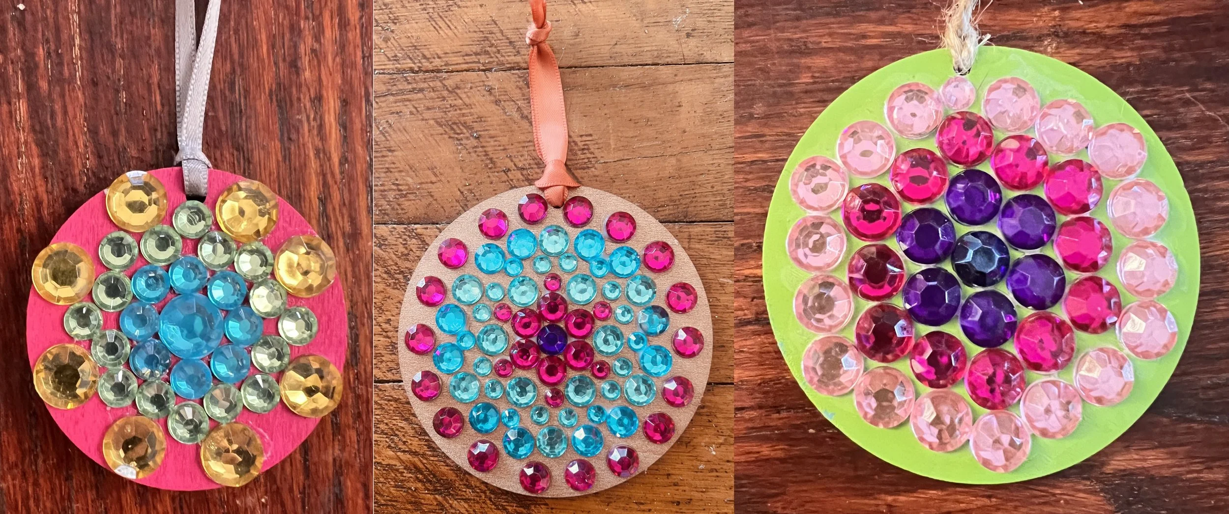
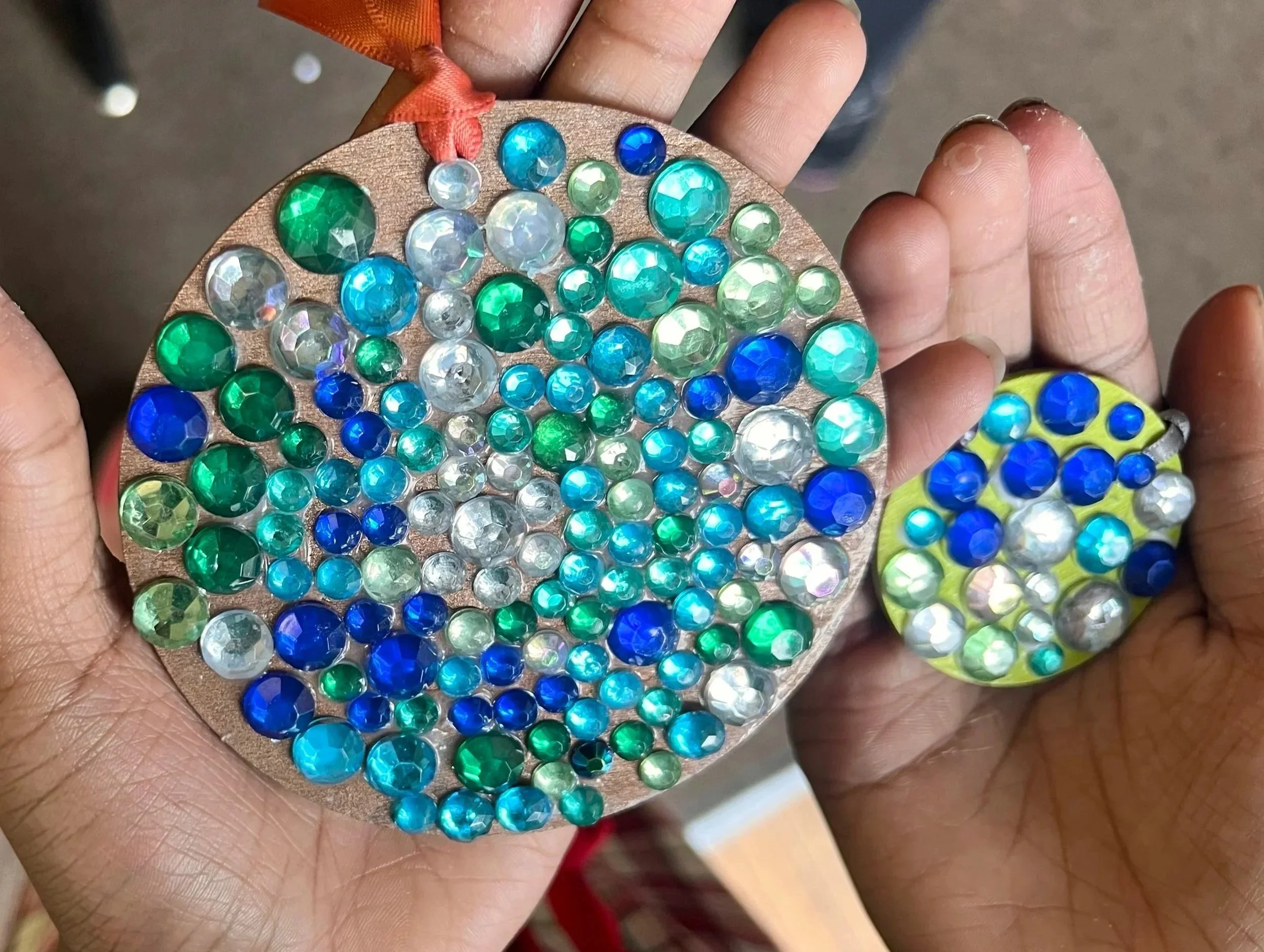
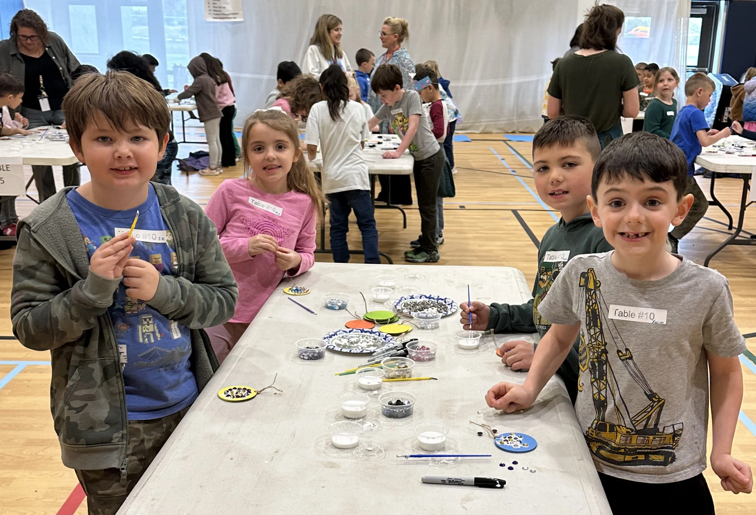
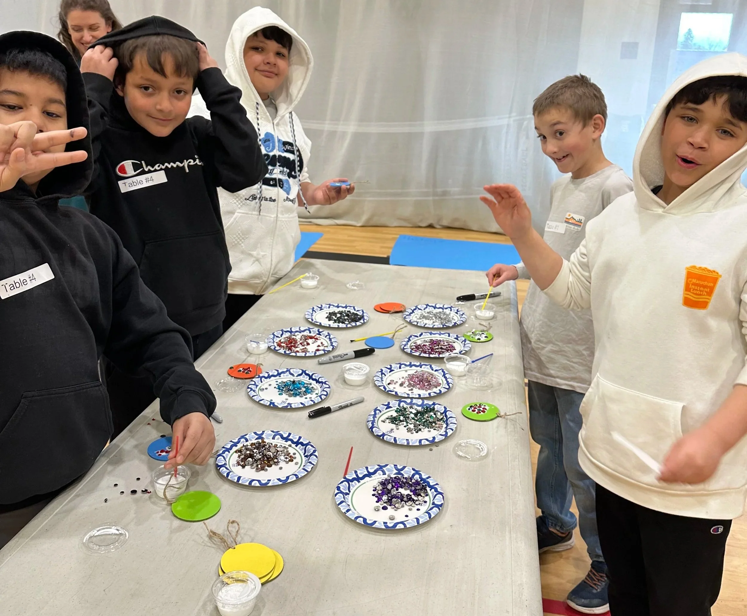
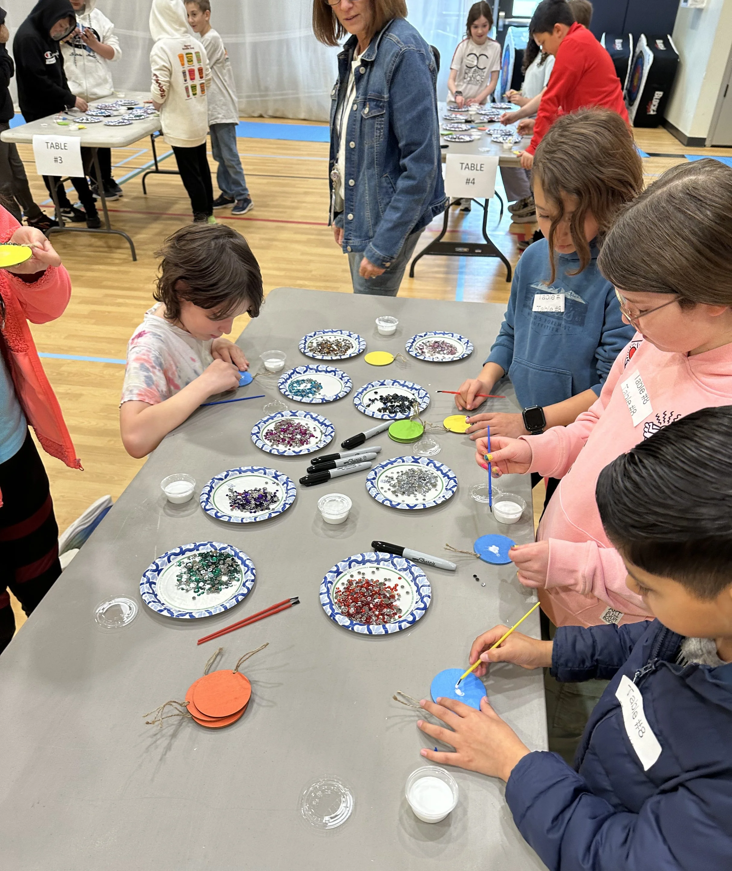
Instead I decided to have the students make mosaic gem medallions they could take home that same day as a keepsake. We worked with students throughout the entire school day, approximately 350 kids in total, cycling through group after group from morning until the final bell.

The librarian and art instructor of the school was the unsung hero of the day. Her organization and preparation made the whole thing run seamlessly, and I genuinely could not have managed it without her. By the end of the day I was completely exhausted, but the joy in the room made every moment worth it. The kids had a wonderful time and their medallions were absolutely adorable.
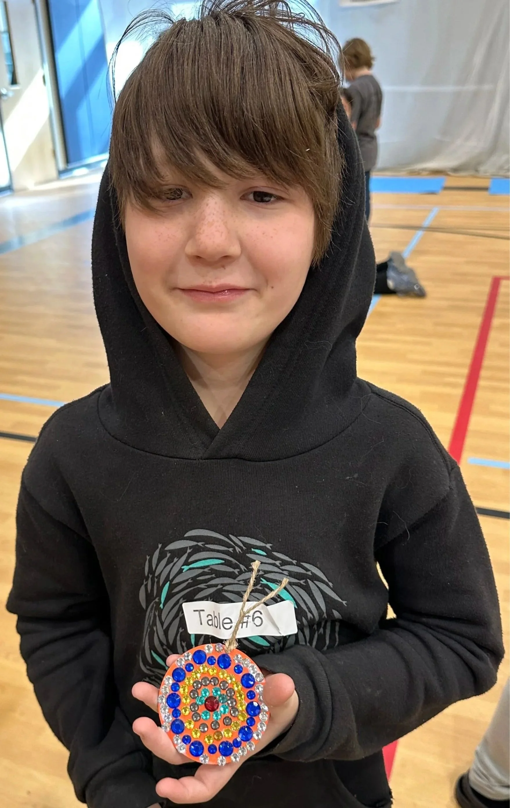
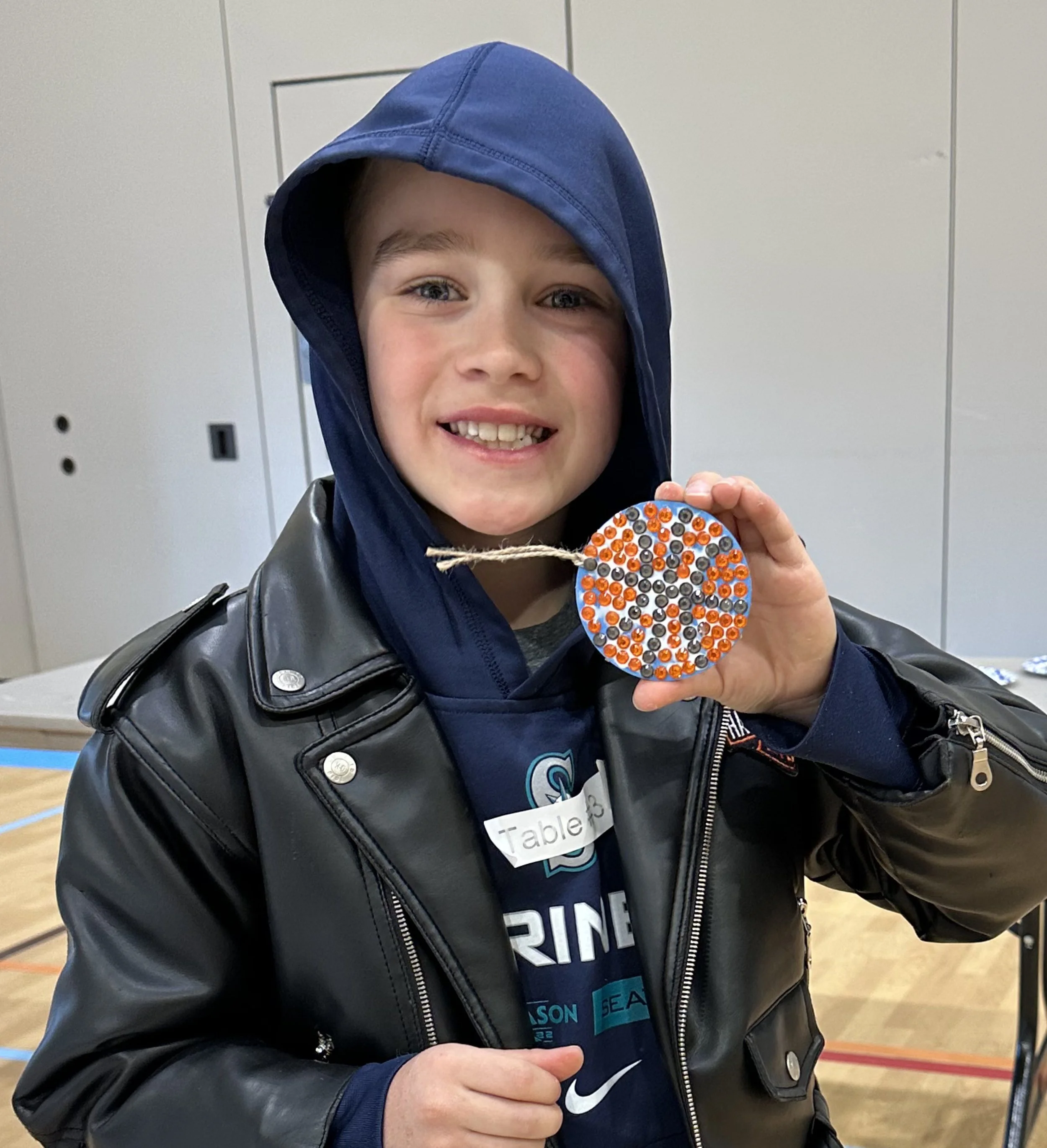
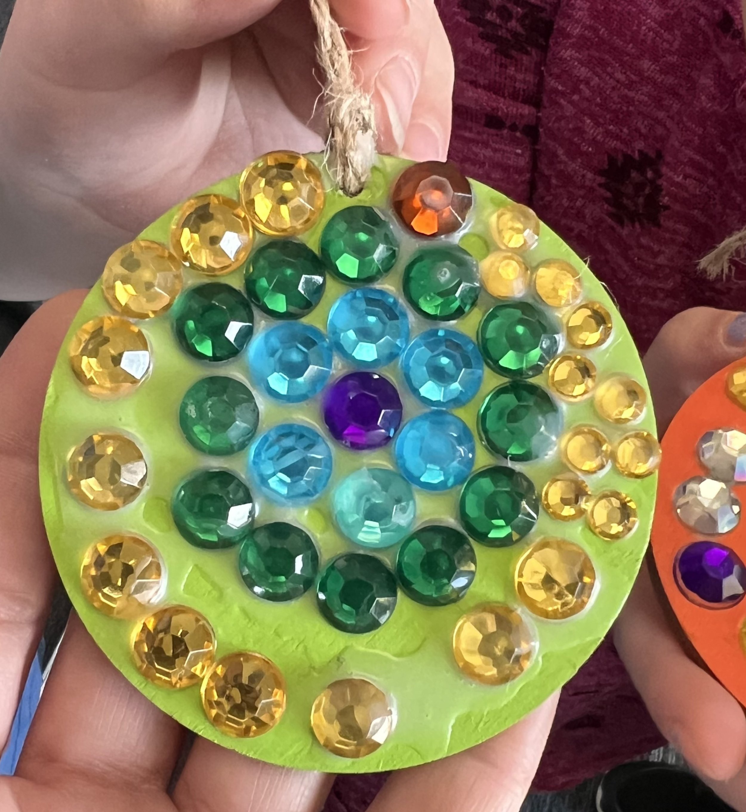
Three examples of gem mosaic medallions made by students at Ida Nason Aronica Elementary School as part of the Cycles public art commission by Dyanne Williams
Child's hands holding two completed gem mosaic medallions made during the Cycles public art commission student participation project at Ida Nason Aronica Elementary School
Children's hands holding two completed gem mosaic medallions made during the Cycles public art commission student participation project at Ida Nason Aronica Elementary School
Students creating a gem mosaic medallion during the Cycles public art commission participation project at Ida Nason Aronica Elementary School in Ellensburg, Washington
Student proudly displaying his completed gem mosaic medallion from the Cycles public art commission participation project at Ida Nason Aronica Elementary School in Ellensburg, Washington
Student proudly displaying his completed basketball gem mosaic medallion from the Cycles public art commission participation project at Ida Nason Aronica Elementary School in Ellensburg, Washington

Dedication

The dedication ceremony took place on my final day in Ellensburg. Photography wasn't permitted during the ceremony itself, but the gathering was deeply meaningful. The family of Ida Nason Aronica, the director of the K'tɨ́taas County Historical Museum who had guided me so generously through the cultural research, and the former principal who had championed the project from the very beginning were all there. I had to speak, which always makes me nervous, and honestly the ceremony passed in a bit of a happy blur. But it was a beautiful moment.

As if the entire experience hadn't already exceeded every expectation, one of Ida's family members honored me with a gift I will treasure always: a gorgeous hand beaded tribal medallion incorporating a rare Ellensburg Blue agate. After spending two years trying to pay tribute to Ida Nason Aronica's extraordinary beadwork through my own medium, receiving a piece of that tradition as a gift felt like the most meaningful possible ending to this journey.

A hand-beaded tribal medallion incorporating a rare Ellensburg Blue agate, a gift from a member of Ida Nason Aronica's family.

This project holds a special place in my heart for many reasons, but perhaps the most personal is the name. Cycles was also the title of my very first glass mosaic, made in Los Angeles over twenty years ago when I was just beginning to find my voice as an artist. It felt meaningful to give that same name to this commission, a public artwork that required every skill and every lesson I had accumulated over my career. In many ways, this piece represents the completion of a long arc and the beginning of a new one.

This project changed me as an artist in ways I'm still discovering. The process that ArtsWA has developed for guiding artists through a public art commission is extraordinary, and I feel genuinely prepared and excited to take on more public art projects. If you are involved in a public art commission and are looking for a mosaic artist, I would love to hear from you. You can reach me through my contact page.