Creating Cycles, an ArtsWA Public Art Commission

Creating this mosaic for Ida Nason Aronica Elementary School in Ellensburg, WA was a milestone. It was my first public art commission, made possible through the Washington State Arts Commission in partnership with Ellensburg School District. ArtsWA has a remarkable process that guides artists through every step of a public art project, and working within that framework taught me things I could never have learned any other way. I'm now excited and prepared to take on more public art commissions! I get a lot of questions about this project, so I wanted to share the full story from design and mosaic techniques to my personal experience along the way.

Video of Cycles, a 20-panel glass mosaic public art installation by Dyanne Williams at Ida Nason Aronica Elementary School in Ellensburg, Washington. A public art commission for the Washington State Arts Commission in partnership with Ellensburg School District.

The Beginning

Several years ago, around 2019, I applied to become an pre-approved artist for ArtsWA, the Washington State Arts Commission, and was accepted. One spring day in 2023 I got a phone call asking me if I’m available to create an art commission for Ida Nason Aronica Elementary School. I was so excited! There were contracts to sign and handbooks to read, but the big first step was to go to Ellensburg, WA for a site visit. The site is a school, so I needed to go before the end of their school year, so I found time to squeeze in the visit a couple of weeks later. Because I was in the middle of projects as a teaching artist, I was only able to be in Ellensburg for 25 hours, but I found time between meetings to go for a hike in the gorgeous mountains surrounding the valley.

Panoramic mountain view from Rattlesnake Dance Ridge Trail in Ellensburg, Washington, near the site of the Cycles public art mosaic installation.

My first meeting was with the director of the K'tɨ́taas County Historical Museum in downtown Ellensburg. She was also the curator for the Aronica family, whose relative, Yakama Nation artist and elder Ida Nason Aronica, the school and this artwork were created to honor, and whose family would need to approve the final design. The director was wonderful, educating me on local history, showing me items the museum has curated, and explaining the cultural significance of Ida's work. As soon as I saw her absolutely stunning beadwork, I knew I wanted to find a way to incorporate it into the mosaic.

Historic downtown Ellensburg, WA, near the K'tɨ́taas County Historical Museum.

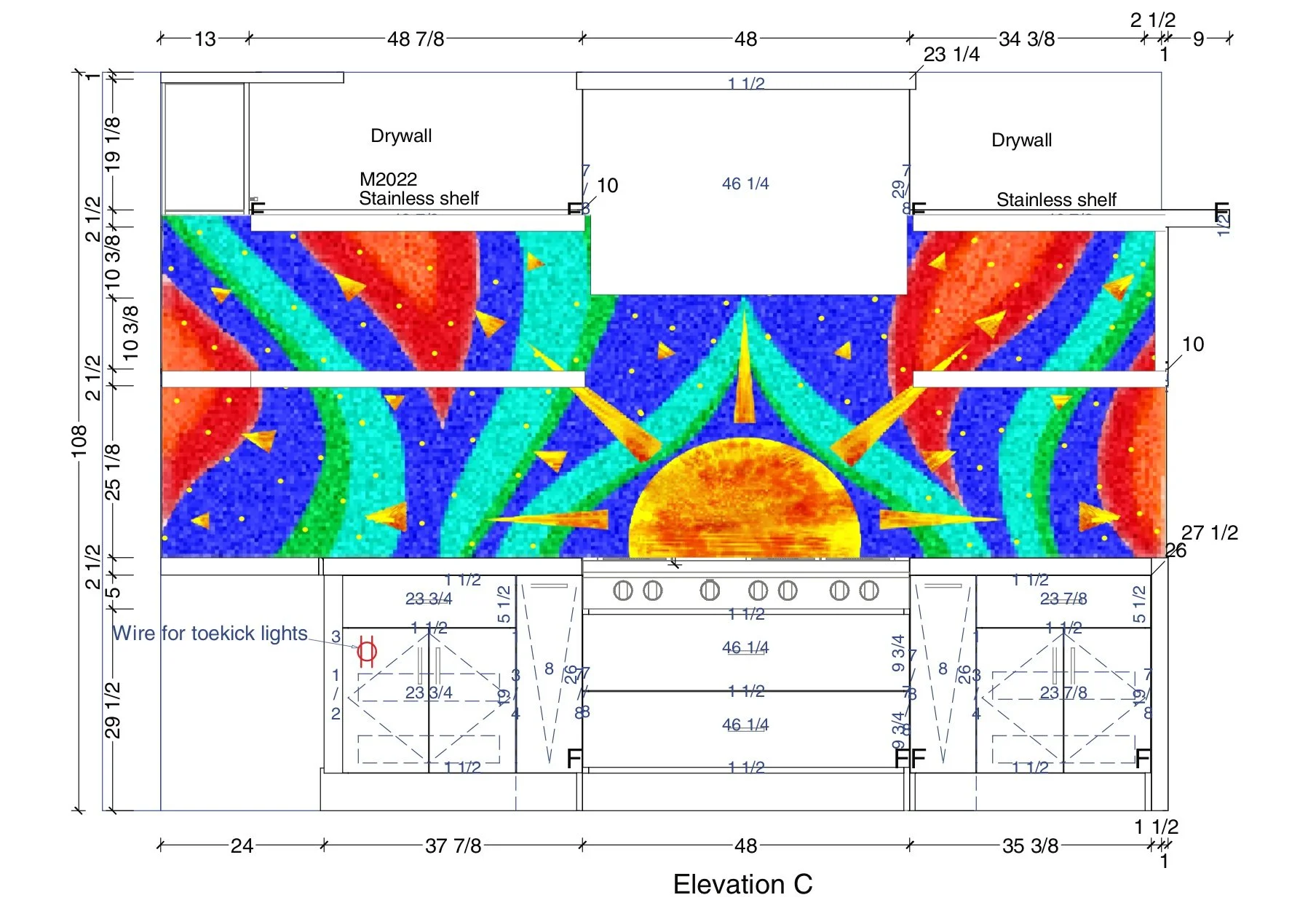
My second meeting was at Ida Nason Aronica Elementary with the arts committee. For every public art commission, ArtsWA forms a committee to approve and oversee the artwork's progress and having the building's architect on the committee was particularly valuable since the school was newly built. The school is designed as a square with a courtyard in the center where students grow local plants. Each of the four corridors surrounding the courtyard represents a season, color-coded with very specific tones: Spring Green, Summer Yellow, Fall Orange, and Winter Blue. As soon as I saw them I was thrilled to realize I already knew of a glass company that makes all four colors. It felt like a sign the project and I were a good fit.

Ida Nason Aronica Elementary Color Banner

Design

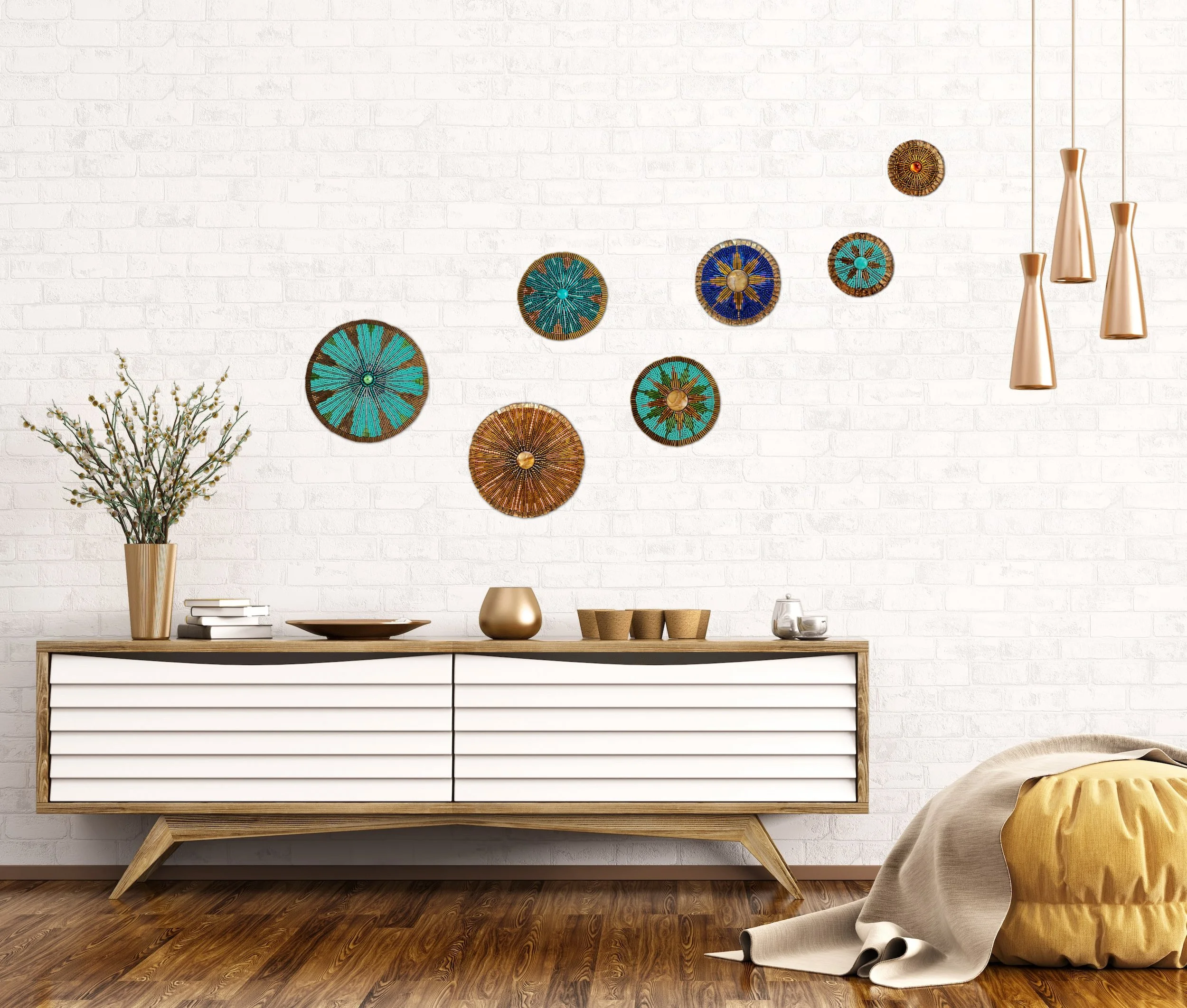
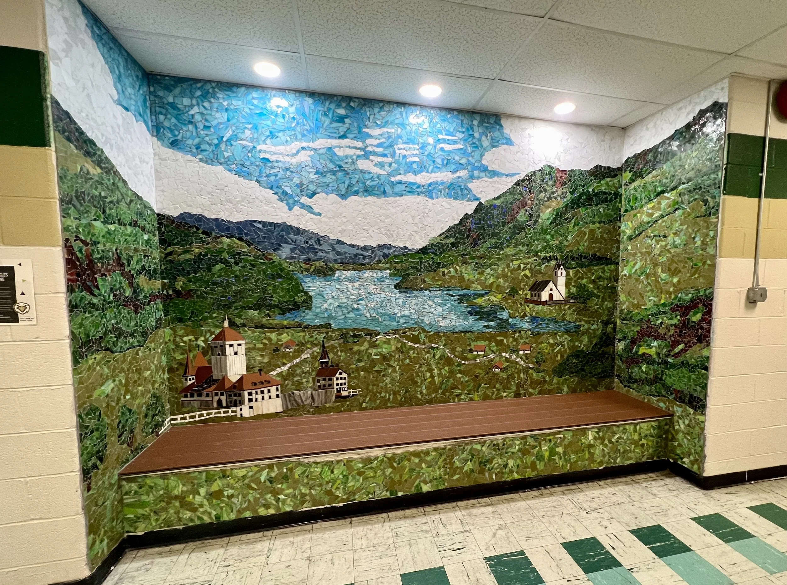
Back in my studio, the site visit had left me buzzing with ideas. One key requirement for ArtsWA public art projects in schools is that the work must be relocatable, designed with a lifespan of at least 30 years, and able to be moved if the school changes grades or purposes. Since I usually create architectural installations applied directly to a building, I needed to channel my ideas into something that could be hung rather than permanently fixed. Circles felt like the natural solution as I've always loved working with them and from there the concept began to take shape. Looking at the measurements of the various potential locations, I chose the long hallway leading to the gym, cafeteria, and assembly hall, where the artwork would be seen by every student every day.

Chosen Location for the Mosaic Installation

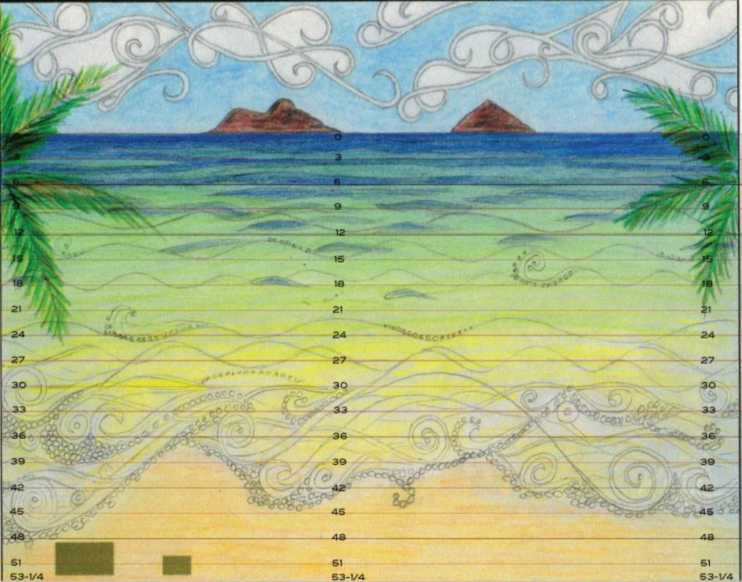
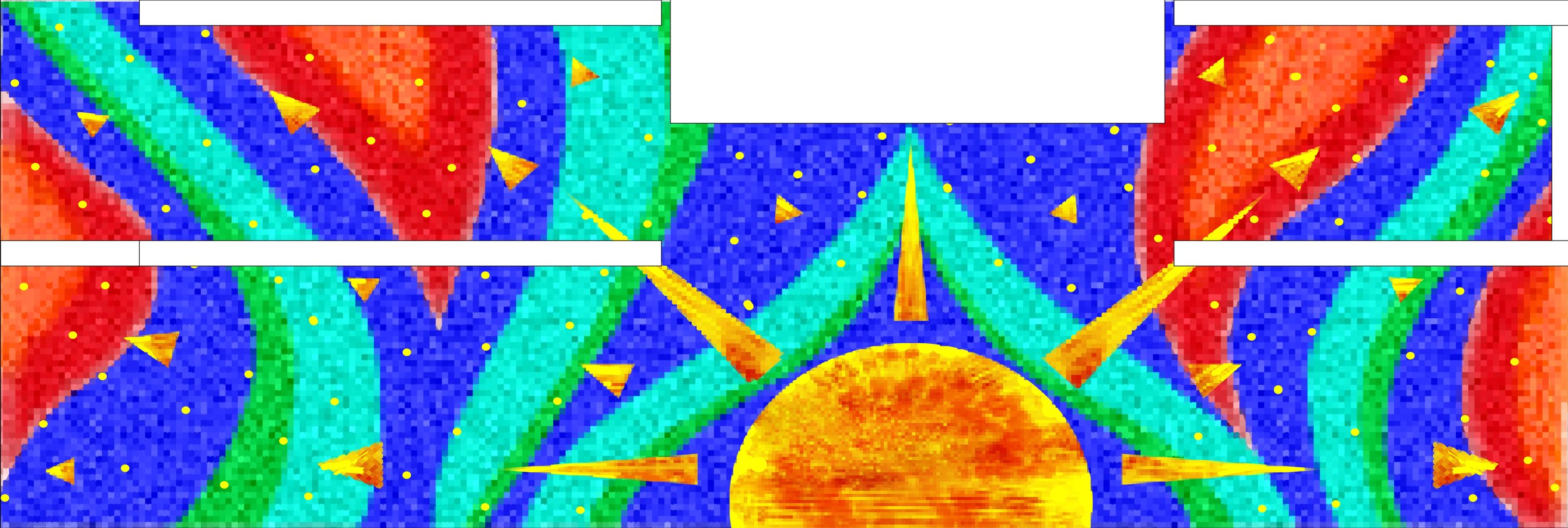
After choosing the location and shape, I divided the panels into seasonal groupings, which felt like the natural next step to reflect the school's existing motif. The architect sent exact measurements, and I settled on 5 panels per season, 20 panels total, ranging from 12" to 24" in diameter. I created my mockups in Pixelmator Pro, working through many different ideas before landing on designs that felt right.

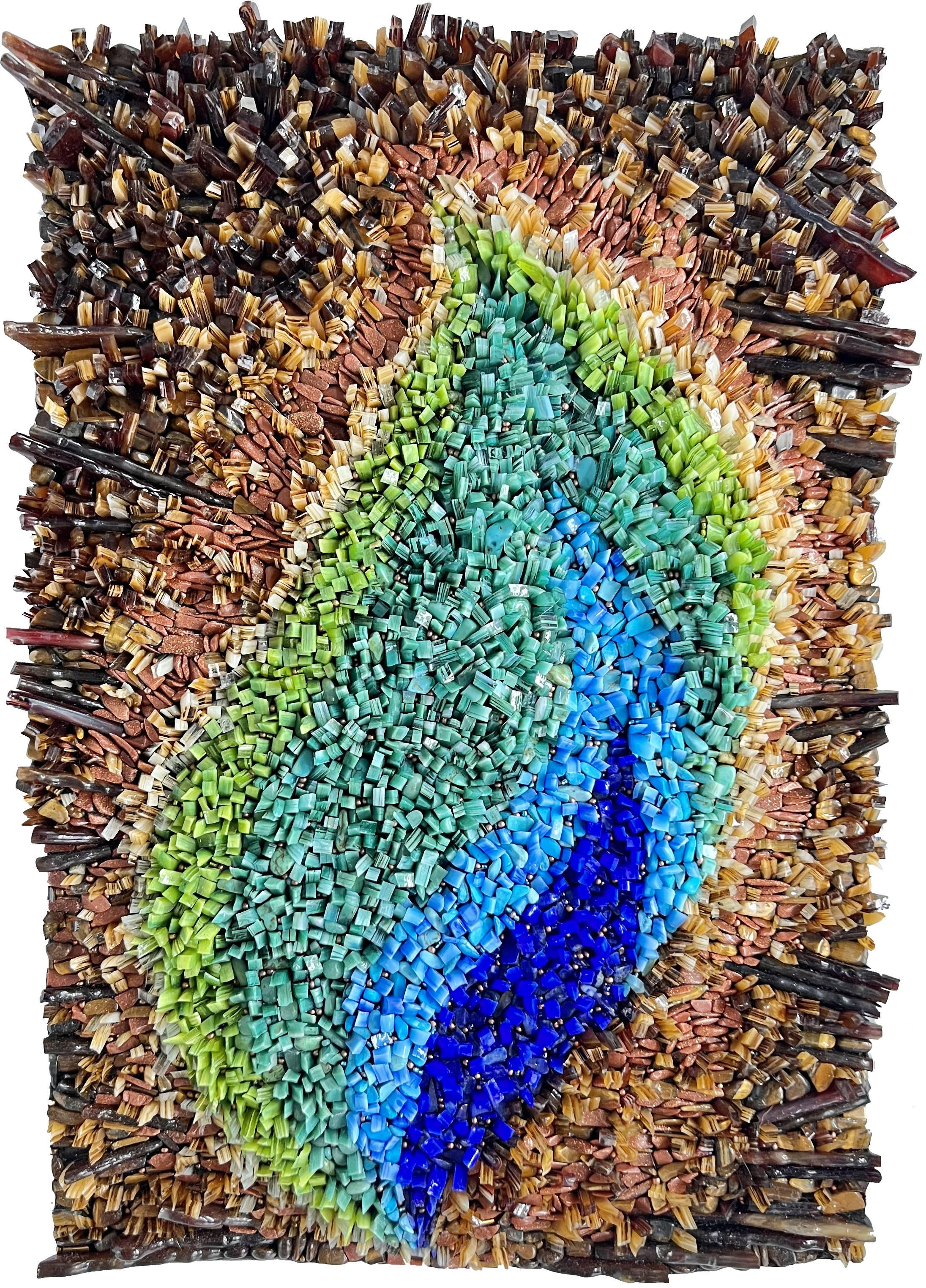
For each season, the first and last panels follow a radially symmetrical design that captures the feeling of transition. The current season's color anchors the piece, while the previous season ebbs out toward the edges and the upcoming season flows in toward the center with more ebb in the opening panel, more flow in the closing one.

Mockups of Seasonal Ebb & Flow

During my site visit I was also drawn to the beautiful woven baskets at the museum and wanted to incorporate some of those designs into the center panels. However, some patterns were of unknown origin and could be personal to specific tribes or hold cultural meanings that I wasn't in a position to fully understand or represent respectfully. It wasn't a risk worth taking. Instead, I decided the center panel of each season would feature a simple graphic representing that season, executed in intricate beaded mosaic as a heartfelt homage to Ida Nason Aronica's meticulous and stunning beadwork. It felt like the right way to honor her through the medium she mastered, interpreted through mine.

Mockup of Seasonal Graphics

The remaining two panels for each season required considerable thought and consultation to find concepts that would authentically represent both Ida Nason Aronica and local Native American cultures. Fortunately, I was permitted to photograph Ida's beadwork at the museum and given permission to use four of her designs as inspiration for the mosaics.

Attribution was handled with great care. While all four pieces were believed to be Ida's work, she was an elder who was frequently gifted beadwork, so the Aronica family wisely chose the phrasing "inspired by Ida Nason Aronica's collection" to ensure credit was never misattributed.

The one significant alteration I made was to the background colors, adjusting them to align with the school's seasonal color scheme. This required careful discussion, as colors in Native American beadwork can carry deep cultural and symbolic meaning. Since only the background colors were being changed and the designs couldn't otherwise fit the panels, everyone ultimately agreed the alteration was acceptable; a decision I didn't take lightly.

Mockup of Beadwork Panels

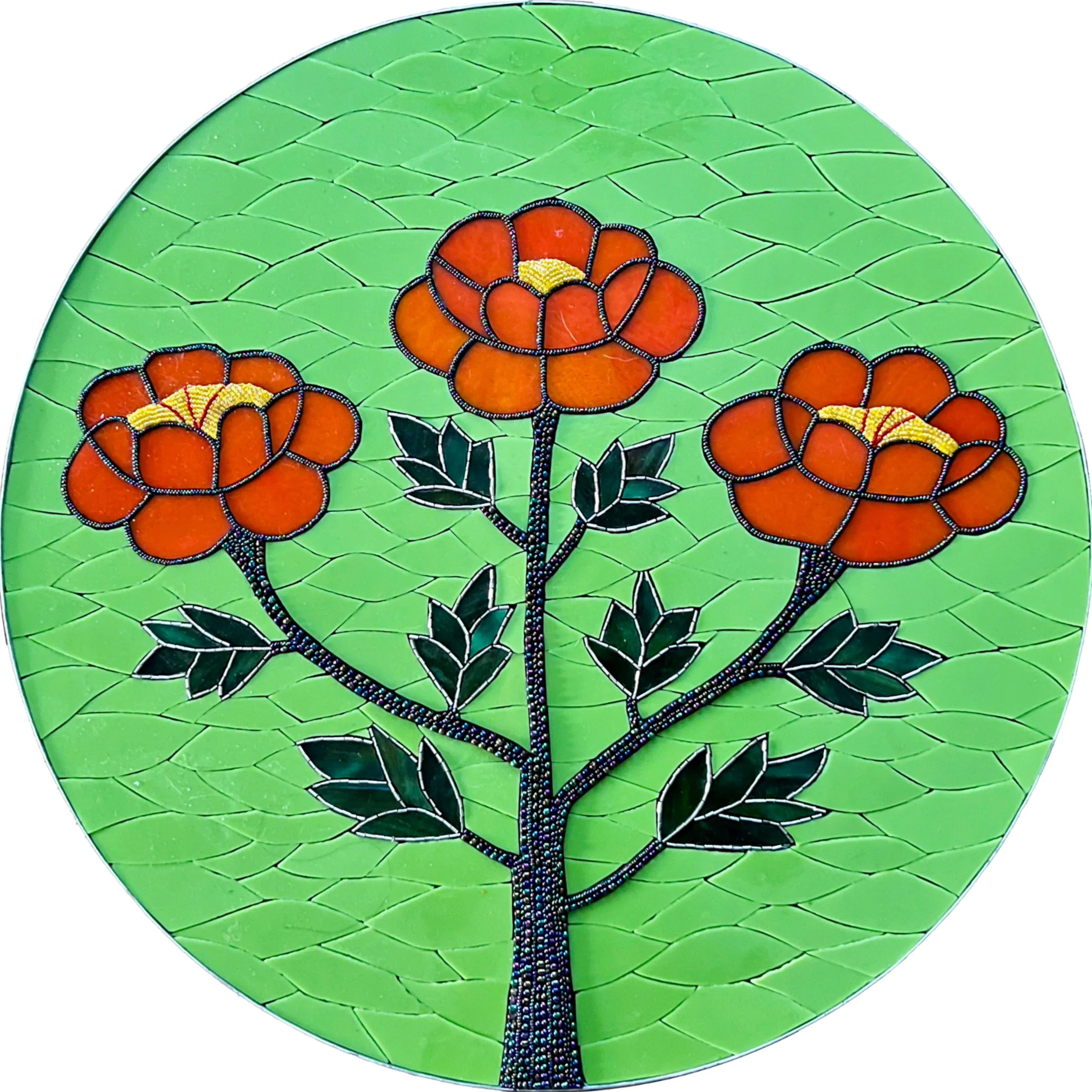
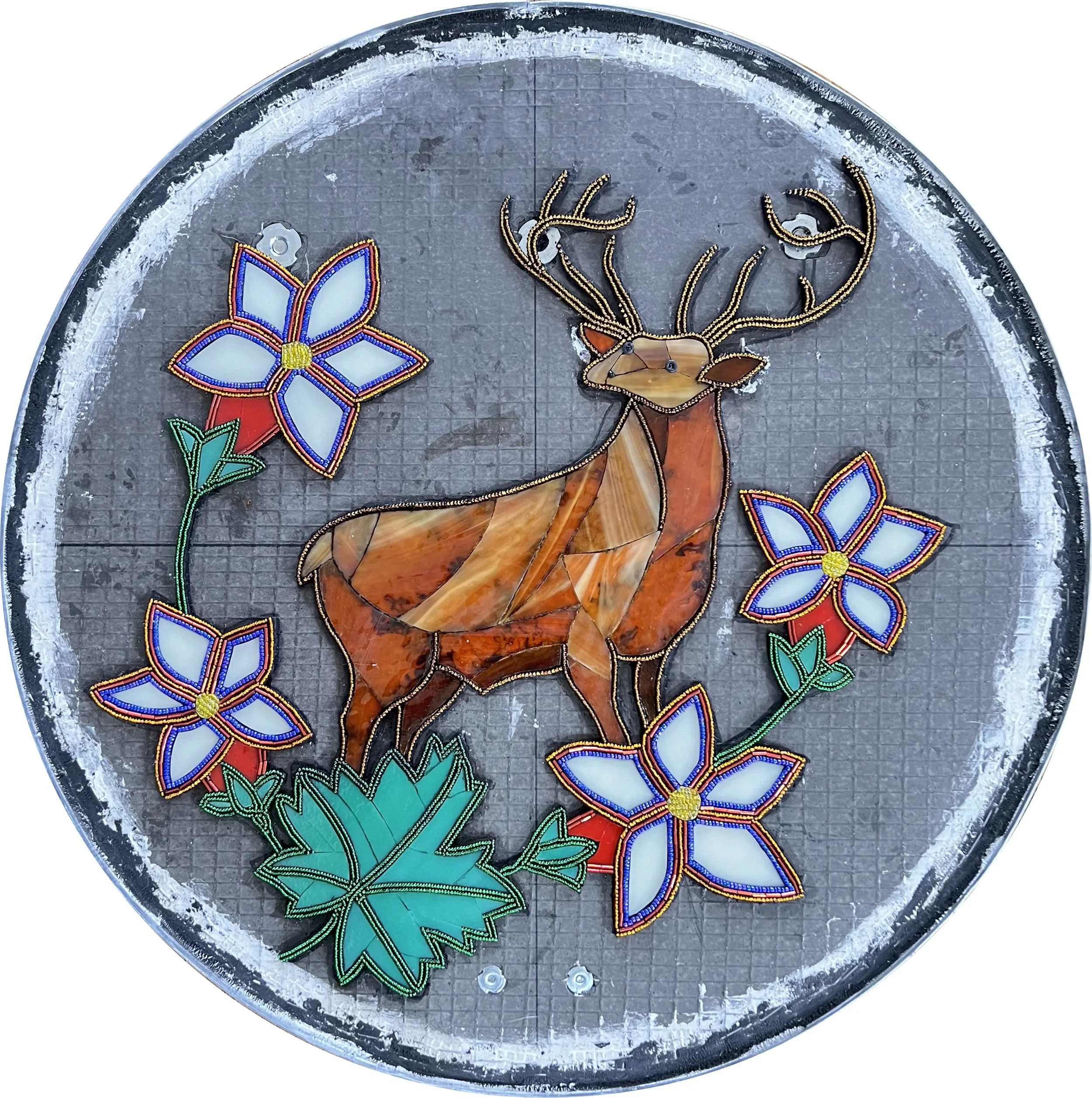
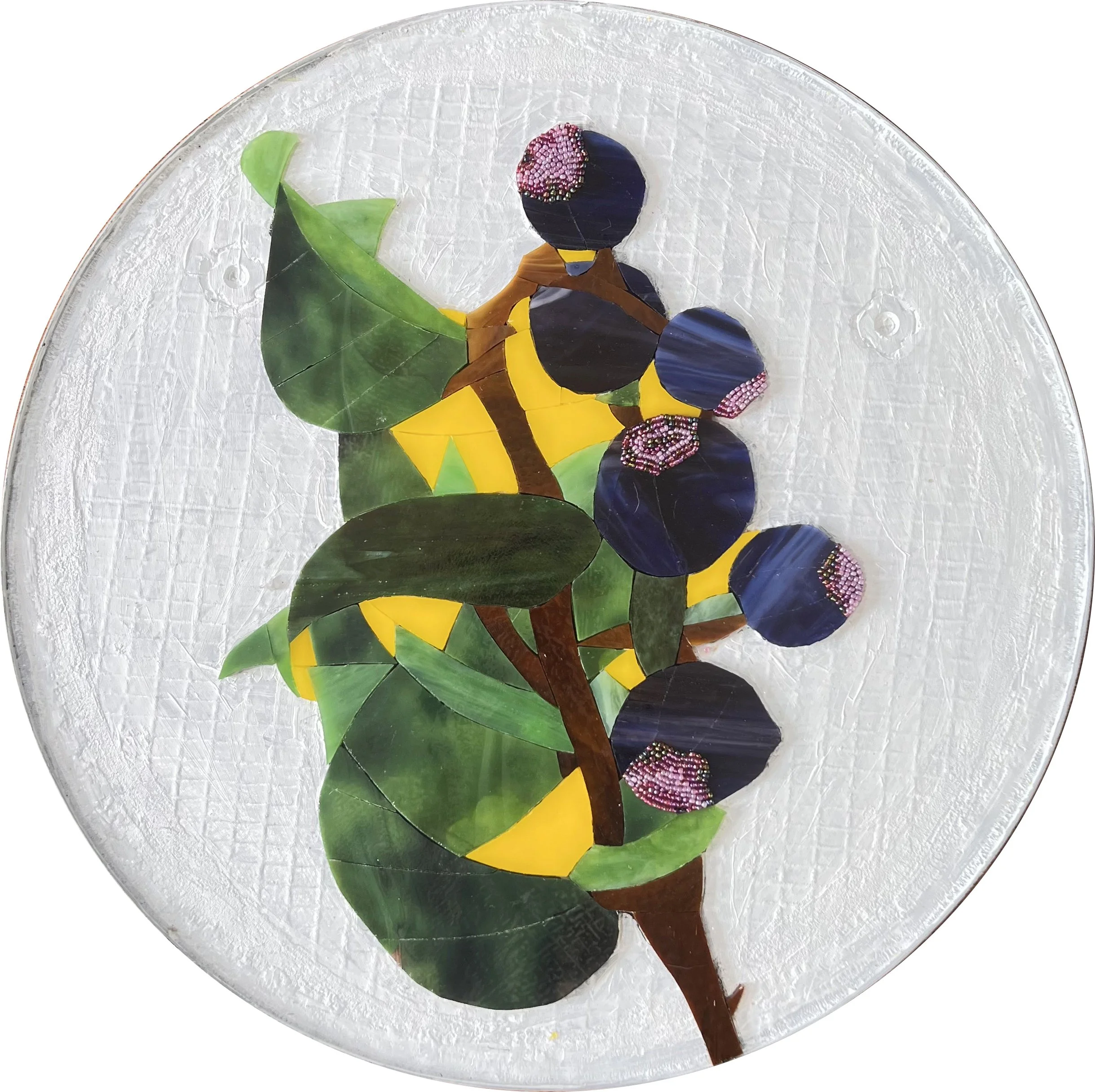
For the fourth panel of each season I returned to the director of the K'tɨ́taas County Historical Museum, who once again gave generously of her time and expertise. Together we identified food sources important to local Native American communities for each season: bitter root harvested in spring, huckleberry gathered in summer, salmon fished in fall, and camas root stored and ground into flour to sustain communities through winter.

Since I was using flowers as the visual symbol for the three plants, the poor salmon looked a bit out of place among them. I ultimately replaced it with the nootka rose for fall. Its edible hips were dried and provided a sustained source of vitamin C through the cold months, and as a flower it fit beautifully into the panel's design.

Mockup of Important Food Sources

Creating the Panels

Once I submitted the designs, the committee approved them with what the director told me was the quickest positive consensus they had ever reached. I was so proud! Before fabrication could begin, I still had several important steps to complete: creating detailed technical documentation for review, consulting with an art conservation expert, and having an engineer analyze and sign off on the structural requirements of the hanging panels.

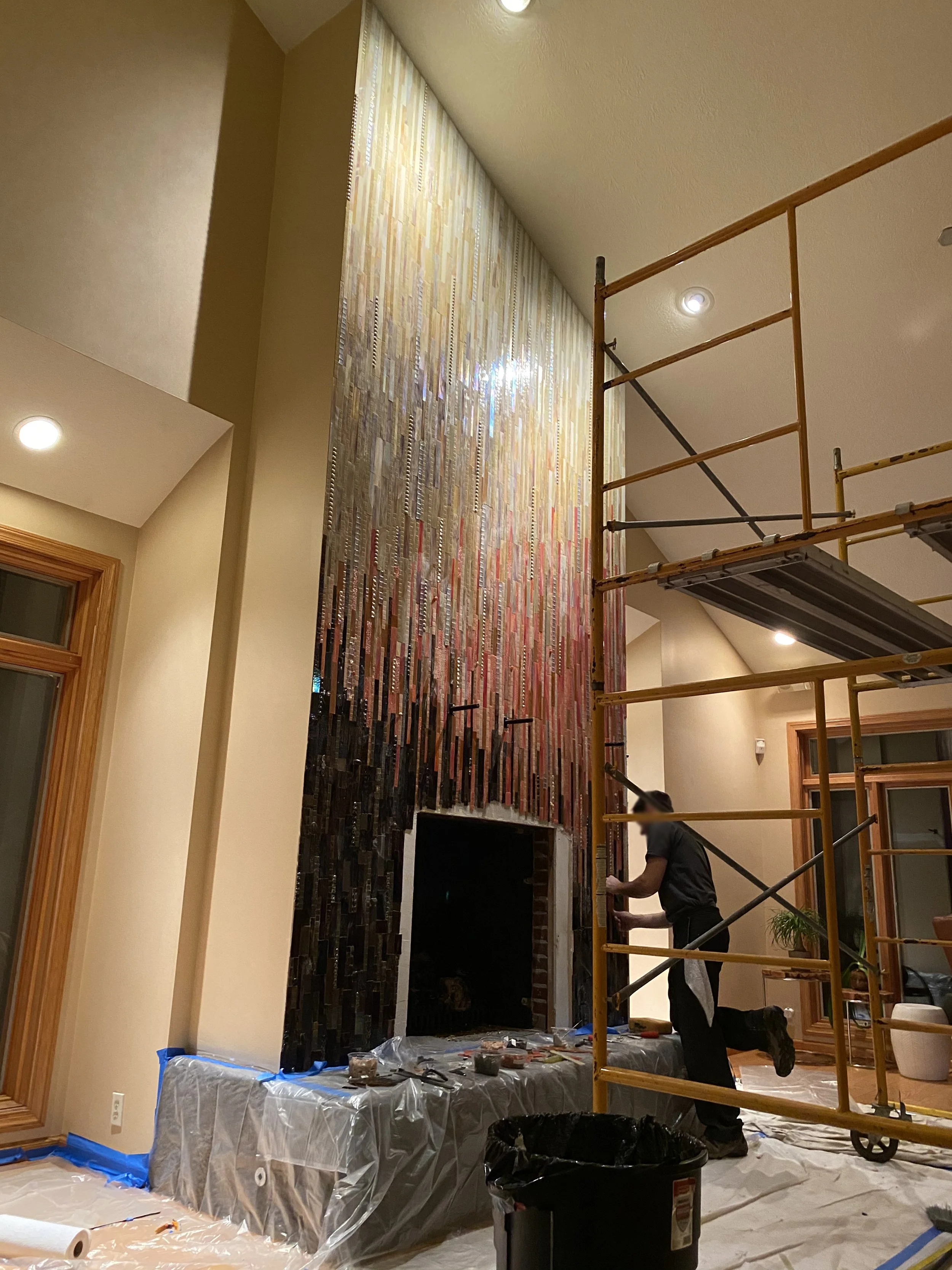
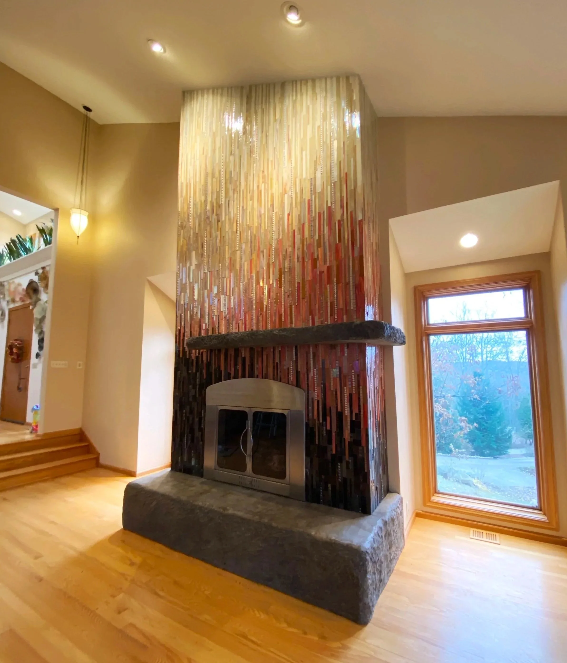
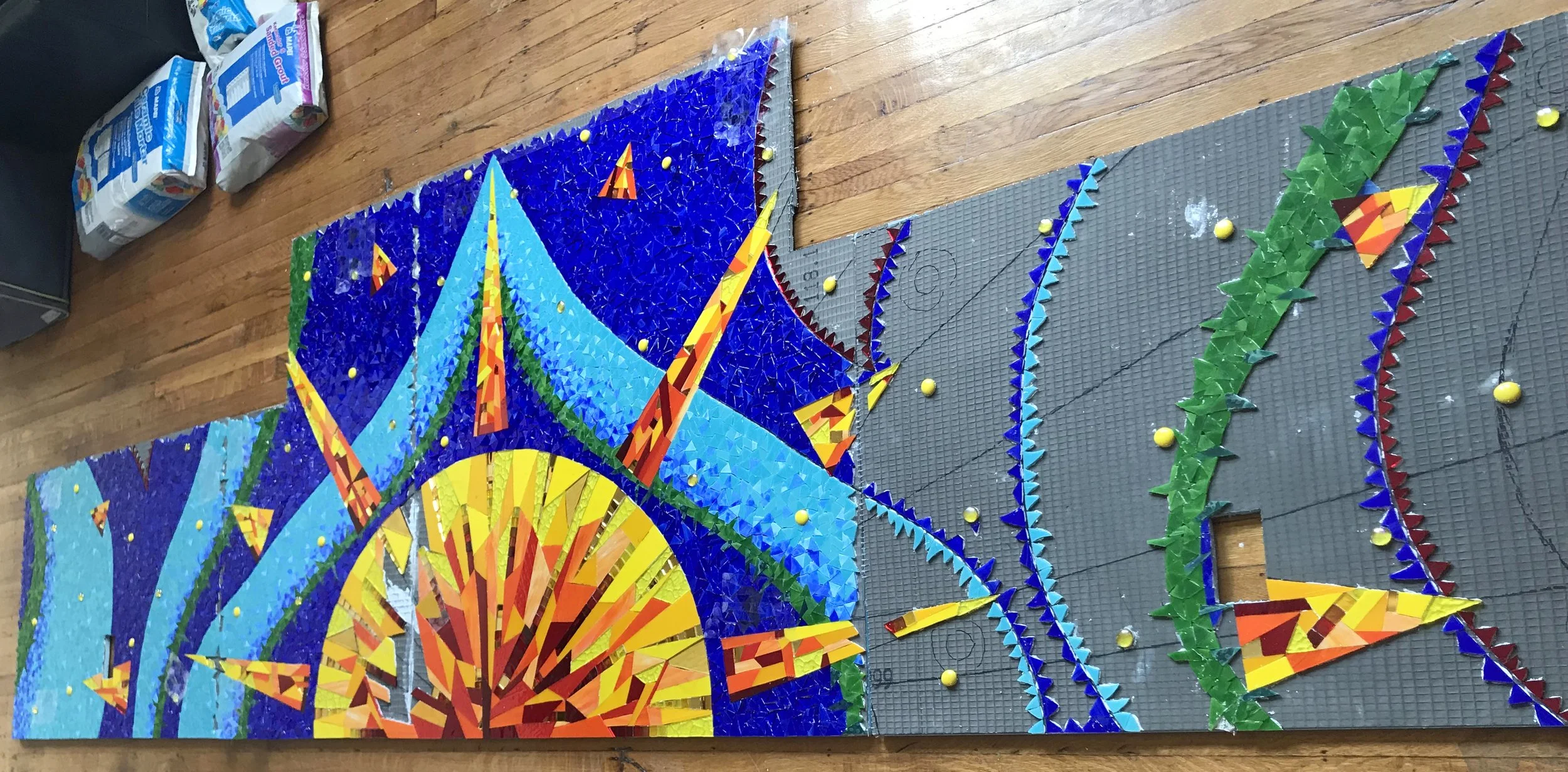
Then, finally, it was time to start making mosaics. ArtsWA requires extensive visual documentation of the entire fabrication process in case the artwork ever needs repair or restoration in the future, which means I have plenty of photos to share!

For the substrate I used 1/2" Wedi board: a foam core backer board coated on both sides with fiberglass mesh and cementitious resin. It's my go-to for installations because it's waterproof, easy to cut into any shape, and most importantly for a project requiring shipping across the country, remarkably lightweight. Once I had all the measurements and designs mapped out, I drew them directly onto the board and cut out the twenty circles.

Next I cut fiberglass mesh to fit around the edges of each circle, holding it temporarily in place with staples before applying a skim coat of mortar to bond it permanently. This is an important step that's easy to overlook. The cut edges of Wedi board expose the foam core, which isn't strong enough on its own to hold up over decades of public display. The fiberglass and mortar create a durable, finished edge that will last.

To finish the edges I added aluminum edging, securing it with Apoxie Sculpt which is a two-part epoxy clay that dries rock hard and bonds to almost any surface. Where the two ends of the edging met, I positioned the seam at the top of each circle where it would be least visible, reinforcing it with additional Apoxie Sculpt and finishing it with Testor's silver enamel paint. The result is a seam that is nearly invisible at a glance, but upon close inspection has the appearance of solder, a small detail I loved.

Because Wedi board won't hold a screw on its own, all hanging hardware has to be installed before the mosaic is created. The wide washers that anchor the screws need to sit on the front surface, which means they have to go in while that surface is still accessible. I used French cleats sized between 6" and 18" depending on the panel size, with special wide washers that screw in flush with the surface so the glass lays flat on top without any bumps or gaps. Getting them perfectly flush is a finicky process and I'll admit I don't always nail it, but if a washer ends up slightly recessed I simply smooth over the depression with a little leftover mortar or Apoxie Sculpt. Problem solved.

The security hangers also need to be attached before the mosaic is created, using the same wide washer method as the French cleats. Once the artwork is hung, a second piece attached to the wall is locked into place using a wrench-like key, preventing the panel from being accidentally (or intentionally!) lifted off the hanger. In a school setting this was particularly important. Without them, a curious kid reaching up to touch the artwork could inadvertently flip an entire panel off the wall. With twenty mosaic circles hanging in a busy school hallway, that wasn't a risk worth taking.

With the substrate prepared, edged, and fitted with hardware, the first panel was finally ready for mosaic! I can't overstate what a relief this was. I had conceived the whole framing and mounting system about six months before receiving the go-ahead to begin fabrication, and the entire time I quietly worried that one of the steps wouldn't come together as planned. Having it turn out exactly as I'd envisioned was deeply satisfying.

Of course, now I had 19 more frames to build...

Precision was critical at this stage as the hangers can't be adjusted once the mosaic is in place, so I measured everything multiple times before committing. It was painstaking work, but I pushed through and completed all 20 frames in about two weeks.

The timing of the project couldn't have been more chaotic. ArtsWA gave me the green light at the exact same moment I was buying my first home. I knew the next couple months would vanish in a whirlwind of carpet removal, painting, cleaning, and moving my entire life, including tens of thousands of pounds of glass.

Fabrication

Once the dust settled, literally and figuratively, from the move it was time to begin creating the mosaics in my new studio. The new space was a revelation. For the first time I have a separate glass room across the hall from my mosaic studio, where I can browse and select glass that wasn’t covered in grout dust, without tripping over works in progress, or balancing precarious stacks of stained glass sheets on boxes. Having a dedicated table in the center of the room to lay everything out and make considered color decisions was a joy and I'm happy to report I got significantly fewer cuts from the stained glass as a result!

The glass room in my new home. My family & friends are kind enough to act like it’s normal to have a room just to store my glass.

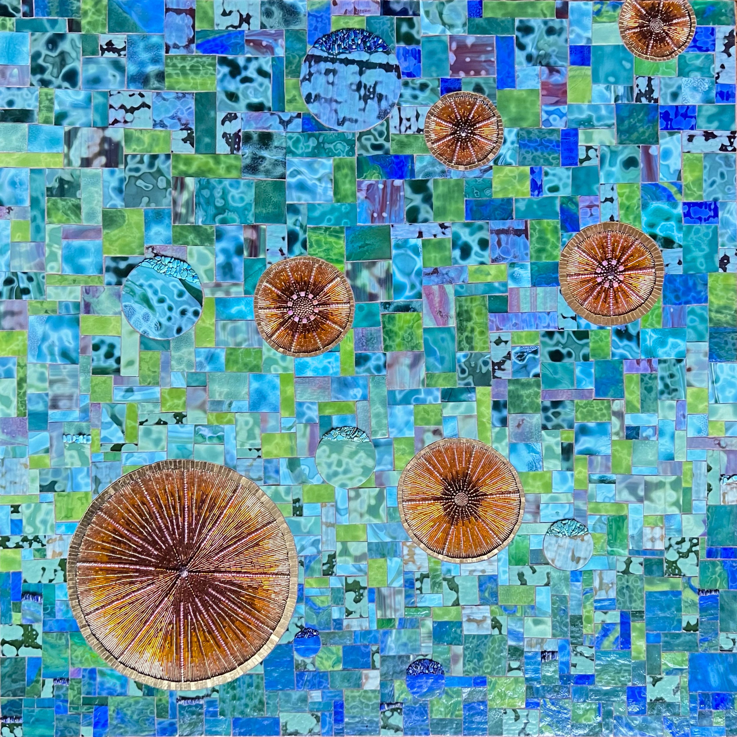
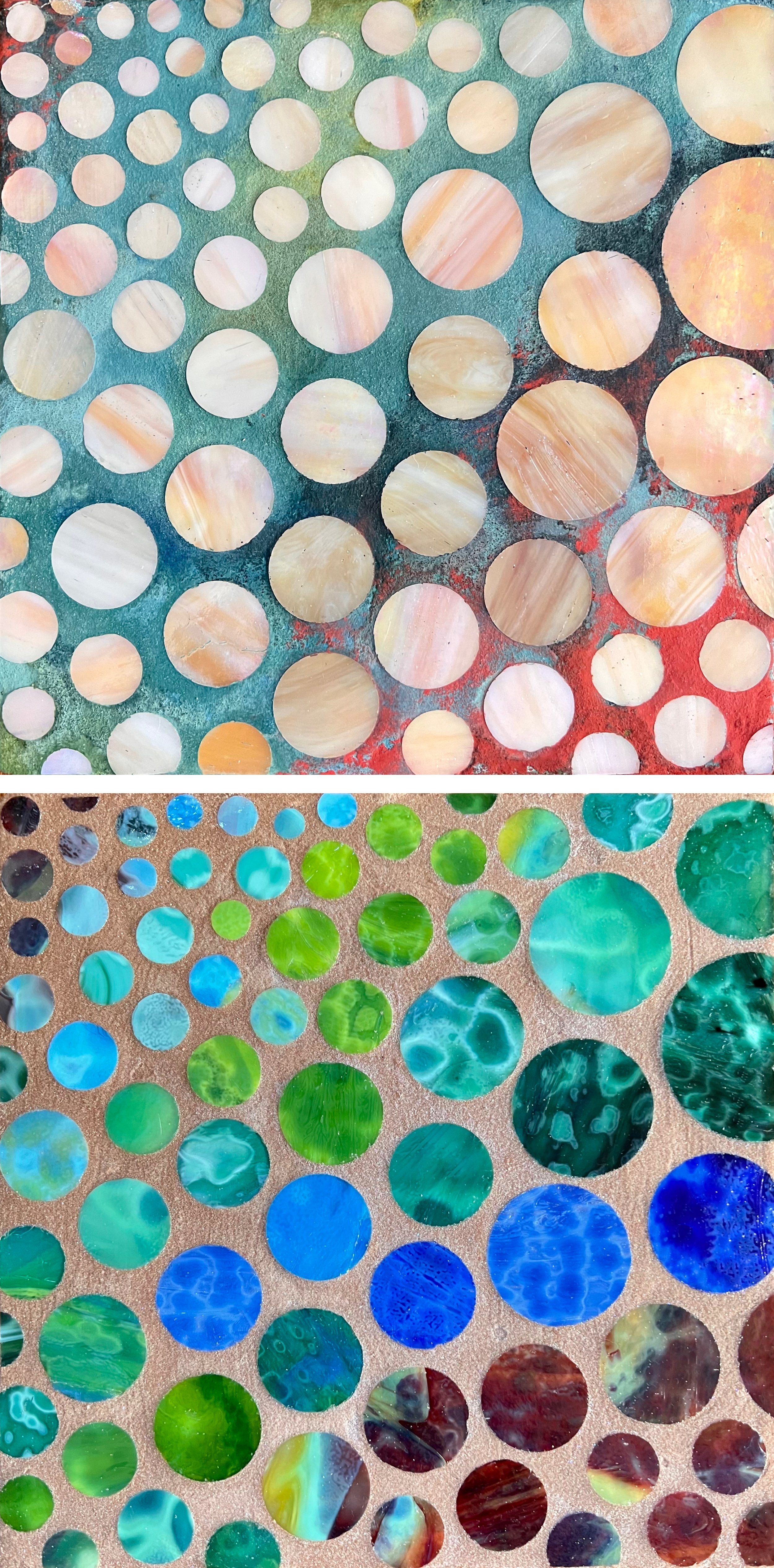
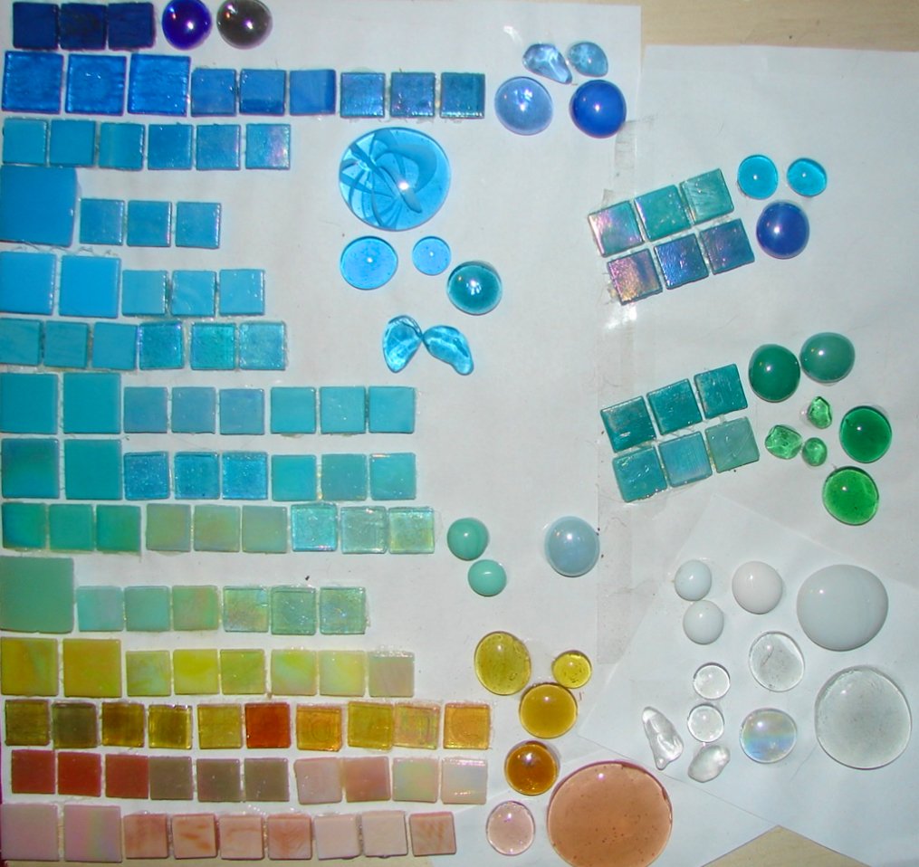
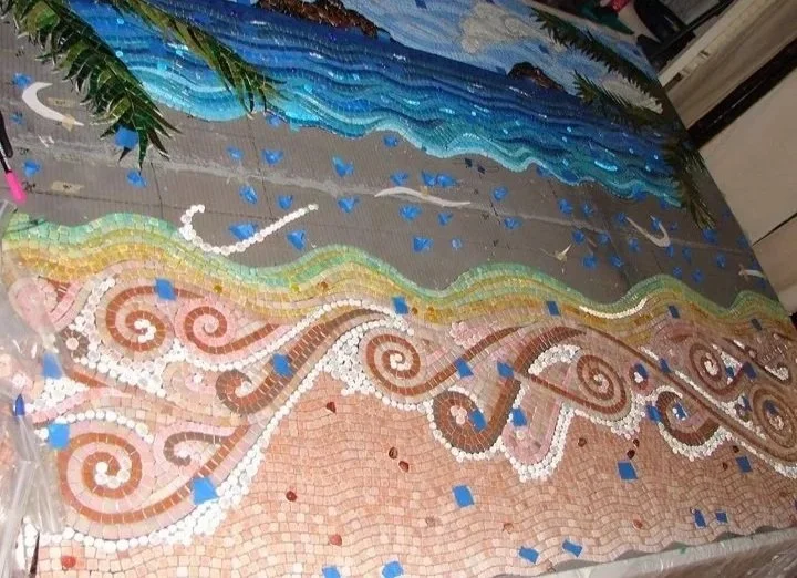
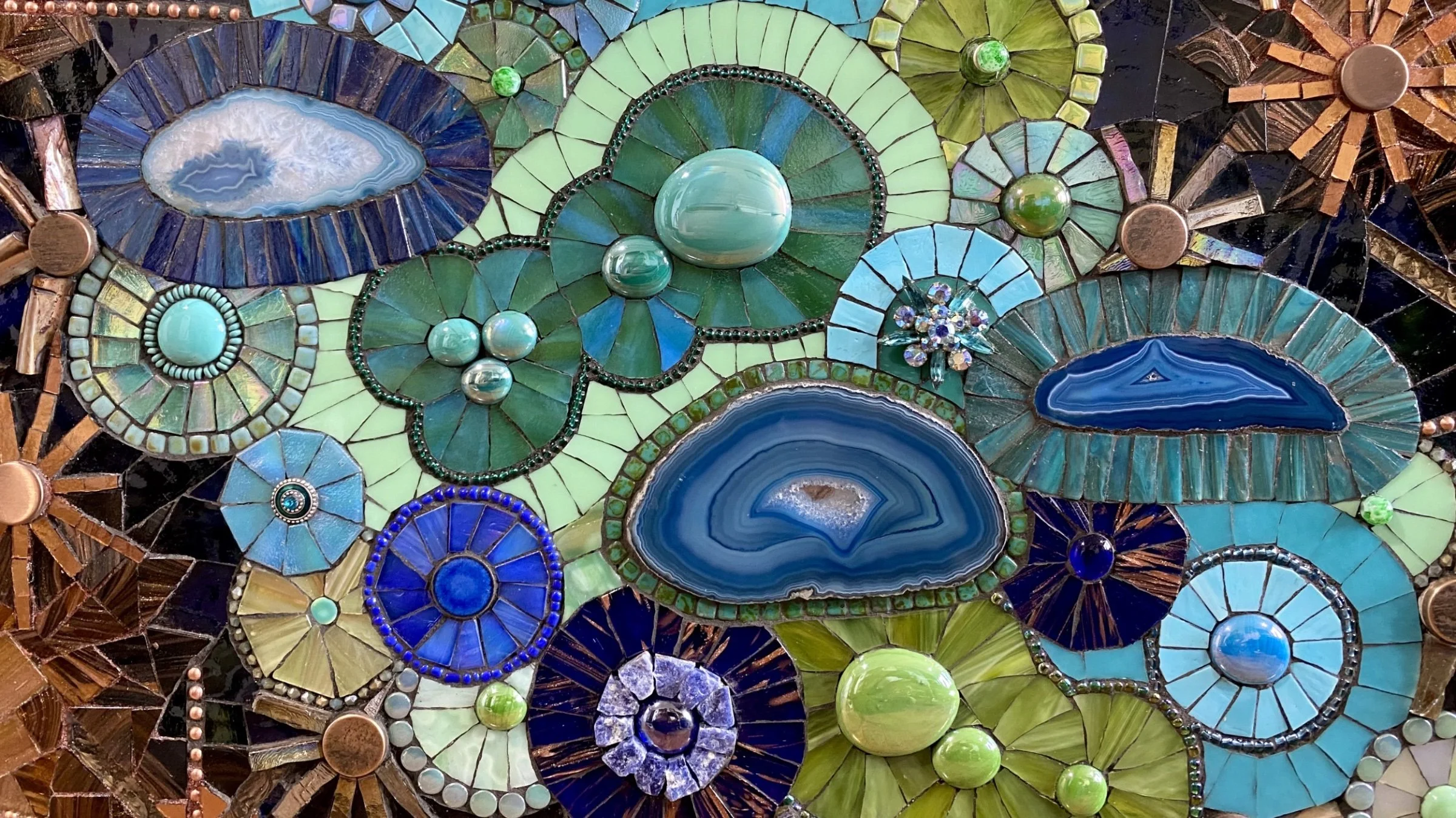
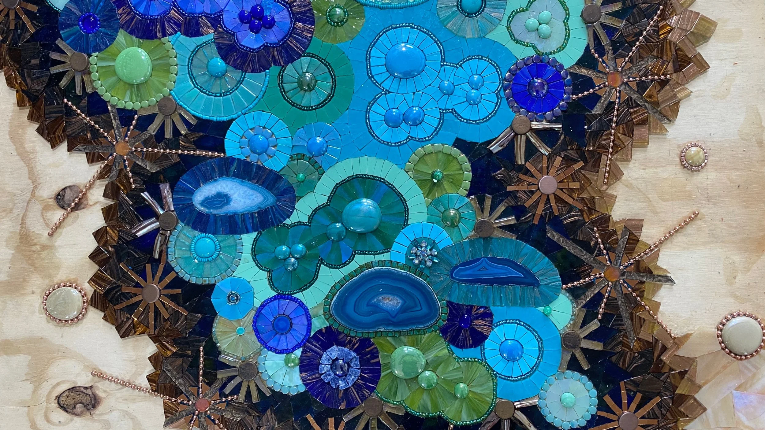
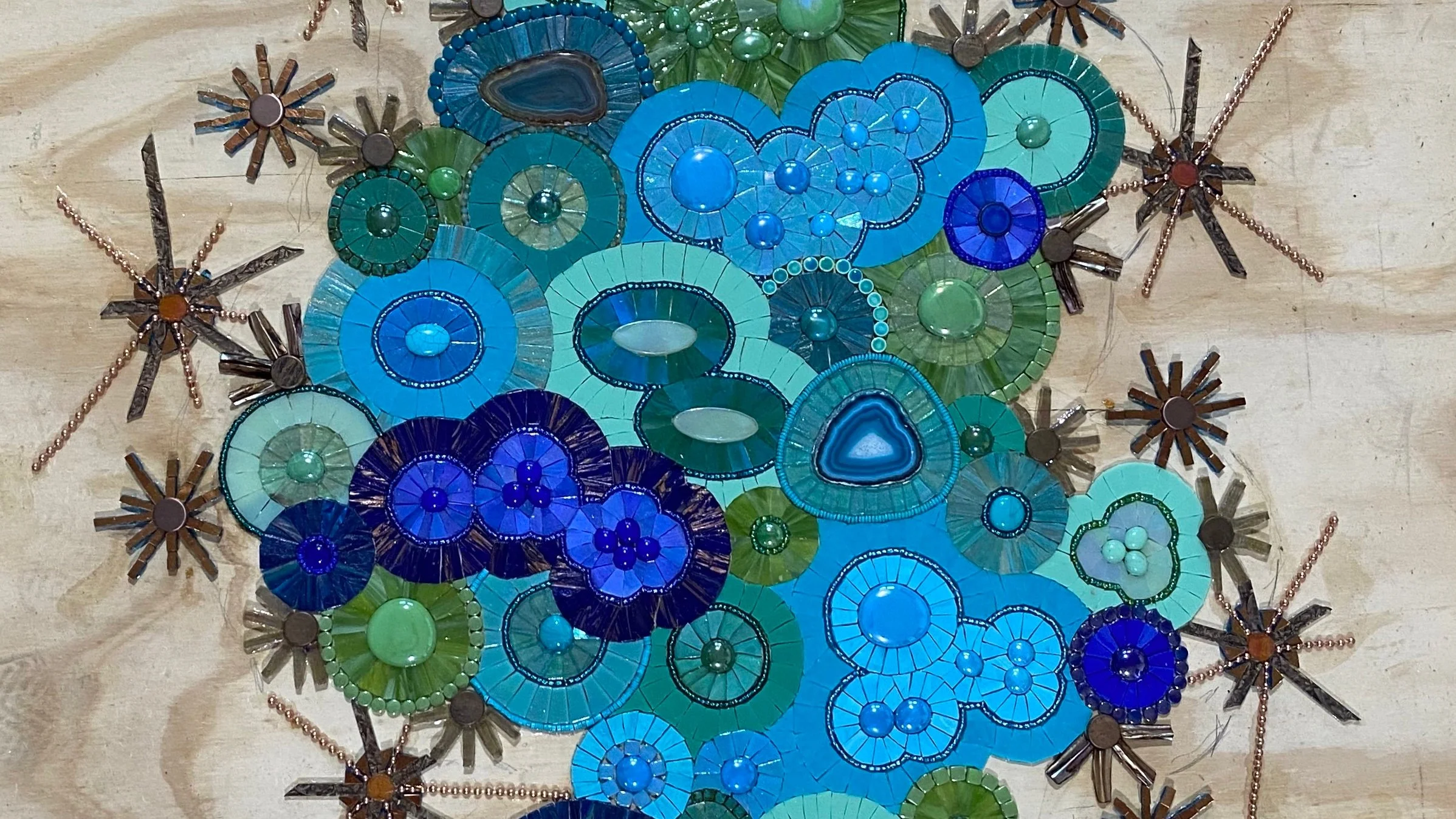
Selecting the materials was one of my favorite parts of the process. I carefully chose stained glass, glass gems, and glass beads not only to make each individual panel shine, but to ensure the entire collection of twenty pieces would flow together as a cohesive artwork. For adhesives I used Weldbond for the stained glass and gems since it's reliable, flexible, and dries clear, and Apoxie Sculpt for the beads, which need a stronger mechanical bond given their rounded surface. Below are images of all 20 panels in various stages of completion. Click any image to view it in detail.

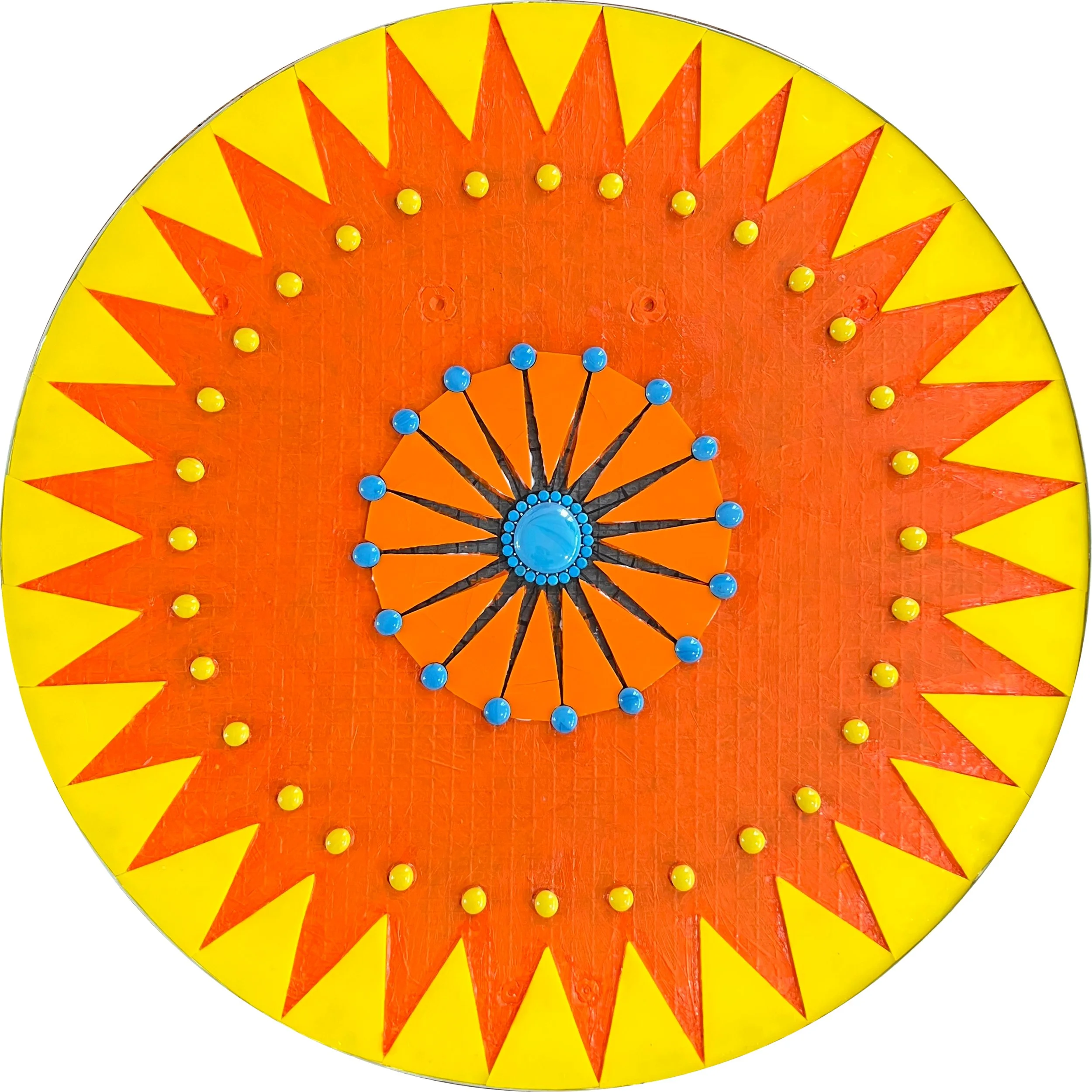
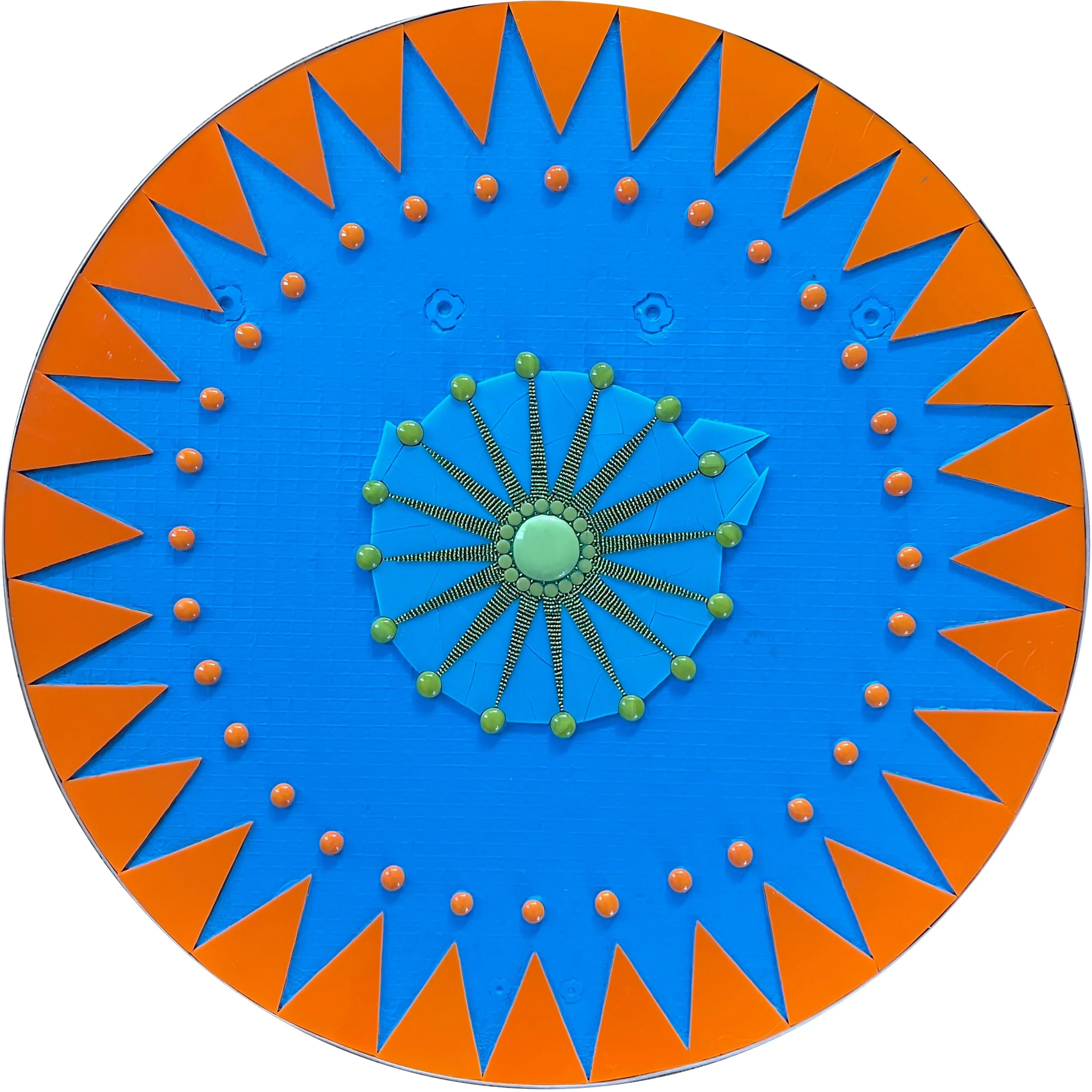
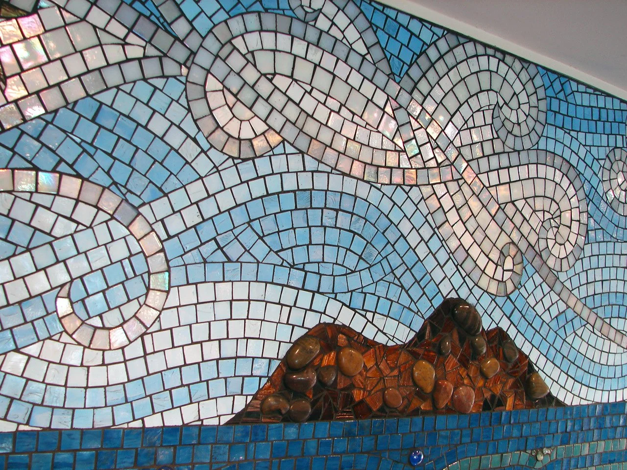
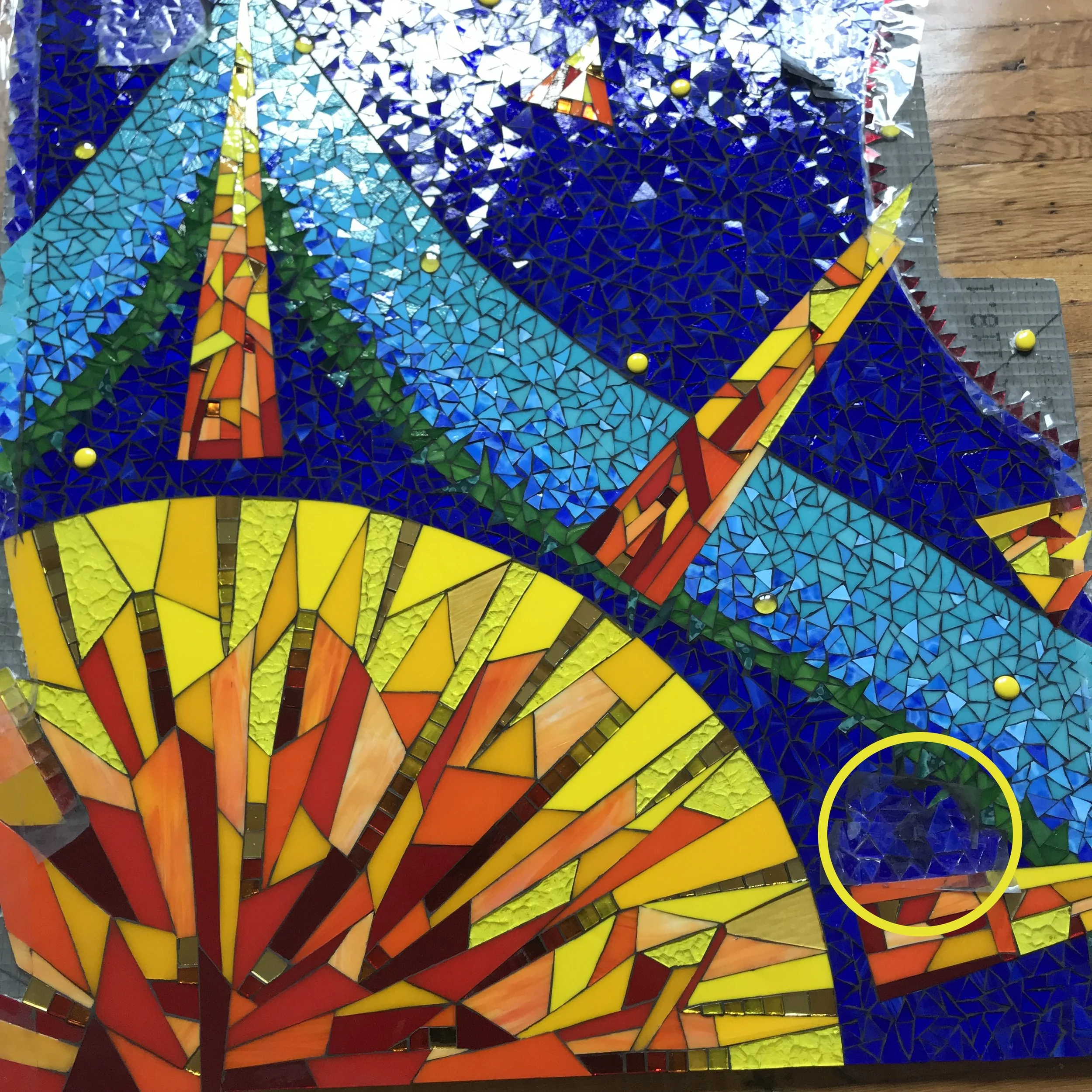
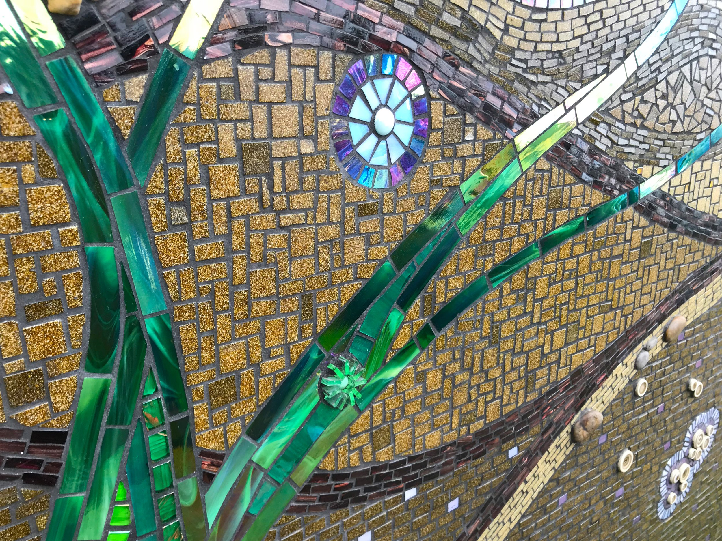
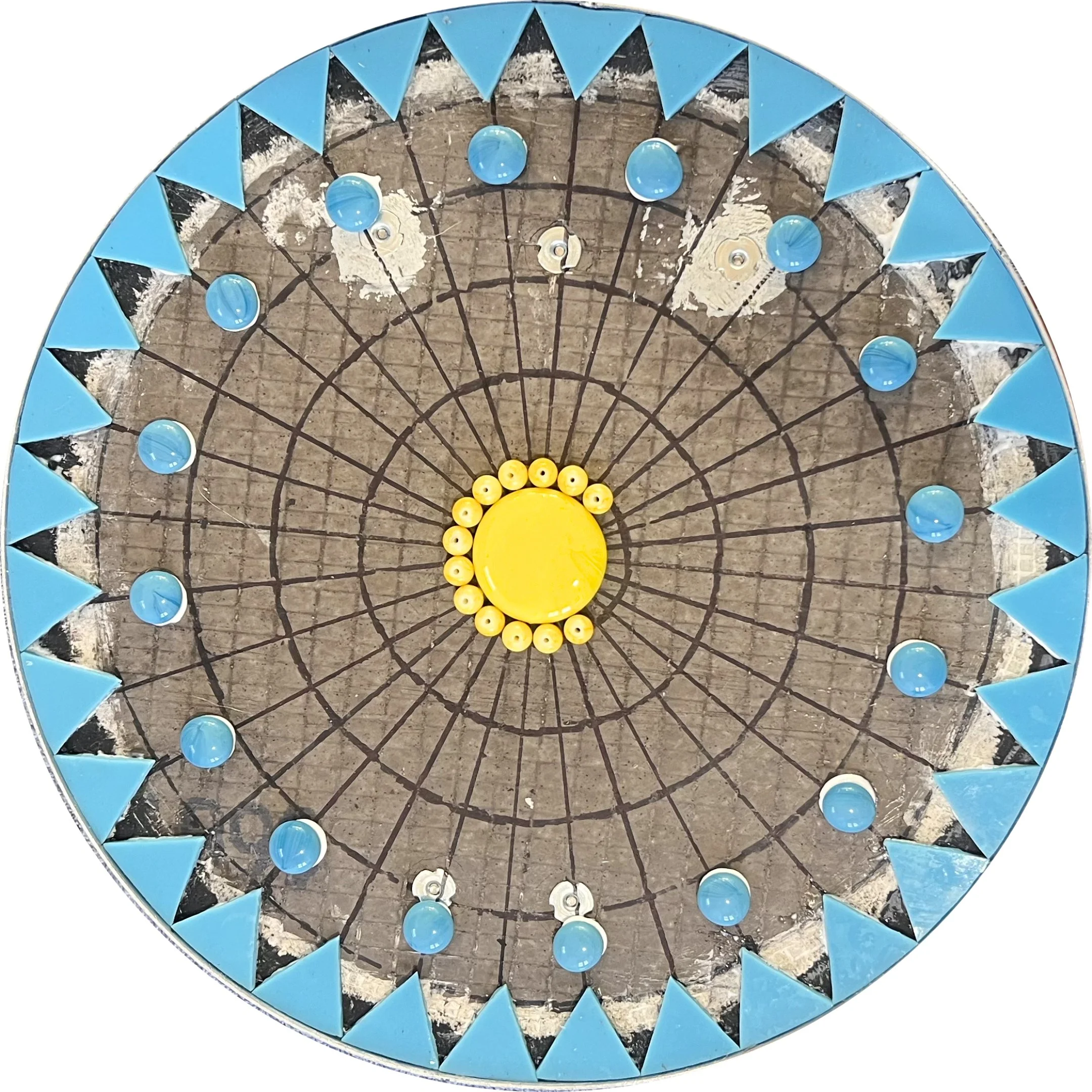
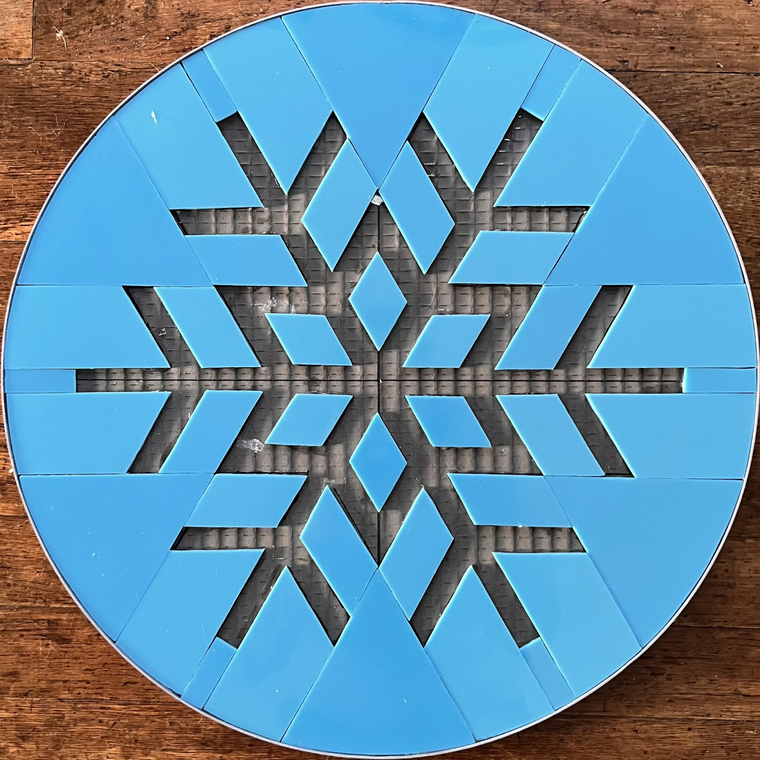
For the first panel of each season I began by drawing diameter lines at every angle needed, followed by concentric circles. These guidelines keep the geometric design accurate while I'm focused in on the small details. You can see them more clearly in the photos of the later geometric panels below.

I painted the substrate background before laying any glass, which might seem like an unnecessary step but makes a significant difference in the final result. Even opaque stained glass has some level of translucency, and without a painted background the dark grey of the Wedi board and my pencil guidelines would show through and shift the color of the glass. On the yellow panels especially, the lines were completely visible through the glass before painting.

The grout choice added another consideration. I used Starlike Evo Epoxy Grout, which has a beautiful glassy, reflective finish, but that reflectivity also picks up the color of whatever is beneath it. Left unpainted, the grey substrate would have made the grout appear darker and murkier than the clean, luminous effect I was going for.

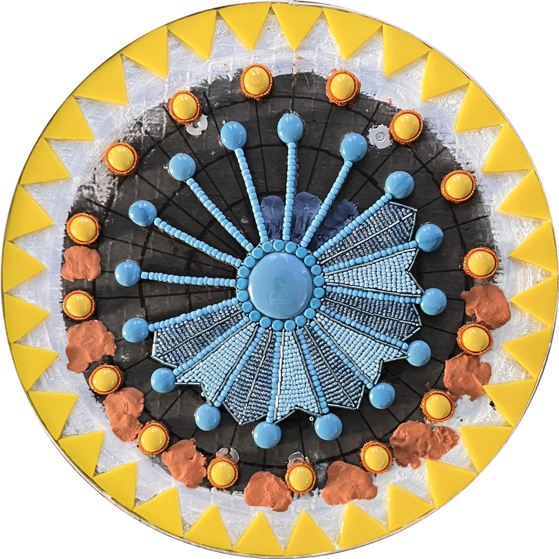
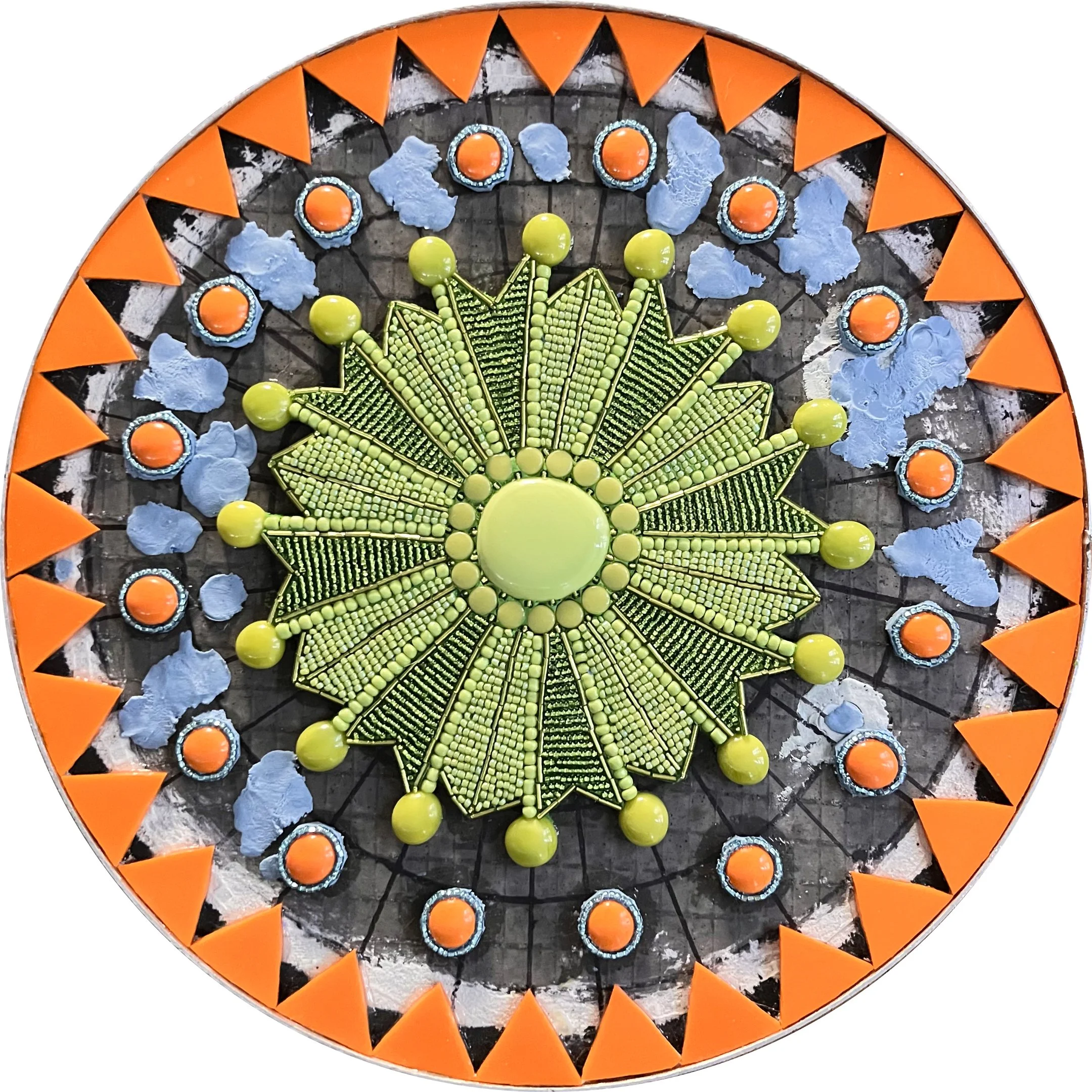
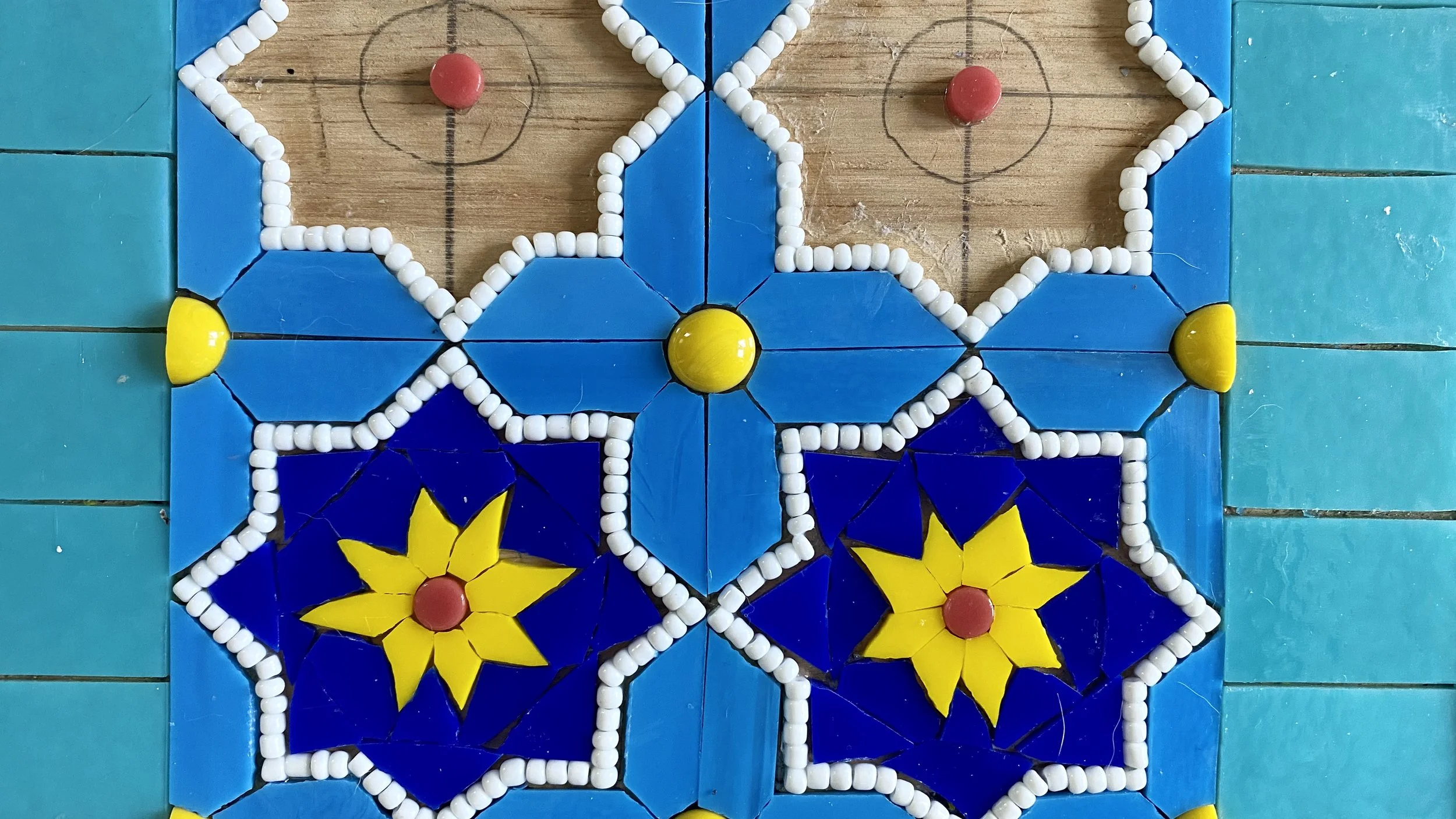
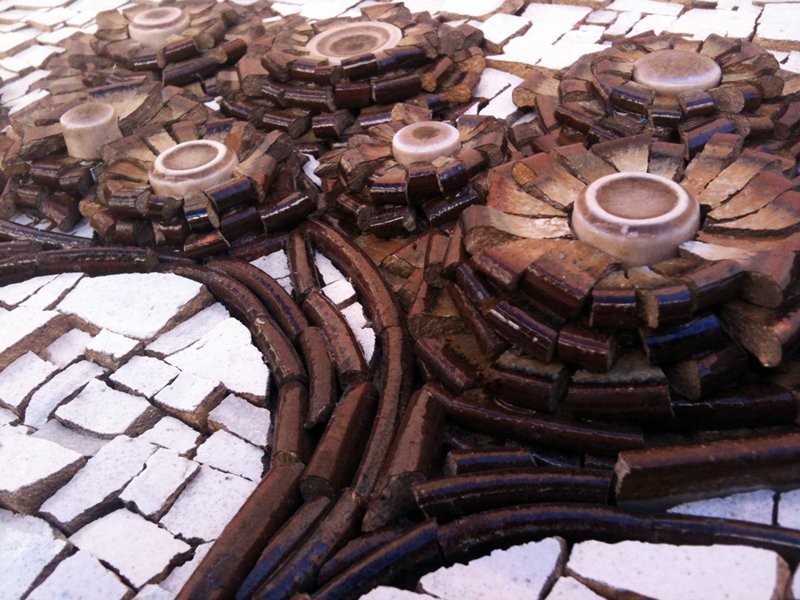
The final panels of each season are similar in structure to the first, but smaller at 12" in diameter and considerably more intricate, featuring detailed beadwork throughout. Since I was using Apoxie Sculpt as the adhesive for the beads rather than mortar, I didn't need to paint the full background, though I did paint under the edges of the yellow stained glass where translucency would have been an issue.

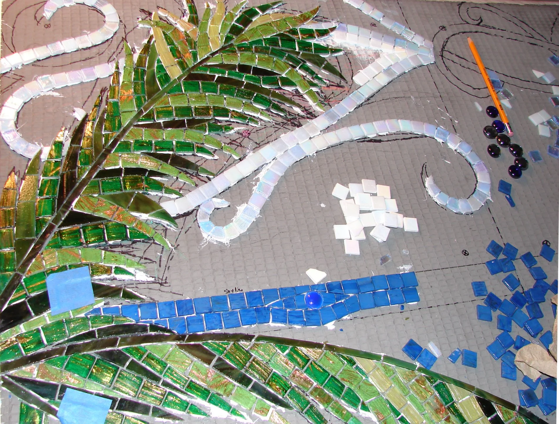
As with the opening panels, I laid out the geometric elements in stained glass and gems first, then added the beads. To prevent the smaller central elements from shifting before they could set, I started by placing the thin pinwheels of glass radiating out from the center, then filled in the smaller bead designs once the pinwheels had dried and stabilized.

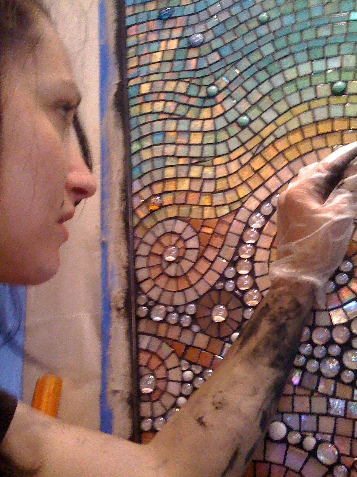
The beaded sections would not be grouted. Grout would obscure the delicate detail and fill the spaces between beads in a way that would diminish rather than enhance the design. Instead I used Apoxie Sculpt in various colors, sometimes mixing colors together or adding powder pigments to achieve exactly the effect I was looking for.

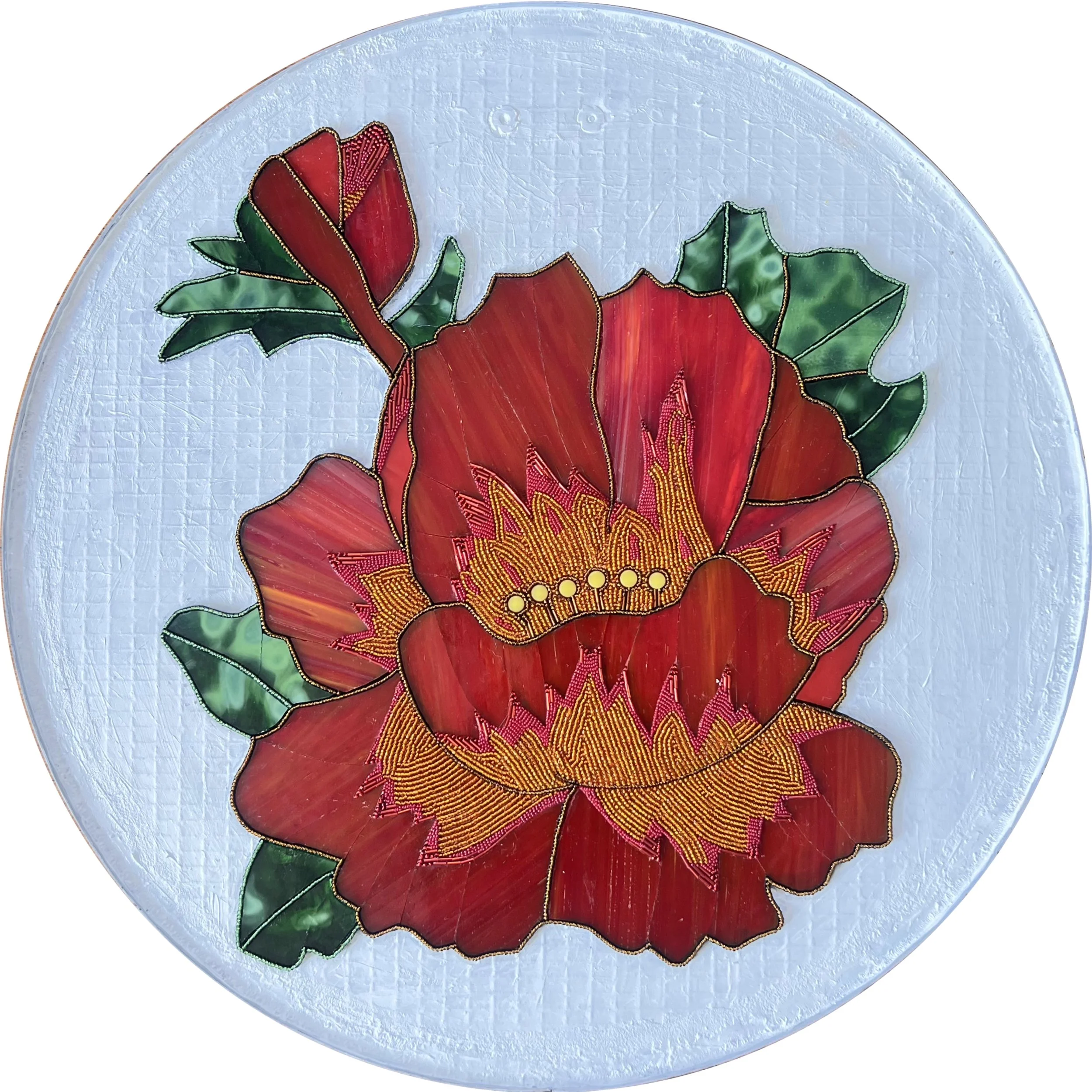
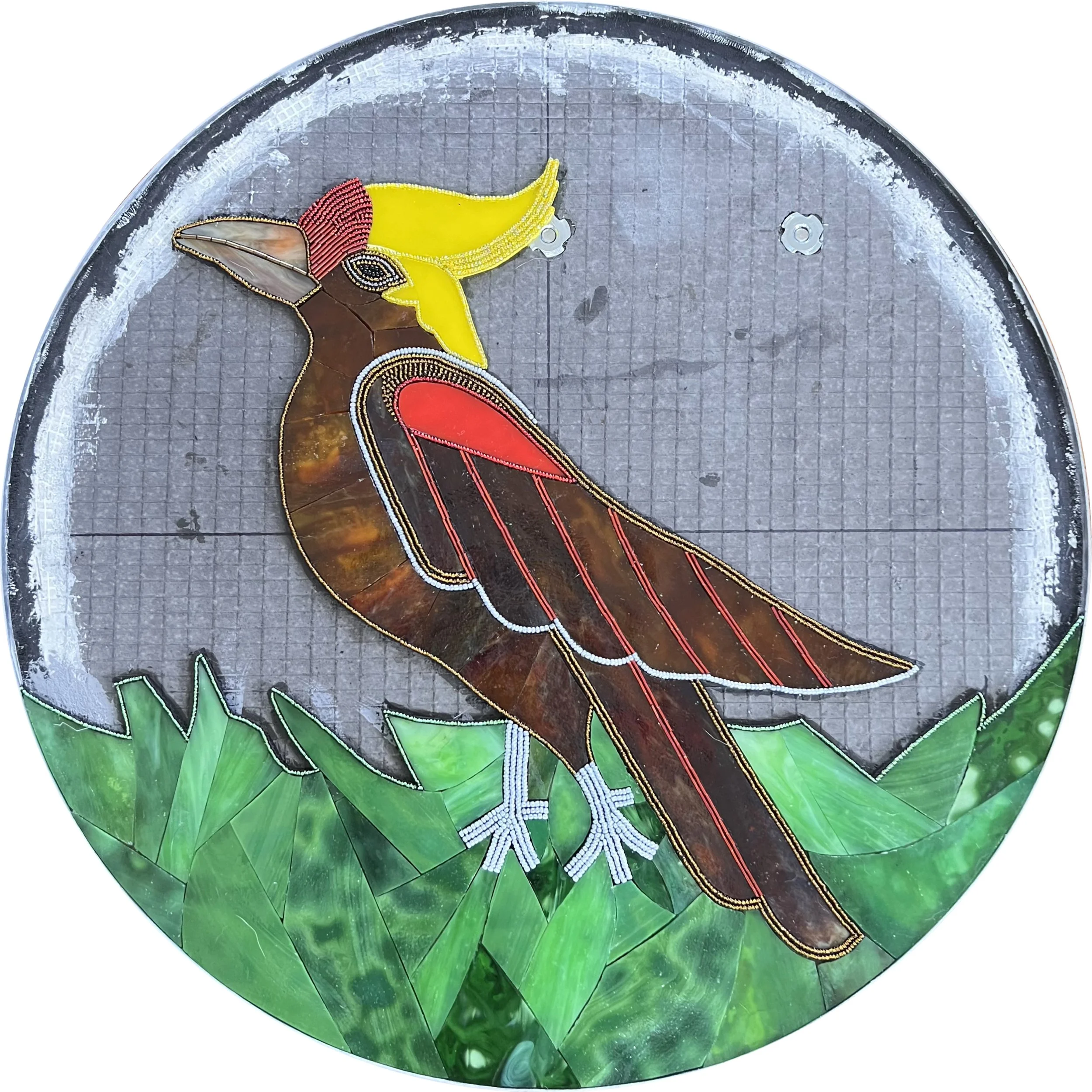
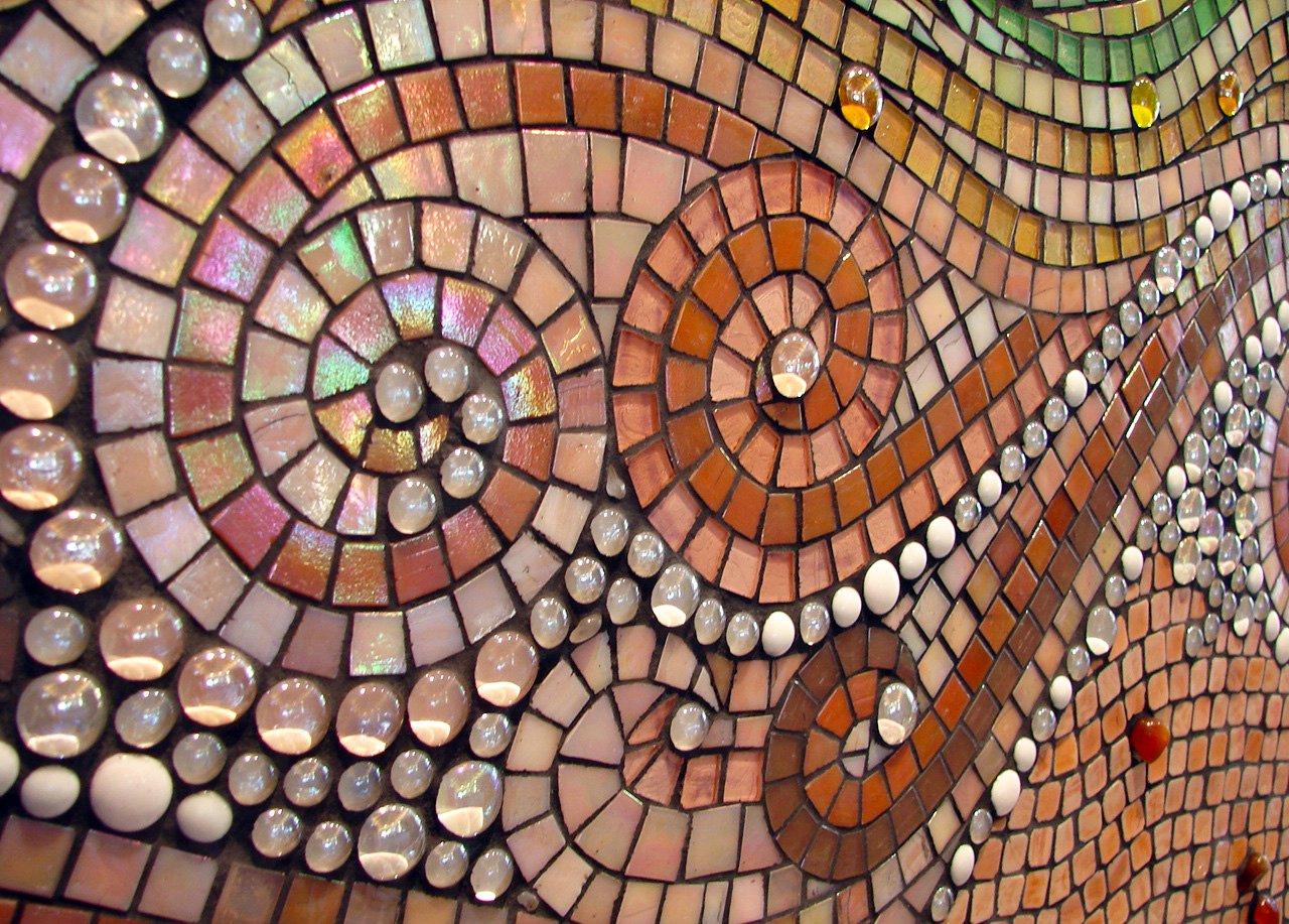
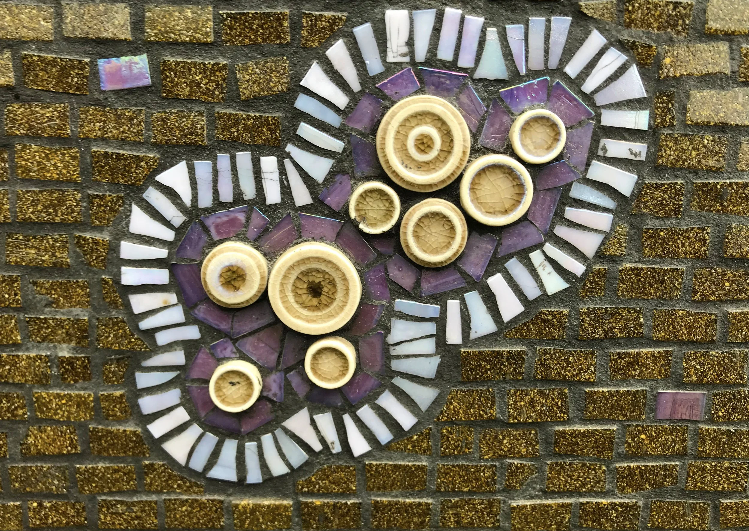
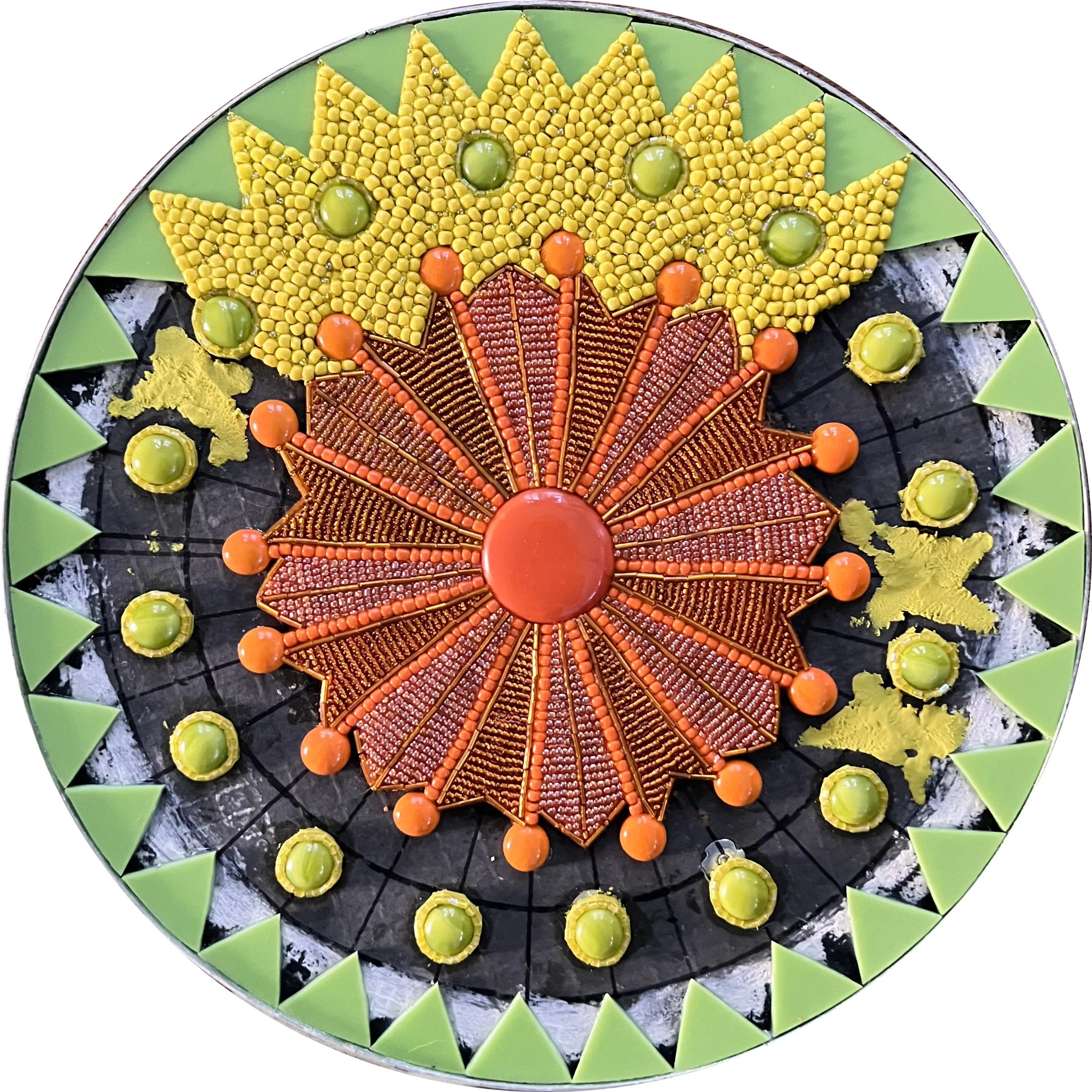
The second 20" panel of each season was inspired by Ida Nason Aronica's beadwork collection. Rather than simply replicating her beautiful designs, I wanted to interpret them using a combination of beads and stained glass to bring something of my own medium to the tribute.

These were by far the most difficult panels to create. The process required building tiny walls of Apoxie Sculpt and beads, most of which used 15/0 seed beads, the smallest size available. The challenge was relentless: there was a very small window between the clay being firm enough to hold the bead walls upright and becoming too firm to accept the beads securely. Too soon and everything collapsed. Too late and nothing would set. I repeated this process hundreds of times across the four panels.

It was painstaking work, but I never regretted taking the time to do it this way. The results exceeded my expectations, and I hope they honor Ida Nason Aronica's extraordinary beadwork in a way that would make her family proud.

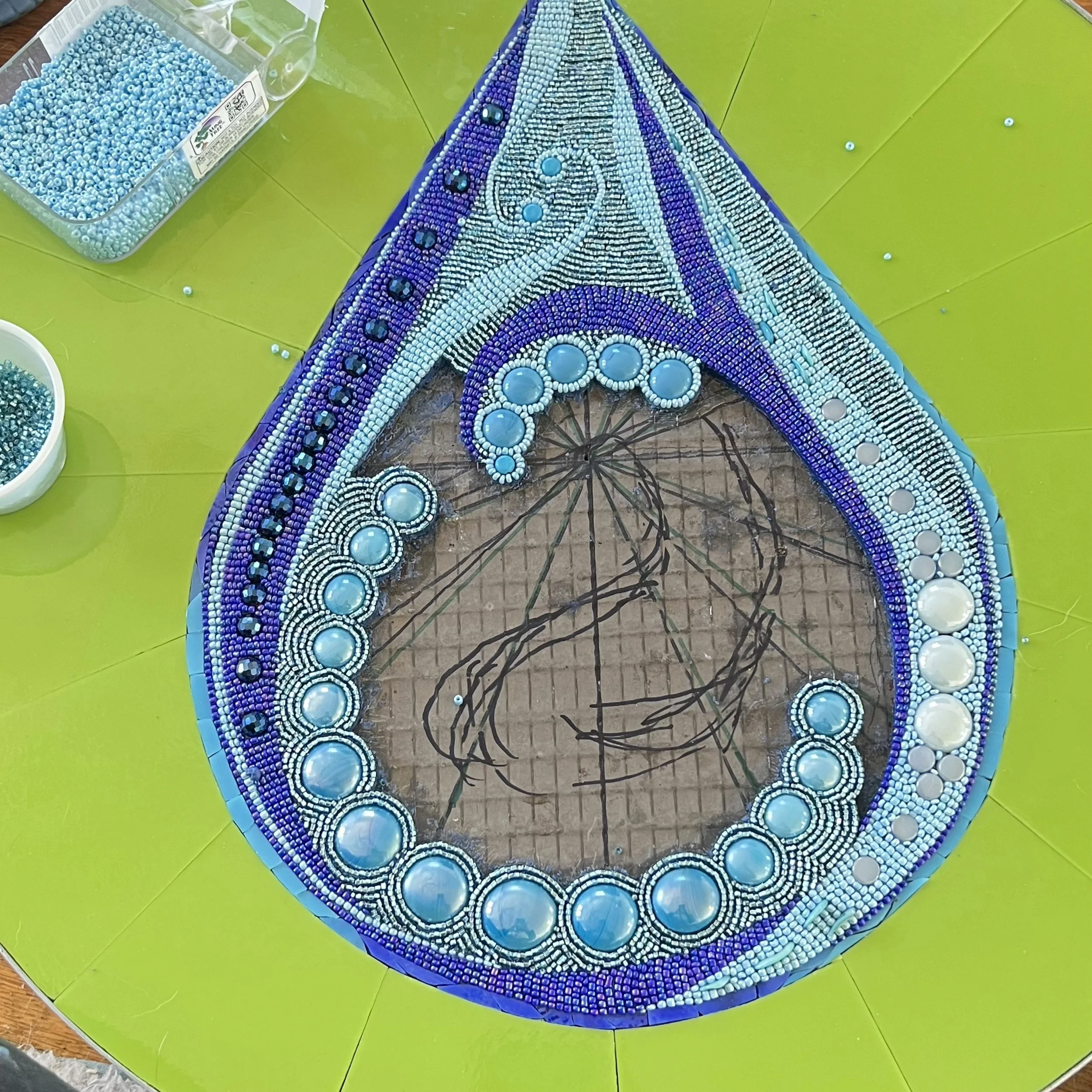
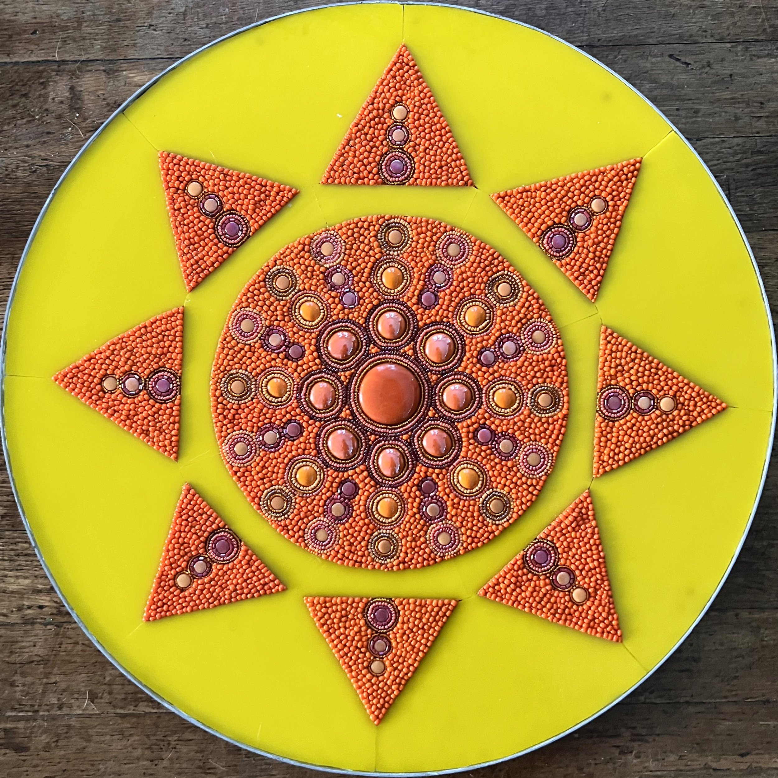
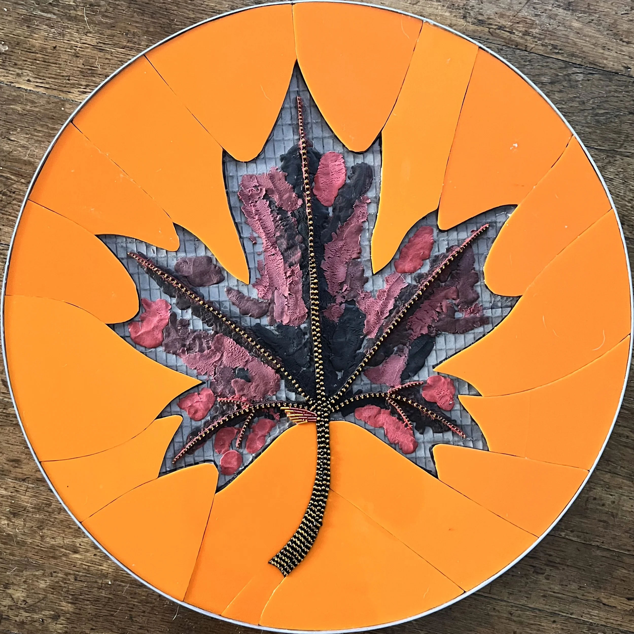
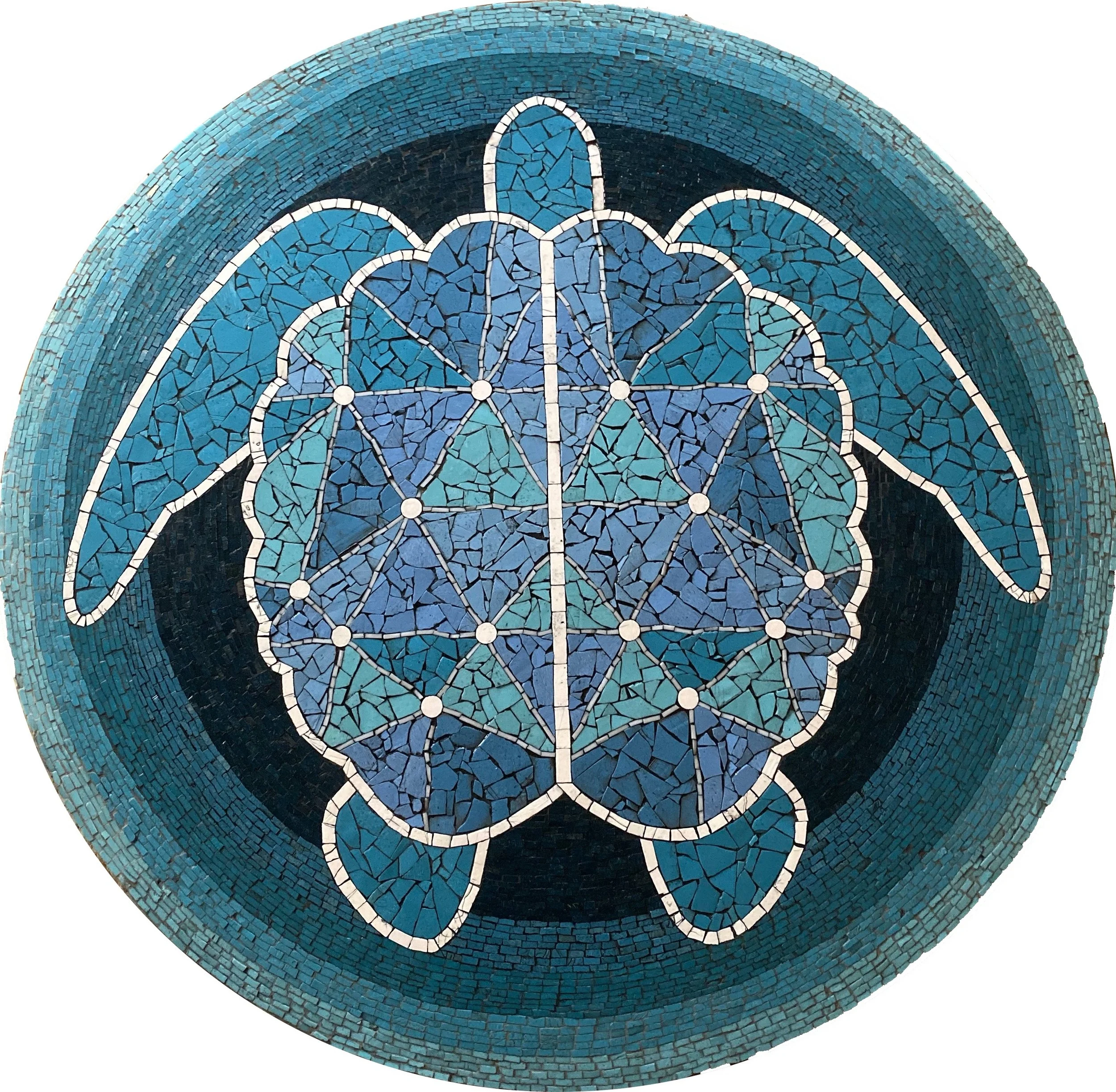
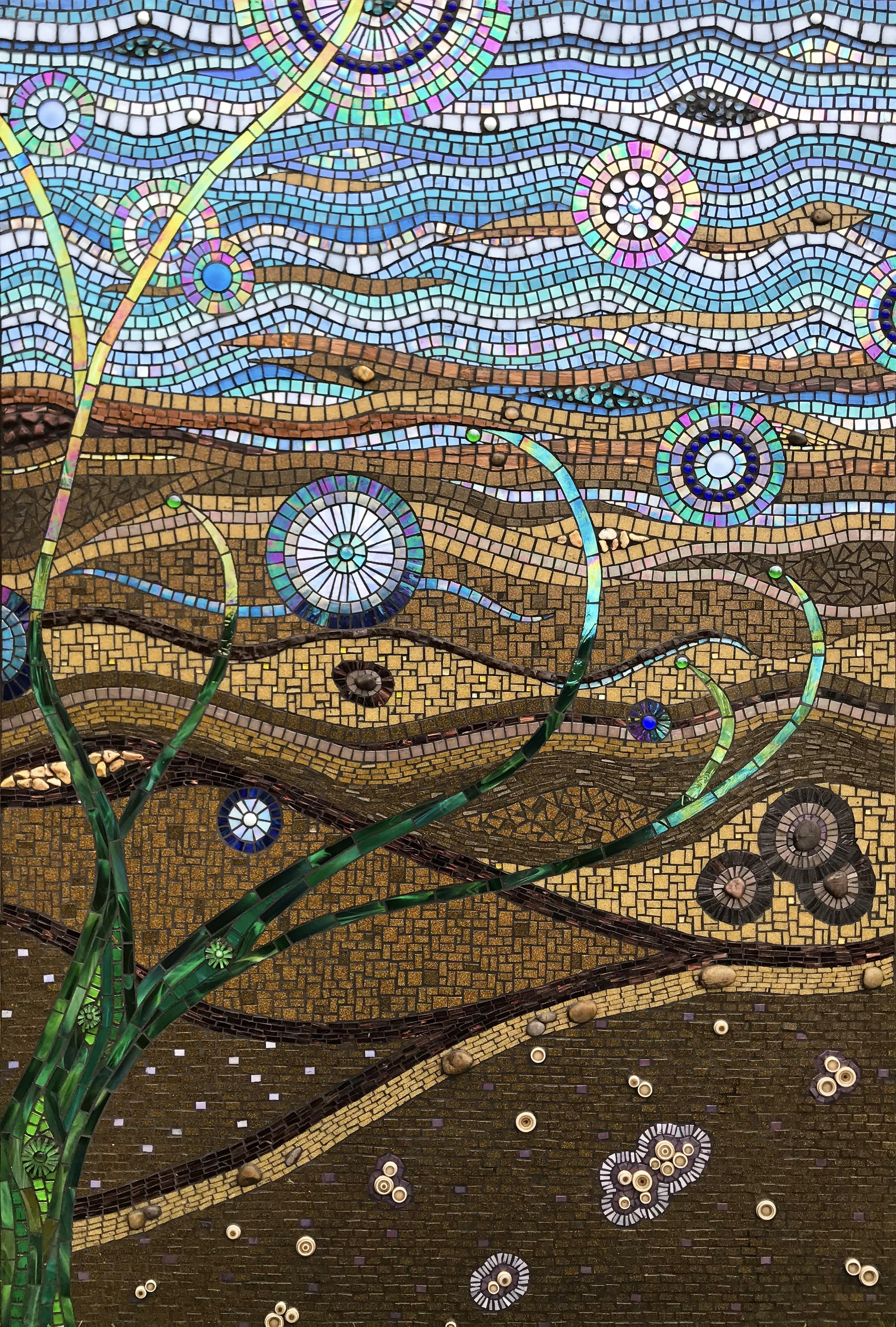
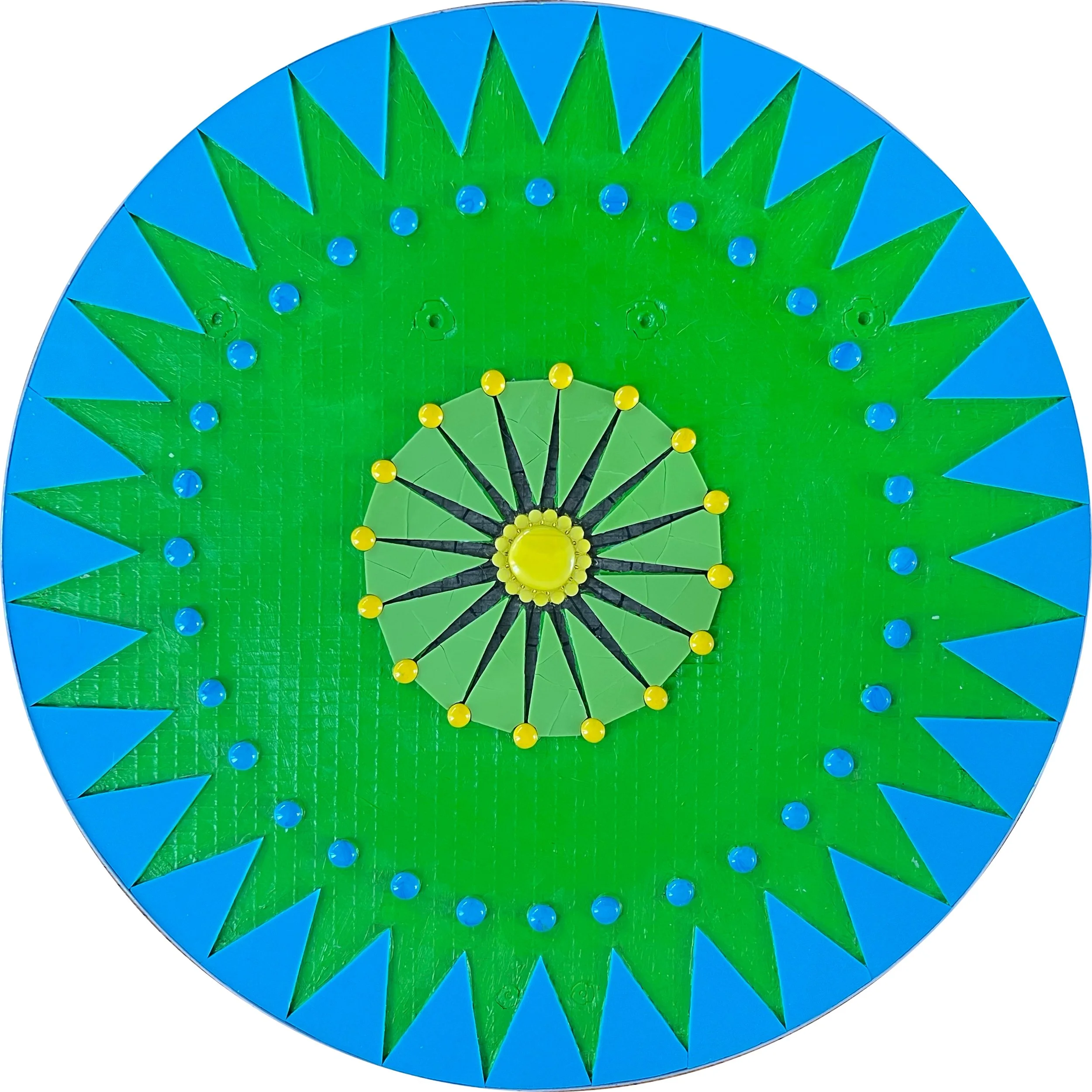
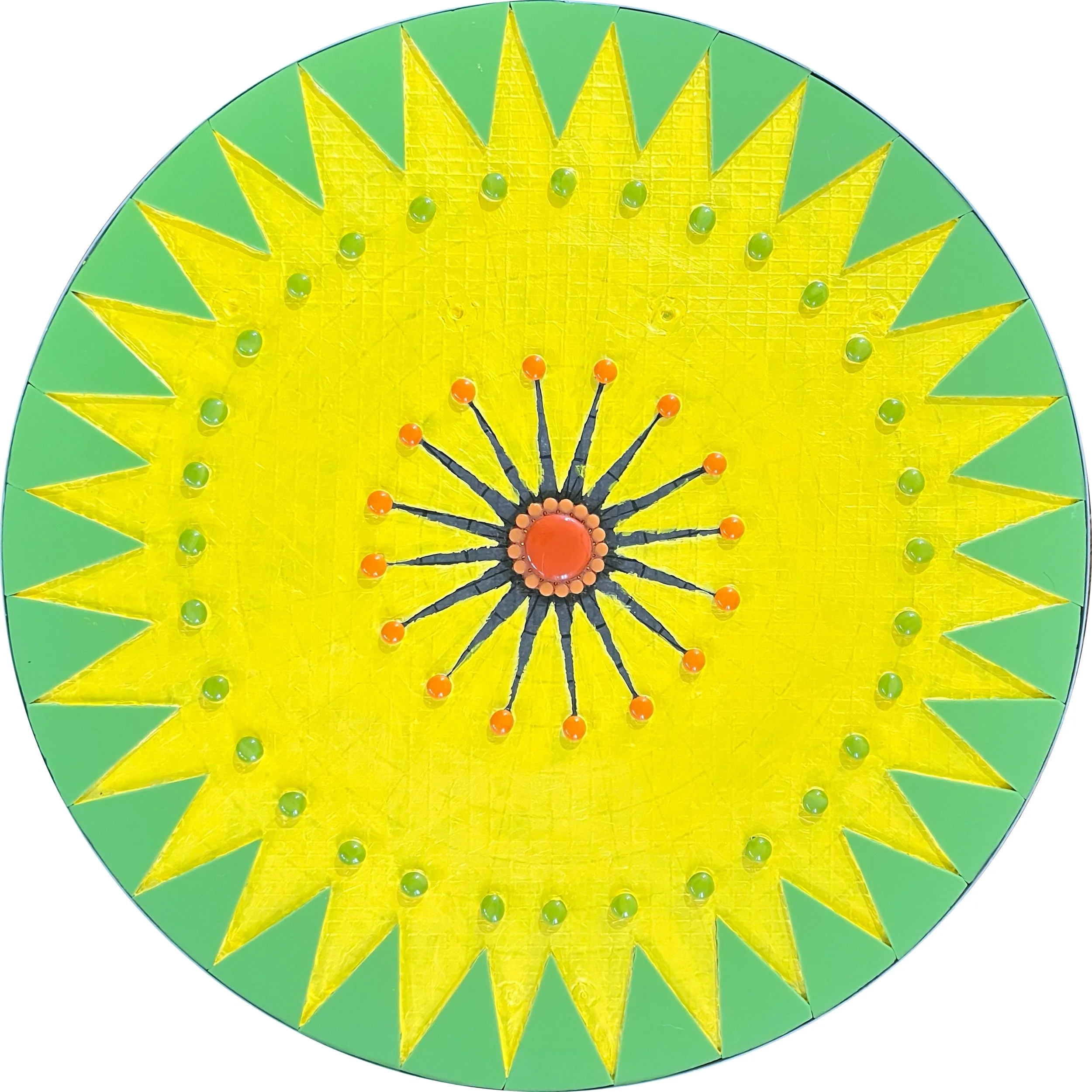
The center panels of each season are 18" in diameter, each featuring a simple symbol of its season made elegant and dynamic through intricate beadwork. As with the beadwork panels, I applied the stained glass shapes first to establish the composition, then built up the beadwork around and within them.

These panels demanded the same painstaking patience as the others, but the results made every tedious hour worthwhile. The fall leaf panel in particular turned out beyond what I had imagined, and remains one of my personal favorites in the entire collection.

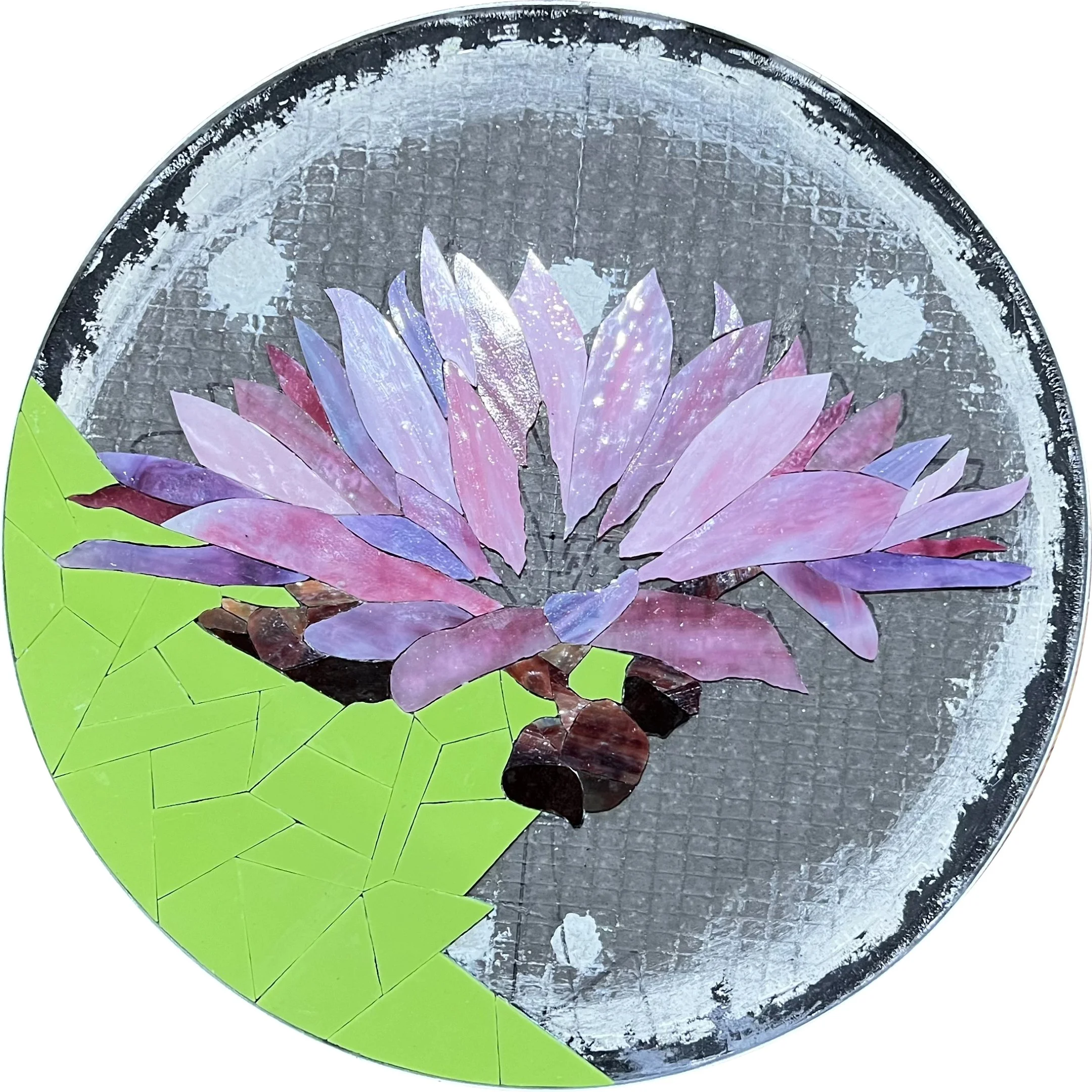
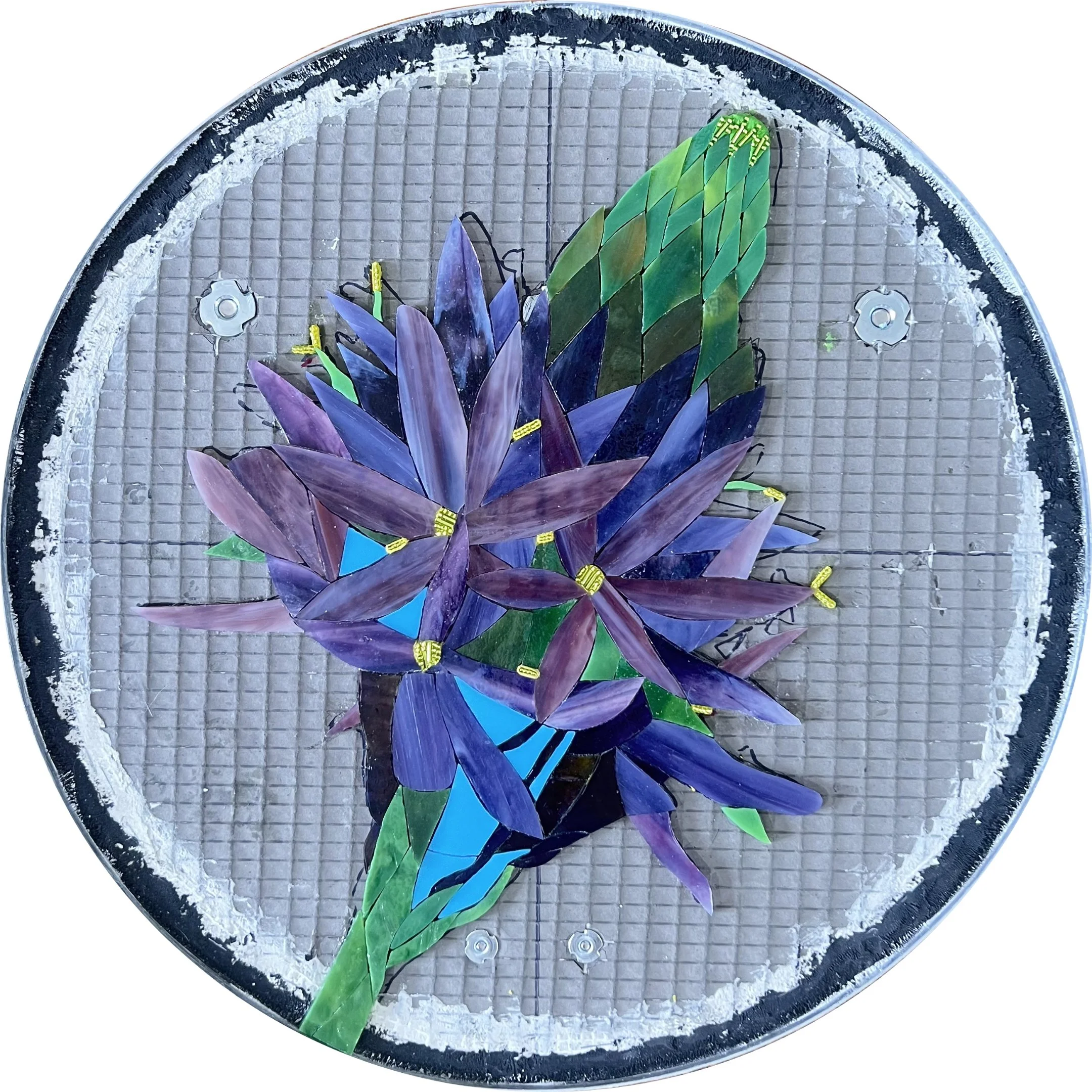
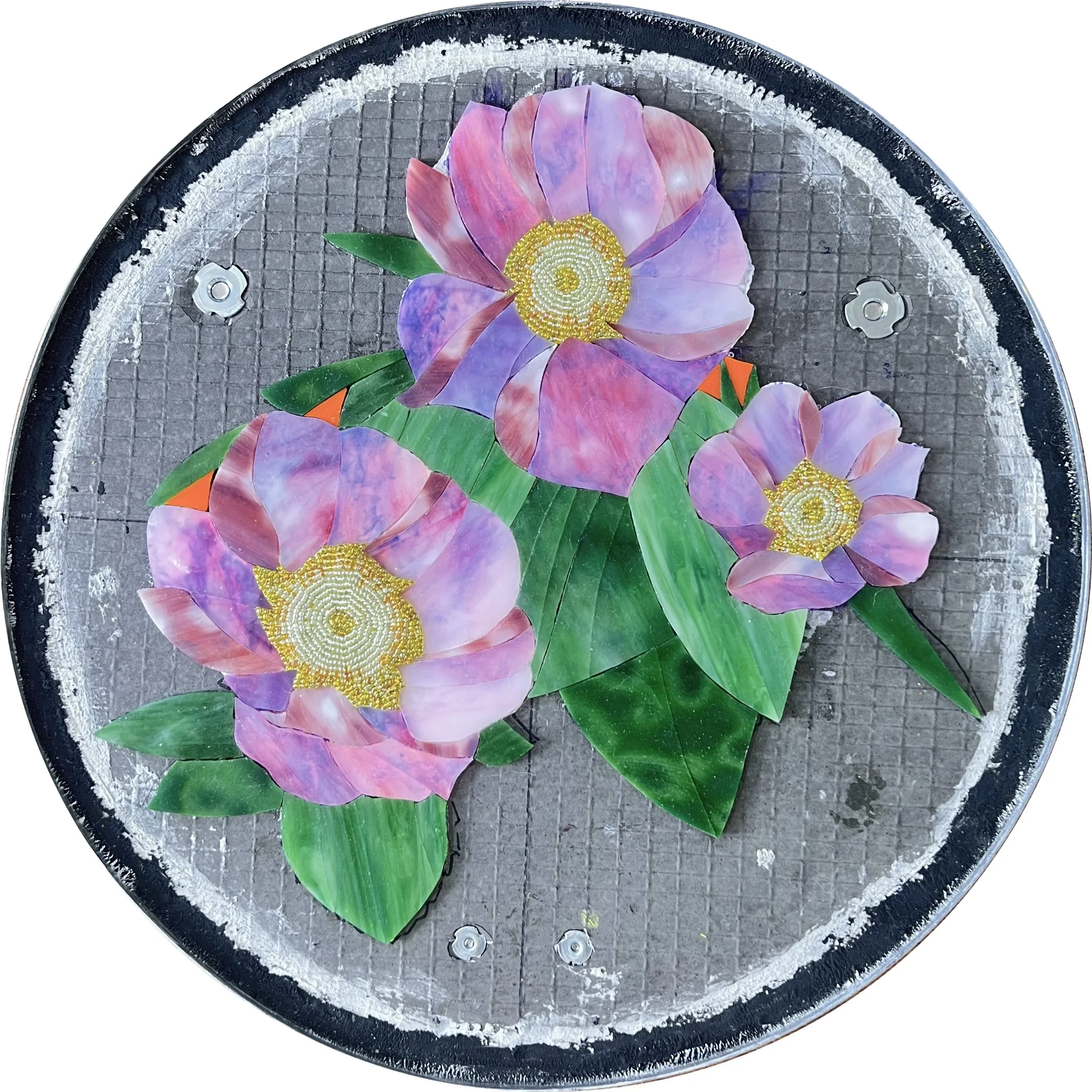
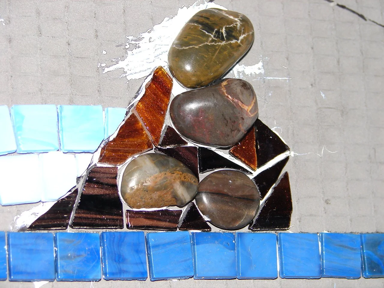
The fourth panel of each season depicts a flower representing an important food source for local Native American tribes, at 15" in diameter. I found ways to incorporate beaded details into each one, both because the beads add a liveliness and sparkle that I love, and because maintaining that beadwork thread throughout all 20 panels ties the entire collection together visually.

This project genuinely changed the way I think about my work. I loved the way the beads added energy and dimension to the floral designs so much that I expect beads will find their way into every floral mosaic I make from now on.

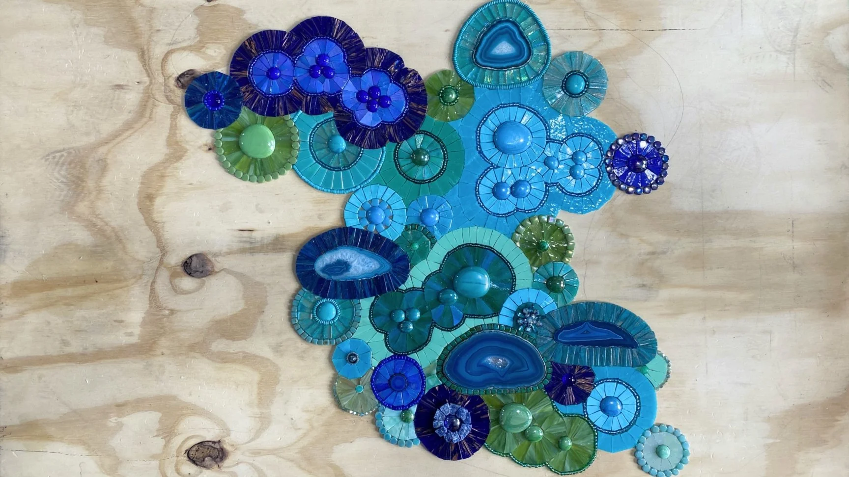
To complete the mosaics, I grouted all the stained glass sections with Starlike Evo Epoxy Grout. Its smooth, glassy, reflective finish was a deliberate choice: I wanted the grout lines to recede quietly into the background rather than compete with the beadwork and glass for attention. As you can see in the photos, the grouted panels have a much softer, more unified appearance that draws the eye directly to the subject of each piece.

Of course, the background glass itself received just as much care. I took considerable time cutting the background of each piece into patterns that flow well and remain consistent across each panel type, because even the supporting elements contribute to the overall cohesion of the collection.

You can view all the completed panels in detail here.

Shipping

With all 20 panels completed, grouted, and polished, it was time to pack them up and ship them to Washington. I gave myself a few days before packing so family and friends could come see them first. After more than a year of work, this was the only chance anyone I knew would ever have to see all 20 pieces together in person.

Arranging the shipping took some coordination. The school was closed for spring break, but the principal was wonderfully kind and communicative, arranging to receive the delivery at her home on a specific date. The packed panels filled several large boxes, and I was genuinely grateful she was willing to accommodate such a cumbersome delivery.

Then came the moment that nearly stopped my heart. I was already booked on a flight to Washington. The installation, student projects, and dedication ceremony were all scheduled. I dropped the boxes at FedEx, drove home, sat down, and breathed a long sigh of relief. Then an email arrived informing me the packages were en route to a random address in Georgia.

I checked the labels I had printed. They were correct. I called FedEx, shaking, and kept being told it was a computer glitch and everything was fine. Something about their responses did not reassure me at all. So I drove back to the FedEx location where I had dropped them off.

The woman who had helped me originally was still there, and she was a lifesaver. She knew something was wrong, made a series of calls, and discovered the boxes had not yet left the building. She arranged for me to load them back into my car and drive them directly to the main FedEx hub at the airport, where a staff member would personally take them from my car and ensure they were on the correct vehicle that afternoon. He even texted me later to confirm they were on their way to the right destination.

I still checked the tracking every couple of hours for the next few days. But they arrived exactly on time, exactly where they were supposed to be. I have never been so relieved in my life.

Installation

Nearly two years after the initial site visit, it was finally time to return to Ellensburg for the installation. I was nervous, excited, and ready.

ArtsWA asked me to arrive Saturday evening rather than Sunday, even though I wouldn't have access to the school until Monday. The reasoning was practical: if anything went wrong with the flight or the notoriously tricky mountain pass from Seattle, there would still be time to sort it out. As it turned out, the early arrival was a gift. I spent Sunday exploring the trails winding through the gorgeous landscape surrounding Ellensburg.

I had my heart set on visiting Mount Rainier, mostly because I envision it as a volcano that continuously spurts out Rainier cherries. Unfortunately the only route that wouldn't require a seven-hour round trip was temporarily closed. I was more than consoled by discovering the Umtanum Creek Falls Trail instead. No volcanoes, but an absolutely stunning waterfall.

Video of Umtanum Creek Falls on the Umtanum Creek Falls Trail near Ellensburg, Washington, visited during the Cycles public art mosaic installation trip

Finding the waterfall turned out to be an adventure in itself. The snow had just melted and the trail was barely visible. I had no cell reception, but thankfully had taken a screenshot of the trail map before leaving. At some point I wandered so far off the path that I had to climb a large hill just to get a vantage point and figure out where I was. I stood there for nearly 20 minutes studying the map and the landscape, trying to reconcile the two. The breakthrough came when I finally accepted how far off course I actually was. Once I let go of my mental image of where I thought I should be, the landscape suddenly matched the map perfectly. I could have turned back and found my way to the car. But I really wanted to find that waterfall.

This was like 5 minutes in. I looked like a mud monster when I left!

I can’t believe I actually made it across this “bridge”.

I fit in a couple more easy hikes that afternoon, but the waterfall was the highlight of the day. I realize I'm including a lot of nature photos in what is meant to be a mosaic installation post, but hiking in the Ellensburg area is simply extraordinary. Beyond the beauty, there was something deeply meaningful about walking this landscape while thinking about the project. This is the ancestral land of the Yakama people, and while I was out on those trails I kept thinking about how remarkable it would have been to live on this land hundreds of years ago, and how that history runs through every panel I had just spent almost two years creating. Back to the installation!

The next morning I met the principal well before dawn and we carried the packages of mosaics into the school together. I knew time would be short, so I had prepared obsessively. I created this detailed layout of all 20 panels and studied it so many times I could picture it with my eyes closed. The custodian generously provided a ladder, tape measure, and level, and I got straight to work marking every screw position for every French cleat with painter's tape.

Hanging the first mosaic panel.

Inspecting to make sure the security hanger is correctly in place.

Installing the fall leaf mosaic panel.

Making sure the French cleat is level.

As an artist working on state property, I wasn't legally permitted to drill into the walls myself. The principal had anticipated this and arranged for the head custodian of the district to come and handle the drilling and hanging of the French cleats. He was incredibly generous with his time, making sure every cleat was secure and positioned correctly. He was even gracious about it when I decided midway through that I wanted one of the panels shifted slightly from its planned position. When you've spent over a year creating something, getting the placement exactly right matters.

The head custodian for the district using the wrench-like key to lock the security hanger onto the wall.

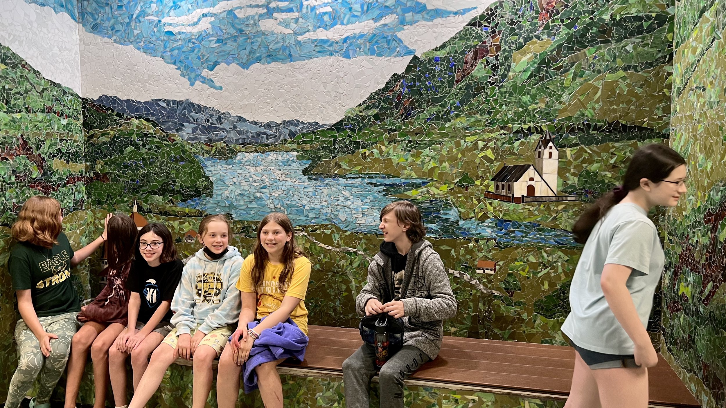
We finished the installation by early afternoon, which gave me just enough time to change clothes and prepare for the end-of-day school assembly. I would be speaking to the students about the artwork, sharing a little history of mosaics, and giving them a preview of the hands-on project they would get to make the following day. After nearly two years of working on this project largely in solitude, I was about to meet the kids it was made for.

Cycles, a public art commission for the Washington State Arts Commission in partnership with Ellensburg School District. Complete and installed!

Student Participation

As part of this commission, involving the students in the artwork was always part of the vision. My original plan was to have each student create a small mosaic disk using glass gems, which would then be installed collectively on the wall opposite the Cycles mosaic. The idea was to install everything in the fall so the students could see their own work displayed throughout the school year, then take their individual pieces home at the end of the year.

The timeline shifted and the installation ended up happening at the end of the school year instead. On top of that, the specific glass gems I had planned to use have become increasingly difficult to source over the past couple of years. With both the timeline and materials changed, the student project needed a fresh approach.

Mockup of Original Kids Artwork Concept

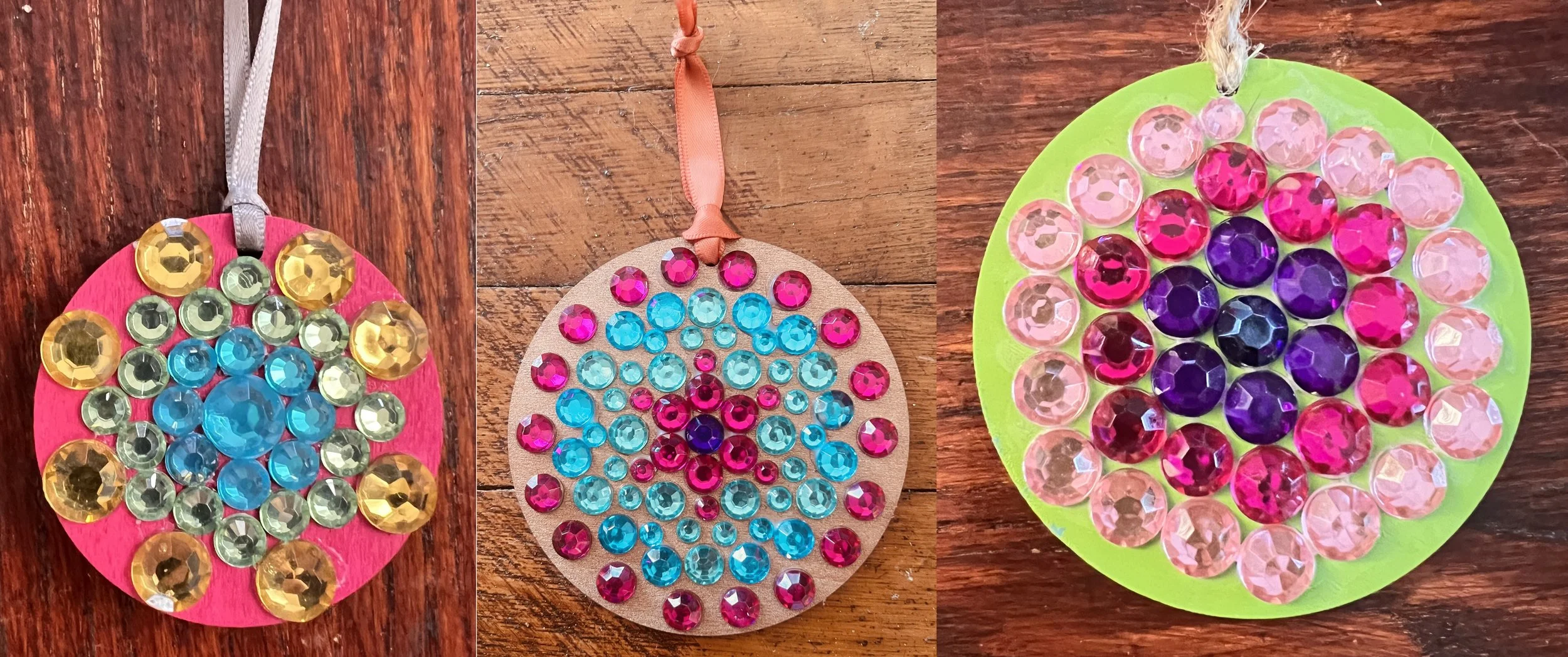
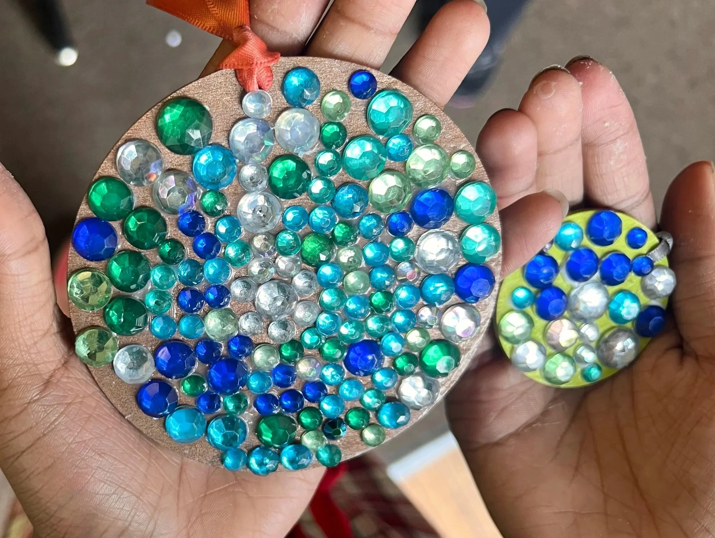
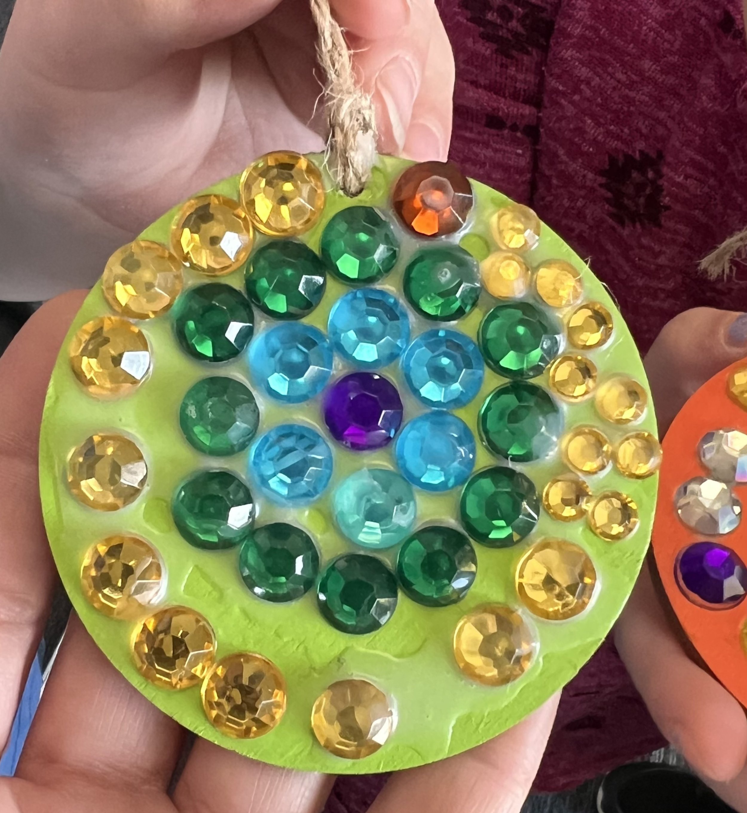
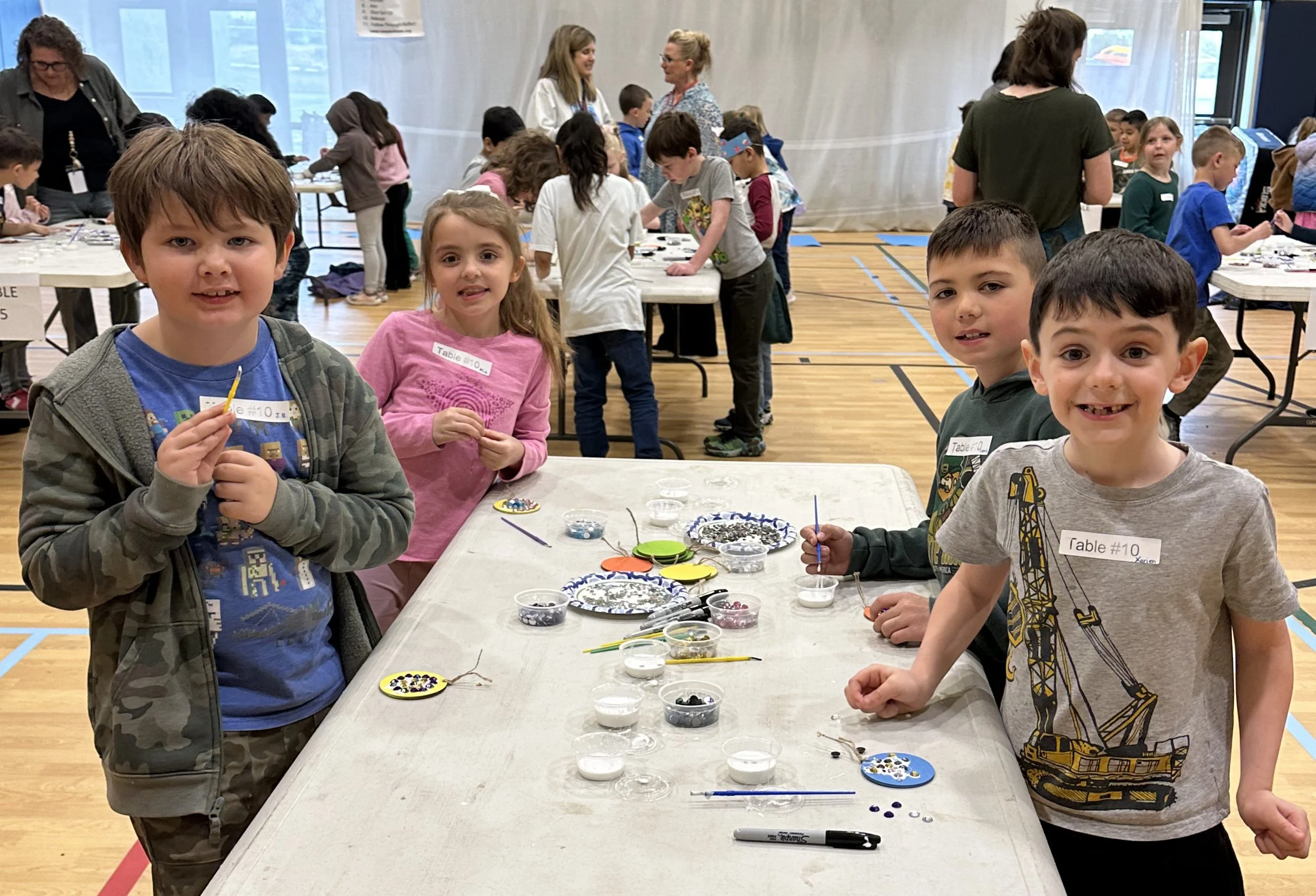
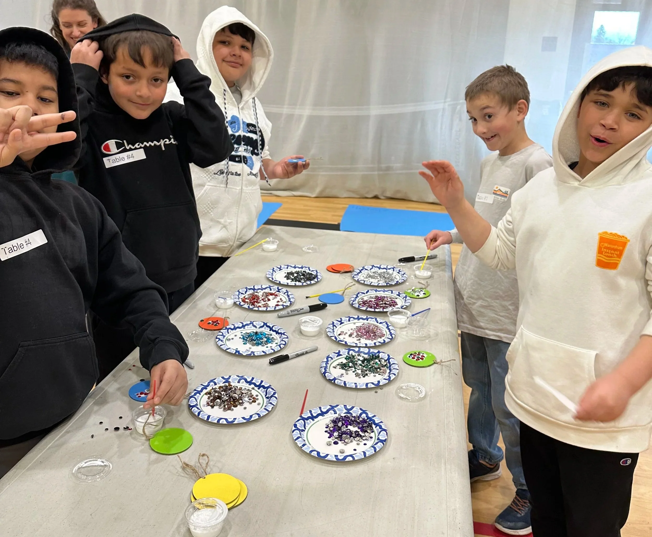
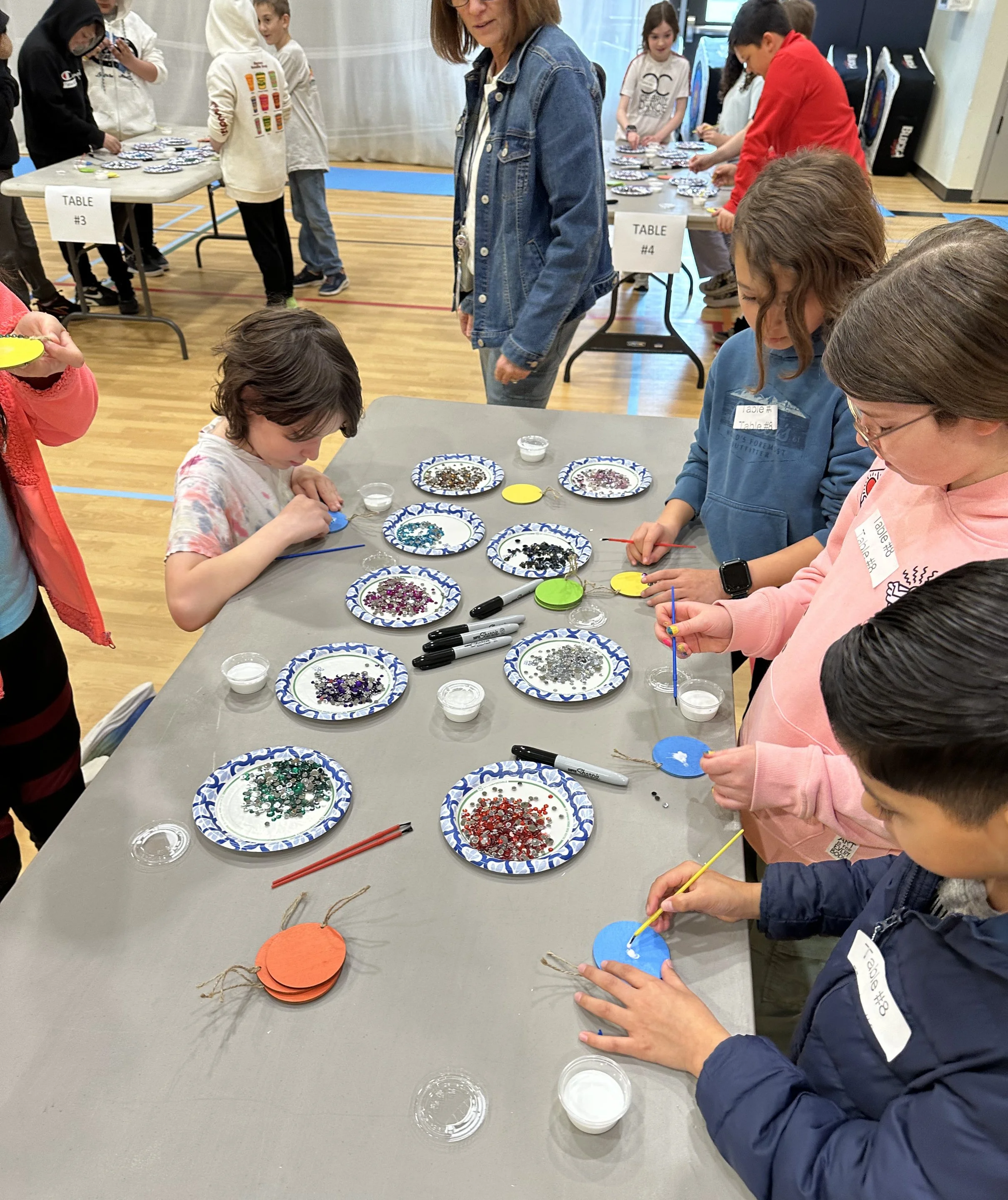
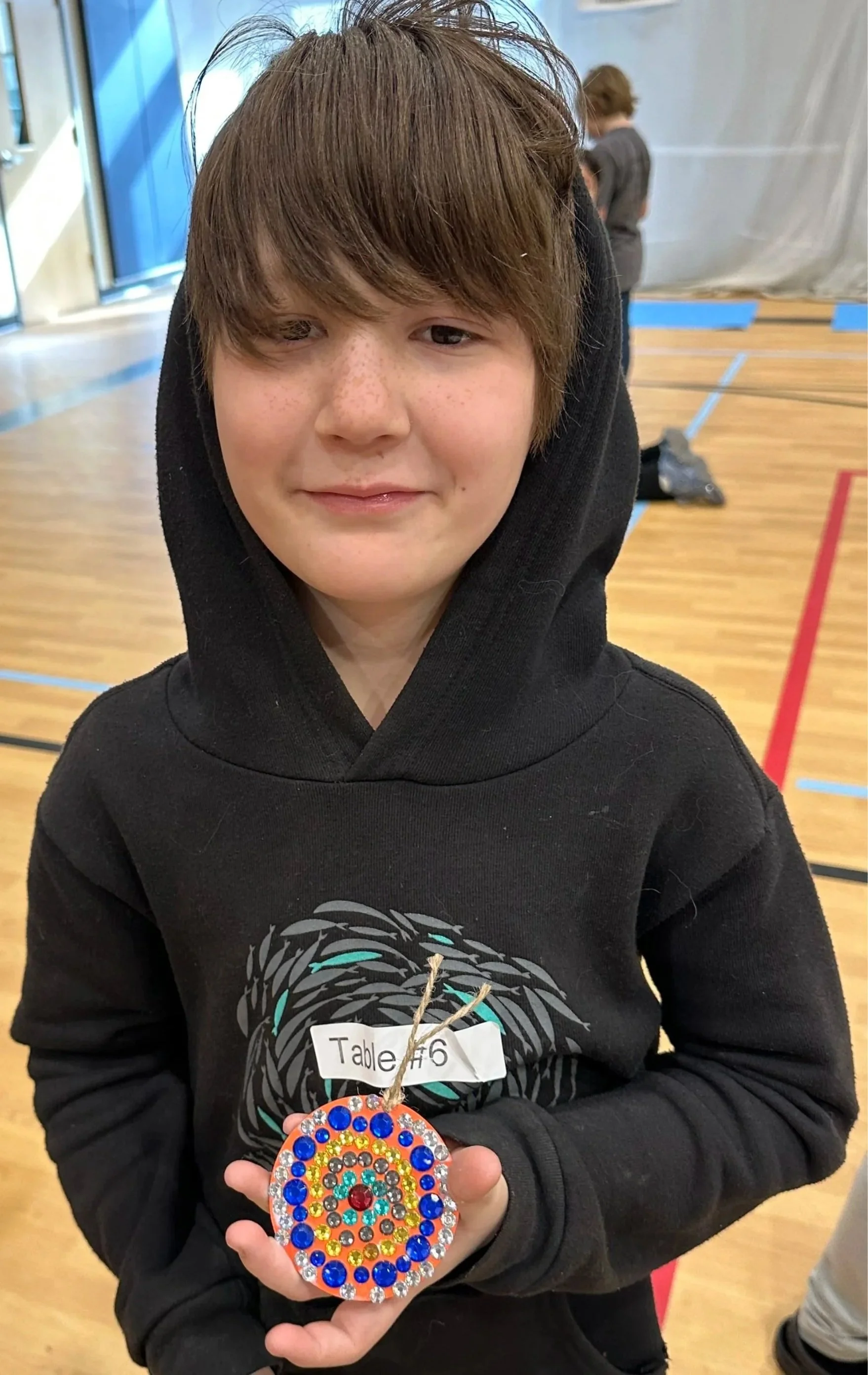
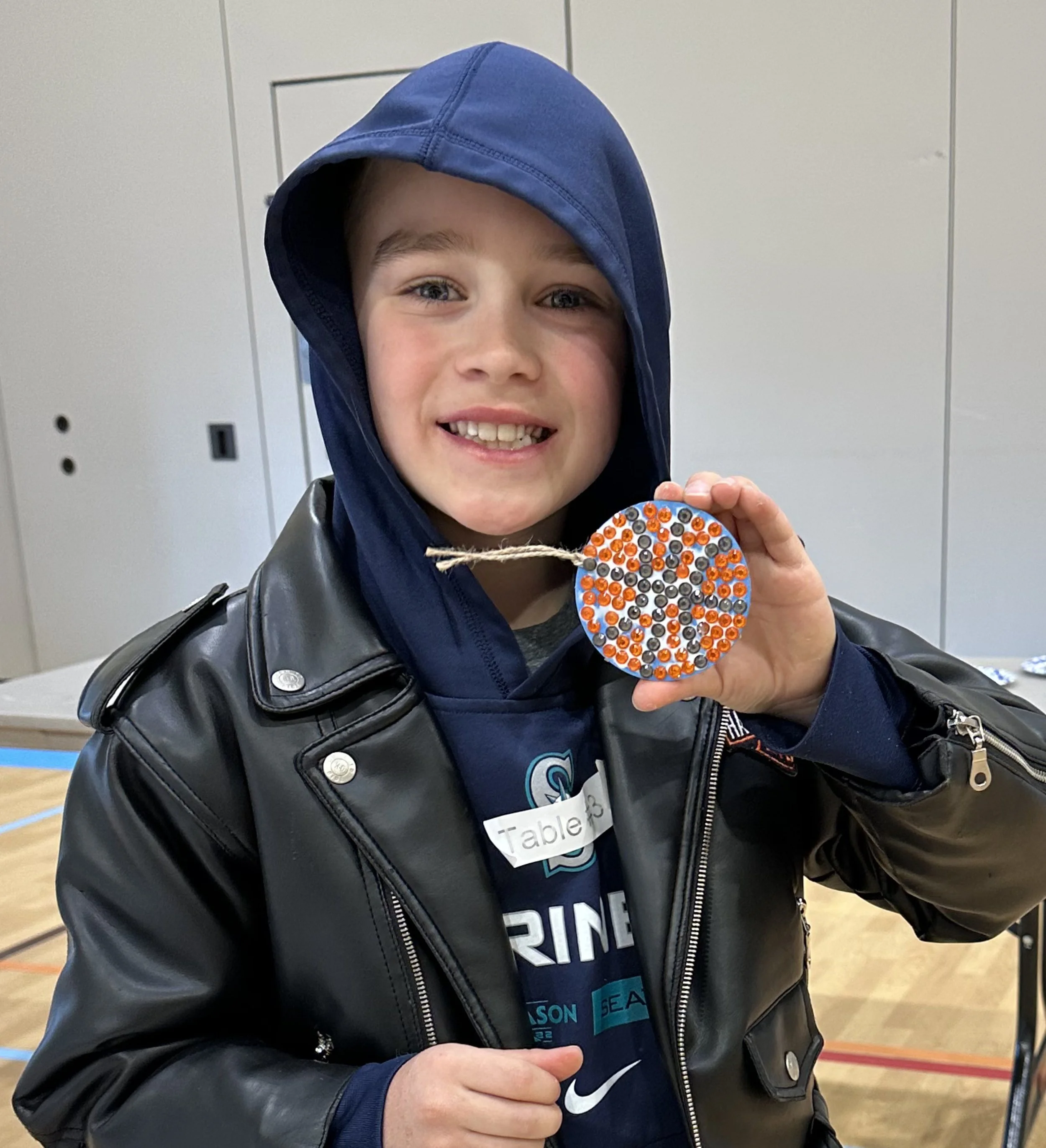
Instead I decided to have the students make mosaic gem medallions they could take home that same day as a keepsake. We worked with students throughout the entire school day, approximately 350 kids in total, cycling through group after group from morning until the final bell.

The librarian and art instructor of the school was the unsung hero of the day. Her organization and preparation made the whole thing run seamlessly, and I genuinely could not have managed it without her. By the end of the day I was completely exhausted, but the joy in the room made every moment worth it. The kids had a wonderful time and their medallions were absolutely adorable.

Three examples of gem mosaic medallions made by students at Ida Nason Aronica Elementary School as part of the Cycles public art commission by Dyanne Williams
Child's hands holding two completed gem mosaic medallions made during the Cycles public art commission student participation project at Ida Nason Aronica Elementary School
Children's hands holding two completed gem mosaic medallions made during the Cycles public art commission student participation project at Ida Nason Aronica Elementary School
Students creating a gem mosaic medallion during the Cycles public art commission participation project at Ida Nason Aronica Elementary School in Ellensburg, Washington
Student proudly displaying his completed gem mosaic medallion from the Cycles public art commission participation project at Ida Nason Aronica Elementary School in Ellensburg, Washington
Student proudly displaying his completed basketball gem mosaic medallion from the Cycles public art commission participation project at Ida Nason Aronica Elementary School in Ellensburg, Washington

Dedication

The dedication ceremony took place on my final day in Ellensburg. Photography wasn't permitted during the ceremony itself, but the gathering was deeply meaningful. The family of Ida Nason Aronica, the director of the K'tɨ́taas County Historical Museum who had guided me so generously through the cultural research, and the former principal who had championed the project from the very beginning were all there. I had to speak, which always makes me nervous, and honestly the ceremony passed in a bit of a happy blur. But it was a beautiful moment.

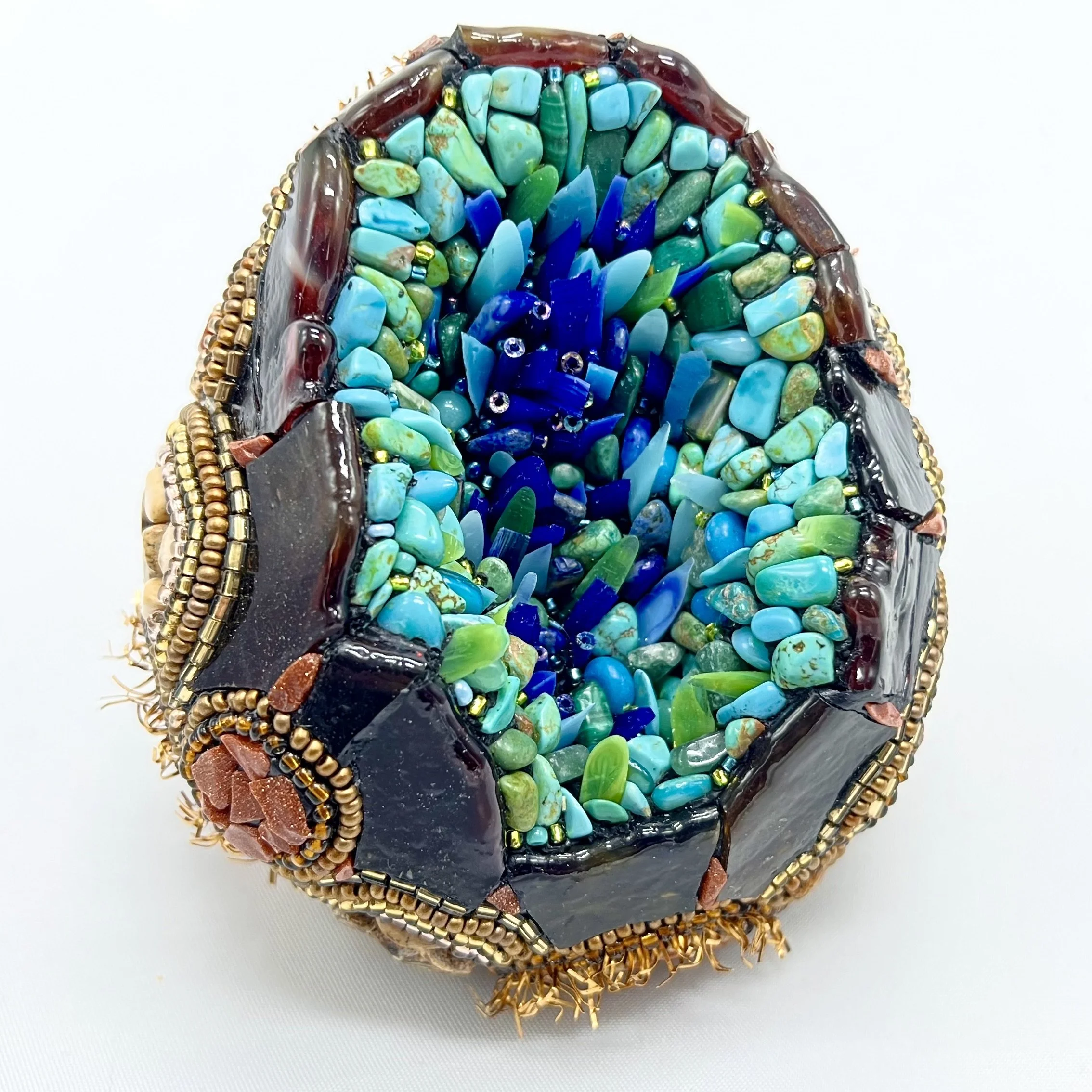
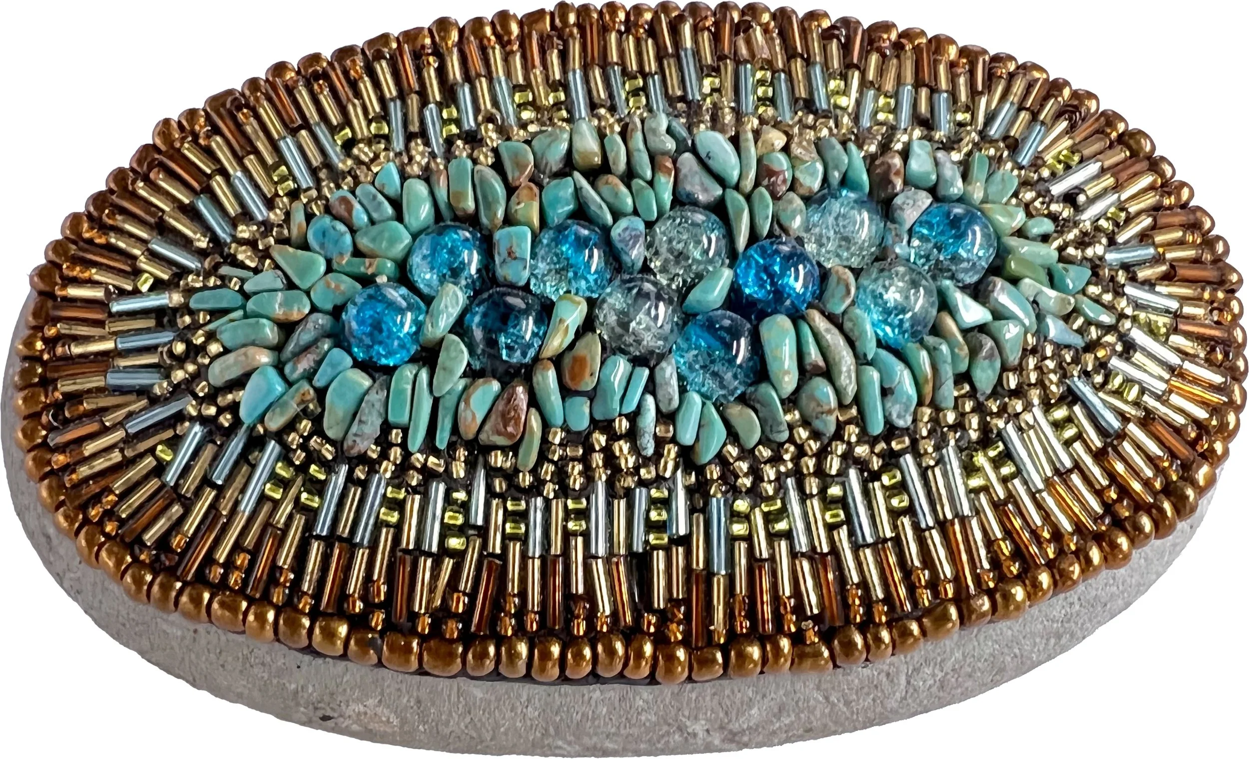
As if the entire experience hadn't already exceeded every expectation, one of Ida's family members honored me with a gift I will treasure always: a gorgeous hand beaded tribal medallion incorporating a rare Ellensburg Blue agate. After spending two years trying to pay tribute to Ida Nason Aronica's extraordinary beadwork through my own medium, receiving a piece of that tradition as a gift felt like the most meaningful possible ending to this journey.

A hand-beaded tribal medallion incorporating a rare Ellensburg Blue agate, a gift from a member of Ida Nason Aronica's family.

This project holds a special place in my heart for many reasons, but perhaps the most personal is the name. Cycles was also the title of my very first glass mosaic, made in Los Angeles over twenty years ago when I was just beginning to find my voice as an artist. It felt meaningful to give that same name to this commission, a public artwork that required every skill and every lesson I had accumulated over my career. In many ways, this piece represents the completion of a long arc and the beginning of a new one.

This project changed me as an artist in ways I'm still discovering. The process that ArtsWA has developed for guiding artists through a public art commission is extraordinary, and I feel genuinely prepared and excited to take on more public art projects. If you are involved in a public art commission and are looking for a mosaic artist, I would love to hear from you. You can reach me through my contact page.

Mosaic Art of 2022

I finally took a pause from making mosaics and got around to updating my site with all the art I created last year! Of course, it's all put into categories, so here's your quick guide on what's new. Every image links to the full page with more and larger images.

I didn’t get around to doing a lot of writing about the artwork, so ignore the boring text and just look at the pretty images. ;)

Copper Patina Mosaics

Starting at the end of 2022, here are some of the new mosaics I created for my Oxidation exhibition at Silo Art Gallery.


Sancta Clara Sunrise behind St. Joseph Mosaic

During the winter I got to stay bright by creating this sunrise mosaic with stained glass and gold smalti, then we installed it in the summer of 2022.

I love when I get to work with bright colors!! Most of my mosaics are at private homes, so it’s also exciting that people can actually visit the grounds of this monastery to see it in person!

Sancta Clara Monastery
4200 Market Avenue N, Canton, Ohio 44714


Glenwood Landscape Mosaic

It was so cool to work with the 6th graders and their fabulous art teacher to make this giant landscape mosaic to beautify their hallway and create a calm place to read and study. This kept us all busy through the winter and spring of 2022.


Coming Up…

For those of you that stuck around to the end, here’s a sneak peek at what I’m working on now. This is what I’m beginning to create for a large exhibition in 2026 or 2027. I hope to finish these two along with a few other things by late spring so I can announce the project and start fundraising.

It’s always hard to find enough time for everything as an artist! I took a couple weeks to update my website and make a few social media posts, but in addition to trying to create, I’m also working with kids for two arts organizations, starting on three commissions, and trying to keep up with the business end of art. This is just a little PSA for those that want to know why artists are always so stressed. We’re running businesses with no experience in business, in which we fill the role of several employees with expertise we don’t have, spending 100 hours a week working and creating art, and then it’s almost impossible to get people to pay enough or buy enough to cover expenses. So hug an artist & buy from an artist. ❤️

VIDEO: Making of Mokuluas Mosaic

It was such an honor to have the opportunity to make such a stunning backsplash for my client in Kailua, Hawaii! This video shows the creation of the Mokuluas mosaic from beginning to end, but before iPhones took good pictures. ;)

Video transcript for deaf or hard of hearing:

 I’m going to take you way back to 2008 to one of the first major commissions of my professional mosaic career. I had done a couple small commissions before and finally got my website together when I got a call from an interior designer in the Bay area.

She wasn’t calling for a client, but for herself. She and her husband were building their dream home in Kailua, HI, and wanted me to make two mosaics for their home. Today I’m going to show you the making of Mokuluas, the Hawaiian art wall backsplash.

This was a new build, so since it didn’t exist yet, I received a pdf file with

elevations from the architect. There were still some variables, so I believe this is the image I sketched up with the red dots to let them know which measurements I needed to proceed.

The client sent me these two images of the Mokuluas islands. They are just around the cove from the new home they were building, but since they didn’t have a view from their property, they wanted this mosaic to bring the islands into their home. 

The client and I knew we wanted it to be slightly stylized, yet realistic, so I started first by showing her how an idea I had for the clouds, a motif that would carry through to the ocean waves. 

Then I sketched the ocean waves.

Again, the kitchen wasn’t built yet, so I put the measurements into a CAD program to create a layout to make sure the client understood the perspective.

Then the client wanted some palm leaves to frame the mosaic. There was also some talk at this time about adding a turtle. I believe I made some sketches with a turtle, but really felt it took away from the elegance of the design.

Then the builders sent me updated measurements, making the proportions slightly squarer.

This was the final design thrown into the CAD layout. 

The next step was to show the client the palette of glass I would use for the mosaic. I ordered samples of every color from a few different glass lines and pared them down to this. I spent a lot of time finding the perfect combos, so I remember being thrilled that the client immediately approved the glass.

Next I laid out the shifts of water color on the design as well as the backer board I would be working on. It would be easy with a free flowing, wavy design to get crooked or get carried away with one color and not leave enough room for all the transitions.

Then it was time to begin the construction.

I started with the palm fronds,

Then the stylized clouds 

And the pebble islands filled in by gold streaked glass to make sure they still catch the light.

I took some pictures for the client without the painter’s tape.

I need to leave some pieces of glass unattached so the panels can be screwed into the wall with washers, so as I’m working the blue tape is to hold them in place.

Now onto the water. I worked from both the bottom and top to make sure the colors and intensity of the waves would come together properly. 

Also as a note, I used white silicone for this project. I want it to be waterproof because it will be in a kitchen in a humid climate. Plus much of the glass is translucent, so using a white adhesive makes the glass bright and shiny.

I cut the mosaic into dozens of pieces and shipped the mosaic to Hawaii. The builder sent me these pics before lighting was installed in the home.

 The next year I went to Hawaii to grout the mosaic. I was busy working the whole time, but here are a couple pictures of the home and property I managed to take. 

And finally the mosaic was finished. This was right before inexpensive cameras and phone cameras started getting really good, so the pictures don’t quite show the movement of the mosaic.

 When you are in the room, because of all the shine and iridescence, the water appears to move and the homeowner reported that the colors change throughout the day.

Thank you for taking this trip back in time with me!

Mokuluas Islands Mosaic Backsplash

Dating back to 2008, this was the first large mosaic piece I created. I received a call from an interior designer about a piece that she wanted for herself. She and her husband were building their dream home in Kailua, Hawaii, and they wanted for me to create a backsplash to be put in their kitchen.

This is the mosaic that started it all for me as a commission artist. Dating back to 2008, the Mokuluas Islands mosaic was my first large commission, and taking it on felt equal parts thrilling and terrifying. Up to that point I had only completed two small local commissions in Los Angeles. This was a 69” by 89” backsplash for a dream home being built in Kailua, Hawaii, for a client who happened to be an interior designer herself. The stakes felt very real.

The client and her husband were building their home near the Mokuluas Islands but wouldn't be able to see the islands from the house. She wanted a mosaic that would bring that view inside, something realistic but also stylized, that would capture the landscape she loved and live with her every day in her kitchen. She sent me measurements and photographs of the islands to work from, and I began sketching.

Final sketch of Mokuluas Mosaic Backsplash.

Final sketch of Mokuluas Mosaic Backsplash.

I started by establishing the cloud shapes, developing a flowing motif that would carry through the entire composition. From there I sketched the ocean waves using the same organic approach. After the client reviewed the sketch she asked if palm leaves could be incorporated, and I was able to work them into the sides of the composition without disrupting the elegance of the overall design. We also adjusted the dimensions slightly at that stage to make the piece more square, which worked better for the layout she had in mind.

Sketch of Mokuluas Mosaic Backsplash in CAD rendering.

Sketch of Mokuluas Mosaic Backsplash in CAD rendering.

Once the design felt right I transferred the measurements into a CAD program. Because the kitchen wasn't built yet when I started the design, the CAD rendering was essential for showing the client exactly how the mosaic would read in the space and from what perspective.

Guide version of sketch for Mokuluas Mosaic Backsplash.

Guide version of sketch for Mokuluas Mosaic Backsplash.

Next I created a detailed guide version of the sketch with measurement lines marked at every few inches across the full height of the composition. Working at this scale, that kind of reference is invaluable for keeping everything on track as you build.

Glass selection for Mokuluas Mosaic Backsplash.

Glass selection for Mokuluas Mosaic Backsplash.

The client was clear that she wanted the piece to be as detailed as my fine art mosaics. She had admired my 3D spiral work, but that kind of dimensional surface isn't practical for a backsplash. Instead we found a wonderful compromise: using a mix of different thicknesses of glass, glass gems, and pebble stones to create visual and tactile depth without the impracticality of true relief.

I spent a lot of time selecting and sampling glass colors, laying out combinations and living with them before committing. The palette needed to move through the deep blues of the ocean, the shifting greens and aquas of the shallows, and the warm sandy tones of the beach. I was genuinely thrilled when the client approved my first round of color choices.

Palm Fronds, work in progress.

Palm Fronds, work in progress.

Palm Fronds, completed.

Palm Fronds, completed.

Islands, work in progress.

Islands, work in progress.

Islands, completed.

Islands, completed.

Mokuluas waves, work in progress.

Mokuluas waves, work in progress.

Mokuluas waves, completed.

Mokuluas waves, completed.

Once everything was set I mapped the color shifts onto the backer board as a guide, so the transitions between sections stayed controlled and no single color overwhelmed another. I built the piece starting with the palm leaves, then worked through the clouds and the islands. For the water I worked from both the top and bottom simultaneously so the wave colors and intensity would build toward each other and meet in the middle without any awkward jumps.

Fuzzy pic of me grouting. iPhone cameras weren’t as good back then!

Fuzzy pic of me grouting. iPhone cameras weren’t as good back then!


Like the Sun Kitchen Mosaic Backsplash, this piece was built on Wedi board panels and cut into sections for shipping to Hawaii, where the builder's team installed it. I used white silicone as the adhesive since this is a kitchen installation and waterproofing was essential. White adhesive also brightens translucent glass from underneath, which made a real difference in how luminous the finished piece would look.

A year after installation I traveled to Hawaii to grout the mosaic.

Getting to see the finished piece in person, and to see the actual Mokuluas Islands that had inspired it, was a genuinely moving experience. The way the water and clouds seem to shift and move as the light changes on the mosaic throughout the day, and as you move around the room, is something the photographs simply can't capture. The client noted that herself. It's one of those pieces that lives differently in person than it does in any image, and knowing it's in someone's home bringing that landscape to life every day means a great deal to me.

See the full gallery page for this commission.

Completed Mokuluas Islands Mosaic Backsplash featuring iridescent glass and gems in Kailua, HI

Ombre Mosaic Fireplace

I loved making this mosaic so much! The subtle color changes and wide variety of tessera made this fireplace a work of art.

It was such a pleasure to make this mosaic fireplace for this delightful client in Akron, Ohio. She had a wonderful eye for color, design, and theme, and had planned color palettes evoking the seasons in different areas of her home. It's wonderful to work with someone who knows what she wants but is open to discussion.

When I visited her home to see her aesthetic, I immediately saw that the fireplace had the potential to be something ethereal. She came with images and a concept, and I sketched up a few ideas. I presented her with a couple of approaches to the ombré, including a simpler diagonal following the line of the ceiling, and she chose the diagonal criss-cross pattern you see here. I think it was absolutely the right call.

Diagonal Fireplace Mockup

Diagonal Fireplace Mockup

Criss-Cross Diagonal Fireplace Mockup

Criss-Cross Diagonal Fireplace Mockup

The ombré transitions through four color sections: deep brown at the base, warm peach in the middle, taupe, and finally a creamy iridescent glass at the top. I felt strongly that the bottom needed the weight of dark brown to ground the piece and make the upper half feel more ethereal by contrast. The peach tones in the middle evoke the warmth of fire without the harshness that orange or red would have brought to the room. And the iridescent cream at the top creates exactly the luminous, almost otherworldly quality I had envisioned from the start.

One of the palettes of materials I showed the client.

One of the palettes of materials I showed the client.

The color palette required some careful negotiation between her original vision and what was technically achievable. Certain materials, like the thicker glass gems and tiles, simply don't come in every color, and excluding them from any section would have made the piece feel inconsistent. Working within the budget also shaped some of the glass choices. She was wonderfully collaborative throughout, willing to discuss adjustments when I felt strongly that a change would serve the piece better.

She came to my studio to choose from a huge variety of glass options and quickly identified what she did and didn't want to use. It was a tough decision to commit to the darker, heavier materials at the bottom, but I really felt it would ground the mosaic and make the design pop. I'm so glad she trusted that instinct.

 
Installing the fireplace mosaic.

Installing the fireplace mosaic.


Several different materials are woven throughout the composition including stained glass, vitreous glass, glass gems, and pebbles. The pebbles are concentrated in the darker lower sections where their weight and texture feel most natural. One of the more technically demanding aspects of this piece was keeping the ombré transitions smooth and gradual while also keeping the criss-cross pattern legible. With so many materials of different widths and thicknesses, maintaining consistent spacing across the entire surface required constant attention.

Iridescent stained glass presents a particular challenge: it can look completely different before it's cut and placed against neighboring glass, so color decisions had to be made carefully and sometimes revisited. Some of the more translucent glass required adhering directly with mortar rather than mesh so the backing wouldn't show through. For grouting I used four different grout colors, blending them at the transitions. That sounds complicated, but it came together more smoothly than I anticipated, even with so many different textures and thicknesses to work around.


This is my favorite mosaic I have ever made. The way so many complicated decisions, materials, and techniques came together into something unified, flowing, and elegant is exactly what I hope for in a commission, and rarely get to this degree.

See the full gallery page for this commission.

Ombré Mosaic Fireplace viewed from other side.

Sun Kitchen Mosaic Backsplash

It was so much fun to have the honor of making this brilliant, Gaudi-inspired showpiece for a client’s home! 

My clients were building their dream pool house, which was sleek, modern, and minimal. It is a gorgeous home with clean lines and almost entirely white walls. They planned on doing a lot of entertaining, so they wanted a bright, bold mosaic backsplash in their open kitchen to serve as the centerpiece of the dining and living area. I was so fortunate that the wife of the president of an arts organization I work with are neighbors and friends with the couple building the home. She told them about my mosaic work and we met to discuss the project.

The couple wanted something inspired by Gaudí because they loved his mosaics and wanted a special artwork to remind them of their travels to Barcelona. They also wanted cobalt contrasting with vibrant, warm colors. It's so rare that clients are bold enough to put this much color in their home, so it was such a joy to work with them to make this mosaic happen.

Mockup of design option 1, colored pencil sketch.

Mockup of design option 1, colored pencil sketch.

I began with a hand-drawn sketch exploring the concept. This early option used a looser, more organic approach with stars and sweeping movement across the full width of the backsplash. You can also see the shelf cutouts already accounted for in the design, since planning around the architecture was part of the process from the very beginning.

Mockup of design option 2, digital.

Mockup of design option 2, digital.

From there I moved into digital mockups to work out the color relationships and composition more precisely. This version refined the design toward the sun concept and brought the cobalt and warm color contrast into sharper focus.

Mockup of design option 3 (chosen design), digital.

Mockup of design option 3 (chosen design), digital.

This is the final design the clients approved. I wanted to create something that matched their Gaudí and color specifications while still reflecting my own style. I suggested a sun because Gaudí has worked with solar imagery, but I approached it my way using geometric shapes, varying levels of translucency in the glass, colored mirror, and gold smalti. I also suggested creating the mosaic in glass rather than ceramic. I was so glad they agreed, because I couldn't have created a work this intricate in ceramic, and it would have lacked the luminosity and impact that glass brings. I still used a picassiette-style andamento traditional to ceramic mosaics as a nod to Gaudí. The whole design came together beautifully and quickly because the clients were open to ideas but also knew exactly what they wanted when they saw it.

Chosen mockup of Sun Kitchen Mosaic placed into wall elevation.

Chosen mockup of Sun Kitchen Mosaic placed into wall elevation.

Before construction began I worked from the architect's wall elevation drawing to plan the panel layout precisely around the stainless shelves, range hood, and exact dimensions of the space. The sun was centered over the stove intentionally, both as a compositional anchor and so the focal point would sit entirely clear of the shelves. I also planned a buffer area at the top of each panel to account for any slight variation between my measurements and the actual wall, since it's far easier to trim a clean edge on site than to cut down a completed mosaic panel.

Sun Kitchen Backsplash, work in progress.

Sun Kitchen Backsplash, work in progress.

The mosaic was built on Wedi board panels, a foam core backer board coated on both sides with fiberglass mesh and cementitious resin, cut to fit the space. Working on the floor of my studio, I built each panel section by section, adhering all the glass with white mortar. I chose white mortar specifically because this is a kitchen installation and I wanted it to be as waterproof as an outdoor piece. White mortar also dramatically affects the color and reflectiveness of stained glass, even opaque glass has some level of translucency, so the mortar color underneath matters. For the translucent gems I backed them with foil so they would catch and reflect light beautifully.

Completed & grouted panel of Sun Kitchen Mosaic with removable section for washer circled in yellow.

Completed & grouted panel of Sun Kitchen Mosaic with removable section for washer circled in yellow.

For each panel seam I pre-cut the glass pieces that would bridge the gap after installation, but instead of adhering them I applied clear packing tape to the front and removed them. That way I could set them aside, install the panels, and then reapply them over the seams and washers during installation. The yellow circle in this image shows where one of the Wedi board washers sits beneath the glass surface. Those washers are designed specifically for foam core backer board installation and are completely hidden once the glass is applied over them. The main panel areas were grouted before installation so that only the seams and washer covers needed grouting on site.

Sun Kitchen Mosaic Backsplash during installation.

Sun Kitchen Mosaic Backsplash during installation.

Installation day was incredibly satisfying. We first dry-fitted all the panels to confirm everything aligned correctly, and fortunately it all fit perfectly. The installers then secured the panels using mortar and screws through the washers. After that we applied the pre-cut glass pieces over the seams, washers, and buffer areas, with extra supplies and tools on hand in case any gaps needed filling. The last thing I wanted was extra grout lines giving away where the seams were hiding. Finally we grouted those areas and the backsplash was complete.

Sun Kitchen Mosaic Backsplash close-up showing orange and red glass mosaic sun rays with reflection in stovetop below

I didn't even anticipate the gorgeous reflection of the sun in the stovetop. That was a happy coincidence. In a home of clean white walls and modern design, seeing it finished and installed was dazzling. The clients are frequent hosts and their guests have told me how much they love it. They still tell me how thrilled they are with it every time I see them, which is the best possible outcome for a piece like this.

See the full gallery page for this commission.

Sun Kitchen Mosaic Backsplash by Dyanne Williams, angled view showing full cobalt blue and golden sunburst mosaic design, Lake Cable Ohio

Casa de Los Robles Mosaic

I loved making this plaque for a client’s home using stained glass and 24 karat gold smalti.

It was such an honor to get to make this beautiful plaque for my client’s home. She wanted something elegant to honor her home, Casa de Los Robles (House of the Oak), that was built in 1927.

A major feature of this mosaic is the gold smalti, which is 24 karat gold leaf between layers of glass. This beautiful and coveted glass comes from the Orsoni glass company in Venice, Italy. I had the idea of working with gold smalti and the client loved it, but then we were left with the dilemma that she definitely wanted the “de” to be placed in the tree trunk. I could have used dark gold smalti for the background and yellow gold to stand out in the tree, but I personally feel that using different colors in font is less elegant. The USA supplier of the gold at the time didn’t have this darkest of colors that had a certain refraction that allowed it to stand out against both dark brown and cream glass. Fortunately, when I relayed the significance of this particular color, the supplier managed to either find some stashed away or get some from Italy before her regular shipment, which would have been several months if the factory even had any in stock. To me, this color totally makes the mosaic work, so I was elated.

Then I had to sculpt this thick glass using andamento that keeps the script lettering light and consistent. Instead of recessing this glass that is slightly thicker than stained glass, I kept its depth so that it rose above a bit to stand out and reflect the light cleanly. I also used this bronze gold smalti in addition to a more traditional yellow gold smalti for the acorns and the border. The rest of the mosaic is stained glass.

I created the Casa de Los Robles mosaic in one piece on Wedi board. I grouted it and shipped it to California to be installed, recessed, into the wall of the client’s butler’s pantry. The client was kind enough to send along this picture after the installation.

VIDEO: Afghan Blue Mosque Mosaic: WIP #3

This is the third video about the creation of my Afghan blue mosque mosaic.

Video transcript for deaf or hard of hearing:

Hi Mosaic Fans! This is where we left off last time with the Afghan blue mosque mosaic 

I’m starting the next step by pre-cutting stained glass into rhomboids for one of the border sections. Each piece will need to be cut and fitted into its space, but it’s easiest to prep about 500 pieces first and tailor them to fit rather than cut each piece from scratch as it’s needed.

Next I’m going to take a little break from those blue pieces because it’s getting a bit tedious. I’m placing some little Kismet round tiles in the upper portion of the archway. I’m really loving the way these are looking. This section should turn out a little more delicate than the rest because of the curvy design.

I’m all over the place now. I want to lock down the designs and patterning for each section, so I’m going to place whatever I can that is quick that allows me to then make decisions about the rest. Here I’m doing some of the beading work and placing the little yellow and red circles around the whole mosaic.

Next I’ll do a little cleanup and place the red squares and yellow circles in the center.

I know I need to get a little green in this mosaic, so I’m going to place the teardrop details around the two corner pieces. These are just green stained glass that I’ve cut into teardrops and surrounded by white beads.

Now it’s time to set the pattern for the center. I know I want to outline the sections in white beads, and the center tiles of the pattern in cobalt blue.

It’s going to take me a while to set this patterning, so I want to talk about why I chose to use beads. I want the crisp outlines you see in ceramic tile. It’s hard to do this with stained glass because glass doesn’t cleanly cut into 3/16” strips. Beads may be time consuming, but I can lay them down exactly how I want them, and the color will be consistent. Stained glass also tends to have dark shadows, so when you cut it super thin, the color can be inconsistent.

The white beads look overwhelming when I first lay them down, but they mellow out quite a bit once they’re surrounded by the rest of the glass. In addition, I’m using cobalt blue grout, so they will tone down a lot once they are surrounded by & slightly buried in the grout.

Next I’m going to use vellum to make some templates for the stained glass in this middle section. I’m just going to make this one square first to set the pattern idea, but if I make the templates now, it will be one less step in a couple months when I finish all the beading and I’m ready for the glass.

I estimate by the time I finish the beading, I’ll have invested at least 300 hours into the project, and that the whole project will take about 500 hours. I haven’t really been keeping track, which I regret, but it’s hard to do the work, let alone keep track of all the videos, images, and time yourself on top of it.

Here’s the mosaic so far. There’s still a lot of work to do, but it’s starting to come together.

Let’s get a little work done on one of the two featured circles. I want to know how the orange I’m planning is going to look with the orange I’ll be using in the center.

I’ll also finish up the blue pentagons on this side while I’m over here. All these robin egg blue pentagons need to be placed before I place the white star beads. I’m going to do this row, finish all the rest of the beading, then come back and finish up the left and right side.

I don’t know why these blue pieces feel so tedious to me, but they do. I’ll be much more motivated when I know I’m closer to the finish line.

And then I’ll finish the green teardrops and surrounding beads on the other circle before moving on to the never-ending task of placing the outlining the beads in the middle sections.

Onto the white beading for the upper archway. This is my favorite part of the mosaic. I love how the flowers come together to form a second pattern in between. This is my favorite thing about this type of ceramic tile in the first place; the way the designs from each tile come together to form a pattern when they are put together as a whole.

Right now the plan is to fill in the flowers with the yellow circles with orange and the designs with the orange circles with green. This may change. It will be the last thing I do because it will allow me to change my mind if a different color will help pull the whole piece together.

For the outer border I’m going to place three concentric rows of beads in kind of an ombre color scheme. This is a chance to add something different and a little more delicate to these outer rows.

I’m going to surround the beads with yellow triangles to make it kind of a sun pattern. Right now the plan is to fill in the background with cobalt blue to ground the project, but I’m going to hold off until later to see if I change my mind.

I’m just going to skim through placing some of the beads in the middle archway section. So many beads!! It felt never ending. I’m I’m just going to skim through with a few clips of placing the beads in the middle archway section. So many beads!! I’m really happy with the way it looks and I think it is worth the time investment, but there was a point at which I thought I would be 86 and still placing these beads.

Now the majority of the beads are in place. Just about another 30 hours of beads left and I can move onto the stained glass.

There’s a lot of work left but unfortunately I have to put this mosaic aside for a while to work on commissions and other projects. I will be coming back to it and sharing it with you when I do. Thank you for watching!

VIDEO: Afghan Blue Mosque Mosaic: WIP #2

This is the second video about the creation of my Afghan blue mosque mosaic.

Video transcript for deaf or hard of hearing:

Hi Mosaic Aficionados! Here I’m going to continue work on the Afghan Blue Mosque mosaic. Now that the basic structure of the mosaic is laid out, I’m going to start on the first decorative tiles.

I began by making a vellum template of the 8 point star design I chose for this section. There are 60 identical tiles in this section, so this will help keep them fairly uniform.

I remembered while sketching out this section that I wanted to put bold yellow circles in the corners. To make these, I created bars using the cutting mat you’ve seen me use before, then used the glass cutter to cut them into slight wedges instead of squares. Then I just placed them into the circle so they fit snuggly together.

I skipped ahead a bit here… I was doing a little trial and error to see what materials I wanted to use, how I would create the cuts, and in what order I wanted to lay out the glass. Since this project is all about repetition and consistency, I want to create a strategy first so that all the tiles come out looking pretty uniform.

I decided the one place I’m not going to try to get super precise is the yellow flower at the center of the design. I figure that it will give it the handmade touch that all mosaics need.

Really, to cut those little pieces into identical microscopic elongated pentagons would be ridiculous and almost impossible, so I’m justifying with the “handmade touch” statement.

I  wasn’t really happy with how close in color the turquoise and blue of the tile background is, so I was really lucky that when I stopped at the Wissmach glass factory I found a perfect blue. It’s hard to see the difference because they’re so close in color, but it will make a big difference in the mosaic.

Here I’m cutting the new blue into 7/16 of an inch bars on the cutting mat so I can swap out that color. That will allow me to cut them into 480 rhomboids to fit around the stars.

Next I need to remove the old blue glass. I lightly sprayed those pieces with water, then I chiseled them out as delicately as possible so as not to disturb the rest of the glass, especially those tiny little beads.

Then I put in the new glass pieces. It’s pretty hard to fit them around the white beaded stars, so I’ve decided to change the order for how I create the rest of this section. I’m going to lay out the background rhomboid bars first, then place the beads inside.

This way is working much better! Not only is it easier and quicker, but then the edges of the blue glass are crisper because I didn’t have to trim them with mosaic wheels.

Next I just need to lay out the glass beads in the interior of the star. This part is also easier because of placing the blue glass first, so I became full of hubris and thought I could lay down the glue for the entire star first.

It’s still not that much easier. I had to wipe up half the glue because it was getting too dry.

Now I know for the rest of the stars.

So then I just need to place my yellow flower and tthe cobalt blue glass around it. You’ll notice that I am being pretty loose with the placement of the cobalt. This is because I’m going to use cobalt grout, so precision of these pieces is unnecessary.

I timed myself making these sections and it will probably take about 66 more hours to complete this section. It’s mind numbing for me to think about having to do all this repetitive work, so if I show you, it will be a super compressed time lapse.

I appreciate you too much to bore you with watching the same thing 60 times.

Before I go today, I just want to show you where I left off for the day, which was putting the glass gems and circles in place in this section so that they won’t be moving around when I’m trying to place the rest of the glass tomorrow. Thank you so much for watching!!

VIDEO: Afghan Blue Mosque Mosaic: WIP #1

The first video about the creation of my Afghan blue mosque mosaic.

Video transcript for deaf or hard of hearing:

Hi Mosaic Fans! Today I’m going to introduce to you my art book idea. I’ve started a few small steps in the last couple years. The concept behind this book is based on the Owen Jones book The Grammar of Ornament, first published in 1856. I’ll get into details about the book in a moment.

For the first step, I wanted to create a mosaic based on the cover of the book. It has been in constant publication for over 150 years, so there have been several covers and I went with this gorgeous gold leaf on leather version.

When I had some spare time between commissions I made this mosaic based on Grammar of Ornament’s amazing art deco book cover design. I used Van Gogh glass and the background is all super black tinted grout to give it a matte feel like the leather book cover and let the bronze and silver glass shine.

Now I want to discuss the interior of The Grammar of Ornament. Jones wanted to create a book that discussed architectural ideas and motifs from around the world. The result was a book that even modern day designers have on their bookshelves over a century later.

My original idea was to follow the same format and recreate all the designs from the book into mosaic. I eventually realized this wasn’t going to work. A lot of the designs just don’t translate well into the mosaic medium, and there is also the cultural shift, such as the problematic use of the phrase “savage tribes”.

Instead I’m choosing art forms around the world that I would love to translate into mosaic. I started by making a list of countries in the world organized by geographic area. I just pick a country, do some research, and find some traditional art, design, or architecture that I want to translate into the mosaic medium.

My first geographic find is located in Afghanistan, in the city now known as Mazari Sharif. It is the architectural marvel, the Shrine of Hazrat Ali, also known as the Blue Mosque. The blue mosque was completed in 1481. Fortunately the mosque has been able to survive all the turmoil of Afghanistan, even though the city of Mazari Sharif has been occupied at times by both Russia and the Taliban.

The mosque is considered an oasis of peace, not only because of its beautiful architecture and tile work, but because the mosque is surrounded by thousands of white doves.

Since I’m focusing on patterning, I’ve decided that my mosaic design will be inspired by one of the archways. Here is the loose idea of my design I created in Pixelmator Pro. I will follow the structure, but I just put enough tile design in to make sure I like the layout and will make more choices as I work.

Next I collected images of tile designs used at the Blue Mosque so that while I’m creating the mosaic, I’ll have ideas to choose which ones will look best. Another factor in choosing patterns is which ones will be able to translate well in the mosaic medium. Each of the tiles will be only about 3” in my mosaic, so some patterns like this one may be too intricate to really look good.

I will start by using the t-square to lay out a grid on my 4’ square plywood substrate. I will be using turquoise glass to create the frame, or solid structure of the mosaic, so I’m going to start by cutting those pieces.

I’m using the grid cutter to cut all the pieces precisely. Each turquoise rectangle is 1-1/2” x 1”. I will need over 300, so I’m turning myself into a rectangle making factory. I’m using the t-square again to line up the pieces as straight as possible. I’m coating the entire back of each piece to seal it so the grout doesn’t seep underneath.

I made a mistake here and placed the horizontal row on top of the vertical rows when it should go one grid space lower in between the vertical rows. I’m spraying the row with water to loosen up the glass and I’ll move them down into their correct spot. Here I just need to sketch the diagonal lines and create the top of the archway.

Now I have the structure complete for the mosaic. I can’t wait to show you more as the mosaic progresses! Thank you for watching!

Bodhi Tree Mosaic

The client for this mosaic came to me after she had purchased pottery from an artist in Africa. Unfortunately, the pottery broke during shipping, so she wanted me to make a mosaic artwork with the shards as a memory of her trip.

My client told me about her amazing trip to Africa (it’s been several years so I forget which country) and how she buys local artwork every time she travels. She was very excited to have this gorgeous pottery set as a memory of her time. The artist offered to ship it to her, and sadly it arrived with almost every piece broken. Her friends suggested she make a mosaic out of the shards. She decided that she wanted something more “fine art” than what she could do herself, so she asked me to help.

The pottery was beautiful, as was her story, so of course I wanted to help. I asked if she wanted to incorporate other glass or tile too, but she wanted to use exclusively the ceramic pottery. I came up with the idea of the design, which she liked. Then I found these Walker Zanger pop art porcelain tiles and realized how amazing and special they would look in this mosaic. I told the client I absolutely understood why she wanted to use only material from her trip, but offered her these as an option in case she wanted to reconsider. She loved the way they looked and how they organically fit with the pottery, so we went for it!

When I created the mosaic, I used the rims of the cups, bowls, and plates for the leaves and branches. I layered the ceramic for a three dimensional effect. For the background, I used the centers of the pottery. I decided on a simple brickish type pattern to give a sense of zen and to make a distinct change in andamento between the background and foreground. I loved how in the background, the different thicknesses between the dinnerware provided depth and texture.

I developed achy hands and a lot of blisters trying to cut this very hard, thick ceramic. It also had a tendency to crumble, which was incredibly frustrating. I stilled loved the opportunity to make this very special artwork, and the client loved it. So overall, absolutely worth it!

VIDEO: Copper I Mosaic: WIP #4

Copper I is the first mosaic in my series based on the allure of oxidized copper. This fourth time-lapse video with audio commentary is the fifth video in the series of six videos and completes the mosaic journey. The sixth video is a time-lapse of the entire mosaic process.

Video transcript for deaf or hard of hearing:

Hi Mosaic Lovers! We left off last time with most of the transition from dark brown to cream complete. It was just the final toffee layer to place before starting on the beautiful, iridescent stained glass background. I took my time with this layer because the shape was really important to the overall look of the piece and I don’t want to place the toffee colored tile in a way where I end up having trouble placing the stained glass.

I want to show you how I go about cutting the stained glass for the background. I want large geometric chunks, so I scored it with a glass cutter to get the edges nice and crisp. It takes considerably longer to get straight lines with mosaic wheels and they’re never quite as clean, especially with a glass that has an iridescent coat like this one. Stained glass always tends to chip, but especially that iridescent layer.

For this section I’m using vellum to trace the shape I want, then cutting it out and using a Sharpie to trace the shape onto the glass. The Sharpie marks will come off during grouting, but I still use a color just slightly darker than the glass. If I use black, it could show permanently if it gets in any crevices and could even discolor the iridescent glaze.

When applying the adhesive, I spread it evenly over the entire back surface of the glass. This forms a seal so that the grout can’t seep underneath the glass and appear as a discolored shadow in the completed mosaic. Most stained glass is more translucent than it appears at first, so this is essential, especially if you’re using grout that is either dark or bright. I also wipe up any excess adhesive with sculpting tools so that it doesn’t smoosh up into the grout joints when I place the next piece of glass.

I’m planning on using several shades of grout with this mosaic. I got Mapei Flexcolor 3D grout in copper for the beige and copper parts. This is a metallic, sort of iridescent grout. If I knew I was going to use this grout before I started the background, I would have spaced the stained glass further apart so that the grout was part of the design and had a few millimeters to shine.

The first thing I’m going to do is grout the blue and green parts off-white. The final color in this section will be black, but this will prevent the black grout from seeping down into the grout joints and darkening the appearance of the glass. We want the blues and greens to be sparkly and bright

Next I’m going to grout the edges beige. My sister suggested putting this mosaic in a copper frame, which is a wonderful idea. The frame could be very expensive, so I’ll wait to see if someone wants a copper frame if they buy it. Until then, I need to cover up the plywood edges with a neutral color.

Here comes the metallic grout! This is the first time I’ve used it and it is so hard to clean up. As I grout I’m coming up with a system that seems to be working. I’m working in small patches using a sponge and water, and then a polishing towel that cleans up the surface. In some places I’m also using a toothbrush, a pottery needle, and a cut off paintbrush to clean it up properly.

This grout goes from feeling like a sticky sugar facial mask to crunchy dried out brown sugar in seconds. It also leaves behind a layer of plastic-like film all over the glass that has to be cleaned up for the glass to shine. Hopefully it will be worth it in the end!

We have two more colors of grout left. Next I’m going to do the black grout in the center. I’m masking off the background because I don’t want the black grout to stain the copper grout. I’m using paper to mask off the part that is copper, but using painters tape on the section in-between that will get another color. This way I don’t have to re-mask between grout colors.

I’m being really careful to remove excess grout around the beads so they shine as much as possible. I am giving everything a good wipe down with a damp sponge so the black won’t get all over the place when I remove the painter’s tape

Now I’m removing the painter’s tape from the midsection. The grout here will be the metallic grout, but I’m adding some pigment this time; brick red and a touch of black. I already forgot how hard this grout is to work with.

I’m loving the way this grout looks with the pigment. Honestly I kind of expected the copper grout to look this color, or maybe more brown out of the bucket, but since I can add pigment to make it darker, it is probably more useful being lighter.

Ok, time to unmask and give the mosaic its final cleaning. I know it isn’t easy to see in the video, but I’m really happy with the results of the metallic grout.

This mosaic overall took somewhere between 150-160 hours. I am so glad I decided to do all the different colors of grout. It was definitely worth the extra time and trouble in the end. Thank you for watching and following along with me on this copper mosaic journey.

VIDEO: Copper I Mosaic: WIP #3

Copper I is the first mosaic in my series based on the allure of oxidized copper. This third time-lapse video with audio commentary is the fourth video in the series of six videos and continues the mosaic journey.

Video transcript for deaf or hard of hearing:

Hi Mosaic Friends! This is where we were at the end the last video about 80 hours into the mosaic. In the last couple weeks, I’ve completed about another 60 hours. From the point we left off, I changed my mind maybe a million times about what to do with the background.

Originally I had planned to use iridescent black textured glass to surround the blue & green circles. As you can see, with all the starburst spikes and different colors of blues and greens, a glass with a sheen of rainbow of colors will most likely muddy the design.

In the end I decided on 5 colors going out from dark to light, and letting the lightest color be simple and stand on it’s own by not continuing the metallic starbursts, but instead using tan and cream colored glass gems surrounded by copper ball chain.

This first color was the hardest decision. I needed a really dark color, but black was too dark and the browns I had were either vitreous glass that is too porous or stained glass that wasn’t consistent enough in color. I didn’t want any lighter colored streaks in this part. I finally settled on a very dark, blue/green wispy stained glass.

I have a ton of this glass by accident. I sent a piece of glass to be color matched to my supplier, saying I couldn’t decide if it was ‘A’ or ‘B’. They said it was ‘C’ and I ordered several sheets for a project. It was obviously not ‘C’, but they wouldn’t take it back because it was a custom order. It turns out to be lucky because out of 10s of thousands of pounds of glass, I couldn’t find any other color that works for this mosaic.

It looks bright when I’m applying the glass because the adhesive is white, but it dries clear, so it will be kind of a muddy bluish green, but super dark when it dries.

For the next three colors, I’m using dark brown, warm brown, and golden Hakatai Aventurine glass that has gold wisps throughout. It is perfect to add to the copper tones and transition to the final cream background color.

I’m working one color at a time so that I can monitor the shape. I keep backing up and looking to make sure it’s looking the way I want it. I was thinking I would flair the shape out at some point, but so far I’m only slightly altering the thickness. I still may decide to do something different with the final golden row.

I am finally really happy with the way the colors are blending together. In the next video I’ll finish up the mosaic. I can’t wait to show you the completed project! Thank you for watching!

VIDEO: Copper I Mosaic: WIP #2

Copper I is the first mosaic in my series based on the allure of oxidized copper. This second time-lapse video with audio commentary is the third video in the series of six videos and continues the mosaic journey.

Video transcript for deaf or hard of hearing:

Hi Mosaic Fans! This is where we left off with the last video after about 35 hours into the mosaic. Today I’m going to show you another 45 or so hours of work. This time lapse covers about 29-30 hours of actually placing the glass. Often the extra time lowers as a project goes on, but with so many colors & materials, there is a lot of cleaning up glass shards, organizing, changing my mind, and some cutting I did for prep that I didn’t capture.

Here I’m finishing the blue and green circles that represent the oxidized copper part of the mosaic. I wish the mosaic was even larger so that I could put in more color changes, but this is already huge for a mosaic that isn’t a commission. I’ll have to balance things out the best I can.

I can’t find the clip of finishing the two circles at the top, but here’s where we end up once I’ve finished with all the blue and green tessera in foreground.

Now on to the starbursts! I want the prominent metallic aspects to have an effect like I’ve made with some of my starburst projects in the past, but they will be more subtle once the surrounding background glass is placed around it.

Here are a couple examples of mosaic starbursts I’ve made before to give you an idea of what I’m talking about.

I’m making a lot of choices as I go. I only knew that I wanted to go from antiqued brass colors to copper to gold as the pattern moved out from the blue and green center toward the edges. I thought I wanted starbursts that were more solid, but as soon as I started, I realized that wasn’t going to work because they would be forming solid blocks of color and wouldn’t leave room behind them for me to make the ombre I’m planning in the background effective.

I also intended to make each starburst unique, but then realized that there was too much going on in similar color tones to have that much chaos. Using pattern repetition will be better to clarify the design.

While I finish up this first row of starbursts, let me discuss what will go behind them. Originally I had planned to continue making brown and copper circles around the blue and green circles, changing colors in an ombre style until I get to an iridescent cream. There is really not enough room left to switch the colors that way, so with only about an inch and a half per color, that’s not enough room to create circles. Plus with all the spikes from the starbursts, it is hard to get patterns going in these spaces even if there was enough room for the circles color-wise.

Next time I’ll be working on the background, transitioning from dark to light, but I’m happy the mosaic is coming together and definitely looking inspired by oxidized copper. Thank you for watching!

VIDEO: Copper I Mosaic: WIP #1

Copper I is the first mosaic in my series based on the allure of oxidized copper. This first time-lapse video with audio commentary is the second video in the series of six videos and shows the start of the creation.

Video transcript for deaf or hard of hearing:

Hi mosaic visionaries! This video is the beginning of the mosaic Copper I in my new series based on oxidized copper. The image you’re viewing right now is how far I am by the end of this video, which is 25 hours of mosaicking, plus about 10 hours of prep, organizing, and cleaning between steps, so about 35 hours in. So let me show you how I got started!

I’m beginning by placing my agate slices. Just like stained glass, agate is translucent even when it doesn’t seem to be so I like to take the extra step of backing them with aluminum foil so that they have a nice iridescent gleam.

Next I’ll build the first rows of tessera around the agate slices. For most of my personal art projects, I work organically. I start with only an idea of the general movement and colors I want in the piece, then as I work, I step back and see how I want the project to evolve.

I’ve been hoarding these agate slices for about a decade. I’ve used some in my previous works, but they often don’t fit in when I do smaller personal projects. I usually only have limited time to work on my own projects between commissions, so I tend to do small projects to work on different techniques I’d like to explore. Since I decided to make a larger mosaic this time, it’s the perfect opportunity to use them.

I am trying here to get a balance of color, shapes, and textures. I want to build some tiny circles with a lot of flash and sparkle first, then fill in with more grounded, larger color spans around them. That basically means that I’m selecting sparkly found objects to be the centerpiece of some of the smaller circles along with brighter colors, lots of beads, and textured glass, then when I get to the larger sections to fill in the middle, I’ll make those sections interesting by forming more abstract shapes using a series of gems as the core, then working out from there, kind of forming a multi-celled structure. Another way I’m using to create some smoothness in these larger areas is by using solid color opaque stained glass to represent the areas where the oxidation process is smooth and even.

I’m also trying at the same time to balance the color. In my favorite images of oxidized copper, there is a lot going on once you really start looking at it. It’s not just a light turquoise or mint green color. It’s every color on the richer yellow-green to aquamarine spectrum. Since this mosaic is intended to be more of an underground, vein of copper found in the earth sort of feel, I’m also going as dark as cobalt. Plus, who doesn’t love some cobalt blue?

There’s a lot more work to do on this first copper mosaic, but I’m really looking forward to seeing how it evolves. I hope you are too! Thanks for watching!