VIDEO: Making of Mokuluas Mosaic

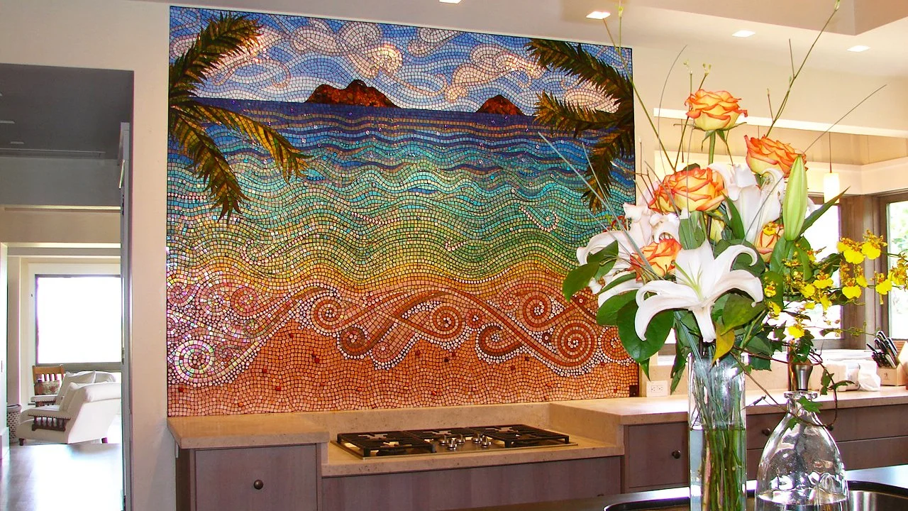
It was such an honor to have the opportunity to make such a stunning backsplash for my client in Kailua, Hawaii! This video shows the creation of the Mokuluas mosaic from beginning to end, but before iPhones took good pictures. ;)

Video transcript for deaf or hard of hearing:

 I’m going to take you way back to 2008 to one of the first major commissions of my professional mosaic career. I had done a couple small commissions before and finally got my website together when I got a call from an interior designer in the Bay area.

She wasn’t calling for a client, but for herself. She and her husband were building their dream home in Kailua, HI, and wanted me to make two mosaics for their home. Today I’m going to show you the making of Mokuluas, the Hawaiian art wall backsplash.

This was a new build, so since it didn’t exist yet, I received a pdf file with

elevations from the architect. There were still some variables, so I believe this is the image I sketched up with the red dots to let them know which measurements I needed to proceed.

The client sent me these two images of the Mokuluas islands. They are just around the cove from the new home they were building, but since they didn’t have a view from their property, they wanted this mosaic to bring the islands into their home. 

The client and I knew we wanted it to be slightly stylized, yet realistic, so I started first by showing her how an idea I had for the clouds, a motif that would carry through to the ocean waves. 

Then I sketched the ocean waves.

Again, the kitchen wasn’t built yet, so I put the measurements into a CAD program to create a layout to make sure the client understood the perspective.

Then the client wanted some palm leaves to frame the mosaic. There was also some talk at this time about adding a turtle. I believe I made some sketches with a turtle, but really felt it took away from the elegance of the design.

Then the builders sent me updated measurements, making the proportions slightly squarer.

This was the final design thrown into the CAD layout. 

The next step was to show the client the palette of glass I would use for the mosaic. I ordered samples of every color from a few different glass lines and pared them down to this. I spent a lot of time finding the perfect combos, so I remember being thrilled that the client immediately approved the glass.

Next I laid out the shifts of water color on the design as well as the backer board I would be working on. It would be easy with a free flowing, wavy design to get crooked or get carried away with one color and not leave enough room for all the transitions.

Then it was time to begin the construction.

I started with the palm fronds,

Then the stylized clouds 

And the pebble islands filled in by gold streaked glass to make sure they still catch the light.

I took some pictures for the client without the painter’s tape.

I need to leave some pieces of glass unattached so the panels can be screwed into the wall with washers, so as I’m working the blue tape is to hold them in place.

Now onto the water. I worked from both the bottom and top to make sure the colors and intensity of the waves would come together properly. 

Also as a note, I used white silicone for this project. I want it to be waterproof because it will be in a kitchen in a humid climate. Plus much of the glass is translucent, so using a white adhesive makes the glass bright and shiny.

I cut the mosaic into dozens of pieces and shipped the mosaic to Hawaii. The builder sent me these pics before lighting was installed in the home.

 The next year I went to Hawaii to grout the mosaic. I was busy working the whole time, but here are a couple pictures of the home and property I managed to take. 

And finally the mosaic was finished. This was right before inexpensive cameras and phone cameras started getting really good, so the pictures don’t quite show the movement of the mosaic.

 When you are in the room, because of all the shine and iridescence, the water appears to move and the homeowner reported that the colors change throughout the day.

Thank you for taking this trip back in time with me!

VIDEO: Afghan Blue Mosque Mosaic: WIP #3

This is the third video about the creation of my Afghan blue mosque mosaic.

Video transcript for deaf or hard of hearing:

Hi Mosaic Fans! This is where we left off last time with the Afghan blue mosque mosaic 

I’m starting the next step by pre-cutting stained glass into rhomboids for one of the border sections. Each piece will need to be cut and fitted into its space, but it’s easiest to prep about 500 pieces first and tailor them to fit rather than cut each piece from scratch as it’s needed.

Next I’m going to take a little break from those blue pieces because it’s getting a bit tedious. I’m placing some little Kismet round tiles in the upper portion of the archway. I’m really loving the way these are looking. This section should turn out a little more delicate than the rest because of the curvy design.

I’m all over the place now. I want to lock down the designs and patterning for each section, so I’m going to place whatever I can that is quick that allows me to then make decisions about the rest. Here I’m doing some of the beading work and placing the little yellow and red circles around the whole mosaic.

Next I’ll do a little cleanup and place the red squares and yellow circles in the center.

I know I need to get a little green in this mosaic, so I’m going to place the teardrop details around the two corner pieces. These are just green stained glass that I’ve cut into teardrops and surrounded by white beads.

Now it’s time to set the pattern for the center. I know I want to outline the sections in white beads, and the center tiles of the pattern in cobalt blue.

It’s going to take me a while to set this patterning, so I want to talk about why I chose to use beads. I want the crisp outlines you see in ceramic tile. It’s hard to do this with stained glass because glass doesn’t cleanly cut into 3/16” strips. Beads may be time consuming, but I can lay them down exactly how I want them, and the color will be consistent. Stained glass also tends to have dark shadows, so when you cut it super thin, the color can be inconsistent.

The white beads look overwhelming when I first lay them down, but they mellow out quite a bit once they’re surrounded by the rest of the glass. In addition, I’m using cobalt blue grout, so they will tone down a lot once they are surrounded by & slightly buried in the grout.

Next I’m going to use vellum to make some templates for the stained glass in this middle section. I’m just going to make this one square first to set the pattern idea, but if I make the templates now, it will be one less step in a couple months when I finish all the beading and I’m ready for the glass.

I estimate by the time I finish the beading, I’ll have invested at least 300 hours into the project, and that the whole project will take about 500 hours. I haven’t really been keeping track, which I regret, but it’s hard to do the work, let alone keep track of all the videos, images, and time yourself on top of it.

Here’s the mosaic so far. There’s still a lot of work to do, but it’s starting to come together.

Let’s get a little work done on one of the two featured circles. I want to know how the orange I’m planning is going to look with the orange I’ll be using in the center.

I’ll also finish up the blue pentagons on this side while I’m over here. All these robin egg blue pentagons need to be placed before I place the white star beads. I’m going to do this row, finish all the rest of the beading, then come back and finish up the left and right side.

I don’t know why these blue pieces feel so tedious to me, but they do. I’ll be much more motivated when I know I’m closer to the finish line.

And then I’ll finish the green teardrops and surrounding beads on the other circle before moving on to the never-ending task of placing the outlining the beads in the middle sections.

Onto the white beading for the upper archway. This is my favorite part of the mosaic. I love how the flowers come together to form a second pattern in between. This is my favorite thing about this type of ceramic tile in the first place; the way the designs from each tile come together to form a pattern when they are put together as a whole.

Right now the plan is to fill in the flowers with the yellow circles with orange and the designs with the orange circles with green. This may change. It will be the last thing I do because it will allow me to change my mind if a different color will help pull the whole piece together.

For the outer border I’m going to place three concentric rows of beads in kind of an ombre color scheme. This is a chance to add something different and a little more delicate to these outer rows.

I’m going to surround the beads with yellow triangles to make it kind of a sun pattern. Right now the plan is to fill in the background with cobalt blue to ground the project, but I’m going to hold off until later to see if I change my mind.

I’m just going to skim through placing some of the beads in the middle archway section. So many beads!! It felt never ending. I’m I’m just going to skim through with a few clips of placing the beads in the middle archway section. So many beads!! I’m really happy with the way it looks and I think it is worth the time investment, but there was a point at which I thought I would be 86 and still placing these beads.

Now the majority of the beads are in place. Just about another 30 hours of beads left and I can move onto the stained glass.

There’s a lot of work left but unfortunately I have to put this mosaic aside for a while to work on commissions and other projects. I will be coming back to it and sharing it with you when I do. Thank you for watching!

VIDEO: Afghan Blue Mosque Mosaic: WIP #2

This is the second video about the creation of my Afghan blue mosque mosaic.

Video transcript for deaf or hard of hearing:

Hi Mosaic Aficionados! Here I’m going to continue work on the Afghan Blue Mosque mosaic. Now that the basic structure of the mosaic is laid out, I’m going to start on the first decorative tiles.

I began by making a vellum template of the 8 point star design I chose for this section. There are 60 identical tiles in this section, so this will help keep them fairly uniform.

I remembered while sketching out this section that I wanted to put bold yellow circles in the corners. To make these, I created bars using the cutting mat you’ve seen me use before, then used the glass cutter to cut them into slight wedges instead of squares. Then I just placed them into the circle so they fit snuggly together.

I skipped ahead a bit here… I was doing a little trial and error to see what materials I wanted to use, how I would create the cuts, and in what order I wanted to lay out the glass. Since this project is all about repetition and consistency, I want to create a strategy first so that all the tiles come out looking pretty uniform.

I decided the one place I’m not going to try to get super precise is the yellow flower at the center of the design. I figure that it will give it the handmade touch that all mosaics need.

Really, to cut those little pieces into identical microscopic elongated pentagons would be ridiculous and almost impossible, so I’m justifying with the “handmade touch” statement.

I  wasn’t really happy with how close in color the turquoise and blue of the tile background is, so I was really lucky that when I stopped at the Wissmach glass factory I found a perfect blue. It’s hard to see the difference because they’re so close in color, but it will make a big difference in the mosaic.

Here I’m cutting the new blue into 7/16 of an inch bars on the cutting mat so I can swap out that color. That will allow me to cut them into 480 rhomboids to fit around the stars.

Next I need to remove the old blue glass. I lightly sprayed those pieces with water, then I chiseled them out as delicately as possible so as not to disturb the rest of the glass, especially those tiny little beads.

Then I put in the new glass pieces. It’s pretty hard to fit them around the white beaded stars, so I’ve decided to change the order for how I create the rest of this section. I’m going to lay out the background rhomboid bars first, then place the beads inside.

This way is working much better! Not only is it easier and quicker, but then the edges of the blue glass are crisper because I didn’t have to trim them with mosaic wheels.

Next I just need to lay out the glass beads in the interior of the star. This part is also easier because of placing the blue glass first, so I became full of hubris and thought I could lay down the glue for the entire star first.

It’s still not that much easier. I had to wipe up half the glue because it was getting too dry.

Now I know for the rest of the stars.

So then I just need to place my yellow flower and tthe cobalt blue glass around it. You’ll notice that I am being pretty loose with the placement of the cobalt. This is because I’m going to use cobalt grout, so precision of these pieces is unnecessary.

I timed myself making these sections and it will probably take about 66 more hours to complete this section. It’s mind numbing for me to think about having to do all this repetitive work, so if I show you, it will be a super compressed time lapse.

I appreciate you too much to bore you with watching the same thing 60 times.

Before I go today, I just want to show you where I left off for the day, which was putting the glass gems and circles in place in this section so that they won’t be moving around when I’m trying to place the rest of the glass tomorrow. Thank you so much for watching!!

VIDEO: Afghan Blue Mosque Mosaic: WIP #1

The first video about the creation of my Afghan blue mosque mosaic.

Video transcript for deaf or hard of hearing:

Hi Mosaic Fans! Today I’m going to introduce to you my art book idea. I’ve started a few small steps in the last couple years. The concept behind this book is based on the Owen Jones book The Grammar of Ornament, first published in 1856. I’ll get into details about the book in a moment.

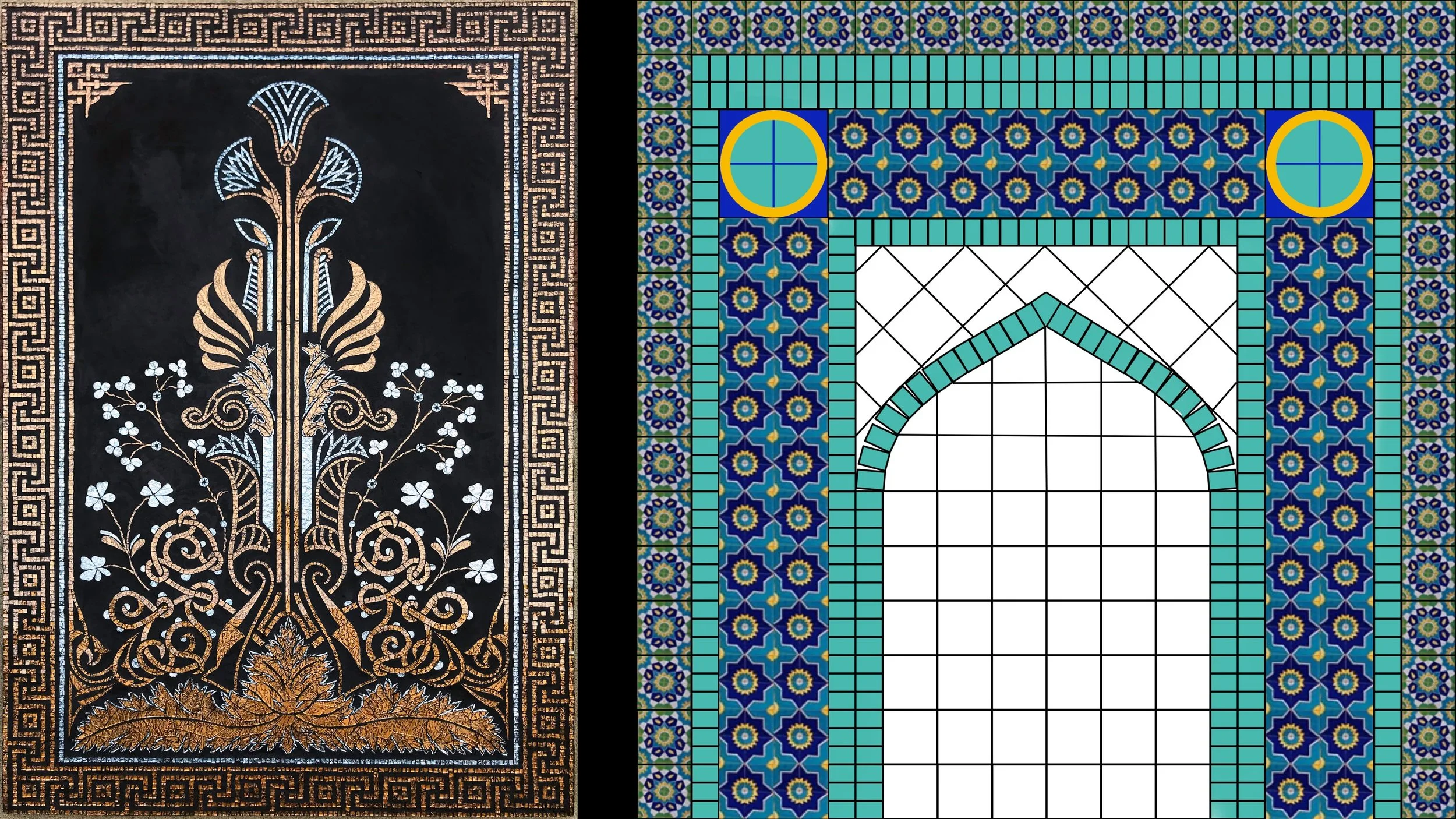
For the first step, I wanted to create a mosaic based on the cover of the book. It has been in constant publication for over 150 years, so there have been several covers and I went with this gorgeous gold leaf on leather version.

When I had some spare time between commissions I made this mosaic based on Grammar of Ornament’s amazing art deco book cover design. I used Van Gogh glass and the background is all super black tinted grout to give it a matte feel like the leather book cover and let the bronze and silver glass shine.

Now I want to discuss the interior of The Grammar of Ornament. Jones wanted to create a book that discussed architectural ideas and motifs from around the world. The result was a book that even modern day designers have on their bookshelves over a century later.

My original idea was to follow the same format and recreate all the designs from the book into mosaic. I eventually realized this wasn’t going to work. A lot of the designs just don’t translate well into the mosaic medium, and there is also the cultural shift, such as the problematic use of the phrase “savage tribes”.

Instead I’m choosing art forms around the world that I would love to translate into mosaic. I started by making a list of countries in the world organized by geographic area. I just pick a country, do some research, and find some traditional art, design, or architecture that I want to translate into the mosaic medium.

My first geographic find is located in Afghanistan, in the city now known as Mazari Sharif. It is the architectural marvel, the Shrine of Hazrat Ali, also known as the Blue Mosque. The blue mosque was completed in 1481. Fortunately the mosque has been able to survive all the turmoil of Afghanistan, even though the city of Mazari Sharif has been occupied at times by both Russia and the Taliban.

The mosque is considered an oasis of peace, not only because of its beautiful architecture and tile work, but because the mosque is surrounded by thousands of white doves.

Since I’m focusing on patterning, I’ve decided that my mosaic design will be inspired by one of the archways. Here is the loose idea of my design I created in Pixelmator Pro. I will follow the structure, but I just put enough tile design in to make sure I like the layout and will make more choices as I work.

Next I collected images of tile designs used at the Blue Mosque so that while I’m creating the mosaic, I’ll have ideas to choose which ones will look best. Another factor in choosing patterns is which ones will be able to translate well in the mosaic medium. Each of the tiles will be only about 3” in my mosaic, so some patterns like this one may be too intricate to really look good.

I will start by using the t-square to lay out a grid on my 4’ square plywood substrate. I will be using turquoise glass to create the frame, or solid structure of the mosaic, so I’m going to start by cutting those pieces.

I’m using the grid cutter to cut all the pieces precisely. Each turquoise rectangle is 1-1/2” x 1”. I will need over 300, so I’m turning myself into a rectangle making factory. I’m using the t-square again to line up the pieces as straight as possible. I’m coating the entire back of each piece to seal it so the grout doesn’t seep underneath.

I made a mistake here and placed the horizontal row on top of the vertical rows when it should go one grid space lower in between the vertical rows. I’m spraying the row with water to loosen up the glass and I’ll move them down into their correct spot. Here I just need to sketch the diagonal lines and create the top of the archway.

Now I have the structure complete for the mosaic. I can’t wait to show you more as the mosaic progresses! Thank you for watching!

Red Bull Mosaic Disco Ball Coolers

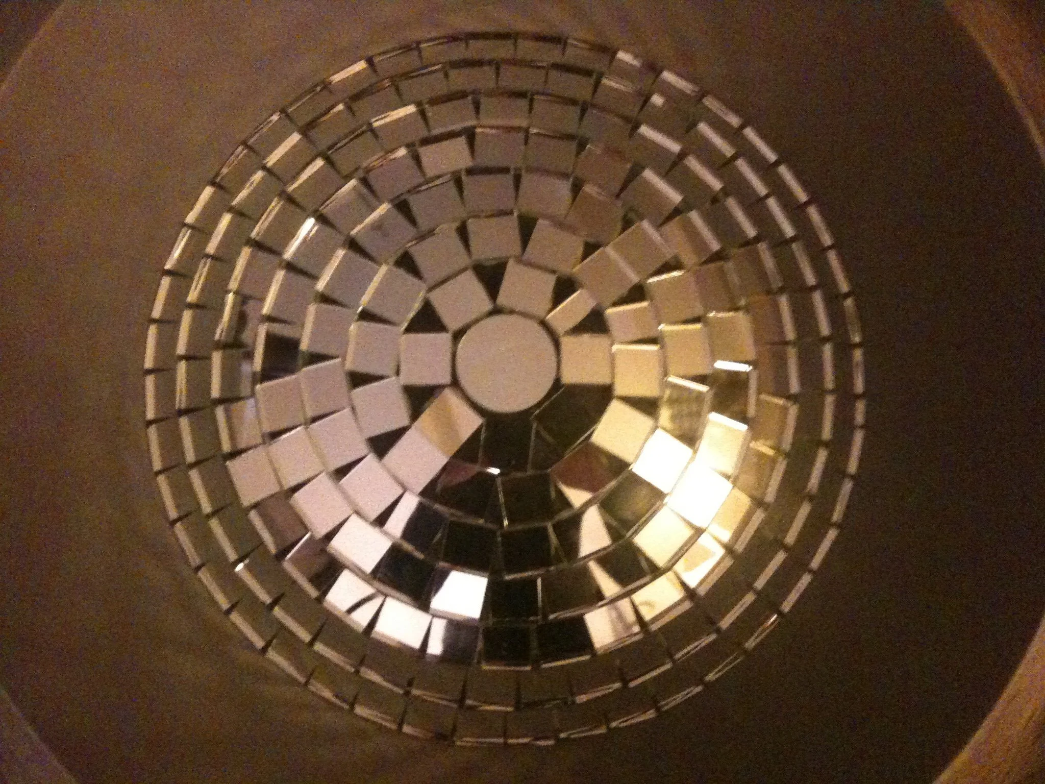
I had the opportunity to make 13 of these disco ball coolers for Red Bull. It was a ton of work, but they are so dazzingly beautiful!

These making of these fully functioning mosaic coolers started when I was approached by a product design company to make a prototype for Red Bull. I purchased the hand-cut mirrored glass from an artist on Etsy and worked hard to make sure it aligned properly as I worked my way around the cooler. The first supplier I used had almost perfect cuts, but a few coolers in, she had some family issues and couldn’t cut the thousands of mosaic tiles I needed per cooler anymore. The second supplier was wonderful, but the cuts weren’t as accurate, so I had to plan ahead a lot more.


In addition to keeping the glass in straight lines, I also had to use a specific mirror bit on my grinder to bevel the edges. These were to be used in nightclubs, so the edges had to be smooth so that bartenders didn’t get cut. You can’t use a regular grinder bit because the backing of the mirror flakes off. The mirror grinder bevels both sides to create a smooth, un-chipped edge.


It was so hard and tedious making these coolers, especially because I had to use a toxic adhesive and wear an organic vapor respirator even during some extreme heat waves, but it was worth it. I found out later that the product design company made dozens of prototypes for Red Bull products, but this is the only one that moved forward into production. I was lucky!

Krishna Sand Mosaic

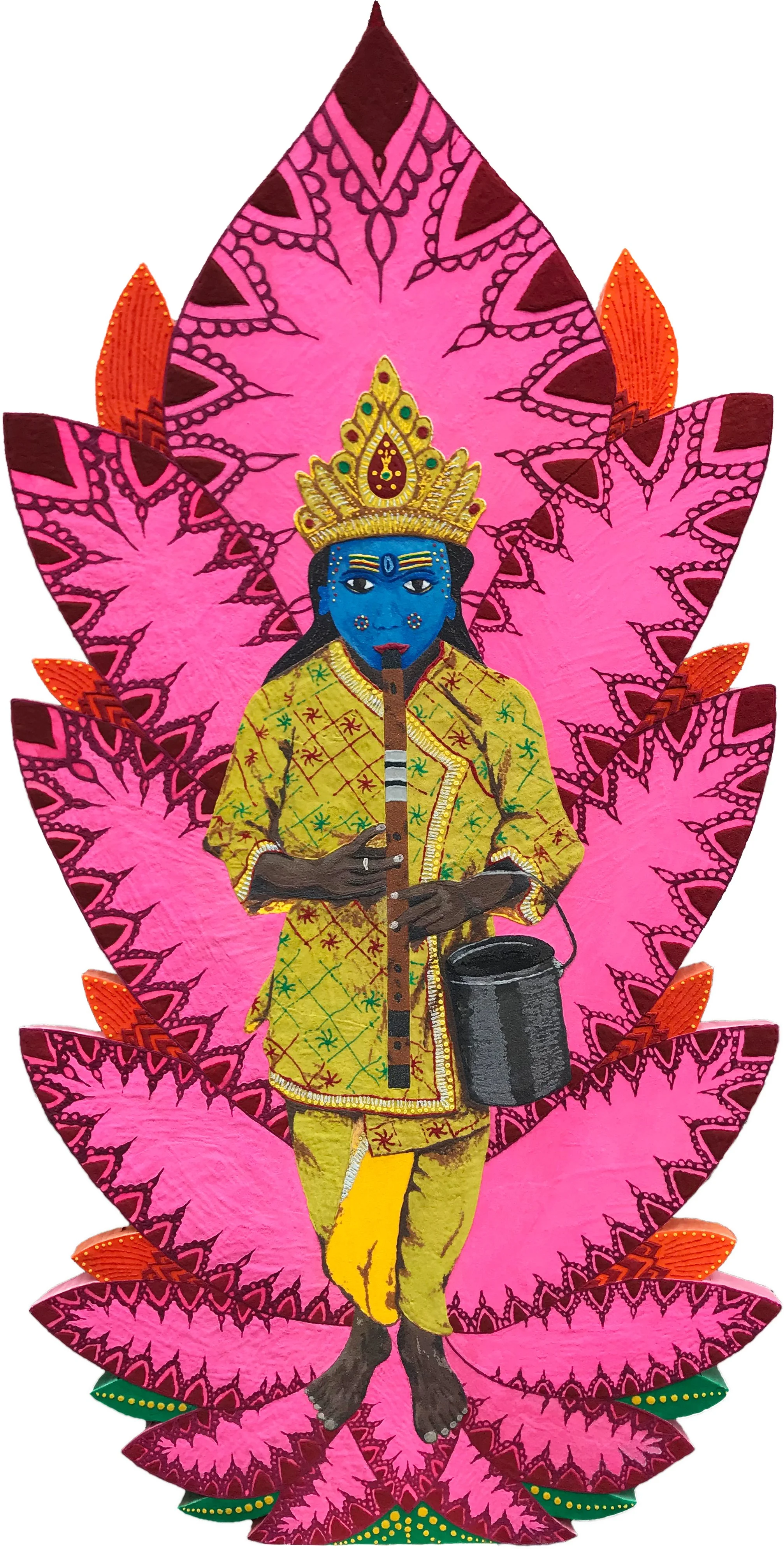
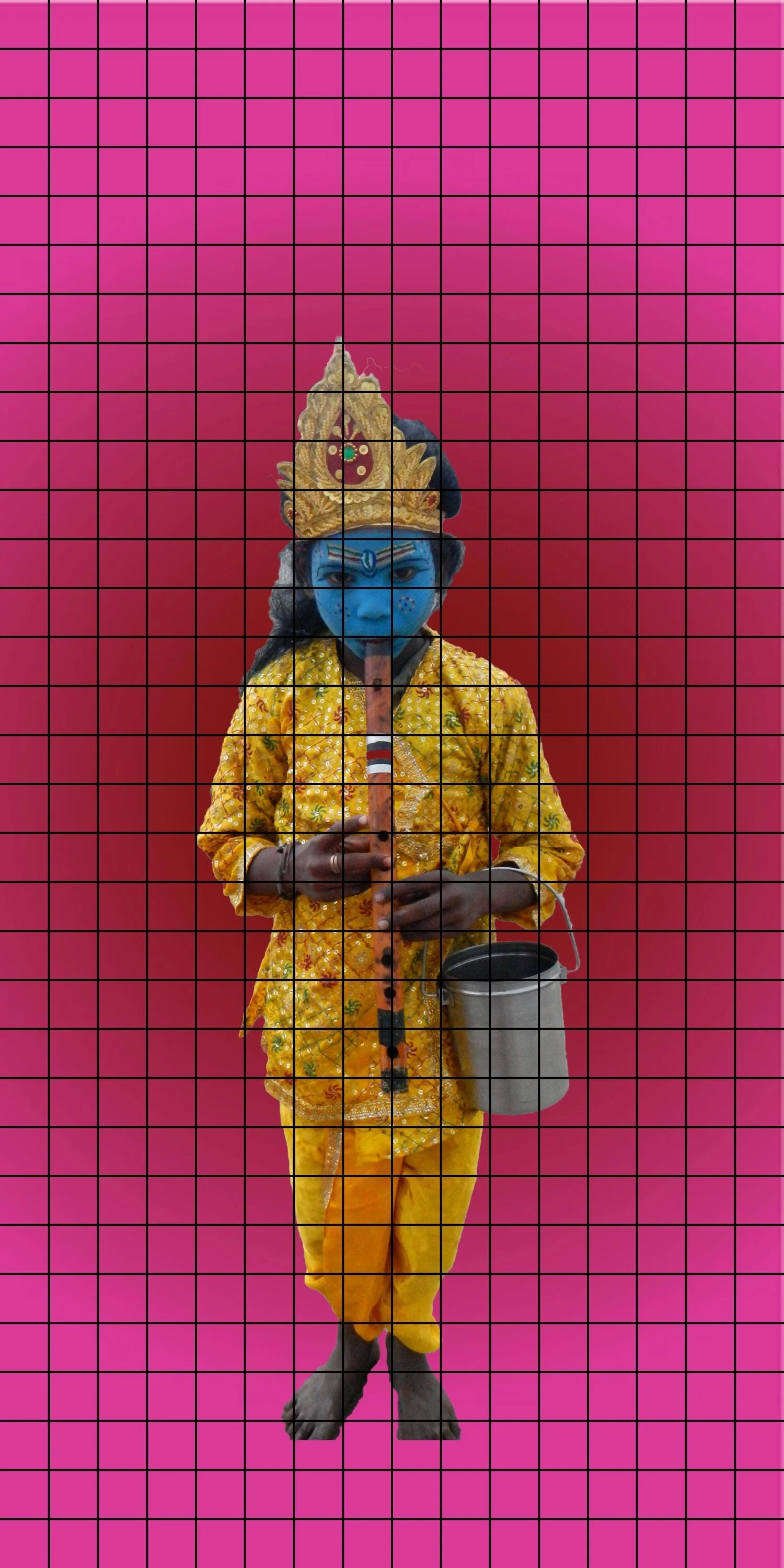
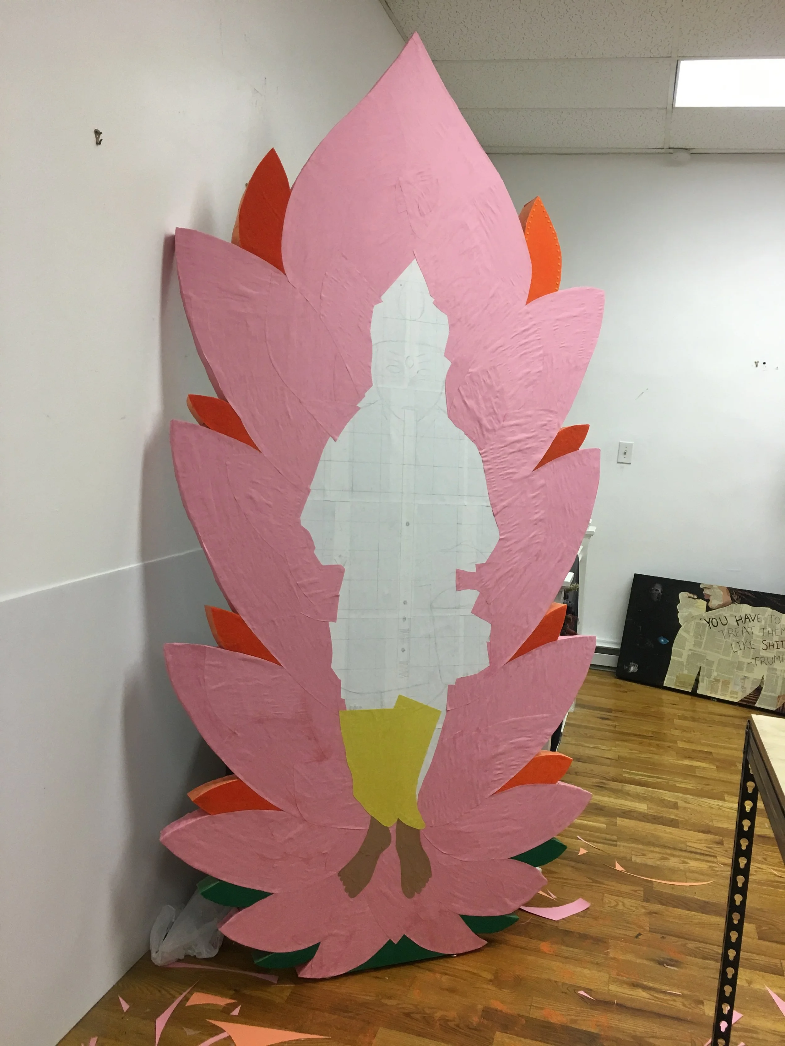
I was doing a collaborative art show in which my art partner and I decided to make mosaics in different mediums than we usually do. I had the idea of working with sand and loved the outcome! This Krishna is based on a photograph by Jeffrey Boardley.


When I first had the idea of making a sand mosaic, I planned on using an image of the 14th Dalai Lama as a child on a mandala. Then I went to a photography exhibit by a high school friend. Once I saw his photograph of Krishna, I immediately asked him for permission to use his photograph instead. Thankfully, he agreed!

Here’s Jeffrey Boardley’s original photograph.

My sand Krishna is eight feet tall, so I put a grid over the original photograph to trace her onto the foam core fiberglass board I created it on.


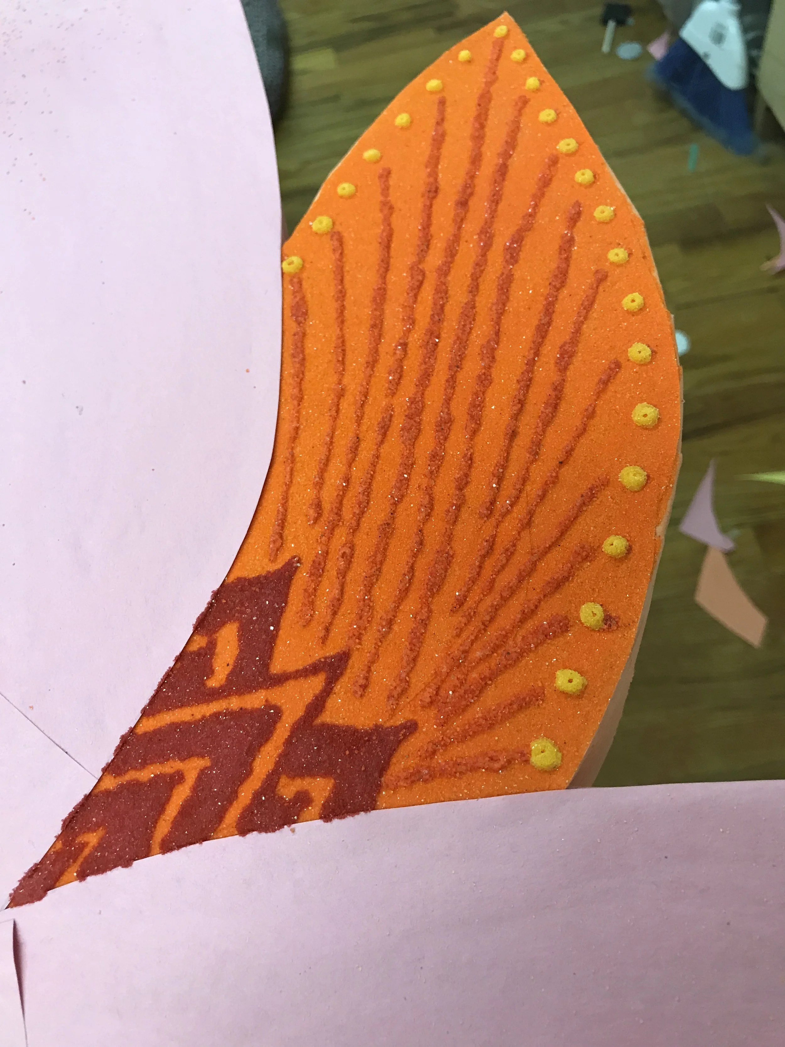
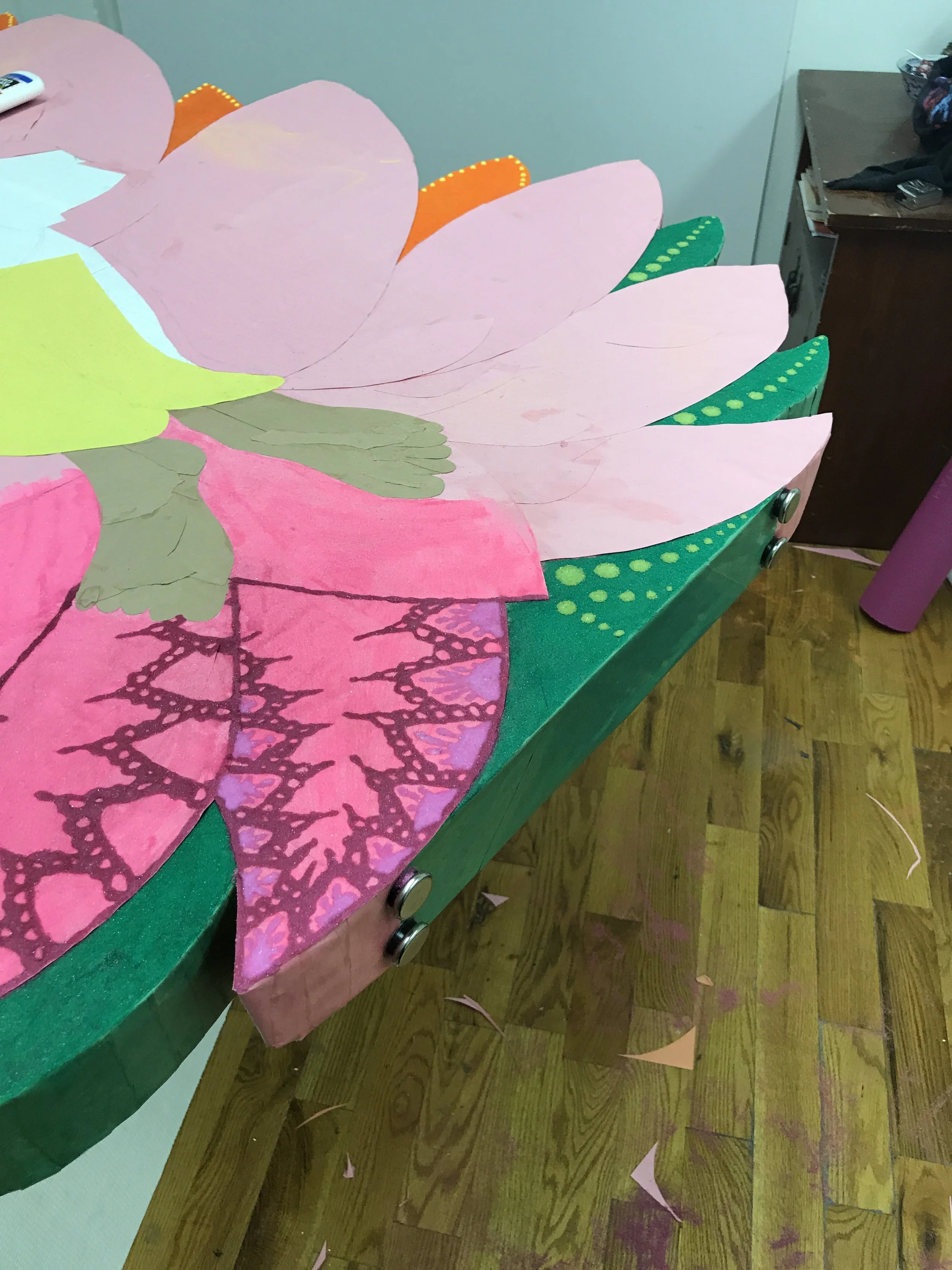
I cut the foam core board in a stylized lotus shape, then applied construction paper to help keep the design on track and because the fiberglass board wasn’t an ideal surface for applying the sand.

I just went section-by-section applying the glue and pouring on the sand. I waited for a color to dry, then shook off the excess.

There was a lot of trial and error, as there always is when trying something new, but eventually Krishna started to come together.

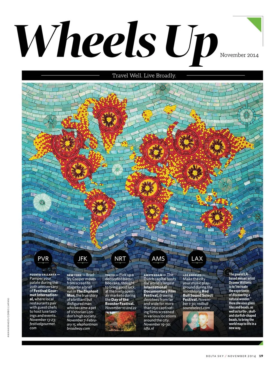
Delta World Map Mosaic

This medium sized mosaic was created for Delta Airlines in 2014. Delta had assigned a national theme for each artist and they choose Mexico for me.

There are many different ways to lay out our three dimensional planet on a two dimensional map, so they wanted to make sure all the artworks in the series were using the same map for cohesion. This also allowed for each artist to add their own personal touch to the world map and be able to express their creativity using their own art forms. 

Most of the mosaic was created organically with the exception of Delta giving me the map to use for the mosaic. This piece was part of a series in which they had artists from different cities create a map in different mediums and they then featured a new one every month for their inflight magazine.

For this project, Delta had very specific dimensions that were necessary for their photography, so I created the mosaic on Wedi board, which is a lightweight, foam-cored cement backer board. By using a Wedi board, it could easily be cut to size and even though it was being created just for a photograph, I attached Wedi washers before I started so the mosaic could be hung at a later time

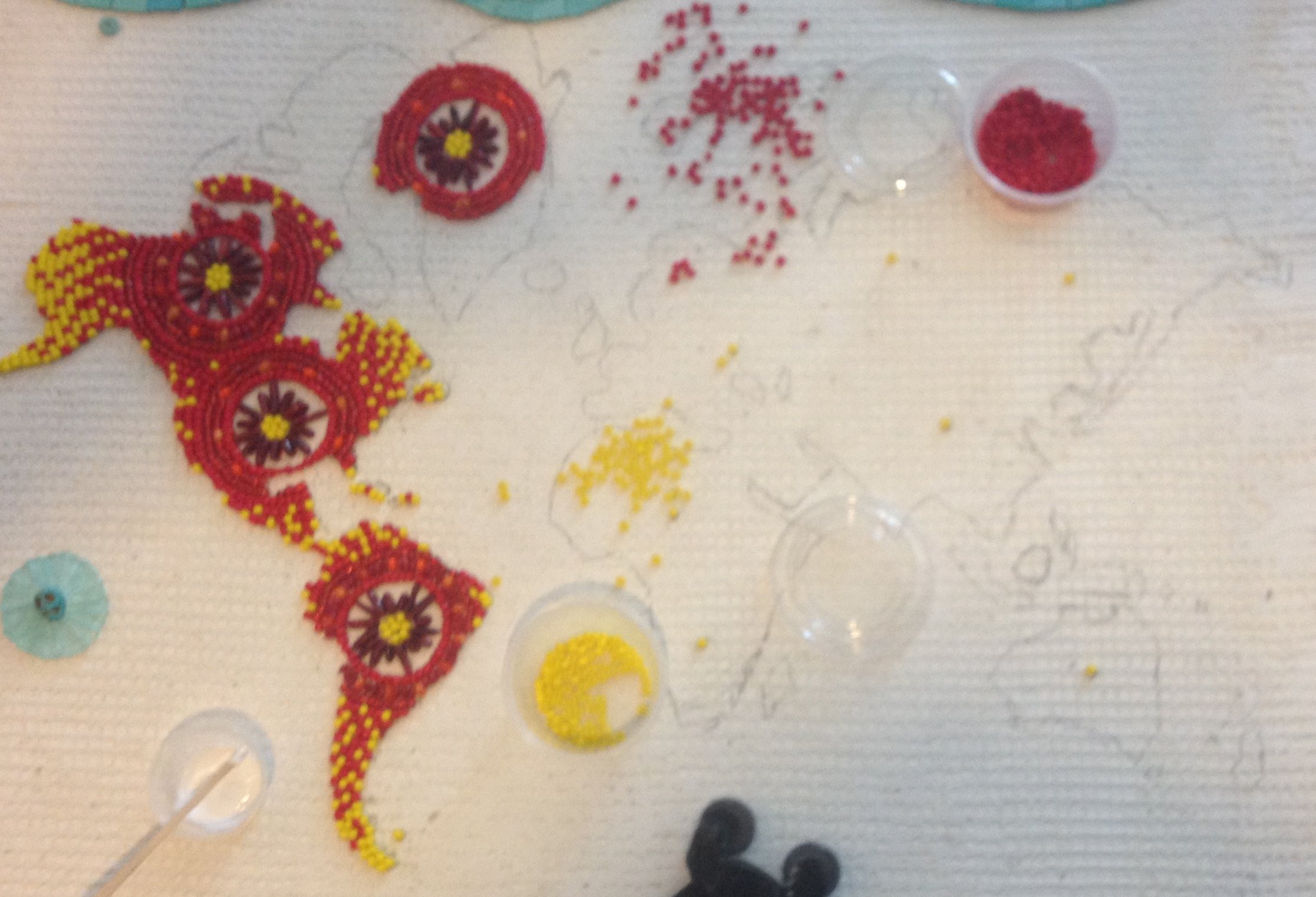
I choose to do the colors yellow and red because of the abundance of these colors in all Mexican art and their culture. Mexican artwork is filled with color, small details and they use a lot of beads as well. At this current time, I was super into beads and since beadwork is popular in Mexican culture, this seemed like a perfect fit.

Once I came up with a plan and choose the colors of beads, I went to Michael’s to buy the beads. I needed almost 20 little tubes of the yellow beads, but each store only stocked 3 at the time. The timeline was too short to be able to order the beads online, so I spent a whole day driving to every Michael’s in the Los Angeles area, from Long Beach to Burbank. I even had to call my bank to turn my debit card back on because apparently when you make purchases at 6 different Michael’s over the course of a few hours looks extremely suspicious!

In addition to just using beads, I used glass tiles. Most of the 5/8” tiles are Sicis and the 3/4” Hakatai. I used a combination of tiles that included translucent, iridescent, opaque, and gold-streaked glass along with wavy andamento to give the impression of movement within the waves. I wanted to create this sense of movement throughout the glass blues to create the ocean and the ripple effects of the waves.

When I started to add the blue shades of tile for the ocean, I originally intended to grout the whole mosaic, however, only the type of dark red beads that were available were painted on the outside so the grout would have just wiped the paint off.

Instead of using grout, I used white silicone with the translucent light glass on the top and then Weldbond for the rest. I also used Mapei black grout for just the bottom portion of the mosaic which included the darkest shades of blue.

I thought of a pattern that flowed from red to yellow would be beautiful, but I mostly wanted red to be the star too because I like red better then yellow and it’s also a complimentary color to the ocean blues that I am using. Just when I started to place the red beads and slowly started adding the yellow, I could see the map come along and it was easy to identify that I was creating North and South America.

Upon completion of my project, I took it to Studio Q photography where Yuno Cho placed in under a LED light box, and this helps so that the lighting can then be diffused and there would be no odd white or dark spots on the photograph in the end result. I really wish I could have all of my art professionally photographed in this way! Professional photography is very expensive... but it if for sure worth it if you can do it! Your artwork will truly benefit from it!

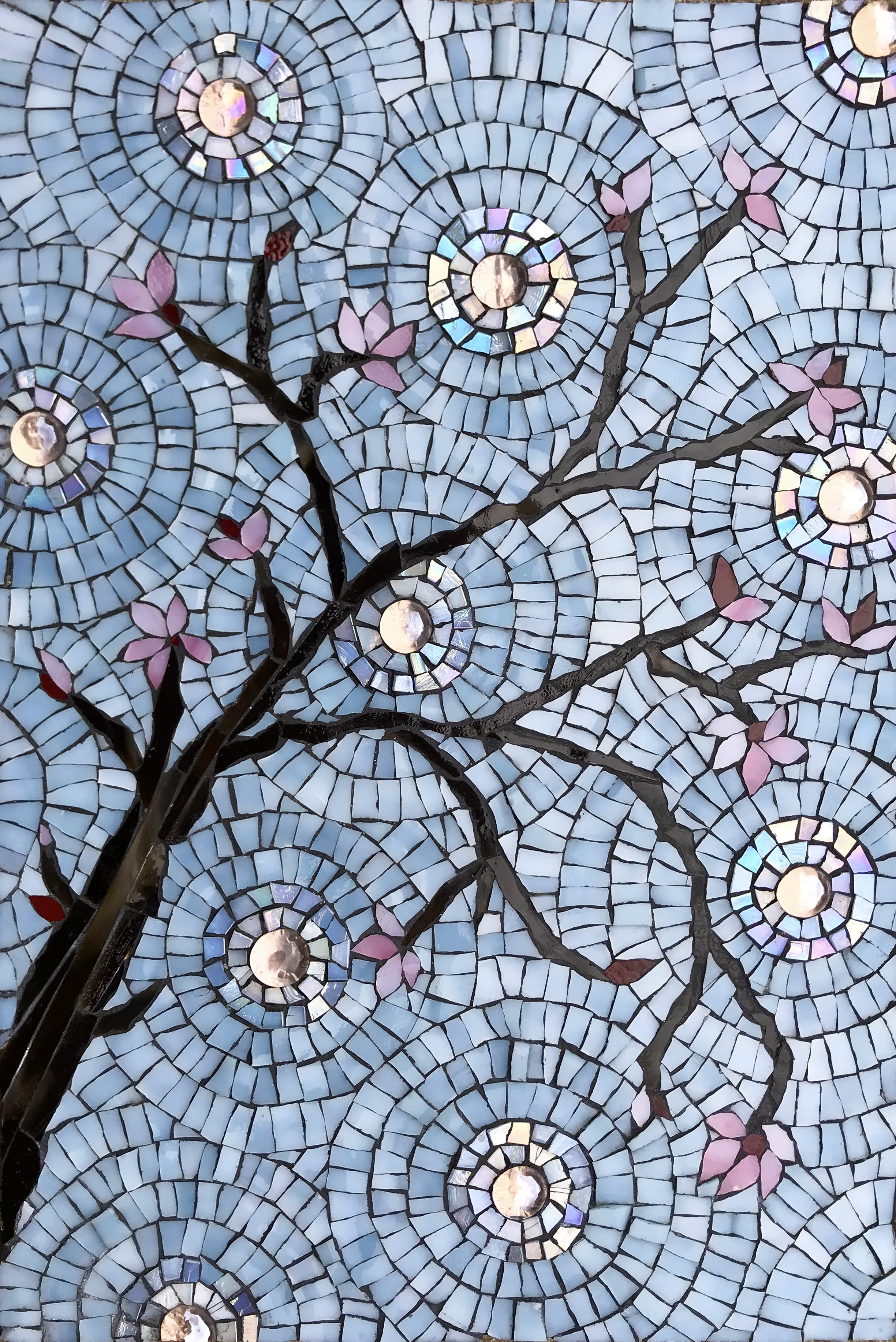
Cherry Blossoms Mosaic

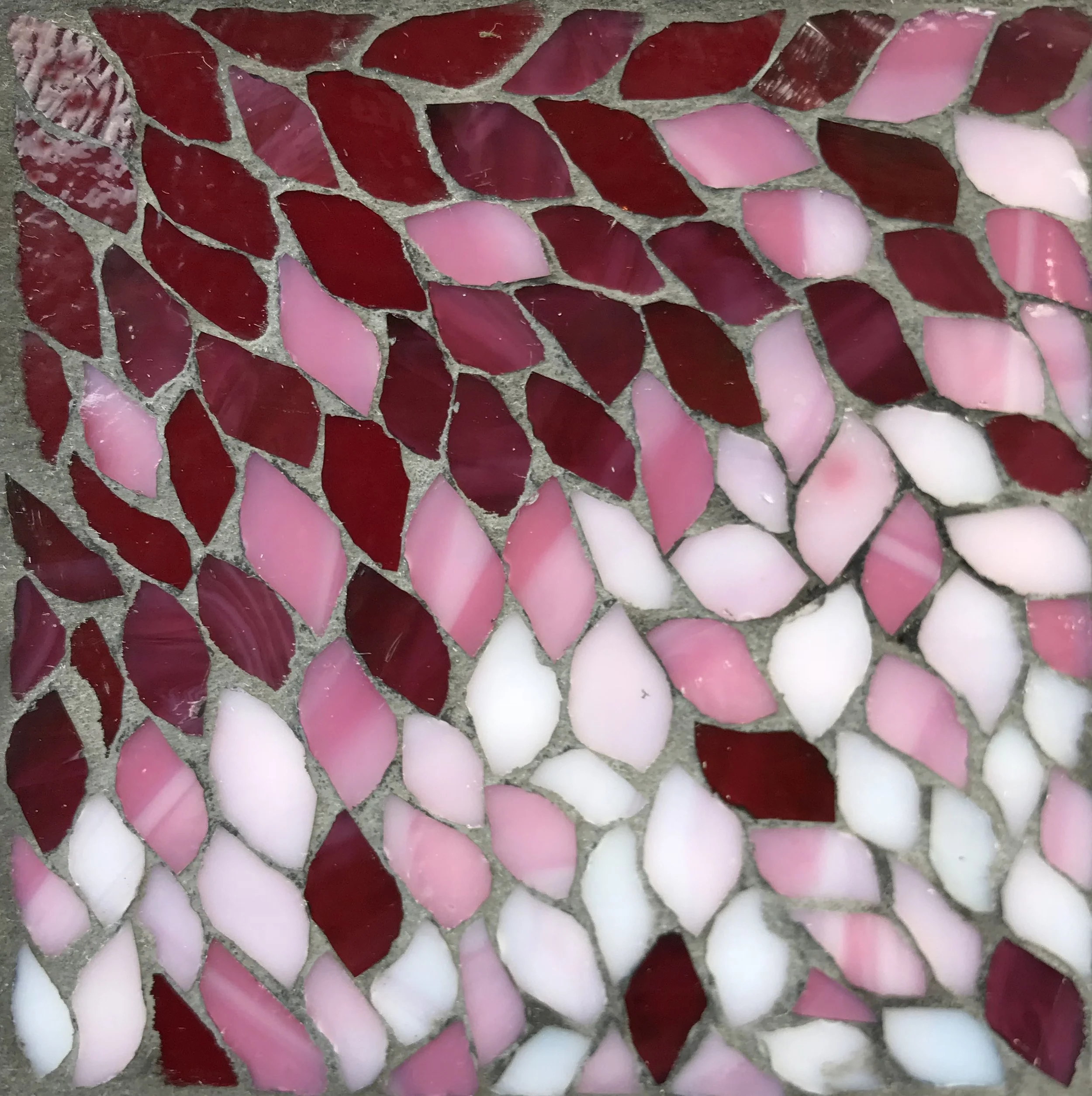
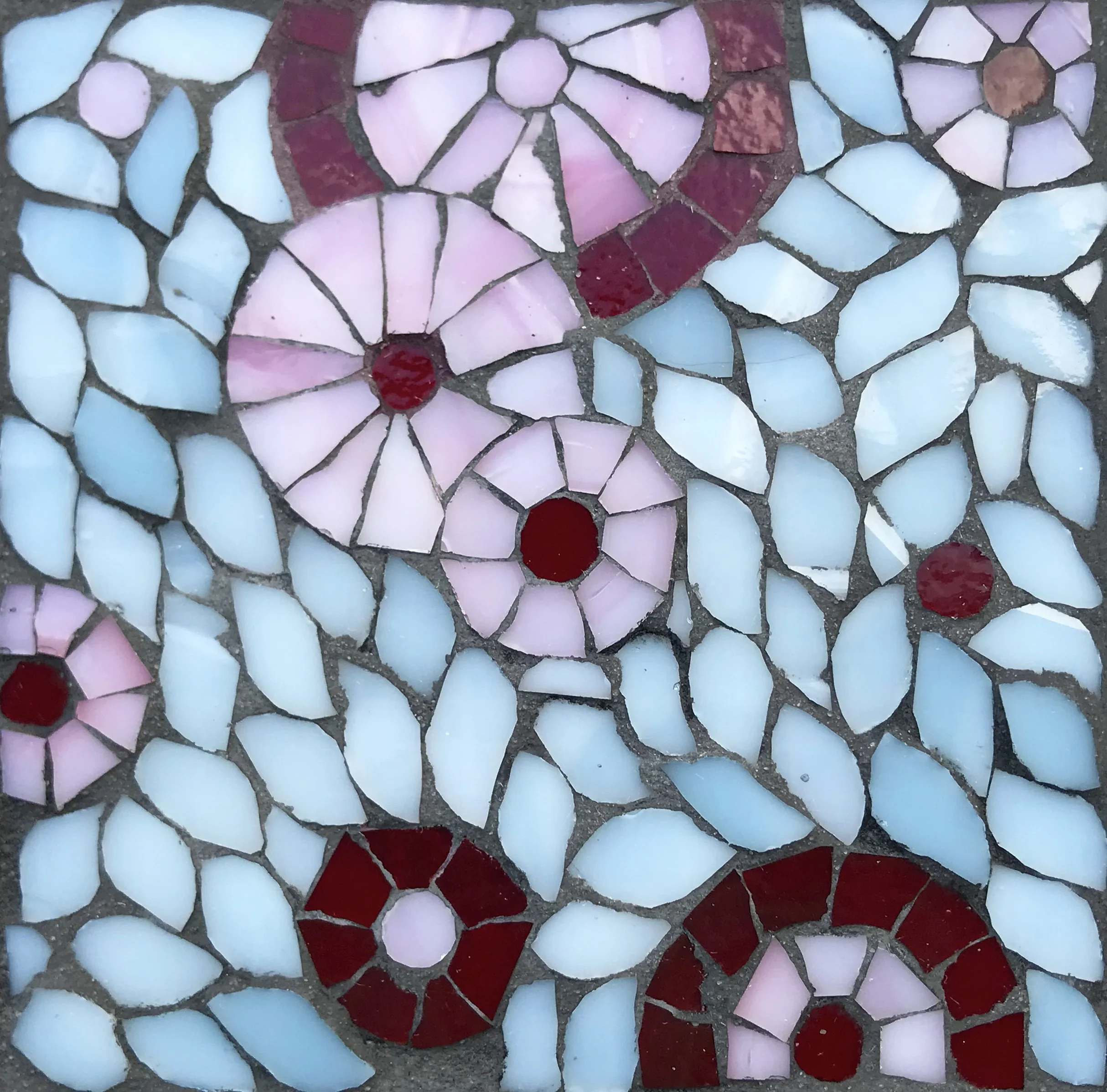
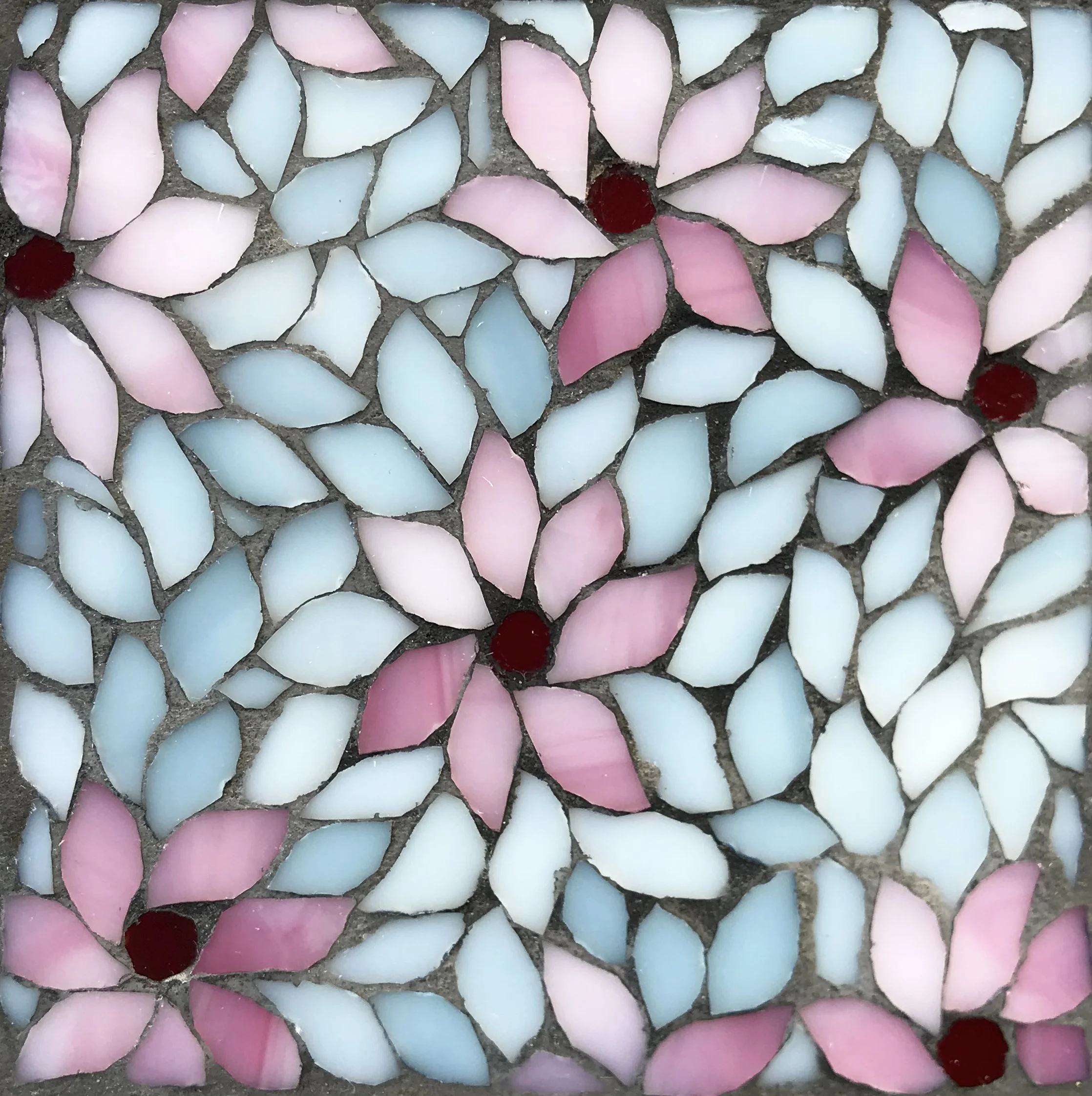
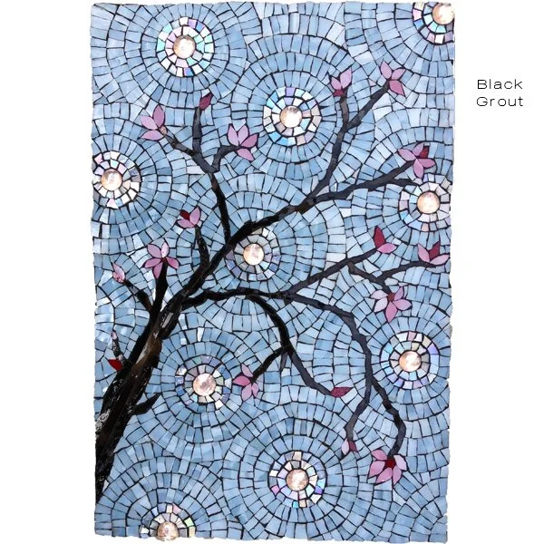
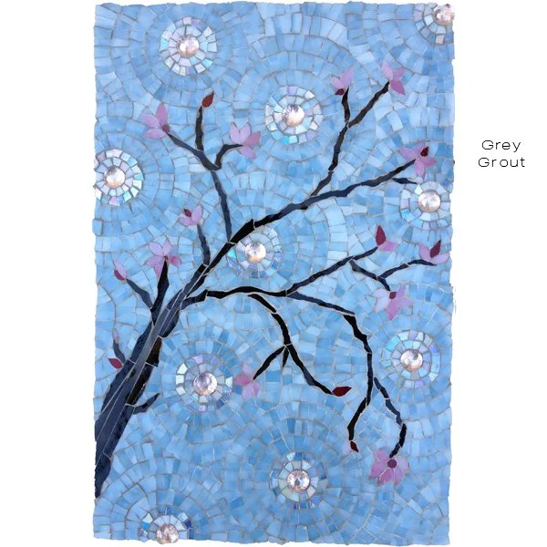
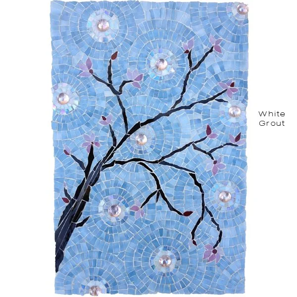
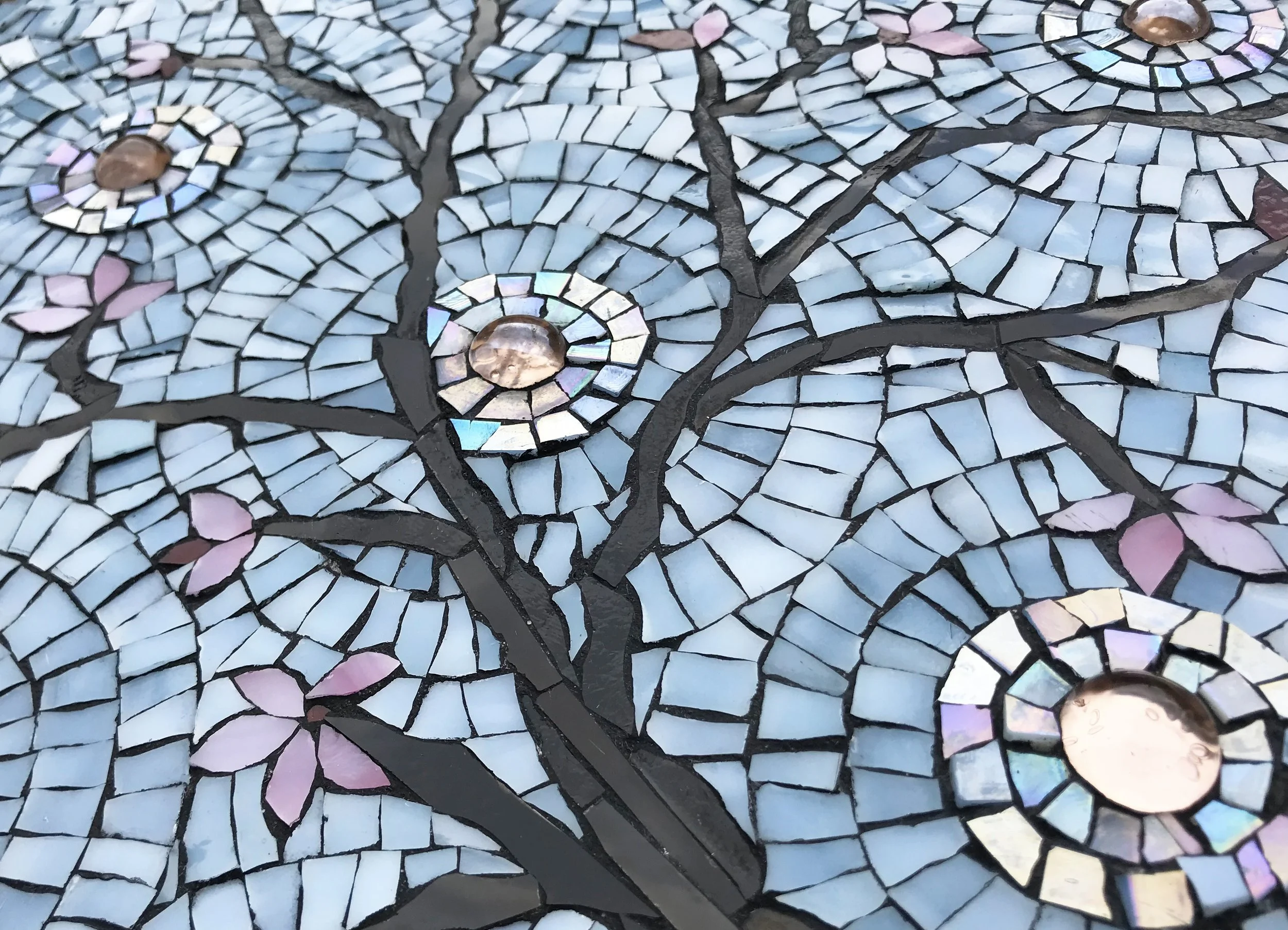
Here’s a delicate little mosaic I made when I was inspired by the elegance of cherry blossoms.


I made this mosaic as a feature piece for a line of tile I wanted to make. I made these tile samples with the intention of making them to be placed on backsplashes embedded within other tile.


I made samples with different colors of grout and tile beds to show how they would look, but the idea didn’t catch on.

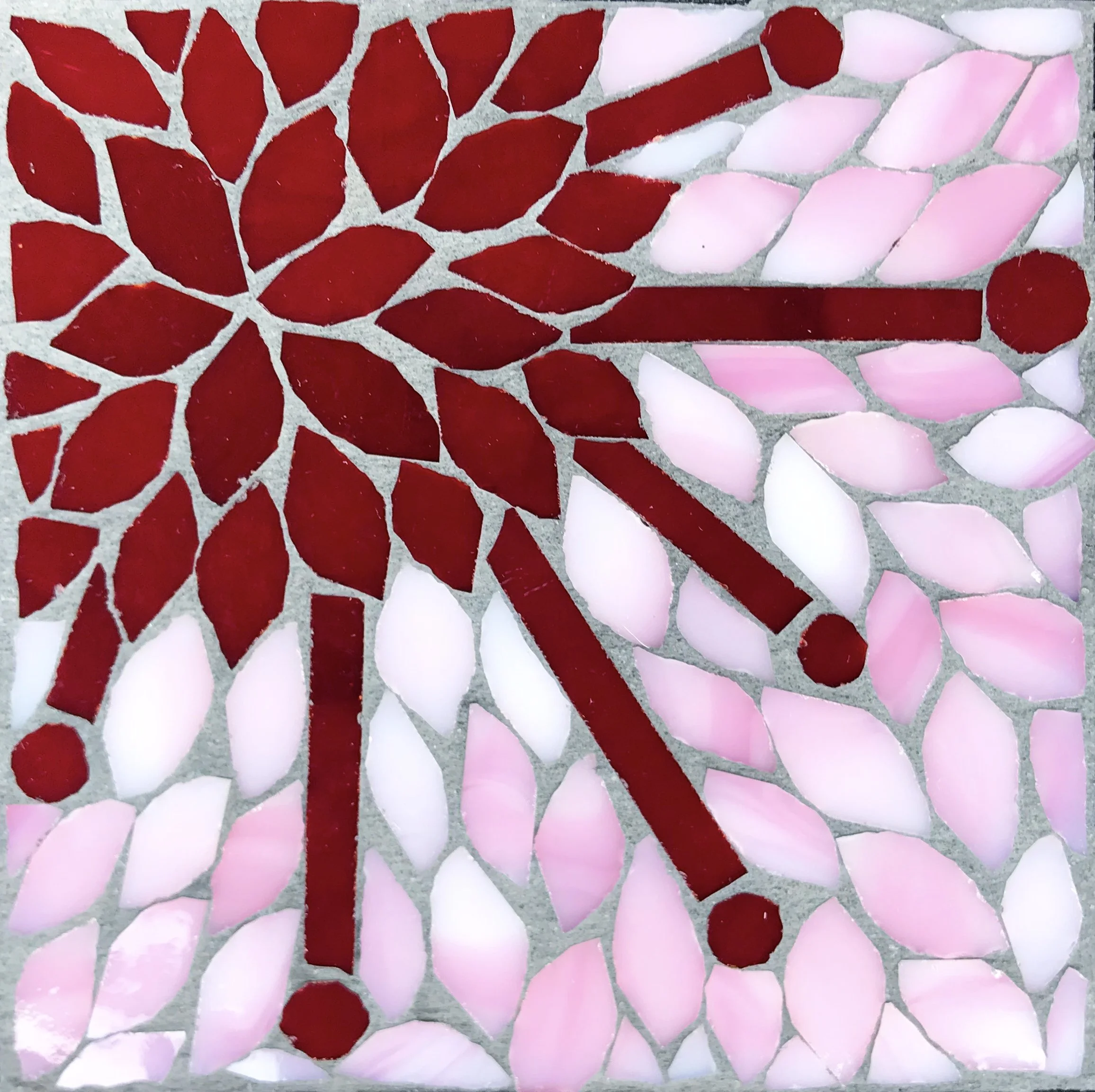
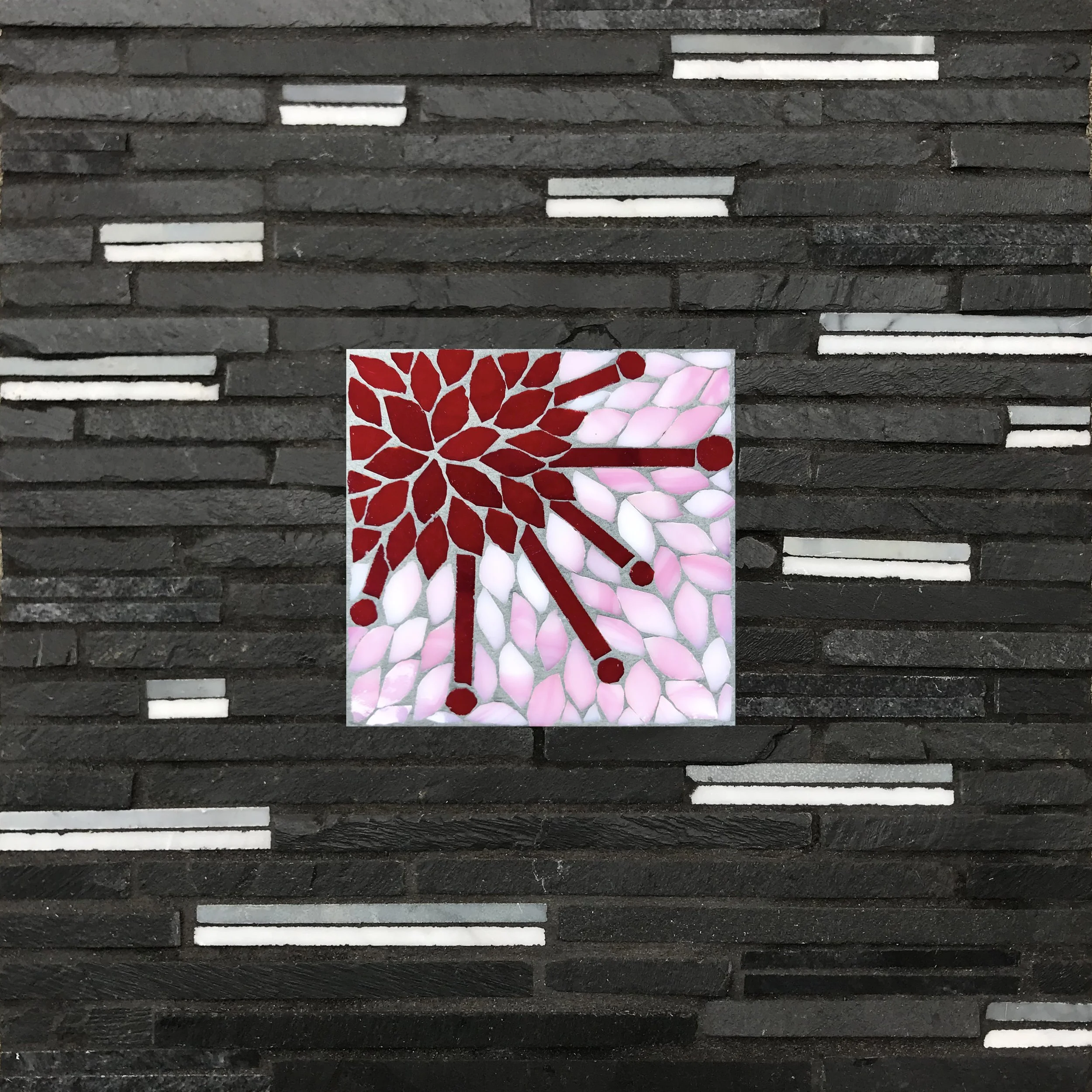
I even tried making some mosaics with a poppy theme.

Some students that came to my studio saw them sitting around and suggested to just sell them as regular hanging artwork. I did that, but they still didn’t sell. Oh well, it either wasn’t a good idea or not good in execution, but people do like my cherry blossoms mosaic and so do I, so it was worth the experiment.

VIDEO: Pathway Key to Success Mosaic: WIP #1

The first of two videos showing the making the Pathway Key to Success mosaic. This was a mosaic artwork I helped kids in a foster care program make as a thank you gift to one of their donors.

Video transcript for deaf or hard of hearing:

Hi Mosaic Fans! This mosaic begins when I had only a day to design a project for kids from a foster care organization to create as a gift for their largest donor.

Fortunately, I woke up at 4am and found myself looking on Etsy before I was even conscious and came across these antique bronze key replicas that range in size from ½” to 2- 1/2”.

 I immediately had an idea of how to use the keys in a mosaic, so I jumped out of bed and went straight to the computer to make a mockup. The theme is to thank their donor for giving them the “Key to Success”.

 Mango, on the other hand stayed in bed until sunrise.

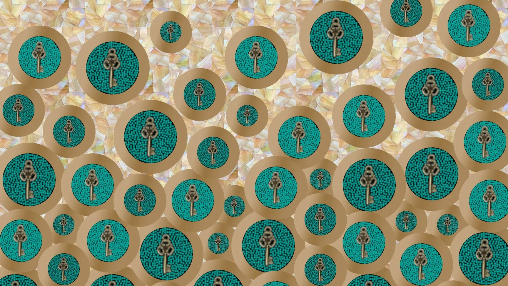
 I’m going to use bronze colored Van Gogh glass to create mosaic rings. Inside the rings, the kids will choose & place a key, then fill up the circle with tiny beads. They will also mosaic the background with my favorite iridescent amber/white glass from Wissmach.

I am using a 2’x3’, ¾” birch panel for the substrate.

I started by printing templates for the inner and outer circles, the inner circles on white cardstock and the outer on yellow cardstock so I can trace them onto the wood.

Then I traced the circles onto vellum so that I have a template I can see through to help make adjustments.

I wanted to keep the circles whole, except for those that come slightly off the edge, though even with those I had to make sure the keys would fit wholly onto the panel because I don’t want to have to cut the keys.

To make sure the circles all remain circles, I carefully interlinked the borders. This will mean making a lot of adjustments as I work, but will pay off in making the circles look very clean and crisp.

With the initial sketch completed, I primed the board. You can do this before or after sketching. I chose after because it’s harder to erase once the board has been primed.

The reason for priming is to help adhesion and to cut down on moisture later getting in and warping the wood. I’m priming using watered down Weldbond, which is the adhesive that will be used for the glass. We’ll be using Apoxie Sculpt for the beads, but I’ll get to that in the next video.

So that I can do this all at once, I use cups to place the mosaic on when I flip it over to prime the other side.

I wait only a few minutes until most of the primer has been absorbed, then flip it over and prime the back. I also make sure to prime the edges.

Now it’s time to cut the Van Gogh glass.

 I’m cutting it into ½” strips using the Morton grid. From there I’ll just cut wedge-shaped tessera as needed.

I started with the simple, straight forward rings on top to get a feel for the angles needed for each of the four sizes of rings.

Then I moved to the bottom to get the hard work of the interlocking rings over with. The glass size may not exactly match my templates, so I may need to adjust some of the free floating rings in the center. Doing the bottom first will allow me to size up how things will look best aesthetically.

As I move into the middle section, I’m just adjusting from the original sketch into what will look best once all the rings and beads are in place.

While the tedious nature of mosaics is often enough to drive someone crazy, it is good in instances when I’m preparing to work with kids because it gives me the opportunity to think through the best way to have them work without too much chaos.

In part two we’ll finish up the mosaic and I’ll show the kids working on it. Spoiler alert: They did awesome! Thank you!
TBT! Mirror Feather Mosaic Cabinet Collab

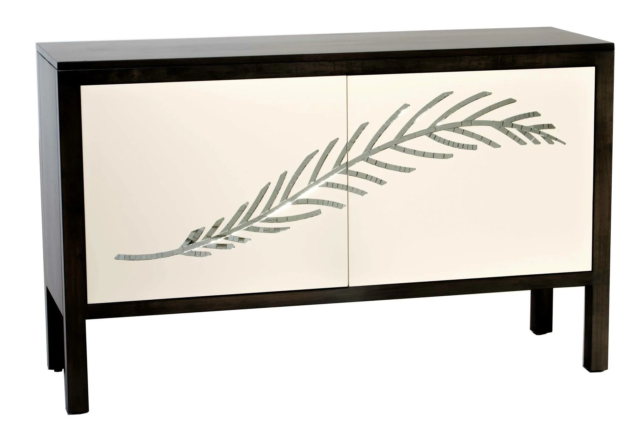
Here’s a gorgeous collaboration I had the opportunity to work on with John Strauss Furniture a few years ago. John created this beautiful cabinet to house this beautiful inset mosaic mirror feather that is inset within the doors. It was so fun to collaborate with John & Carisa on this and so many other furniture/mosaic works!