Video transcript for deaf or hard of hearing:
Hi Art Aficionados! I’ve wanted to try experimenting with alcohol inks for a long time. A couple years ago I made these privacy screens for my apartment. I was looking for brilliant color more than fine art, so I was really happy with the outcome.
I usually show you the progress on successful projects because I’m doing mosaics that I’ve been making forever. Today you get to see the failures, or as I like to call them, educational experiments.
I bought a bunch of inks when a local art store was going out of business, and on their last couple days when they were practically giving art supplies away, I picked up alcohol ink markers. I’m not actually sure how to use them.
For this experiment, I cut 11” x 14” Yupo paper into smaller pieces so that I’m not wasting a lot of time & supplies in practice. Yupo is a cotton based paper that is non-porous so that alcohol inks can flow on top.
To me it feels like this paper is porous and absorbing some of the ink. I don’t know if the problem is the quality of my yupo or if I’m not doing it right.
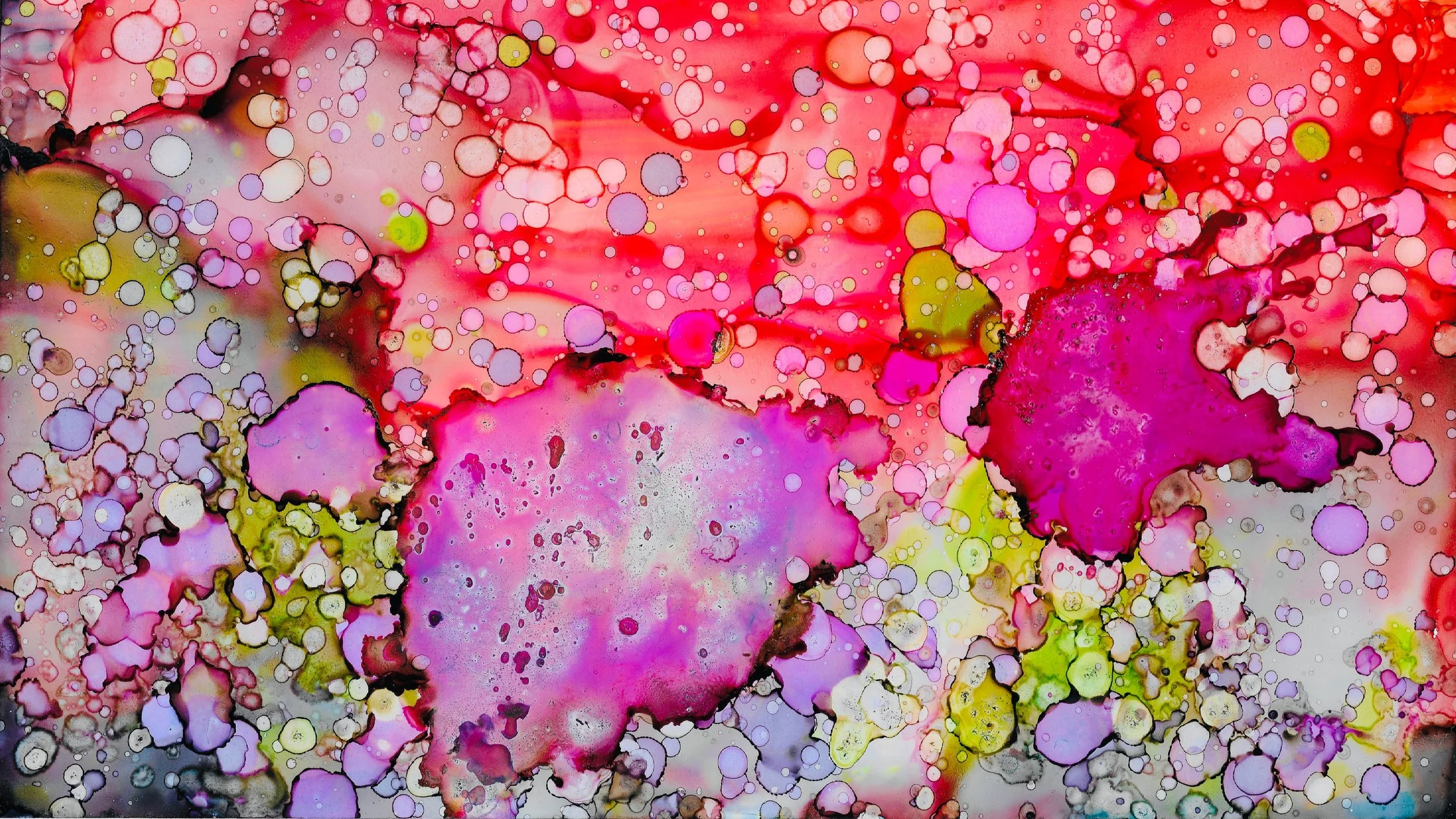
There are so many ways to work with alcohol inks, but I really like the brilliant colors and circular patterns. I’m attempting to get that going here, but it’s not quite working out the way I wanted.
I’m just going to keep going because even though I’m frustrated that nothing I’m putting down is looking the way I intended, I can’t learn unless I try.
As I come to the end of filling the paper, I do like the saturation, especially the fuschia, so I’m going to pick it up and tilt it to let the ink flow. My plan is to come back to this paper in a few weeks or months when I have a better handle on this and use this saturated color as a background and add to it. The ink reactivates once rubbing alcohol or alcohol ink is added.
I’m going to try the markers again as a background. As I’m doing these voice overs, I’m realizing that since I’m someone that likes to work precisely, the alcohol ink markers may be a better option for detailing the foreground in the future instead of just as a background.
What I tried differently on this one is dropping on pearl mixative. I am not sure if it’s supposed to be used on its own like this, or mixed in as the name implies, but I dropped it on anyway. I don’t love the way I used it here, but the effect is something I will be able to use to help ideas in my head come onto the paper.
I realize I didn’t show you the inks. I’m using Tim Holtz Ranger inks, which seem to be the most popular and recognized as highest quality by alcohol ink artists.
One last try for today. I’m dropping ink colors on that I want, then using a straw to try to blow the colors around. I was very unhappy with what I had going on here, so I washed it over with rubbing alcohol and I’m going to try one last thing: I’m going to sprinkle ink on by flicking a paint brush. This isn’t exactly what I want, but at least I can see that the tiny circles that look like those images of micrograph cells ARE what I’m looking for. I just want it more saturated and precise.
I am someone that needs to do things to learn, so I’m glad I pushed through this frustration of ignorance. Now I will do what my sister wisely does every time she is about to embark on a new endeavor… I will watch a million YouTube videos. There is no short supply of alcohol ink videos and tutorials, and now that I have played around a little, I will be able to soak in their techniques better.
Thank you for watching my trial and mostly error. Remember you can’t make beautiful art until you fail many times first.