Copper I is the first mosaic in my series based on the allure of oxidized copper. This sixth and final video in the series is a time-lapse of the entire mosaic process. 160 hours of mosaicking in a 5 minute time-lapse video.

Your Custom Text Here
Video transcript for deaf or hard of hearing:
Hi Mosaic Lovers! We left off last time with most of the transition from dark brown to cream complete. It was just the final toffee layer to place before starting on the beautiful, iridescent stained glass background. I took my time with this layer because the shape was really important to the overall look of the piece and I don’t want to place the toffee colored tile in a way where I end up having trouble placing the stained glass.
I want to show you how I go about cutting the stained glass for the background. I want large geometric chunks, so I scored it with a glass cutter to get the edges nice and crisp. It takes considerably longer to get straight lines with mosaic wheels and they’re never quite as clean, especially with a glass that has an iridescent coat like this one. Stained glass always tends to chip, but especially that iridescent layer.
For this section I’m using vellum to trace the shape I want, then cutting it out and using a Sharpie to trace the shape onto the glass. The Sharpie marks will come off during grouting, but I still use a color just slightly darker than the glass. If I use black, it could show permanently if it gets in any crevices and could even discolor the iridescent glaze.
When applying the adhesive, I spread it evenly over the entire back surface of the glass. This forms a seal so that the grout can’t seep underneath the glass and appear as a discolored shadow in the completed mosaic. Most stained glass is more translucent than it appears at first, so this is essential, especially if you’re using grout that is either dark or bright. I also wipe up any excess adhesive with sculpting tools so that it doesn’t smoosh up into the grout joints when I place the next piece of glass.
I’m planning on using several shades of grout with this mosaic. I got Mapei Flexcolor 3D grout in copper for the beige and copper parts. This is a metallic, sort of iridescent grout. If I knew I was going to use this grout before I started the background, I would have spaced the stained glass further apart so that the grout was part of the design and had a few millimeters to shine.
The first thing I’m going to do is grout the blue and green parts off-white. The final color in this section will be black, but this will prevent the black grout from seeping down into the grout joints and darkening the appearance of the glass. We want the blues and greens to be sparkly and bright
Next I’m going to grout the edges beige. My sister suggested putting this mosaic in a copper frame, which is a wonderful idea. The frame could be very expensive, so I’ll wait to see if someone wants a copper frame if they buy it. Until then, I need to cover up the plywood edges with a neutral color.
Here comes the metallic grout! This is the first time I’ve used it and it is so hard to clean up. As I grout I’m coming up with a system that seems to be working. I’m working in small patches using a sponge and water, and then a polishing towel that cleans up the surface. In some places I’m also using a toothbrush, a pottery needle, and a cut off paintbrush to clean it up properly.
This grout goes from feeling like a sticky sugar facial mask to crunchy dried out brown sugar in seconds. It also leaves behind a layer of plastic-like film all over the glass that has to be cleaned up for the glass to shine. Hopefully it will be worth it in the end!
We have two more colors of grout left. Next I’m going to do the black grout in the center. I’m masking off the background because I don’t want the black grout to stain the copper grout. I’m using paper to mask off the part that is copper, but using painters tape on the section in-between that will get another color. This way I don’t have to re-mask between grout colors.
I’m being really careful to remove excess grout around the beads so they shine as much as possible. I am giving everything a good wipe down with a damp sponge so the black won’t get all over the place when I remove the painter’s tape
Now I’m removing the painter’s tape from the midsection. The grout here will be the metallic grout, but I’m adding some pigment this time; brick red and a touch of black. I already forgot how hard this grout is to work with.
I’m loving the way this grout looks with the pigment. Honestly I kind of expected the copper grout to look this color, or maybe more brown out of the bucket, but since I can add pigment to make it darker, it is probably more useful being lighter.
Ok, time to unmask and give the mosaic its final cleaning. I know it isn’t easy to see in the video, but I’m really happy with the results of the metallic grout.
This mosaic overall took somewhere between 150-160 hours. I am so glad I decided to do all the different colors of grout. It was definitely worth the extra time and trouble in the end. Thank you for watching and following along with me on this copper mosaic journey.
Video transcript for deaf or hard of hearing:
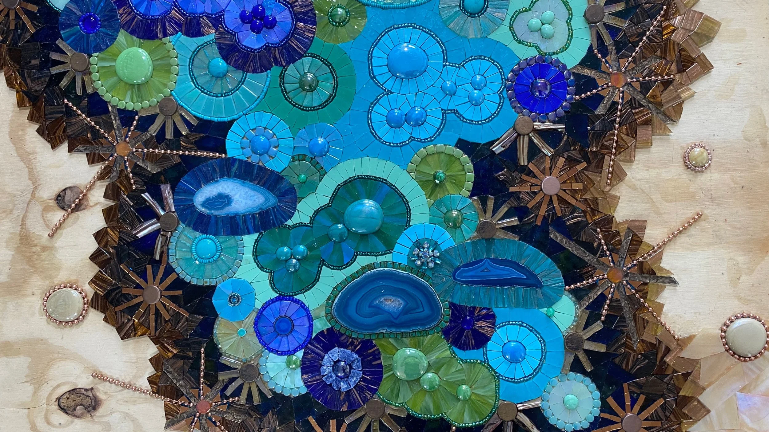
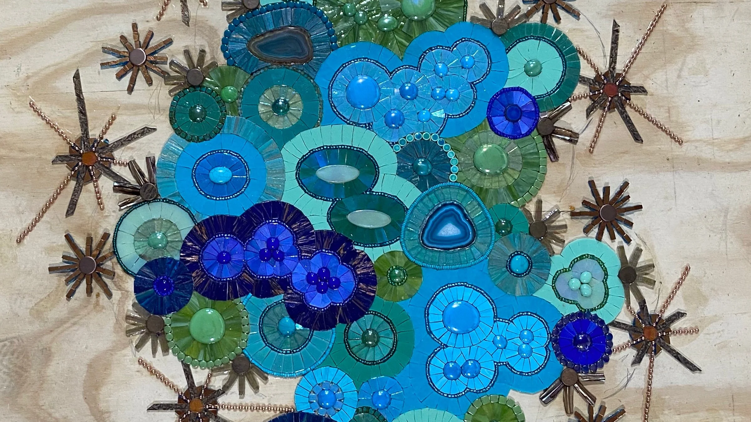
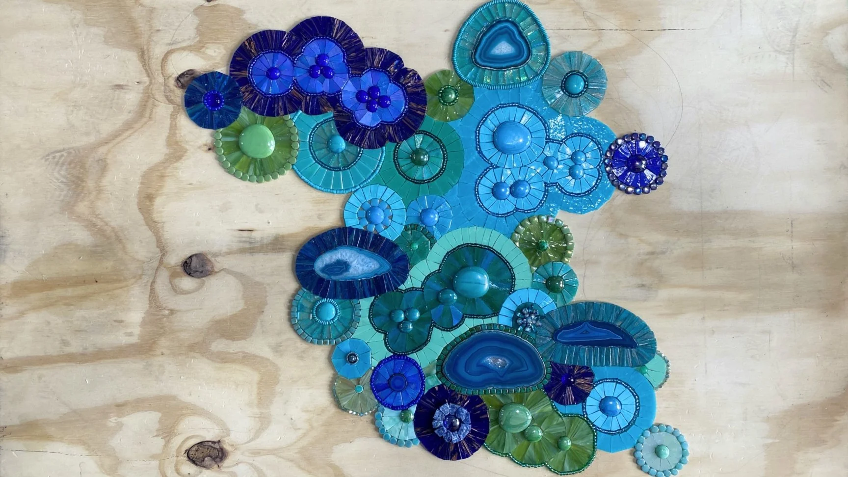
Hi Mosaic Friends! This is where we were at the end the last video about 80 hours into the mosaic. In the last couple weeks, I’ve completed about another 60 hours. From the point we left off, I changed my mind maybe a million times about what to do with the background.
Originally I had planned to use iridescent black textured glass to surround the blue & green circles. As you can see, with all the starburst spikes and different colors of blues and greens, a glass with a sheen of rainbow of colors will most likely muddy the design.
In the end I decided on 5 colors going out from dark to light, and letting the lightest color be simple and stand on it’s own by not continuing the metallic starbursts, but instead using tan and cream colored glass gems surrounded by copper ball chain.
This first color was the hardest decision. I needed a really dark color, but black was too dark and the browns I had were either vitreous glass that is too porous or stained glass that wasn’t consistent enough in color. I didn’t want any lighter colored streaks in this part. I finally settled on a very dark, blue/green wispy stained glass.
I have a ton of this glass by accident. I sent a piece of glass to be color matched to my supplier, saying I couldn’t decide if it was ‘A’ or ‘B’. They said it was ‘C’ and I ordered several sheets for a project. It was obviously not ‘C’, but they wouldn’t take it back because it was a custom order. It turns out to be lucky because out of 10s of thousands of pounds of glass, I couldn’t find any other color that works for this mosaic.
It looks bright when I’m applying the glass because the adhesive is white, but it dries clear, so it will be kind of a muddy bluish green, but super dark when it dries.
For the next three colors, I’m using dark brown, warm brown, and golden Hakatai Aventurine glass that has gold wisps throughout. It is perfect to add to the copper tones and transition to the final cream background color.
I’m working one color at a time so that I can monitor the shape. I keep backing up and looking to make sure it’s looking the way I want it. I was thinking I would flair the shape out at some point, but so far I’m only slightly altering the thickness. I still may decide to do something different with the final golden row.
I am finally really happy with the way the colors are blending together. In the next video I’ll finish up the mosaic. I can’t wait to show you the completed project! Thank you for watching!
Video transcript for deaf or hard of hearing:
Hi Mosaic Fans! This is where we left off with the last video after about 35 hours into the mosaic. Today I’m going to show you another 45 or so hours of work. This time lapse covers about 29-30 hours of actually placing the glass. Often the extra time lowers as a project goes on, but with so many colors & materials, there is a lot of cleaning up glass shards, organizing, changing my mind, and some cutting I did for prep that I didn’t capture.
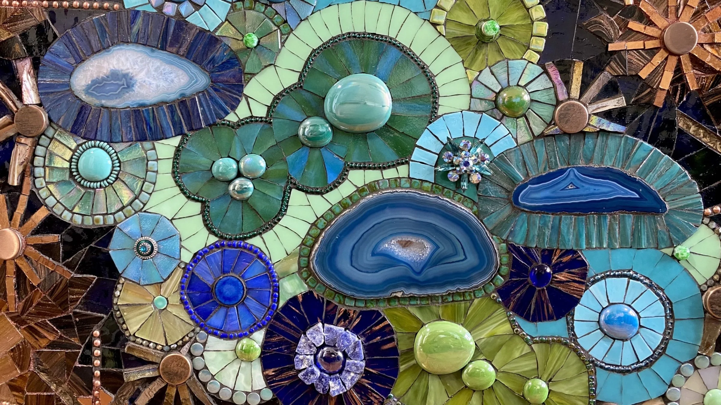
Here I’m finishing the blue and green circles that represent the oxidized copper part of the mosaic. I wish the mosaic was even larger so that I could put in more color changes, but this is already huge for a mosaic that isn’t a commission. I’ll have to balance things out the best I can.
I can’t find the clip of finishing the two circles at the top, but here’s where we end up once I’ve finished with all the blue and green tessera in foreground.
Now on to the starbursts! I want the prominent metallic aspects to have an effect like I’ve made with some of my starburst projects in the past, but they will be more subtle once the surrounding background glass is placed around it.
Here are a couple examples of mosaic starbursts I’ve made before to give you an idea of what I’m talking about.
I’m making a lot of choices as I go. I only knew that I wanted to go from antiqued brass colors to copper to gold as the pattern moved out from the blue and green center toward the edges. I thought I wanted starbursts that were more solid, but as soon as I started, I realized that wasn’t going to work because they would be forming solid blocks of color and wouldn’t leave room behind them for me to make the ombre I’m planning in the background effective.
I also intended to make each starburst unique, but then realized that there was too much going on in similar color tones to have that much chaos. Using pattern repetition will be better to clarify the design.
While I finish up this first row of starbursts, let me discuss what will go behind them. Originally I had planned to continue making brown and copper circles around the blue and green circles, changing colors in an ombre style until I get to an iridescent cream. There is really not enough room left to switch the colors that way, so with only about an inch and a half per color, that’s not enough room to create circles. Plus with all the spikes from the starbursts, it is hard to get patterns going in these spaces even if there was enough room for the circles color-wise.
Next time I’ll be working on the background, transitioning from dark to light, but I’m happy the mosaic is coming together and definitely looking inspired by oxidized copper. Thank you for watching!
Video transcript for deaf or hard of hearing:
Hi mosaic visionaries! This video is the beginning of the mosaic Copper I in my new series based on oxidized copper. The image you’re viewing right now is how far I am by the end of this video, which is 25 hours of mosaicking, plus about 10 hours of prep, organizing, and cleaning between steps, so about 35 hours in. So let me show you how I got started!
I’m beginning by placing my agate slices. Just like stained glass, agate is translucent even when it doesn’t seem to be so I like to take the extra step of backing them with aluminum foil so that they have a nice iridescent gleam.
Next I’ll build the first rows of tessera around the agate slices. For most of my personal art projects, I work organically. I start with only an idea of the general movement and colors I want in the piece, then as I work, I step back and see how I want the project to evolve.
I’ve been hoarding these agate slices for about a decade. I’ve used some in my previous works, but they often don’t fit in when I do smaller personal projects. I usually only have limited time to work on my own projects between commissions, so I tend to do small projects to work on different techniques I’d like to explore. Since I decided to make a larger mosaic this time, it’s the perfect opportunity to use them.
I am trying here to get a balance of color, shapes, and textures. I want to build some tiny circles with a lot of flash and sparkle first, then fill in with more grounded, larger color spans around them. That basically means that I’m selecting sparkly found objects to be the centerpiece of some of the smaller circles along with brighter colors, lots of beads, and textured glass, then when I get to the larger sections to fill in the middle, I’ll make those sections interesting by forming more abstract shapes using a series of gems as the core, then working out from there, kind of forming a multi-celled structure. Another way I’m using to create some smoothness in these larger areas is by using solid color opaque stained glass to represent the areas where the oxidation process is smooth and even.
I’m also trying at the same time to balance the color. In my favorite images of oxidized copper, there is a lot going on once you really start looking at it. It’s not just a light turquoise or mint green color. It’s every color on the richer yellow-green to aquamarine spectrum. Since this mosaic is intended to be more of an underground, vein of copper found in the earth sort of feel, I’m also going as dark as cobalt. Plus, who doesn’t love some cobalt blue?
There’s a lot more work to do on this first copper mosaic, but I’m really looking forward to seeing how it evolves. I hope you are too! Thanks for watching!
Video transcript for deaf or hard of hearing:
Hey everyone! So during these Corona times I’m waiting for some glass to be delivered from Italy so I can finish up a project that will go to Florida; it’s a large driveway mosaic. And in the meantime I’ve been working on some mosaic gifts for my family, but they are gifts so I can’t show those to you. So what I though I’d show you today is, um, I am starting a new mosaic, a personal project, um, that is based on the idea of copper, oxidized copper. So I’m going to be picking out materials and I though I would show you some of the fun supplies I’m going to be working with and how I go about selecting them.
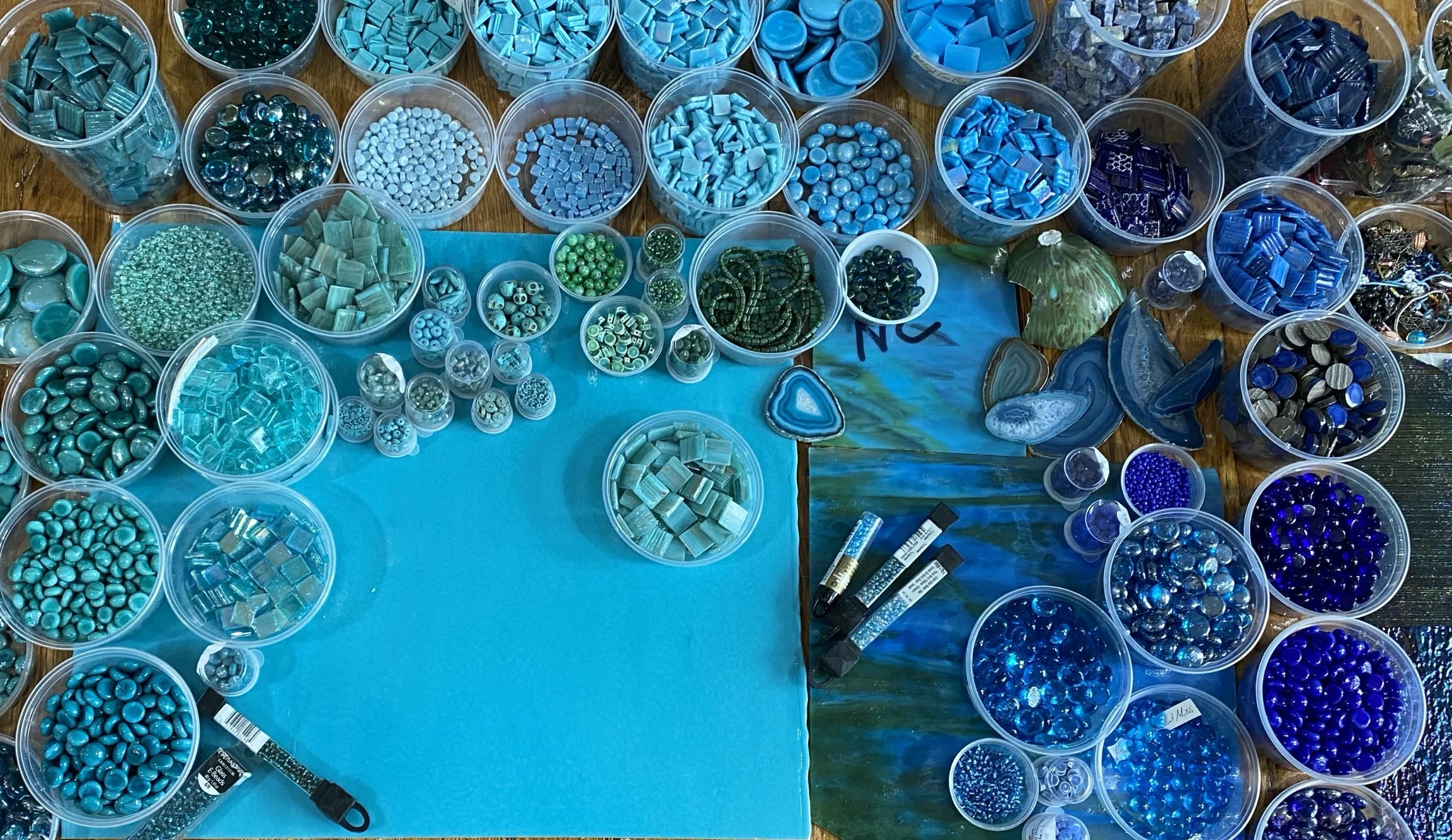
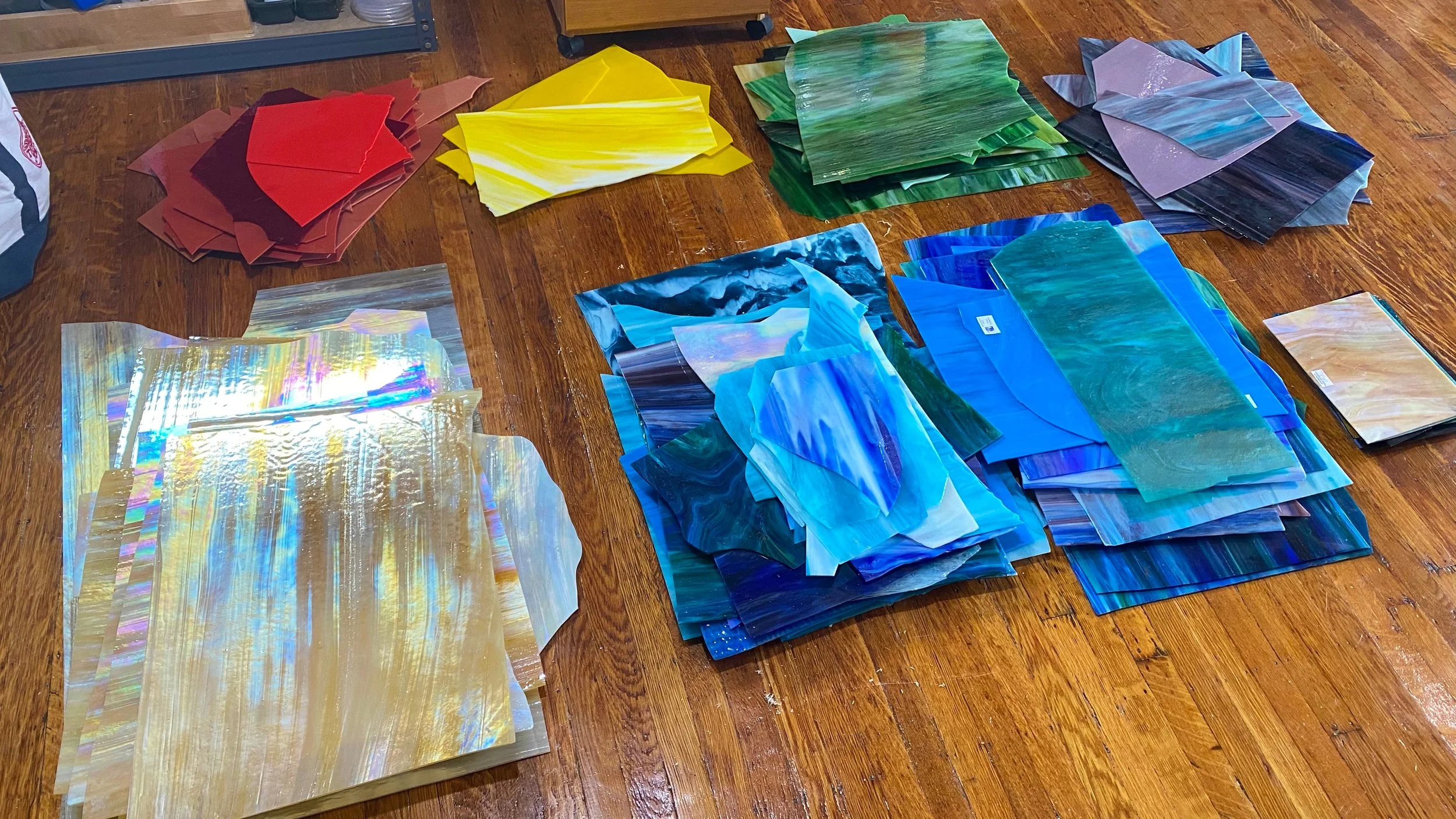
I’m going to start off with this gorgeous turquoise Bullseye stained glass as a base color for the oxidized copper. My stained glass is pretty accessible in my studio, so I will only pull out a few sheets for now just to get a range for my palette. I’m adding in a nice blue/green swirly glass, then the background color of the mosaic, which is a natural creamy glass, including some iridescence. Then I’ll add in the transition colors: earthy browns, including some with copper tones, and iridescent blacks with funky patterns. This stained glass array is the general palette.
Next I’m going to pick out some gems. Here I have a variety of turquoise to blue, including iridescent and translucent gems for depth, and some milky tan gems in case I need them for the background.
This is Hakatai Aventurine tile. It has gold streaks through it and will be perfect for this project.
Here I have a variety of 5/8” tile from Sicis and Hakatai. To add different thicknesses, I’ve pulled out some thicker tessera: glass, ceramic, marble, and metal.
These super cute glass beads and tiles are only about 8mm. This is millefiori which means thousand flowers, ball chain, pebbles, agate slices and a bit of broken pottery I love, and some beautiful mother of pearl.
Finally we have the beads and found objects. When I had the idea for this series, I put out a call on Facebook and the wonderful Linda Broka was kind enough to send me these metal pieces. I haven’t experimented yet to see how best to use them, but I’m looking forward to it! I also try to collect a wide variety of accent pieces such as broken jewelry whenever they cross my path.
Next, I arrange everything into the color palette. You want a lot of variety when making a mosaic like this so that the final artwork has a lot of texture and depth. I have a good range of sizes, textures, thicknesses, and sheens, so I’m really excited to get started!
A time-lapse I put together for a mosaic I made years ago before there was a time-lapse function on the iPhone. I just put together a bunch of progress pics, but I thought it still may be fun to see. This is a mosaic I created for Delta Airlines to use the image in their in-flight magazine.
Video transcript for deaf or hard of hearing:
Hi Mosaic Fans! I wanted to show you the Wissmach Glass Factory where I got this gorgeous glass for an awesome price.
At the factory they have scrap glass available to pick through for $1 a pound. As you can see, it’s not just tiny shards, it’s large pieces of their gorgeous stained glass. Even Mango was enjoying the visit, though mostly because one of the employees shared his lunch with Mango.
Here is their bin of COE 90 glass, which is unfortunately pretty sparse. I had hoped to find something good for my sister that fuses this kind of glass, but there wasn’t anything interesting, or basics like clear glass.
There’s even more glass here around the corner and you can choose from any of these bins down to the No Smoking sign. And someone pointed out to me today that there’s also this bin of samples.
Here’s most of the glass I got during this trip. It’s probably thousands of dollars worth of glass and I only paid $300 for it, so that was a pretty good deal. As you can see, a lot of it is a little more broken than it was at the factory and I have a few bags of smaller, broken pieces because unfortunately right as I left the factory, a car pulled out in front of me and I had to slam on my brakes, which broke a lot of the glass. I guess it’s a good thing I do mosaics!
What I mostly stopped in for was this wispy iridescent glass that varies in color from amber to white. It’s what I used as the background for the Copper I mosaic. I’ve fallen deeply in love with it and want to use it more.
I wanted to find glass to use for more copper mosaics, but didn’t find a lot. I did find a lot more iridescent glass than usual though.
So that’s it for this Wissmach Glass trip. I hope you get a chance to either go there or to another glass factory sometime because in addition to finding this inexpensive glass you can pick out, they also give tours to show how they make the glass. I’ve never been on one of these tours and I would love to and I hope all of you get to sometime too. Thank you!
Logo by Louis Marchand
Copyright© 2002-2024 Dyanne Williams Mosaics